Working with Embedded Wizard: Using Widgets
The Mosaic framework provides a set of ready to use GUI components, so-called Widgets. Widgets are complex graphical objects you add and arrange within a superior GUI component in order to compose its appearance similarly as you do with ordinary views. Embedded Wizard provides various widget types for typical cases found in every GUI application. Almost every widget is able to react to user inputs performed either via touch screen or keyboard. Few of the widgets are intended to display information only, so the user can't interact with them.
For every widget type we provide three default appearances preconfigured to support the small, medium and large version of the widget. In addition, for some widgets further configurations are available. For example, in case of the Toggle Button you can select between the Switch and the CheckBox version of the widget. The following figure demonstrates it. It shows the Push Button widget and the Toggle Button (as Switch and CheckBox), each in all three possible sizes:
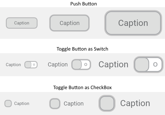
The provided default appearance configurations are intended to be used as they are. For every widget instance you can individually select the desired configuration. As demonstrated in the figure above you can even mix within one and the same application various widgets using different configurations. For example, you can use small and large buttons simultanously.
You can customize the widgets according to your design expectations by creating your own appearance configurations. You do this by adding and initializing new configuration objects. With a configuration object you determine the bitmaps, fonts and other parameters controlling the appearance and the behaviour of the widget. Once your configuration object is available, you can select it in the widget instance similarly as you do with the provided default configurations.
Widgets versus Component templates
The here described widgets are intended to be used directly as they are. If necessary, the appearance and partially also the behaviour of the widgets can be configured by providing your own configuration objects. This approach is simple and convenient and you don't need to implement a single line of code to customize your own widgets. The flexibility of this approach, however, is limited by the implementation of the particular widget.
For example, you can customize a Push Button widget to appear with particular bitmaps, fonts and colors. However, if you want the button caption to blink, or you want it to bounce when the user touches the button, then such adaptation is beyond the flexibility of the Push Button implementation.
You will need to implement such very particular widget by yourself. To help you with this task, Embedded Wizard provides so-called Component templates - very simply kept implementations of widget components you have to adapt according to your expectations. With Component templates you are not limited. But you have to take care of the implementation of the particular component. You have to write code.
Summarized, widgets follow a convenient, simple but also limited approach where you don't need to write a single line of code. With Component templates you have to write code by which you are flexible to create very individual and sophisticated widgets. Which of the both approaches applies to you does depend on your application case. By understanding the differences in the both concepts you can select the optimal one.
Available widgets
The table below provides a short overview of the available widgets. More details how to use a particular widget, in which default configurations it is available and how to customize its appearance according to your own design expectations is found in the respective chapter describing the widget:
Icon |
Name |
Description |
|---|---|---|
|
This widget implements a simple monostable push button. Every time the user taps within the area of the button, an associated action is triggered. If the button is focused, it can also be controlled by using the keyboard. |
|
|
This widget implements a simple bistable toggle button. Every time the user taps within the area of the button, the button toggles its actual state between on/off and triggers an associated action. If the button is focused, it can also be controlled by using the keyboard. |
|
|
This widget implements a bistable button permitting the user to choice from a set of mutually exclusive options. When the user taps within the area of the Radio Button, the affected button becomes selected while other associated Radio Buttons are automatically deselected. If the button is focused, the corresponding option can also be selected by using the keyboard. |
|
|
Horizontal slider is a widget permitting the user to set an integer value by simply touching and dragging the slider's thumb horizontally. Every time, the user drags the thumb, the value is updated and an associated action is triggered. If the slider is focused, it can also be controlled by using the keyboard. |
|
|
Vertical slider is a widget permitting the user to set an integer value by simply touching and dragging the slider's thumb vertically. Every time, the user drags the thumb, the value is updated and an associated action is triggered. If the slider is focused, it can also be controlled by using the keyboard. |
|
|
Rotary Knob is a widget permitting the user to set an integer value by simply touching within the knob area and performing a rotation gesture. Every time, the user rotates the knob, the value is updated and an associated action is triggered. If the widget is focused, it can also be controlled by using the keyboard. |
|
|
Gauge is a kind of virtual instrument intended to display an integer value (e.g. measured value) by using a needle as pointer that rotates above a scale. The areas on the left and on the right of the needle appear as circle segments - the tracks. The user can't interact with the widget. |
|
|
Value Display widget is a kind of virtual instrument intended to format and display an integer value (e.g. measured value) together with the associated unit. The user can't interact with the widget. |
|
|
Horizontal Value Bar is a kind of virtual instrument intended to display an integer value (e.g. measured value) by using a needle as pointer that moves along a horizontal track. Accordingly, the track areas on the left and on the right of the needle appear as separate horizontal bars. The user can't interact with the widget. |
|
|
Vertical Value Bar is a kind of virtual instrument intended to display an integer value (e.g. measured value) by using a needle as pointer that moves along a vertical track. Accordingly, the track areas below and above the needle appear as separate vertical bars. The user can't interact with the widget. |
|
|
Horizontal Scrollbar is a widget intended to show the horizontal scroll position and the size of the actually visible area (view) within the body of a large document (content). If the scrollbar is enabled, the user can interact with it by touching and dragging the scrollbar's thumb horizontally. Scrollbar can be configured to disappear automatically when it is not needed. |
|
|
Vertical Scrollbar is a widget intended to show the vertical scroll position and the size of the actually visible area (view) within the body of a large document (content). If the scrollbar is enabled, the user can interact with it by touching and dragging the scrollbar's thumb vertically. Scrollbar can be configured to disappear automatically when it is not needed. |


