Working with Embedded Wizard: Compositing component appearance
In order to edit the appearance of a GUI component added previously to your project you have to open the component class. Thereupon the content of the component in revealed in a new Composer page.
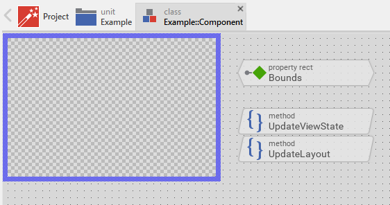
In the top-left corner of the Composer you see the Canvas area. It is surrounded by the thick blue border. You can consider this area as the part of your component, which later is visible on the screen. If the affected component is a new one, the Canvas area appears empty filled only with a checkerboard pattern representing the actual transparent screen background:
The areas right and below the Canvas are intended to accommodate all other non graphical project members necessary for the function of the GUI component. They will take care of the state management, event processing, etc.
While you edit your project, Embedded Wizard manages several Composer pages, one for every component you have opened for editing. Above the Composer window you see the Navigation Bar with it you can conveniently switch between all the opened Composer pages.
Change the size of the Canvas area
When you open a new created GUI component, you should adjust the size of its Canvas area. This is an important step, since the dimension of the Canvas determines the default, initial size of the component as it will appear at the runtime on the screen.
Add views to the component
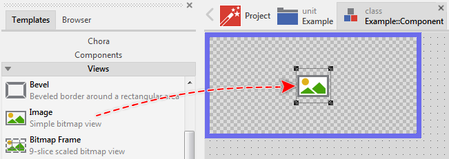
The simplest way to determine the appearance of a GUI component is to composed it from views. Embedded Wizard provides an extensive set of views for the most typical application cases like filling a rectangular area with color or gradient, displaying an image, text or even applying a 3D effect. The overview of the available views and how these are used is found in the chapter Using Views. In practice to add a new view you do following:
★First ensure that the Templates window is visible.
★In Templates window switch to the folder Views.
★In the folder locate the template for the desired view e.g. Image.
★Drag & Drop the template into the Canvas area of the Composer window:
Technically seen, a view is just an instance of the respective Mosaic view class embedded in-place within the GUI component. At the runtime, when the GUI component is displayed on the screen, the component takes care of all the views embedded inside it, so they appear exactly as you have composed them at the design time.
Use Inspector
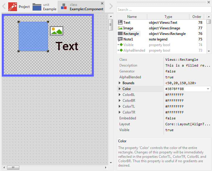
All members you add to the Canvas area appear also listed within the Inspector window. In fact both the Composer and the Inspector are coupled together. When you work in the Composer, the modifications are instantly reflected in the Inspector window. Similarly when you modify something in the Inspector, the Composer is accordingly updated. The following screenshot demonstrates a situation after few views have been added to the Canvas area:
Name the views
Every new added view receives per default a name identifying it uniquely within the component e.g. Image4. Thus it is recommended, that after being added you rename the view explicitly according to its later function. For example, a Text view intended to display a label within a push button could be named LabelText.
Arrange the views
Once added, you can freely move the view, or you simply grab one of its corners and resize it in this way. If you want the view to appear behind other views you can reorder it explicitly.
Configure the views
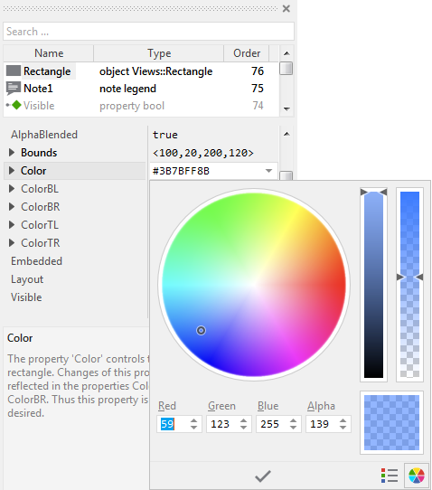
When you select a view you can inspect and modify its properties conveniently in the Inspector window. You can consider the properties as variables where the individual parameters of the respective view are stored. By changing a property the view updates accordingly its appearance. For example, if you have a Filled Rectangle view within your component, you can see and modify in the Inspector window its property Color, which instantly affects the appearance of the rectangle:
When working with the Inspector window you can enter the value for a property directly as text by using the notation compatible for the respective property type. For example, the above property Color is declared with color as its data type. It is thus valid to initialize this property with a color literal, e.g. #0000FF80 (means a semi-transparent blue color). The data types and the corresponding literals are part of Chora programming language and are described in Data types.
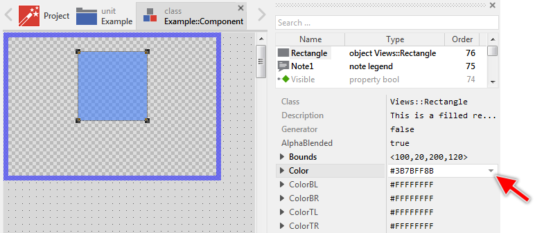
The Inspector is a very powerful tool. It provides for the most of Chora data types specially optimized Assistant windows. With an Assistant you can conveniently browse and select the right value for the affected property instead of manually entering the literal expressions. For example, the Assistant for a color property permits you to pick the desired color from a color wheel. Similarly you can select the luminance and opacity of the color:
In the chapter describing the respective view you will find detailed information about its all available properties and their associated function.
Add an instance of a widget component
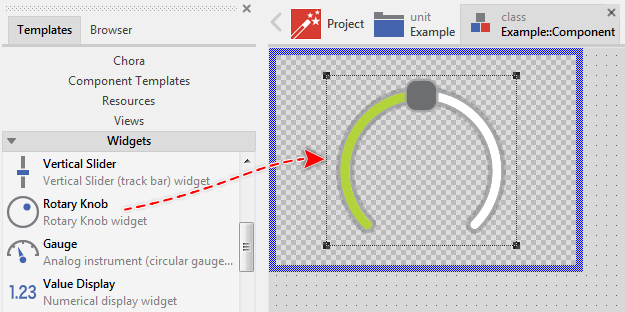
Besides the above mentioned views, the Templates window contains also many different ready-to-use widgets, you can add and use instantly in your GUI component. The overview of the available widgets and how these are used is found in the chapter Using Widgets. The workflow to add and configure widgets is similar to the described in the sections above how ordinary views are added. In practice you do following:
★First ensure that the Templates window is visible.
★In Templates window switch to the folder Widgets.
★In the folder locate the template for the desired widget e.g. Rotary Knob.
★Drag & Drop the template into the Canvas area of the Composer window:
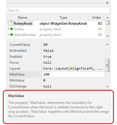
Now, as explained above you use the Inspector window to configure the properties of the just added widget. Please note the description area in the bottom part of the Inspector. When you select a property, this area displays useful information regarding the property:
From the technical point of view, widgets are, similarly to the views, just instances of the respective widget class embedded in-place within the GUI component. The implementation of the widget classes is part of the Mosaic framework. For more details regarding the available widgets and how these are used is found in the chapter Using Widgets.
Add an instance of an existing GUI component
If you have already created several GUI components, you can assemble them together to a more complex component. The components can thus be considered as building blocks. Technically seen, you embed an instance of the respective component class in-place within the superior GUI component. At the runtime, the superior GUI component takes care of the correct initialization and the displaying of all embedded components, so they appear similarly as you have composed them at the design time.
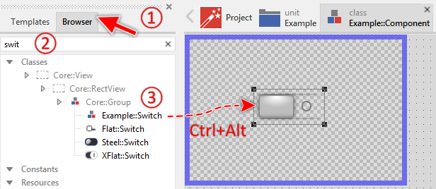
In order to add an instance of an already implemented GUI component, you use the Browser window:
★First ensure that the Browser window is visible.
★Within the Browser locate the desired GUI component class. This can be done easily with Browser's own filter function.
★Select the found class in the Browser window.
★Drag & Drop the selected class into the Canvas area while holding the keys CtrlAlt pressed:
Again, as explained above you use now the Inspector window to configure the properties of the just added component instance. Similarly as you can add several copies of one and the same view or widget, you can also embed several instances of one and the same component. Every instance can be configured individually:
Composer and visibility of views
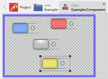
As mentioned at the beginning of this chapter, the visible part of the GUI component is determined by the Canvas area. Views lying outside this boundary are clipped. When you select a view arranged outside the Canvas area, all you see is the selection border surrounding it:
You can of course configure a view to become invisible regardless of its current position. Every view provides for this purpose a property named Visible you can modify in the Inspector window. However, please consider, that under special circumstances the views configured as invisible are still displayed in Canvas area permitting you to select and arrange them at the design time. If you are wondering why an invisible view is still displayed please see Invisible views for more details.
TIP
In the complete GUI application an individual view is visible on the screen only when all of its superior Owner components are visible too, the view itself does lie within the visible area of the superior components and the view is not covered by other sibling views nor components.
Control the visibility of nested components
When you add an instance of an existing GUI component or one of the provided ready-to-use widgets, you can control the visibility of such nested component similarly as you do with any other view. After selecting the affected component you see in Inspector its properties. The following screenshot shows the properties common to all components:
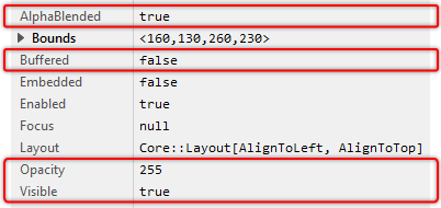
With the property Visible you control whether the component is visible or not. Please note, that modifying the property Visible may eventually have no effect in the Composer window. This is a feature intended to help you to find, select and arrange views even if these are not visible. In the target system and the Prototyper window the property Visible has the expected behavior. See also Invisible views.
TIP
In the complete GUI application an individual nested component is visible on the screen only when all of its superior Owner components are visible too, the component itself does lie within the visible area of the superior components and the component is not covered by other sibling views nor components.
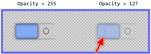
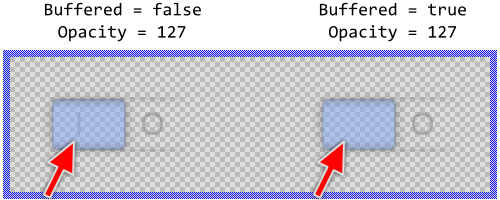
More sophisticated effects are possible with the property Opacity. Per default the property is initialized with the value 255 which means full opacity. Initializing this property with a value less than 255 results in the affected component being shown semi-transparent. Finally with the value 0 set to the property Opacity the component is hidden.
Technically seen, the value you specify in the property Opacity is applied to every view nested within the component. In other words, when you initialize Opacity with the value 127, every view existing within the component is shown with the half of its normal opacity. This has the effect that originally opaque views will become semi-transparent and you can see other views lying behind them. The following screenshot demonstrates this aspect. After changing the opacity of the switch component to 127 you can see the text I shining through the switch image:
This effect disappears when you additionally set the property Buffered to the value true. With this the affected component will manage internally an off-screen image of its actual content. Then during the screen composition this image is used to display the component. In other words, the component renders its actual image with the full opacity into an internal image memory and then displays this image with the specified Opacity value. The resulting effect is demonstrated in the following figure:
With the other property AlphaBlended you control how the component should be treated when compositing the screen. Per default the property is initialized with the value true resulting in the component contents being composed with other contents lying behind them by using alpha-blending. Setting the property AlphaBlended to the value false causes the component to display every of its embedded views by overriding the contents in the background. For example:
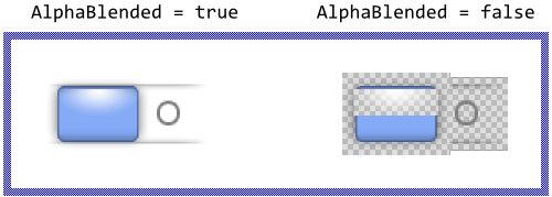
Similarly to the property Opacity, the effect of setting AlphaBlended to the value false is applied individually to every view existing within the component. In other words, if you have two image views arranged one above the other, the lower view will override the contents in the background and then the upper view is displayed overriding the resulting contents inclusive the image behind it. This is the reason why in the right switch from the above screenshot you see a hole where the left switch displays the white highlight effect. Again by using the property Buffered you can improve this behavior:
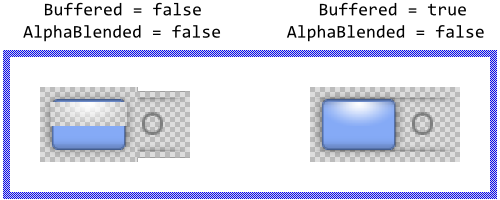
If used with prudence, the property Buffered together with Opacity and AlphaBlended allows you to flexibly control the screen composition. It can be used even to optimize the screen updates. Setting the property Buffered to the value true will cause the affected component to prepare an off-screen image of its content and use it every time the screen is updated instead of rendering again and again the embedded contents. This is in particular noticeable, when the affected component contains many embedded contents and the contents change seldom.
By the way, the property Buffered is also used when you intend to display a stretched, rotated or 3D warped image of the component by using the Group and WarpGroup views.
CAUTION
Please consider, that with activating the buffered mode, the component reserves memory for an internal bitmap to store its image inside. The size of the bitmap corresponds to the actual size of the component. In other words, a 200x100 pixel large GUI component will be buffered with a 200x100 pixel large bitmap. Assuming you are working with the RGBA4444 (16-bit per pixel) Platform Package, then the bitmap would occupy ~40 KB of the RAM. Thus, if RAM is a scarce resource in your target device, you should use the buffering mode with prudence.
Control the Enabled state of nested components
When you add an instance of an existing GUI component or one of the provided ready-to-use widgets, you can precisely control whether such nested component should be able to handle touch screen or keyboard events. After selecting the affected component you see in Inspector its properties. The here interesting property is named Enabled:
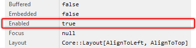
Per default the property Enabled is set true permitting so unrestricted event handling. The simple changing this property to the value false will suppress the affected component from being able to react to any user input event. This affects all Keyboard and Touch Handler existing within the component or existing within one of the nested components depending on it within the view tree.
Why do we need this feature? Let's imagine a panel the user needs to enter the parameters for a CNC machine. Since not all parameter combinations do make sense, it is essential to prevent the user from being able to start the machine with parameters, which eventually lead to machine damage. The button GUI component to start the machine remains thus disabled until the user has entered all parameters and these parameters have been validated regarding their correctness.
Please note, as long as not enabled, the affected component can't become focused. Similarly, changing the property Enabled to the value false while the affected component was focused, revokes automatically its focused and selected states.
IMPORTANT
The possibility to handle user input events is not affected by the visibility status of a GUI component. Embedded Wizard differentiates explicitly between the status ready to be shown on the screen and able to handle user inputs. Accordingly, hiding the component will not suppress the enclosed Touch or Keyboard Handler from being able to react to user inputs.
If you want a GUI component to be hidden and to not be able to handle user inputs, you have to hide and disable the component. In such case you set both properties Enabled and Visible to the value false.
Control the stacking priority of nested views
The views (or instances of other GUI components) are arranged within their superior GUI component always one above the other. Consequently, views lying in front do overlap the views in the background. If you want a view to appear behind other views you can reorder it explicitly. Doing this, you modify the Z-Order of the view. This can also be done at the runtime of the application, by using one of the RestackXXX() methods.
If you only want to ensure that some view remains arranged in front of other views, you can configure its property StackingPriority. With this property you specify a constraint how the view should be arranged relative to other views. You can, for example, configure a view to be always top-most regardless of how other views are reordered. To achieve this, just change the property StackingPriority of the affected view to a value greater than that of all other sibling views coexisting within the same GUI component.
The Mosaic framework automatically prevents a view from being rearranged behind another views with lower StackingPriority or in front of views with higher StackingPriority. This feature is not a replacement for the above described Z-Order. It is just a constraint how Mosaic automatically ensures that views keep their stacking position.
IMPORTANT
Please note, reordering of views and the constraints resulting from the StackingPriority property are limited to views existing within the same GUI component. You can't arrange a view to be screen top-most if the view itself belongs to a GUI component lying in the background and being overlaid by other GUI components.
Component background
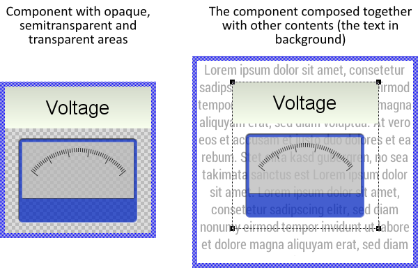
When you create a new component, you see the Canvas area filled with the checkerboard pattern. This pattern indicates, that the affected component is actually empty and thus transparent. Depending on your design requirements you fill then the component with views and other nested components.
All areas of the component, which are not covered by views or other nested components remain implicitly transparent. In turn, areas, which are covered by semitransparent views are translucent. During screen update, Embedded Wizard composes the images resulting from every component one above the other. Thus wherever a component is transparent, you will see all other components lying behind it. If an area is semitransparent, you see both the contents in the background shining through and the content of the component itself.
For example, when you add an Image view to the component and configure this view with 50% opacity, the affected area of the component will become semitransparent. The following screenshot demonstrates it. On the left you see a simple component containing opaque, semitransparent and transparent areas. On the right you see how such component is composed together with other contents found in the background:
Although components have rectangular shapes, by leaving areas of the component empty (transparent) you are free to design components of any shape. Even with semitransparent contents you can create overlays where the background contents may shine through.
If you wish the component to be completely opaque, just put a Filled Rectangle view to it and arrange the view to cover the complete area of the component. The rectangle will serve as the component background. More sophisticated is to use the Image or the Wallpaper view to determine the background. Which views you select depends finally on the visual effect you want to achieve.
Delete a view
If not desired anymore, you can delete a view from the GUI component again.
Edit 'this' component properties
While you edit a GUI component, you see in Inspector window a pseudo member named this. When you select this member, the Inspector will reveal all properties belonging to this actually edited component. For example, in case of a switch button component:
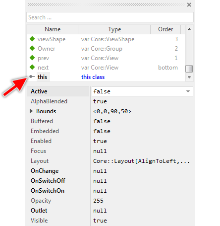
In this manner you can conveniently evaluate or modify the properties. By modifying the properties you determine the default values valid for all instances of the component and other components derived from it. Let's assume, you want all instances to be invisible per default. In such case, change the property Visible of the selected this member to the value false. Later, when you create an instance of the affected component, the component will be invisible unless you explicitly change its property Visible.
In the same manner you can configure the property Bounds determining so the default size and the default position to arrange the component when you create a new instance of it. By the way, the property Bounds correlates with the size of the Canvas area. So changing one affects the other implicitly.
Compose the component programmatically
The above sections focused on the approach of how the appearance of a GUI component is composed by Drag & Drop all the desired views together. This approach is simple and convenient. It works however only when all affected views are well known at the design time.
If your application case requires the views being created dynamically at the runtime, then you can implement code to create a new instance of the view by using the operator new, configure its properties and finally add the just created view to the current component by invoking its method Add. The following Chora code demonstrates this approach. Every time this code is executed, 10 new Filled Rectangle views are created and arranged within the GUI component:
var int32 i; // Iterate 10 times. Every time, create a new Filled Rectangle view and // add it to 'this' GUI component. for ( i = 0; i < 10; i = i + 1 ) { // First create a new instance of the view class 'Views::Rectangle' var Views::Rectangle view = new Views::Rectangle; // Initialize the property determining the position and the size // of the new rectangle view relative to the top-left corner of the // Canvas area. Here all rectangles are 100x100 pixel large and they // are arranged with an offset of 30x30 pixel. view.Bounds = <10,10,110,110> + point( i * 30, i * 30 ); // Determine the color to fill the rectangle view.Color = #0000FF80; // Now make the just created view be a part of the GUI component. Add( view, 0 ); }
The following example project demonstrates the function of the above described Chora code. When you open this project in Embedded Wizard and start the Prototyper, every time you touch inside the component area, the above code is executed and new 10 rectangles appear:
Please note, the example presents eventually features available as of version 8.10
Technically seen, a GUI component is just an ordinary class derived from the Mosaic class Core::Group. This class implements besides the above used Add method many other methods very useful when you intend to modify the GUI component programmatically. The following table provides you an overview of the most essential methods:
Method |
Description |
|---|---|
Inserts the view into the component and places it per default top most above all other views existing already within the component. |
|
Inserts the view into the component and places it immediately behind a specified sibling view. |
|
Removes the given view from the component. If the view instance is not referred elsewhere, the instance will be disposed automatically during the next garbage collection. |
|
Removes all views from the component. After this operation the component is empty. If the view instances are not referred elsewhere, the instances will be disposed automatically during the next garbage collection. |
|
Changes the Z-order position of a view relative to its sibling views. |
|
Arranges the view behind all other sibling views. |
|
Arranges the view in front of all other sibling views. |
|
Arranges the view behind the specified sibling view. |
In principle, you can use the methods whenever it is required within the implementation of your GUI component. You can do this even in context of another GUI component instance modifying thus its own appearance. In the example below a new empty GUI component instance (an instance of the class Core::Group) is created programmatically, then a new Filled Rectangle view is added to it and finally the new component is inserted into the main application component (to the root object) causing the new component to appear on the screen:
// First create a new empty GUI component instance var Core::Group component = new Core::Group; // Configure the visible size of the component and // the position where it should appear inside its superior // component. component.Bounds = <0,0,300,200>; // Now create a new instance of a Filled Rectangle view. var Views::Rectangle view = new Views::Rectangle; // Configure the position, size and the color of the rectangle // view. view.Bounds = <0,0,300,200>; view.Color = #FF0000FF; // Insert the Rectangle view to the previously created empty // GUI component. component.Add( view, 0 ); // ... and finally insert the component into the application // component (the root object of the application) itself. GetRoot().Add( component, 0 );
Enumerate and search views existing within the component
Sometimes it is necessary to know the views embedded within the component. This can, for example, be the case when you need to add some cursor navigation to your menu or control panel. Then when the user presses a key Up, Down, Left or Right your component should react and select the next available menu item or widget lying in the specified direction relative to the currently selected view. Or, much more simple, you want for example all Text views existing within the component being initialized with another font resource. In such case the Core::Group class provides various useful methods. The following table gives you a short overview of them:
Method |
Description |
|---|---|
Returns the total number of views controlled by this component. |
|
Determines the rectangular area occupied by the views embedded within the component. |
|
Searches for the view lying in front of the view specified in the method parameter aView. If the parameter aView is null, the method returns the first view belonging to the component. This allows you to enumerate all affected views, view by view from the background to the front. |
|
Searches for the view lying behind the view specified in the method parameter aView. If the parameter aView is null, the method returns the last view belonging to the component. This allows you to enumerate all affected views, view by view from the front to the background. |
|
Combines the functionality of FindNextView() and FindPrevView() and tries to find any view lying above or below the specified view. |
|
Searches for a view, which area encloses a given position. |
|
Searches for a view lying in the specified direction relative to the center of a reference view. For example, invoked with the parameter Core::Direction.Right the method tries to find a view placed on the right relative to a reference view. |
|
Searches for a view lying completely or partially within the designated area. |
|
Returns the stacking order of a view. The first view belonging to the component has the index 0 (zero). The next above view has the index 1, and so far. |
|
Returns the view with the specified stacking order. The first view belonging to the component has the index 0 (zero). The next above view has the index 1, and so far. |
Let's assume, you are developing a control panel GUI component containing various widgets and you want that the user can navigate between those widgets by using keyboard keys Up, Down, Left or Right. For this purpose do following:
★Follow the instructions to add a new Key Press Handler.
★Configure the property Filter of the Key Press Handler with the value Core::KeyCode.CursorKeys to react to cursor keys only.
★Add a new slot method to your GUI component.
★Assign the slot method to the property OnPress of the previously added Key Press Handler.
★Open the slot method for editing.
★In the Code Editor implement the following Chora code:
var Core::View view = null; var Core::Direction direction = Core::Direction.None; // Depending on the pressed key, determine the direction to look // for the new view to select. switch ( KeyHandler.Code ) { case Core::KeyCode.Up : direction = Core::Direction.Top; case Core::KeyCode.Down : direction = Core::Direction.Bottom; case Core::KeyCode.Left : direction = Core::Direction.Left; case Core::KeyCode.Right : direction = Core::Direction.Right; default :; } // Search the component for a view relative to the currently selected view, // which is determined by the property 'Focus'. Ignore all views, which are // invisible or not allowed to be selected. view = FindViewInDirection( Focus, direction, Core::ViewState[ Enabled, Visible, Focusable ]); // If a view has been found, select it now. If no view was found, the current // selection remains unchanged. if ( view != null ) Focus = view;
Now, when you start the Prototyper, you can use the cursor keys to navigate easily between the widgets embedded within the component:
Please note, the example presents eventually features available as of version 8.20
Understand the view tree and the Owner relationships
As described above you have the possibility to compose a GUI component directly at the design time by drag-and-drop the desired views within the Composer window or dynamically at the runtime by using methods like Add() of the component base class Core::Group. In both cases the embedded views and the component will establish a relationship whereby the component is acting as the owner of all views belonging to it.
This relationship is reflected in the variable Owner available in every view. As soon as you add a view to a component the variable is updated to refer to its new owner. Thus evaluating the variable Owner of a view permits you to access the component, the view belongs to. In the case, the affected view doesn't belong to any component, its variable Owner contains the value null. For example:
// Create a new 'image' view var Views::Image imageView = new Views::Image; // Actually, the view doesn't belong to any component. 'Owner' is 'null'. trace imageView.Owner; // null // Now add the view to 'this' component Add( imageView, 0 ); // The 'Owner' variable of the view refers now to 'this' component trace imageView.Owner == this; // true [...] // Later, remove the view from the component Remove( imageView ); // The view doesn't belong to any component anymore. trace imageView.Owner; // null
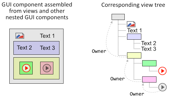
With Embedded Wizard you can assemble a component from other already existing components by simply nesting one component inside another. For the superior component the nested components appear as being regular views with their Owner variables referring to this superior component.
You can imagine, the nesting several components one inside another results in a tree-like structure reflecting the relationships between the affected components. The following image demonstrates this aspect. You see here a GUI component assembled from several nested components and views. In the figure the components are visualized as colored rectangles. On the right you see the corresponding view tree with the Owner relationships:
Knowing the structure of the view tree, the Owner relationships and the enumeration methods described above you can navigate in the view tree, access the owners or search for sibling components. For example, let's assume you want to access from the actual component its next following sibling component and make it invisible:
// Search in the superior component for a view with next higher stacking order // relative to 'this' component var Core::View view = Owner.FindNextView( this, Core::ViewState[]); // Since the method FindNextView() returns the generic 'Core::View' type, // we need to typecast the returned value and verify so whether it really does // refer to the expected view type. Here, we cast the returned view to the // generic component class 'Core::Group' var Core::Group group = (Core::Group)view; // Is the estimated view a component? If yes, hide it now if ( group != null ) group.Visible = false;
Please note, that one view can't belong at the same time to two different owners. Trying to add the same view twice will cause a runtime error. If you intend to move a view from one to another component, remove the view first from its old owner before you add it to its new owner. Let's assume, you have created an instance of an alert component dynamically at the runtime and nested it inside some existing GUI component. Now, you want to change the owner of the alert component:
// First remove 'theAlert' component from its actual owner theAlert.Owner.Remove( theAlert ); // Then add it to its new owner newOwner.Add( theAlert, 0 );
With this approach the alert component disappears from its old owner and appears within the new owner. The position where the component appears within its new owner is determined by the component's actual Bounds property relative to the top-left corner of the new owner component. You can thus, if it is necessary in your application case, adjust this Bounds property shortly before adding the component to the new owner. For example:
// First remove 'theAlert' component from its actual owner theAlert.Owner.Remove( theAlert ); // Adjust the position of the component to appear e.g. in the center of its // new owner theAlert.Bounds.origin.x = ( newOwner.Bounds.w - theAlert.Bounds.w ) / 2; theAlert.Bounds.origin.y = ( newOwner.Bounds.h - theAlert.Bounds.h ) / 2; // Then add the component to its new owner newOwner.Add( theAlert, 0 );
In practice, the entire GUI application can be considered as being represented by a single large view tree with all actually existing GUI components as individual tree branches. While the user interacts with the application, new GUI components are created and added to the tree, or existing components are hidden and removed from the tree. Every time you modify the tree the modification is seen after the next screen update has been performed. You don't need to worry about this update mechanism.
The view tree can thus consist of any number of nested components and views. However the root of this tree is unique. It is represented by the application component (also known as the root object). Unlike other components, the application component exist the whole time and it serves as the main component of every Embedded Wizard project. Any other GUI component you intend to show on the screen has to be embedded, directly or indirectly, within this application component.
Convert between local and global (screen) positions
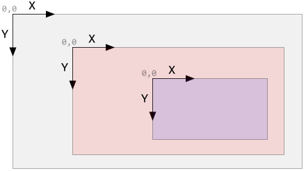
Every GUI component calculates the position of its embedded views within its own coordinate space. The origin of this coordinate space (the position X=0, Y=0) is found at the top-left corner of the respective component with values increasing right-down. In other words, if you arrange or move views within a component, you do this always within its own local coordinate space. This coordinate space is independent of the coordinates managed by the next superior component. You can imagine, every nested GUI component manages its own local coordinate space. The following figure demonstrates it with three nested GUI components:
The consequence of this approach is, that when you move a component, all views existing within it do automatically follow the movement. This is logical, since the position of the embedded views is calculated in the local coordinate space relative to the top-left corner of the moved component. From this arises the problem (or advantage) of multiple coordinate spaces co-existing within a single GUI application. The component base class Core::Group provides thus two methods permitting you to convert coordinates between the component's local and the global (screen) coordinate spaces:
Method |
Description |
|---|---|
Converts the given position aPoint from the global (screen) coordinate space in the corresponding position valid within the local coordinate space of the affected component. |
|
Converts the given position aPoint from the component's local coordinate space in the corresponding position valid within the global (screen) coordinate space. |
Technically seen, the screen area does correspond to the area of the application component (the component at the root of the view tree). Accordingly the global screen coordinates are calculated relative to the top-left corner of the application component. The both above described methods do nothing else than converting the coordinates between the coordinate space of the affected GUI component and the application component.
The knowledge about these details is useful if you intend to arrange a component at a position relative to another component. Let's assume, you want to change the owner of an alert component whereby you want the alert component to not be moved on the screen. In other words, you want to remove the alert component from an old owner component with its old coordinate system and arrange it within a new owner component with a different coordinate system. In order to ensure that the component doesn't move on the screen you have to convert its old in the new position:
// The actual (old) owner of the component var Core::Group oldOwner = theAlert.Owner; // Remove 'theAlert' component from its actual owner oldOwner.Remove( theAlert ); // Convert the 'old' origin position of the component in a global // (screen) position var point globalPos = oldOwner.GlobalPosition( theAlert.Bounds.origin ); // Now convert the global position back in a local position valid // within the 'new' owner component and adjust the position of the // component accordingly: theAlert.Bounds.origin = newOwner.LocalPosition( globalPos ); // Finally add the component to its new owner. Although the owner has // changed, for the user the position of the component did not changed. newOwner.Add( theAlert, 0 );