Working with Embedded Wizard: Creating components from templates
In the preceding chapters you have learned how to create a new GUI component from scratch and about the possibility to derive a new component from another already existing one. In this chapter we present a further approach with it you can create new components by using provided component templates.
Component templates
Component templates are ready to use, simply designed GUI components prefabricated for typical application cases. For example the Push Button template implements a button widget able to react to touchscreen and keyboard user interactions. Thus by using this template you can easily add a new push button component to your project. Afterwards you can edit and adapt the new component regarding your particular design requirements.
With this approach, you can even create from one and the same template several components, every adapted to appear and behave individually. For example, you can create one push button to display a label text, another to display an icon and the third version of the button to flash when the user touches it. It's completely up to you how you adapt the component.
The approach with component templates has two functions. Primarily the templates should simplify the development of new components. Instead of creating every component from scratch you can use the available templates. The second function is more educative. The templates implement fully workings components you can investigate and learn about the corresponding programming aspects. The templates are well documented. Most of them contain annotations and inline comments with instructions helping you to understand how the component works and how it can be adapted to your particular needs.
All component templates are found in the folder Component Templates in the Gallery Templates window. The following table provides a short overview of them. Knowing this you should be able to decide which template is the best suitable to create your own component. Don't forget, you can adapt or even completely redesign the component after creating it from the template:
Icon |
Template name |
Description |
|---|---|---|
|
Push Button |
Push button is a simple widget the user can press in order to perform an action. |
|
Toggle Button |
Toggle button is a simple widget the user can press in order to toggle a value. It is also suitable to serve as a check box. |
|
Radio Button |
Radio button is a simple widget the user can press in order to select an option. |
|
Horizontal Slider |
Slider is a widget the user can interact with in order to change a number value by touching and dragging a knob. |
|
Vertical Slider |
Slider is a widget the user can interact with in order to change a number value by touching and dragging a knob. |
|
Rotary Knob |
Rotary knob is a widget the user can interact with in order to change a number value by touching and rotating a knob. |
|
Horizontal Scrollbar |
Scrollbar is a widget intended to show the current position within a large document (e.g. within a long list with thousand of items). |
|
Vertical Scrollbar |
Scrollbar is a widget intended to show the current position within a large document (e.g. within a long list with thousand of items). |
|
Horizontal Value Bar |
Value bar is a widget intended to display a horizontal bar with size depending on the widget's current value. |
|
Vertical Value Bar |
Value bar is a widget intended to display a vertical bar with size depending on the widget's current value. |
|
Gauge |
Gauge is a kind of analog instrument to show e.g. measured values. |
|
Value Display |
Value Display is a kind of virtual instrument to show e.g. measured values. |
|
Numeric Keyboard |
With this template you can add a simple numeric virtual keyboard component to your project. The keyboard component provides a grid with keys the user can touch. Activating a key feeds the corresponding event to the application as if the user had pressed the key on a real keyboard. |
|
Alphanumeric Keyboard |
With this template you can add a simple alphanumeric virtual keyboard component to your project. The keyboard component provides a grid with keys the user can touch. Activating a key feeds the corresponding event to the application as if the user had pressed the key on a real keyboard. |
|
List Box |
With this template you can add a list box component to your project. List box is a widget the user can interact with in order to select an option from a list of possible items. To display the available items the list box implements a list and list item components. |
|
Combo Box |
With this template you can add a combo box component to your project. Combo box is a widget the user can interact with in order to select an option from a list of possible items. To display the available items the combo box implements a list and list item components. |
|
Text Editor |
With this template you can add a text editor component to your project. The editor provides functionality to enter, edit and delete text - be it single or multiline. A blinking caret indicates the position where the next sign is entered. The user can move the caret and scroll the text by using the keyboard or by touching the screen. When the user touches the screen for a while, a magnifying glass appears permitting the user to move the caret directly with the finger. |
|
Alert |
With this template you can add an alert component to your project. Alert is a complex widget intended to display a message text with additional push buttons. At the runtime the application presents the alert to the user in order to inform him/her about an event or to ask the user for a confirmation. |
|
Menu |
Menu is a complex widget intended to automatically arrange and manage menu items. At the runtime the user can interact with the menu, scroll and activate the items. Once you have finished the adaptation of the menu component, you can derive from it as many individual menus as necessary. Every derived menu can then be filled individually with menu items and the associated functionality. To add menu items to your project use the below listed item templates and the Menu Separator Item. |
|
Menu Item |
Menu item is a simple widget the user can press in order to perform an action. Menu items are used within menus only (see the template Menu above). Once you have added the menu item component to a unit, you can embed instances of this item wherever you edit a menu in your GUI project. |
|
Toggle Item |
Toggle item is a simple menu item widget the user can press in order to toggle a value. It is also suitable to serve as a 'check box item'. Menu items are used within menus only (see the template Menu above). Once you have added the menu item component to a unit, you can embed instances of this item wherever you edit a menu in your GUI project. |
|
Radio Item |
Radio item is a simple menu item widget the user can press in order select an option. Menu items are used within menus only (see the template Menu above). Once you have added the menu item component to a unit, you can embed instances of this item wherever you edit a menu in your GUI project. |
|
Slider Item |
Slider item is a simple menu item widget the user can interact with in order to change a number value by touching and dragging a knob. Menu items are used within menus only (see the template Menu above). Once you have added the menu item component to a unit, you can embed instances of this item wherever you edit a menu in your GUI project. |
|
Open Menu Item |
Open menu item is a simple menu item widget the user can press in order to enter a sub menu. Menu items are used within menus only (see the template Menu above). Once you have added the menu item component to a unit, you can embed instances of this item wherever you edit a menu in your GUI project. |
|
Exit Menu Item |
Exit menu item is a simple menu item widget the user can press in order to leave the actual menu and return to the superior menu. Menu items are used within menus only (see the template Menu above). Once you have added the menu item component to a unit, you can embed instances of this item wherever you edit a menu in your GUI project. |
|
Menu Separator Item |
Menu separator item is a very simple widget intended to separate menu items within a menu (see the template Menu above). As such the menu separator item doesn't react to user inputs. Once you have added the menu separator item component to a unit, you can embed instances of this item wherever you edit a menu in your GUI project. |
|
Time Picker |
Time picker is a complex widget, which allows the user to select the hour, minute and second from three lists the user can conveniently scroll. |
|
Date Picker |
Date picker is a complex widget, which allows the user to select the day, month and year from three lists the user can conveniently scroll. The special case of February and the leap year is handled automatically. |
|
Bar Chart |
Bar chart is a component intended to display bar diagrams. |
|
Line Chart |
Line chart is a component intended to display line diagrams. |
|
Pie Chart |
Pie chart is a component intended to display diagrams composed of slices. |
|
Graph |
Graph (or plotter) is a component intended to collect and display data values as a curve. |


Please note the orange star  in every template icon. It indicates, that the template is intended to add new GUI components to your project. This should avoid confusions with the ready to use widgets from the folder Widgets in the Gallery Templates window.
Component templates versus Widgets
Besides the here described component templates, Embedded Wizard provides also a set of ready to use widgets. These are finished implemented and ready to be used as they are. If necessary, the appearance and partially also the behavior of the widgets can be configured. The advantage of the approach is, that to customize them you don't need to write a single line of code.
The flexibility of the provided widgets, however, is limited by their implementation. With Component templates you are not limited. But you have to take care of the adaptation of the particular component. You have to write code. More deep understanding is required.
Add new component
To create a new component from a template you simply Drag & Drop it between the Templates window and the Composer with an opened unit. This is important in that by using the component templates you add in fact a new class to your project. Classes, in turn, can exist within units only. The following are the typical steps to create a new component from a template:
★First switch to the Composer page for the respective unit, where you want to add the new component.
★Then ensure that the Templates window is visible.
★In Templates window switch to the folder Component Templates.
★In the folder locate the template for the desired component e.g. Rotary Knob.
★Drag & Drop the template into the Composer window:
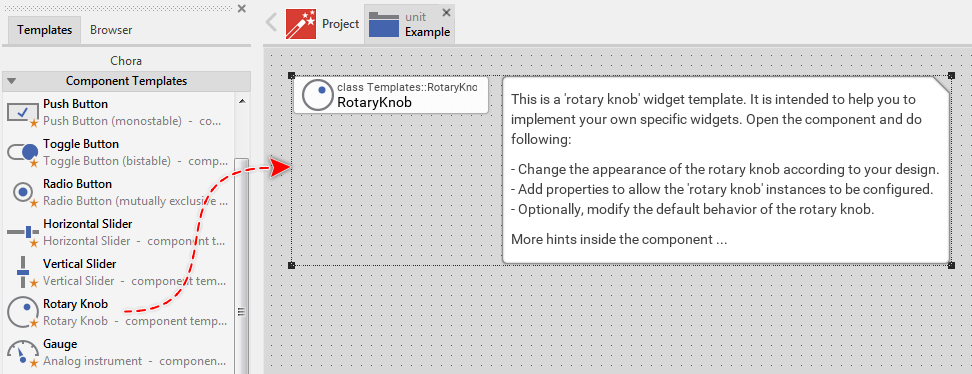
★Eventually name the new added component.
The new created component appears usually accompanied by annotations providing helpful tips how to proceed. If undesired, you can select and delete the annotation.
Modify the component
Once you have created a new component, you can open the component class for editing. Thereupon the component appears in a new Composer page. For example, if you have created a new Rotary Knob component, the Composer window displays following contents:
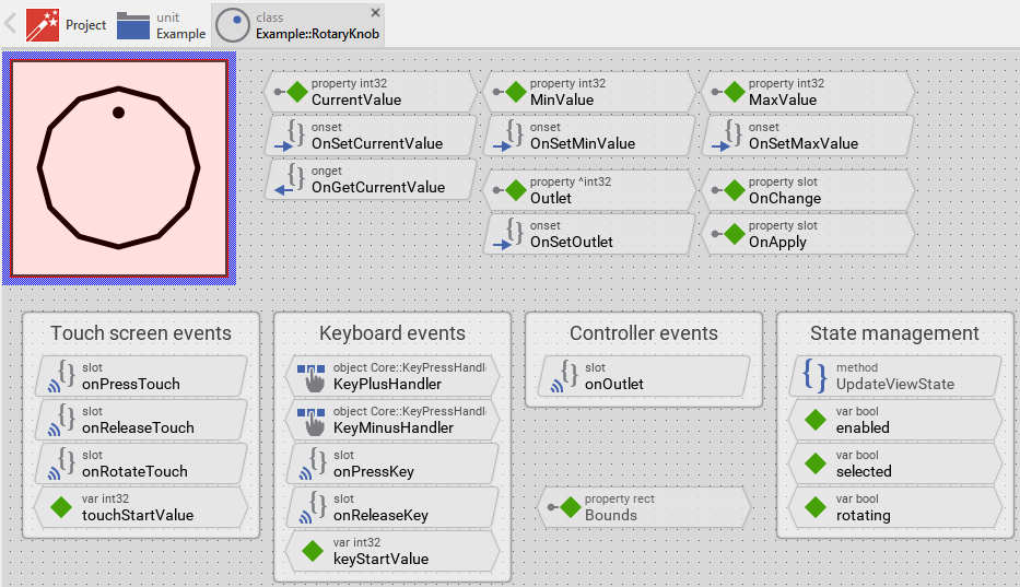
As you see in the screenshot above, components created from a template have already a lot of functionality and they have a simple appearance. In principle, the component is already fully functional. When you start the Prototyper you can interact with it instantly. Thus if you like this default, simple appearance and behavior then you don't need to modify anything in the component.
The templates are intentionally implemented with simple design since every customer has different expectations regarding the exact appearance and behavior of the component. We decided to reduce the components to their minimum possible core functionality and allow the customer to adapt the components to his or her particular needs.
All you have learned in the preceding chapters is similarly applicable to component created from templates. In particular you can edit the appearance of the component, modify its interface, manage other component states, etc.
Feel free to implement your ideas!
Use the component
Once you have created and modified the component, you can use it to assemble more complex components. The components can thus be considered as building blocks. Technically seen, you embed an instance of the respective component class in-place within the superior GUI component. At the runtime, the superior GUI component takes care of the correct initialization and the displaying of all embedded components, so they appear similarly as you have composed them at the design time.
How you achieve this is described in the section Add an instance of an existing GUI component.