Quick Tour - a Tutorial
If you are reading this tutorial article, then you are obviously new to Embedded Wizard. We all from Embedded Wizard team would like to welcome you! With this tutorial we will show you the typical workflow and explain the most important concepts behind the technology.

While reading this document you will be asked to perform diverse tasks (steps). You can recognize these by small yellow star marks (e.g.  ). Please carefully follow the instructions. If you encounter any difficulty or you don't understand some aspects, please don't hesitate to use our Ask Embedded Wizard forum to post your questions. Usually, it takes between 60-90 minutes to complete this entire tutorial.
Also if you haven't read it yet, we recommend you check out the introduction article Basic concepts. It provides a very superficial view of the technology, describes the requirements you should take into account and lists its most important key features.
Have fun and good luck!
The Embedded Wizard tutorial is also available as a full video, leading you step by step through all relevant chapters. Click on the thumbnail to jump into the Quick Tour video tutorial. |
|

1. Before you start
In the first step make sure that Embedded Wizard Studio 9.20 (or latest version) is installed on your desktop PC. If you have done that already, you can skip over this section.
★If you wish to try out our product, please visit Download Free Edition. Follow the instructions there on how to register. After registering you will be able to download the setup application for Embedded Wizard Studio Free.
★If you have licensed the professional edition (Embedded Wizard Studio Pro), we will provide you with the right setup application.
★Once you have downloaded the setup application, start the setup and follow the instructions.
You can install Embedded Wizard Studio on a desktop PC running Microsoft Windows 8 or higher. If you are working on a Linux or macOS machine, we would recommend you to install Embedded Wizard within a virtual machine (e.g. VMWare or Parallels Desktop).
2. Open the Quick Tour sample project
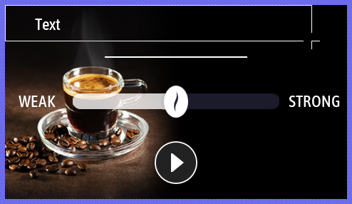
To facilitate your entry into the new technology, we have prepared a small project called Quick Tour. This project implements the GUI for a simple coffee machine. Through the GUI, the user can select how strong the coffee should be brewed and start the brewing process. Nothing more. Very straightforward.
★If you have not yet started Embedded Wizard Studio, now is the right time to do so.
★In the menu select the item .
★In the dialog box that appears, select the sample QuickTour. The following figure demonstrates the dialog box with the properly selected sample:
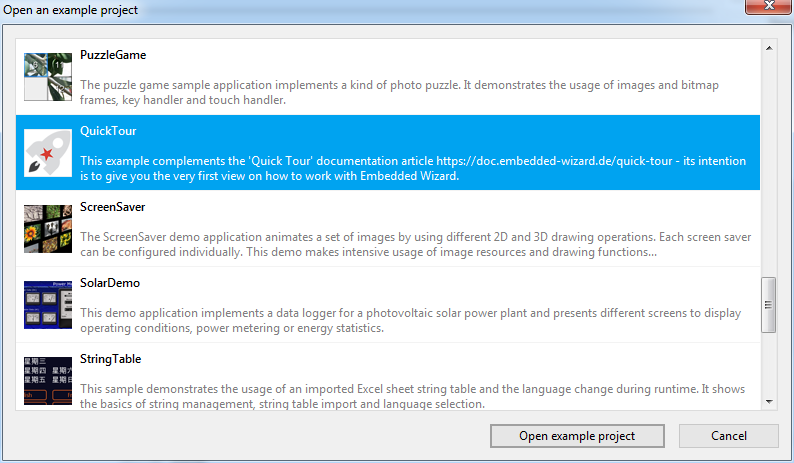
★Open the sample by clicking on the button at the bottom of the dialog.
Please note, the sample Quick Tour is available in Embedded Wizard 9.20 or its latest version.
3. Get a first impression
Embedded Wizard Studio provides a powerful integrated development environment permitting you to simply design, test and customize your GUI application. The workflow is based on the idea of visually aided programming, where software entities are arranged and connected with the mouse by dragging & dropping them. From our point of view, it was self-evident to combine visual programming and the GUI application development – both concepts complement each other. In this manner, you compose the appearance of an application and implement its complete functionality. No further development tools are needed.
After you have opened the Quick Tour sample, you will see in the middle area of Embedded Wizard the so-called Composer - the main editor of Embedded wizard. Within the Composer you see many gray rectangles:
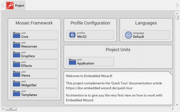
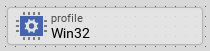
The small rectangles are called bricks. Every brick represents an individual member within the project. The shape of the brick, its icon and the text at its upper edge describe the exact function of this brick. For example, the brick named Win32 represents the profile member - a member needed to configure general project and target specific parameters:
The large gray rectangles are called annotations. They have no real function in the application. They exist only to leave comments or to group bricks together visually. Don't worry about them:
Depending on their type, the bricks contain diverse attributes and properties. These appear in the Inspector window on the right-hand side of the Composer after the affected brick has been selected. For this purpose:
★Single-click the mouse on the brick Win32 to select it. After you have selected the brick, you will see its attributes in Inspector:
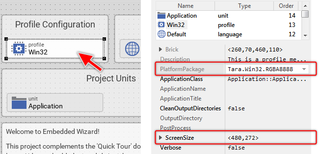
The Profile brick Win32 exposes, beside others, the attributes PlatformPackage and ScreenSize. As you see in the screenshot above, the attribute PlatformPackage is actually configured with the value Tara.Win32.RGBA8888. This means, by using this profile, the Embedded Wizard will generate a code optimized for Microsoft Windows operating system (Win32) with RGBA8888 as a native color format for all images. Selecting another value in this attribute would allow you to generate code for other target systems or color formats.
The attribute ScreenSize, as you probably deduced, determines the desired target display resolution (here 480x272 pixel). In the case of Windows as a target system, this gives a hint about the dimension of the window when the application is running. If you intend to create an application, for example, for Raspberry Pi, you will configure this attribute to correspond to the native resolution of the LCD in your target system.
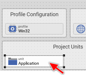
Depending on the type of project member, the corresponding brick may contain further embedded members. You can reveal them by simply double-clicking on the member - similarly to how you open a folder in Windows File Explorer. Please take a look at the brick named Application. Bricks of this type represent in the project the so-called units. The unit is where you put your concrete implementation - analog to a *.cpp file in a C++ development system.
★Double-click the mouse on the brick Application to reveal its contents:
Thus the contents enclosed within the unit Application are revealed in a new Composer page. During the work with Embedded Wizard, you will often switch between the diverse Composer pages. All opened pages are listed as tabs in the Navigation bar at the upper edge of the Composer. Actually, you can see there the one tab representing the main Composer of the project and another associated to the just opened Application unit:
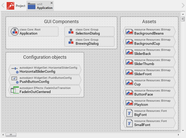
Within the unit, all enclosed members are similarly represented by bricks. In the figure above you can see many of them with different icons and names. In particular, please note the bricks with pointed edges. Such bricks represent data entities - they store information. For example, the brick BackgroundBeans (in the top-right corner) serves as a bitmap resource - it contains an image.
★Click the mouse on the brick BackgroundBeans to select it. Thereupon the Inspector shows its attributes:
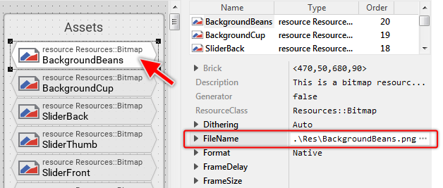
Among the various attributes of the just selected brick, please note the attribute FileName. This attribute addresses the image file to associate with this bitmap resource. When generating code, Embedded Wizard converts this image file into a format that is appropriate for the target system. This usually includes the color reduction and compression. Later, when you want to display the image, you simply refer to the member BackgroundBeans.
★Now, click on the brick SmallFont to select it:
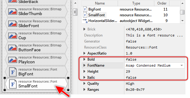
The just selected brick SmallFont represents a font resource. As you see in Inspector, the font resource is configured with the font name Asap Condensed Medium and the font size of 29 pixel. Again, when generating code, Embedded Wizard will automatically convert the specified font in a format that is appropriate for the target system. This usually includes the rasterization and compression of all affected font glyphs. Later, when you want to display text with this font, you can simply refer to the member SmallFont.
Besides the above-mentioned bitmap and font resources, you can see the unit containing a few other bricks. Please take a look at the three bricks grouped together below the annotation Configuration objects. These bricks represent the so-called autoobjects (global objects) containing diverse settings that are important for the GUI application. Since an object is a data entity, the bricks are also shown with pointed edges:
★Click on the brick PushButtonConfig to select it. Thus the Inspector would reveal the properties of the object:
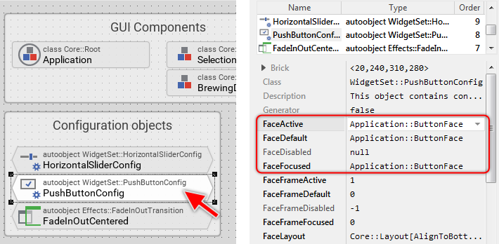
In the upper text row of the selected brick, you will see the expression WidgetsSet::PushButtonConfig. This expression identifies a class from which this object is instantiated. The particular ancestry of the object is also reflected in its icon, here you will see a small button with an associated gearwheel as a symbol for configuration.
Embedded Wizard follows an object-oriented approach to structure and implement GUI applications. This means, in practice, when developing a GUI application, you need to create and implement classes. Objects are instances of the corresponding classes. The above-mentioned autoobjects are nothing else than global instances you can access from everywhere in your project. A class, in turn, can implement either a visual GUI component (like the push button) or a non-visual component (like the configuration object).
The class WidgetsSet::PushButtonConfig implements such non-visual configuration component. In the screenshot above, please note the four properties FaceActive, FaceDefault, FaceDisabled and FaceFocused. They determine the bitmap resources to display in push buttons using this configuration object. In other words, when you connect a push button with the configuration object PushButtonConfig, the push button will use the specified bitmap resources for its appearance.
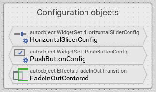
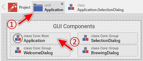
Now, you might want to know you where the class WidgetsSet::PushButtonConfig does come from? And where are the push button components implemented? Well, all these classes are part of the so-called Mosaic framework - a component library serving as a basement for every GUI application created with Embedded Wizard. If you recall the contents of the first Composer just as we started this article, there was an annotation Mosaic Framework grouping seven unit bricks. These units contain the implementation of the Mosaic framework:
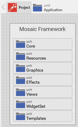
In particular the unit WidgetSet implements all widgets (including the push button component) as well as the associated configuration objects. Every unit, by the way, serves as a namespace for its enclosed members. This avoids eventual name conflicts with homonymous members existing in other units. For example, the class name WidgetSet::PushButtonConfig addresses the class PushButtonConfig within the unit WidgetSet. As such, it does not interfere with the homonymous autoobject PushButtonConfig existing within the unit Application. Both coexist within the same project.
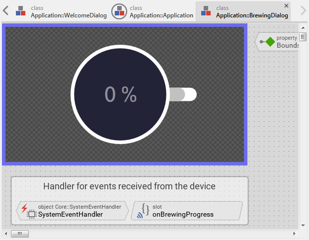
Among the above described, you see within the unit Application many other bricks. The bricks shown in the screenshot below, for example, contain the implementation of the interface between the GUI and the real device. In other words, the bricks take care of the communication with the device. In our Quick Tour sample, the interface limits to start/stop the device and to query its actual status. The exact implementation of these bricks is not important at this moment. We will learn it more in detail in a later section of this article:
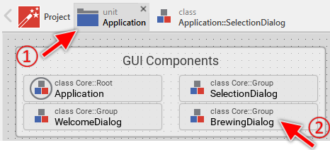
Much more interesting for the actual moment are the bricks grouped together below the annotation GUI Components as shown in the following screenshot:
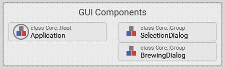
These three bricks are classes implementing (visual) GUI components. For example, the brick SelectionDialog implements a screen (we call it dialog) where the user can select the desired strength of the coffee to prepare. The brick BrewingDialog, in turn, implements a dialog showing the progress of the brewing process.
In practice, when developing a new GUI application, you will first reflect on the components needed to assemble it. Here you will list all dialogs (screens) the user may interact with as well as any other subordinated widget the application should contain (e.g. a push button, slider or progress bar). Then, in the second step, you implement every identified component as an individual class.
★Click the mouse on the brick SelectionDialog to select it. As in the previous cases, the attributes of the selected brick are shown in the Inspector window:
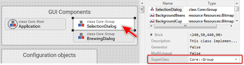
Most especially, take note of the attribute SuperClass of the just selected brick. It is actually initialized with the expression Core::Group (by the way, the same value is also displayed in the upper text row of the brick). This expressions indicates, that the class SelectionDialog descends from another class Core::Group. This super class, in turn, is implemented in the Mosaic framework (the basement of every GUI application) we have explained shortly before.
The class Core::Group implements a lot of common functionality needed by almost every GUI component. It takes care of screen updates and dispatches incoming user input events (received e.g. from a touch screen or keyboard). By descending from it, the class SelectionDialog inherits all this functionality implicitly. It is not necessary to re-implement this functionality again. In the derived class, you just add new contents specific to this component. This is one of the advantages of the object-oriented approach.
★Double-click the mouse on the brick SelectionDialog to reveal its contents:
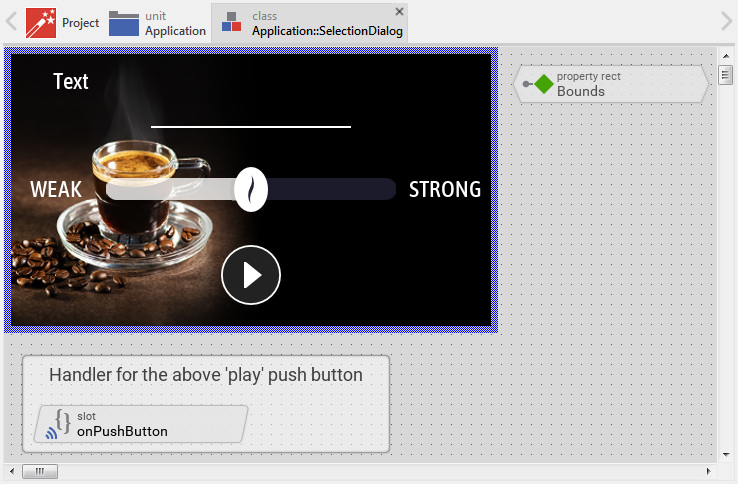
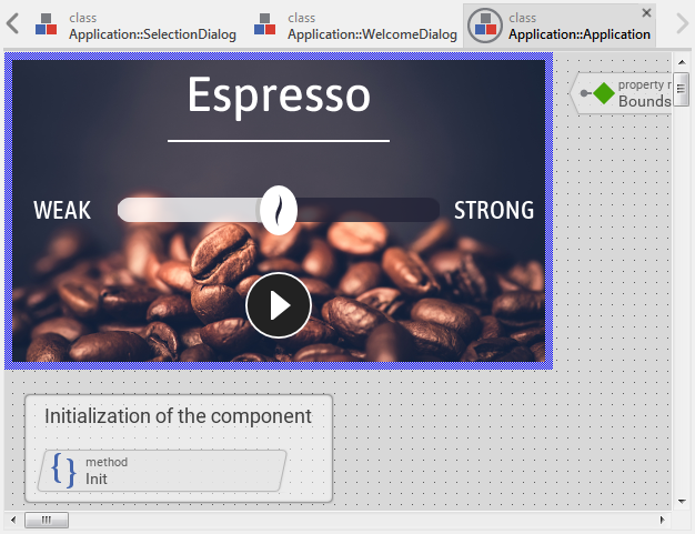
The contents of the class SelectionDialog appear in a new Composer page. This Composer, however, is something different. In the top-left corner, you will see an area surrounded by a thick blue border. This area is called Canvas. What you see within this area will also be visible on the display in your target device. The Canvas area is available only when the actually-edited class does represent a visual GUI component.
In our tutorial example, this GUI component permits the user to select the desired coffee strength and to start the brewing process. Typically, complex GUI projects will consist of many different GUI components, which depending on the user interaction appear and disappear on the display. The SelectionDialog component implements, thus just one of the GUI components.
Now please take a look at the Inspector window. In its upper area, you will see a list of members. As you have probably noticed, this list always corresponds to what you see in Composer. When working with Embedded Wizard, you can select the members either in Composer or in Inspector. Both work coupled together. Within this list, you can also rename the members if desired or rearrange their order if necessary.
Here, however, the Inspector lists much more members than shown in Composer. In Composer you will see some visual members within the Canvas area and few bricks. Nothing else. The Inspector, in turn, lists 100 members (you can see this in the Inspector's column Order):
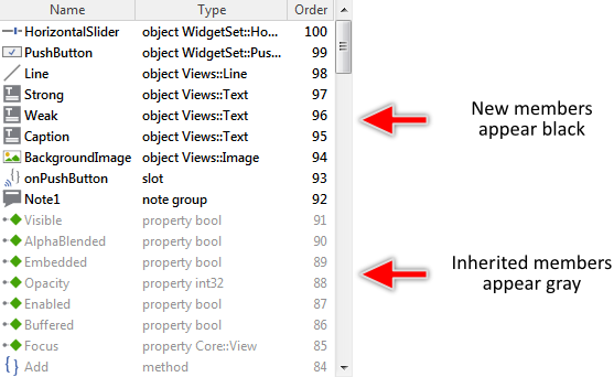
The difference roots in the object-oriented characteristic of Embedded Wizard. In this concrete case, the actually edited class descends from the superclass Core::Group. As explained above, the descending class inherits all the functionality implemented in the superclass (and also implemented in all higher superclasses). Displaying all those inherited members in Composer would quickly become confusing. Therefore, when you edit a class, the Composer conceals implicitly the bricks for members defined in the ancestor classes but not overridden in the actual class. In other words, the Composer shows only those bricks which are added or modified in the actual class by hiding all other inherited and not overridden bricks.
The Inspector, in turn, always displays all members. Those, which are inherited appear in Inspector in gray color. New members added to the actually-edited class appear black. In this manner, you can recognize the origin of a member easily.
4. Modify a GUI component
Till now, we limited to analyze the contents in the sample project. You learned what the bricks are and how to navigate in the project. In the next steps you will learn how to modify the existing GUI component SelectionDialog.
★In the top-left corner of the Canvas area, you will see Text. Click on it to select the corresponding member.

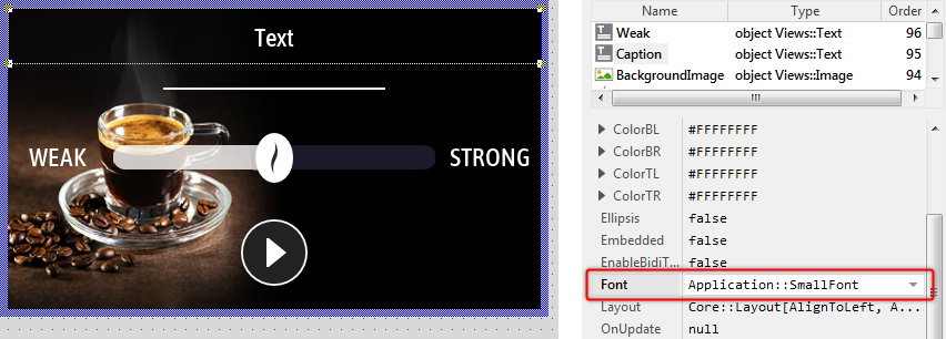
After being selected, the text appears surrounded by a thin-dotted border. The corners of the border appear as small quadrates. With this so-called selection frame, you can move and resize the text. Simultaneously, the Inspector highlights the corresponding member Caption as selected and you will see, that the text is an object of the Mosaic class Views::Text. It is a view - a primitive visual component:
★Resize the text view to fill the entire width of the Canvas area. For this purpose click on the bottom-right corner of the selected text view and drag the corner accordingly:
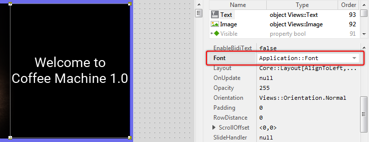
★As long as the text view is still selected, look in the Inspector window for the view's property Font.
★Click on the property Font to select it:
★Then on the right-hand side of the selected property, click on the small icon  to open the so-called Assistant window:
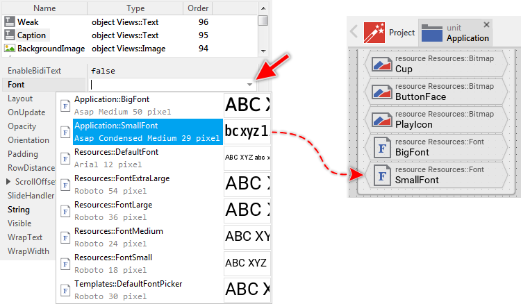
Assistant windows are convenient tools to easily select the adequate value when modifying a property or attribute. While working with Embedded Wizard, you will use them very often. In this concrete case, the Assistant from the screenshot above is intended to list all font resources existing actually in the project.
While we analyzed the contents of the unit Application you saw there the brick SmallFont. The function of this member was to store font information. Now, you will see exact this member listed in the Assistant window. Since the corresponding item is highlighted, the text view is actually using this font. In other words, the text you see in Canvas is drawn with this font. Now, let's assume that this is not the font we want to use for the caption. The caption should appear with the bigger font Application::BigFont. For this purpose:
★In the Assistant window, double-click on the item Application::BigFont to select it. Thereupon the new font name appears in the property Font and the size of the text displayed in the Canvas area changes. The text is big enough now:
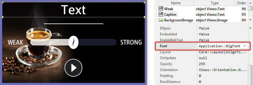
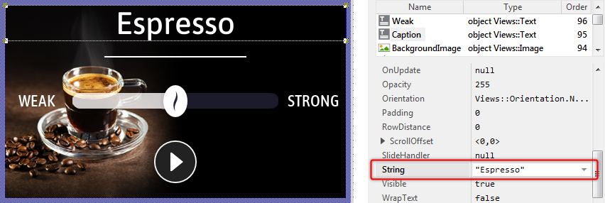
★Now look in the Inspector window for the text view's property String.
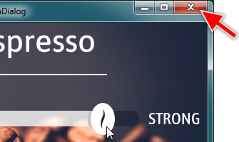
★Click on the property and enter the text "Espresso" (Be aware of both double quote signs which are part of the expression).
★As soon as you have pressed the key Enter your modification is confirmed and you see the new text Espresso displayed in the Canvas area:
★As next select the background image view. To do this you can click in Inspector window on the corresponding member BackgroundImage or directly on the corresponding view on the canvas area.
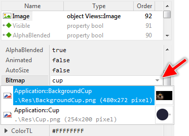
★After selecting the image view, look for the view's property Bitmap. The following figure below demonstrates it:
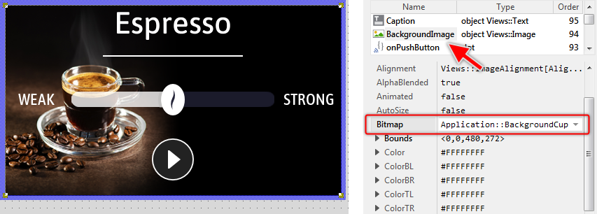
★On the right of the property Bitmap, click on the small icon to open the associated Assistant window.
★While the Assistant window is visible, enter the text back. The entered text serves as a filter for the items shown in the Assistant window. Now only items containing back in their name are displayed:
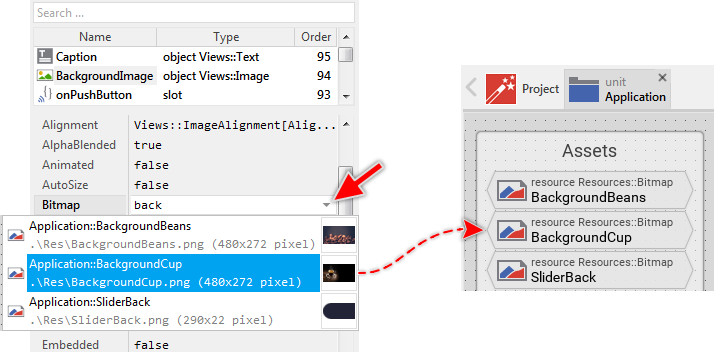
The image view (as you can deduce from its name) is intended to display images. As we analyzed the contents of the unit Application, we explained the brick BackgroundBeans. The function of this member was to store image information. Now, you see this member listed in the Assistant window. The image view, however, is actually using the bitmap resource Application::BackgroundCup, which is not what we expect here. We want the image to display the bitmap resource BackgroundBeans. For this purpose:
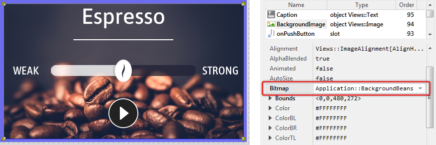
★In the Assistant window, double-click on the item Application::BackgroundBeans to select it as a new resource for the image view. Thereupon the new bitmap name appears in the property Bitmap and the image displayed in the Canvas area changes. Instead of the cup, you see coffee beans:
5. Test and debug a GUI component
Now it's time to test whether the component is working as expected. Embedded Wizard implements for this purpose the so-called Prototyper, a kind of virtual machine able to instantly interpret and execute the GUI application without needing to start an external compiler and load the resulting binary to the target system.
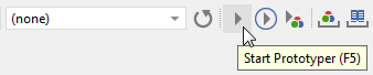
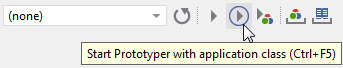
★In the upper area of Embedded Wizard window, click on the tool button to test the actually-edited GUI component. You can also use the shortcut F5 to achieve the same effect:
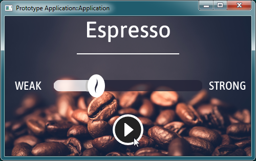
★Thereupon a Prototyper window appears. Within this window, play around with the GUI component. You can, for example, click and drag on the horizontal slider. Also, try to click on the round play button in the bottom area of the tested GUI component window.
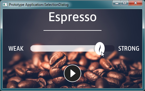
As you saw, the GUI component worked. You were able to drag the horizontal slider and the appearance of the slider changed accordingly. Uniquely, pressing the round play button had no practical effect. This is because we started the Prototyper directly with the component. You can imagine, the component was running outside the remaining application. This test mode is thus ideal if you intend to test the component insulated from other parts existing in your application.
★Close the Prototyper window again by clicking on the close button found in the top-right corner of the window:
★Then, in the upper area of Embedded Wizard window, click on the tool button to test the entire GUI application and not only the actually-edited component. You can also use the shortcut CtrlF5 to achieve the same effect:
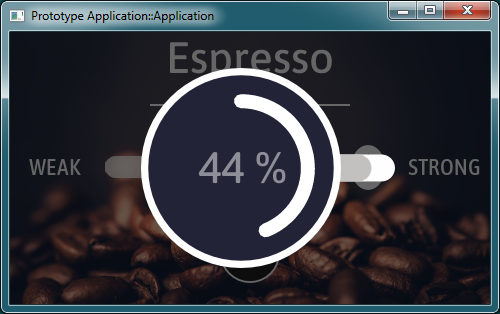
★In the just opened Prototyper window, play with the application. In particular, try to click again on the round play button:
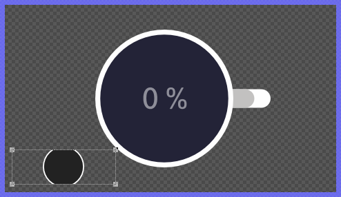
Now, the Prototyper is loaded with the entire GUI application. Accordingly, pressing the play button as well as have an effect. It starts the brewing process. You will see a new GUI component overlapping the component in the background. The new component displays a round progress bar enclosed inside an image of a stylized coffee cup. When the brewing process is done, the overlapping component disappears automatically, restoring the visual state of the underlying SelectionDialog component. Every time you activate the push button, this operation repeats:
★Close the Prototyper window again.
As you have noticed, activating the push causes a new component to be displayed. How is it achieved? Among the diverse bricks you learned in the course of this article, Embedded Wizard also provides bricks, permitting the implementation of your desired functionality. With these bricks you are flexible to code the behavior of the application.
★In the Canvas area of the Composer, click on the round play push button to select it.
★Thereupon the properties of this widget are revealed in the Inspector window. Look there for the button's property OnActivate:
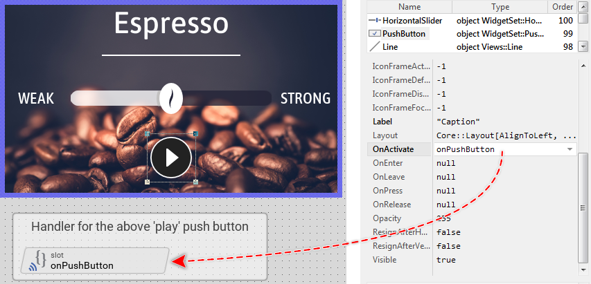
As you see from the screenshot above, the button's property OnActivate is actually initialized with the expression onPushButton. This expression, in turn, addresses the homonymous brick - a so-called slot method. At the runtime, when the push button is activated, the button will send a signal to the associated slot method and trigger so its execution. The slot method thus serves as a functioning entity, which can be recognized by the beveled edges of the corresponding brick.
★Double-click on the brick onPushButton to reveal its content. Unlike the bricks you learned before, the content of a slot method is shown in the Code Editor in the bottom-right area of Embedded Wizard window:
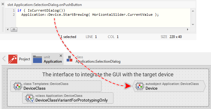
In this example, the implementation of the slot method onPushButton consists of two lines of code written in Embedded Wizard - own object-oriented and platform independent programming language Chora. The syntax of Chora is very similar to the common languages C, C++, Java, JavaScript or C#. Thus, if you have already experience with one of these languages, you will find the code implemented in the slot method onPushButton comprehensible.
The slot method, after successfully evaluating an if-condition, invokes a method (in the language C, you would say function) named StartBrewing. The method is invoked in the context of a global object (an autoobject) Device existing within the unit Application. As you remember, at the beginning of the article, we have explained that the object Device, as well as the both accompanying bricks (e.g. DeviceClass), build the interface to the underlying device.
When invoking the method, the CurrentValue stored in the object HorizontalSlider is evaluated and passed to the method as a parameter (the value corresponds to the actual position of the coffee strength slider). That's all. For the moment, it is sufficient to understand, that StartBrewing controls the brewing process in the device - it activates the heater, the water pump and depending on the value passed in its parameter, it regulates the duration of the brewing. We will analyze its implementation later.
It is important to understand that during the code generation, Embedded Wizard evaluates (compiles) all the code written in Chora and generates the equivalent and optimized code for the particular target system (e.g. C or JavaScript). There is no runtime interpreter nor any other just-in-time compiler used in the target system. The code is executed natively. Furthermore, Chora is used not only to implement your own application-specific business logic. In practice, the entire Mosaic framework, the basement of every GUI application, is implemented in Chora.
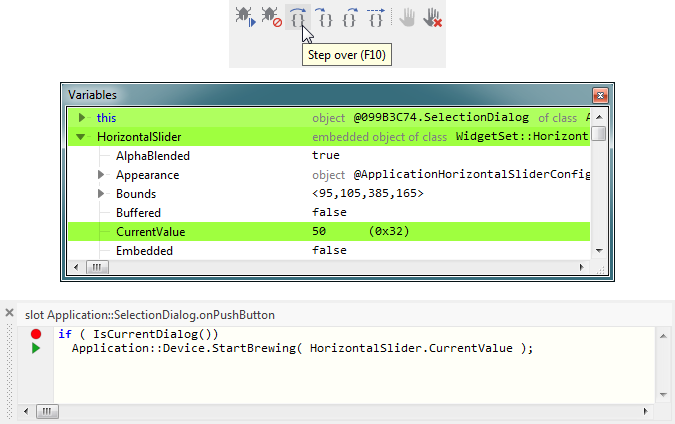
As in other development systems, when you program an error, the application will not work as expected. To help you to find the cause of the problem, Embedded Wizard integrates a debugger environment. With it, you can set breakpoints, step through the code, inspect the call stack, variables and objects directly while you test the application in the Prototyper window. Please try the following:
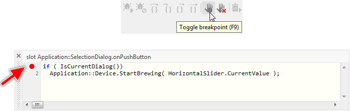
★In the Code Editor, click within the first code row so the blinking caret appears there.
★Then in the upper area of Embedded Wizard window, click on the tool button to set a breakpoint at the just clicked code row in Code Editor. You can also use the shortcut F9 to achieve the same effect. The breakpoint is indicated by a red circle directly on the left of the affected code row:
★Now, start the Prototyper again by using the shortcut CtrlF5 to test the entire application.
★In the running Prototyper window, click on the play button to activate the brewing process. Thereupon the slot method onPushButton is executed, the breakpoint is triggered and the execution is paused:
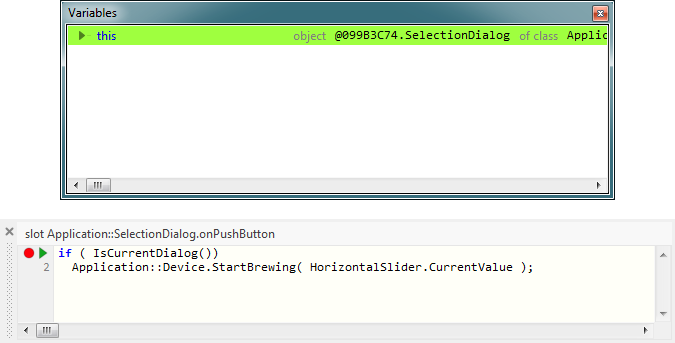
While the execution is paused, a small green triangle appears in the Code Editor, indicating the next statement to execute. Additionally, new window Variables is shown. In this window you can actually see the unique value this, which refers to the object in the context of which the executed method has been invoked. It represents the actual object. By clicking on the small gray triangle on the left of this, you can expand and inspect the values contained within it.
★To continue the execution step by step, click on the tool button found in the upper area of Embedded Wizard window. You can also use the shortcut F10 to achieve the same effect. Thereupon the green triangle moves to the next row and the Variables window is updated:
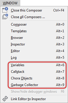
Besides the above-presented Variables window, the integrated debugger also provides many other windows you can activate when the Prototyping is paused from the menu . An exception is the window Garbage Collector which can be shown during the complete runtime of the application, permitting you to observe the automatic disposal of Chora objects:
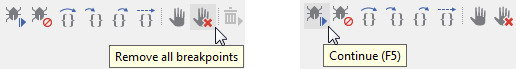
★Now remove the breakpoint again by clicking on the tool button .
★Then click on the tool button to resume the application execution.
★Finally, close the Prototyper window again.
6. Create a new GUI component
So far our coffee machine GUI project consists of two dialogs (screens). The SelectionDialog allows the user to specify the desired coffee strength and to start the brewing process. The BrewingDialog, in turn, displays the progress of the running brewing process. Now let's assume, we would like to extend the application by a third dialog, a welcome screen, which should appear just in the moment when the coffee machine is switched on - when the GUI application starts.
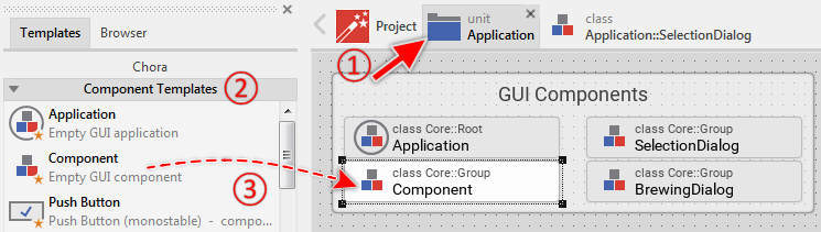
To implement such a welcome screen, you will need to add to the project a new class descending from the Mosaic class Core::Group. You remember, the class Core::Group implements the functionality common to all GUI components. Deriving a new class from it would result in a new GUI component. For your convenience, the Embedded Wizard provides a gallery of diverse ready-to-use templates that you can simply drag & drop to the Composer and so add a new class.
★In the Navigation bar (the area just above the Composer), click on the tab corresponding to the unit Application. Thereupon you will switch to this Composer page.
★In the Gallery window (on the left of the Composer), click on the item Component Templates. This reveals the contents of the homonymous Gallery folder.
★Within the folder Component Templates, look for the item Component.
★Click on the item Component and drag it to the Composer.
★Release the mouse within the Composer. The following figure demonstrates all steps and the resulting contents in the Composer:
★To rename the just added member, press the key F2. Thereupon a small in-place edit field appears in the Inspector window:
★In the in-place edit field, enter the member's new name WelcomeDialog and confirm the operation with the key Enter. The following figure shows the resulting contents:
★Double-click on the brick WelcomeDialog to reveal its contents. Thereupon a new Composer page is opened showing the new GUI component with an empty Canvas area:
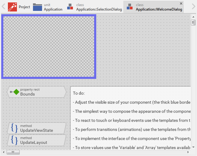
The checkerboard pattern in Canvas represents the actual screen background. With it, you can easily distinguish during the design how transparent or semi-transparent the areas of the component will in fact be composed with other screen contents lying behind them.
Just below the Canvas area, you will see a few bricks and one annotation. These members come with the template you have dragged & dropped from the Gallery window. In our simple welcome screen component, however, they are not necessary. We can thus delete them:
★Click on the brick UpdateViewState and press the key Del to delete it.
★Repeat the operation with the brick UpdateLayout.
★Then click on the big annotation member containing the Text To do: and also delete it. Please don't delete the brick Bounds!
Our welcome dialog should occupy the entire display, which in our example, has a resolution of 480x272 pixel. Since the visible portion of the component is determined by the size of its Canvas area, you have to adjust the size of Canvas. For this purpose:
★Click on the right edge of the thick blue border enclosing the Canvas area and drag it until the Canvas has assumed the width of 480. During the resize operation, the actual size is displayed in the status bar at the bottom of the Embedded Wizard window.
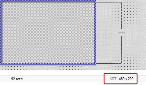
★Now, repeat the operation and drag the bottom edge of the Canvas border until the Canvas has assumed the height of 272.
In an alternative approach, you can change the size of Canvas by modifying the corresponding property Bounds. As its name indicates, this property determines the size of the component and the position where to show it. Even if you have performed the above steps and adjusted the Canvas area as indicated, please follow the steps below to learn this alternative approach:
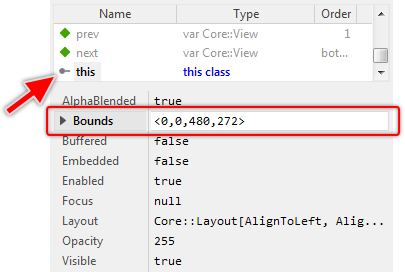
★In the upper area of the Inspector window, look for the member this (it represents the actually-edited component). Select this member.
★Now, in the middle area of the Inspector window, look for the property Bounds.
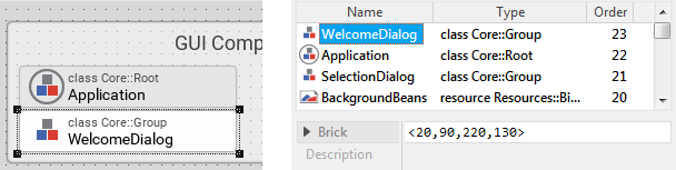
★Modify this property to the value <0,0,480,272> and confirm the modification by pressing the key Enter (Be aware of both angle brackets that are part of the expression):
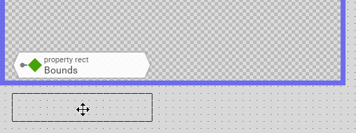
This is the alternative approach so far. With this, you are able to determine the correct size of the Canvas area pixel-precise without having to drag on its edges with the mouse. After you have adjusted the Canvas area, you see the brick Bounds overlying it now. Since bricks are non-visual, this is not a problem. The brick will not appear on the screen. However, it is ideal to arrange the brick so you have a free entire Canvas area. For this purpose:
★In the Composer, select the brick Bounds and drag it just below the bottom edge of the Canvas area. It should not cover the Canvas area:
Now we can focus on the interior decoration of our welcome dialog component. The component should display a background image and some welcome text containing the version number of the coffee machine GUI. As you remember from the preceding analysis of the SelectionDialog component, such image and text contents are displayed by so-called views. Let's add an image view:
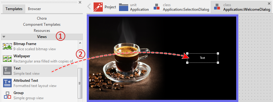
★In the Gallery window, click on the item Views. This reveals the contents of the homonymous Gallery folder.
★Within the folder Views, look for the item Image.
★Click on the item Image and drag it to the Canvas area.
★Release the mouse within the Canvas area. The following figure demonstrates all the steps:

★Move the just added view to the top-left corner of the Canvas area. For this purpose, click on the view and drag it with the mouse.
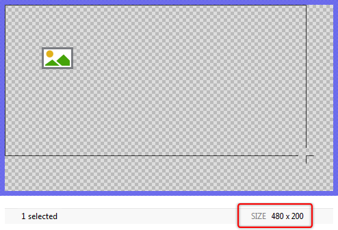
★Resize the view to fill the entire Canvas area. For this purpose, click at the bottom-right corner of the view and drag it. The actual size of the view is displayed in the status bar at the bottom of the Embedded Wizard window:
Similarly to how you resized the Canvas area, there exists also an alternative approach to arrange and resize the view without having to drag it with the mouse. The view's property Bounds determines its actual size and position pixel-precise. Even if you have performed the above steps and arranged the image view as indicated, please follow the steps below to learn this alternative approach:
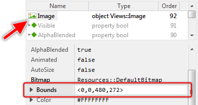
★As long as the image view is still selected, look in the middle area of the Inspector window for the view's property Bounds.
★Modify this property to the value <0,0,480,272> and confirm the modification by pressing the key Enter (Be aware of the angle brackets which are part of the expression).
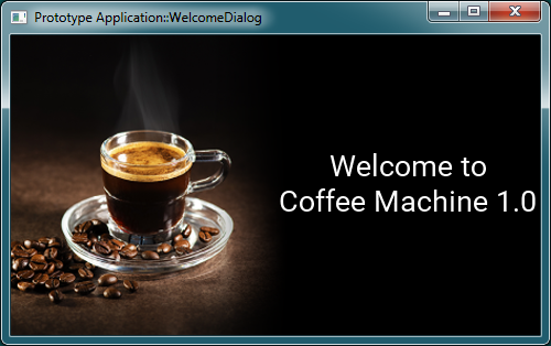
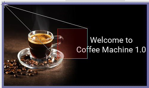
Till now, the image view displays a default image. However, we want it to display the big image with the espresso cup you saw at the beginning of this article as we started to analyze the component SelectionDialog. As you remember, Embedded Wizard manages all images as bitmap resources. Thus, all you have to do is to assign the correct resource to the image view:
★As long as the image view is still selected, look for the view's property Bitmap.
★On the right of the property Bitmap, click on the small icon to open the associated Assistant window.
★While the Assistant window is visible, enter the text cup. The entered text serves as a filter for the entries shown in the Assistant window.
★Finally, double-click on the item Application::BackgroundCup to select it as a new resource for the image view:
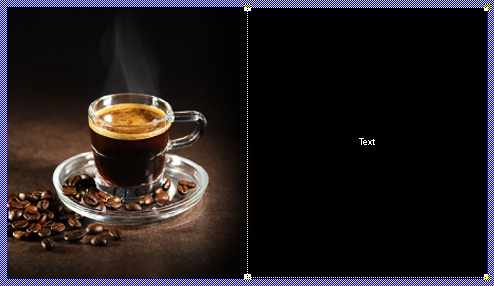
Just at the moment, you have modified the property Bitmap, the Canvas area is updated and you see the image view displaying the espresso cup. The background of our welcome dialog is finished so far:

As mentioned above, our welcome screen should also display some text. So let's add a new text view to the component:
★In the Gallery window, make sure that the folder Views is still opened.
★Within the folder Views, look for the item Text.
★Click on the item Text and drag it to the Canvas area.
★Release the mouse within the Canvas area. The following figure demonstrates the steps:
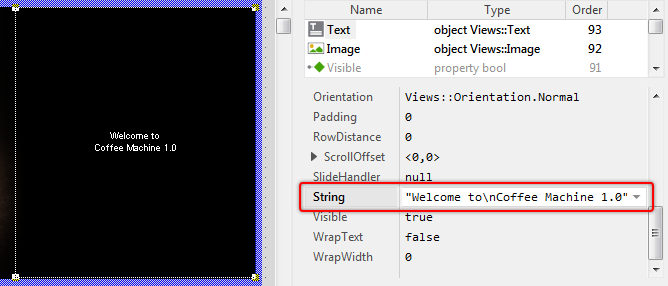
★Arrange the just added text view to occupy the right half of the Canvas area.
★Change the property String of the text view to the expression "Welcome to\nCoffee Machine 1.0" (Be aware of the double quote signs). Just after modifying the property, the Canvas area is updated and you can see the new text:
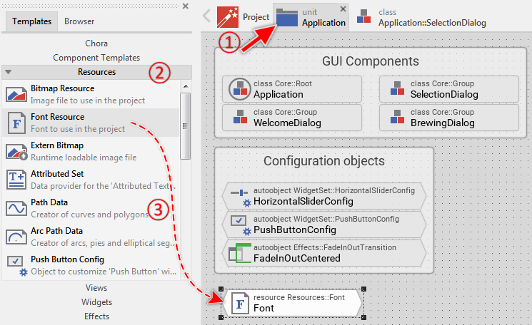
So far our welcome dialog already shows the correct text. What we want to change next is the font used here. The text appears with a small Arial font, which is the font used per default by text views. We, however, would like the text to be shown with a 32-pixel large Roboto font. As you remember, the Embedded Wizard manages all fonts as font resources and our project already contains some of these members. The Roboto font with 32-pixel size, however, is not yet a part of the project. Thus you have to add such font to the project:
★Navigate again to the unit Application. This is important since the font resource, like any other global entity, may exist within a unit only. You can't add the font to a class.
★Then, in the Gallery window, switch to the folder Resources.
★Within the Gallery folder, look for the item Font Resource.
★Click on the item Font Resource and drag it with the mouse to the Composer.
★Release the mouse within the Composer. The following figure demonstrates the corresponding steps:
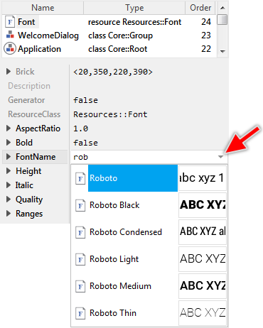
★In the middle area of the Inspector, look for the attribute FontName of the just added font resource.
★Change the value of this attribute to Roboto. You can use the Assistant window for this purpose:
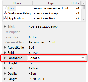
The following figure demonstrates the attributes of the new font resource after the above-described modification. Please note the attribute Height. It is already initialized with the value 32, which is exactly what we expected. So you don't need to modify it. The font resource thus represents a 32-pixel large Roboto font:
★Switch back to the Composer for the class WelcomeDialog.
★Make sure the text view is still selected.
★Look for the view's property Font.
★Open the Assistant window associated with this property and enter the text app to filter the displayed entries.
★In the Assistant window, select the item Application::Font. The following figure demonstrates all the steps:
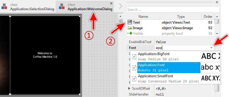
The expression Application::Font explicitly addresses the new font resource added during the preceding steps. Accordingly, after assigning the new font to the text view, the Canvas area is updated and the text is displayed with the 32-pixel large Roboto font, exactly as configured in the associated font resource:
★Press the key F5 to start the Prototyper. Thereupon the Prototyper window is opened, showing our just designed welcome dialog:
As you can convince yourself, there is nothing spectacular about what happens in the Prototyper. The component has, in fact, no particular functionality. It limits to display an image and text. Well, this is a bit boring, so why not add an animation effect to flash the text? This can be achieved easily by using the provided animation effects, in particular the Pulse color effect:
★Close the Prototyper window again.
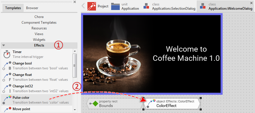
★In the Gallery window, switch to the folder Effects.
★From the folder, drag the item Pulse color and drop it inside the Composer:
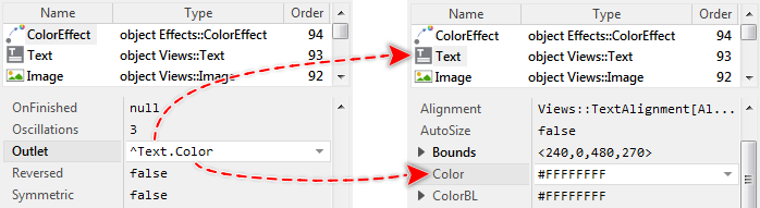
★As long as the just added color effect member is still selected, look in the middle area of the Inspector for its property Outlet.
★Open the Assistant window associated with this property and enter the text text to filter the displayed entries.
★Select the entry Text.Color and confirm by pressing the key Enter. The following figure demonstrates the operation:
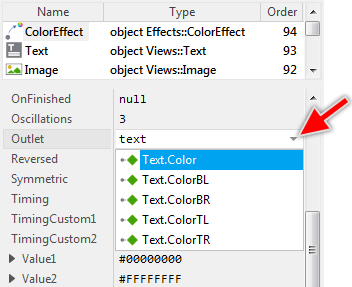
With the above assignment, you have established a connection between the color effect member and the property Color of the text view member Text. This means, in practice, the color effect member is now able to access and modify the property Color of this view. The following figure visualizes this relationship:
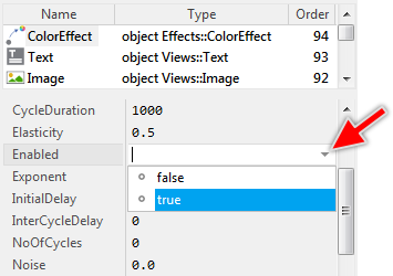
★Then change the effect's property Enabled to the value true as shown in the figure below. With this, the effect will be configured to start automatically:
★Finally, press the key F5 to start the Prototyper.
★After a few seconds, close the Prototyper window again.
When the Prototyper open, you will see the text fading-in repeatedly with a period of 1 second. The text is flashing. From a technical point of view, this animation is controlled by the just added color effect member. At the runtime, the effect interpolates a value between two predetermined key values and assigns the result of this operation to the foreign property referenced via its own Outlet property - here, the property Color of the text view. We can say, the color effect remotely controls the property of the text view.
★Look in the Inspector window for the properties Value1 and Value2 of the color effect object. These properties determine the key values the effect interpolates between them:
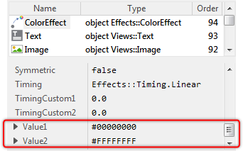
The property Value1 determines the value valid at the begin of the animation and the property Value2 determines the value at its end. Actually, the property Value1 is initialized with the expression #00000000 - meaning a transparent color. The property Value2, in turn, describes a fully opaque white color (expression #FFFFFFFF). Both expressions are color literals written in Chora syntax. These always consist of 8 hexadecimal digits in the fixed order #RRGGBBAA (RR:red, GG:green, BB:blue, AA:alpha).
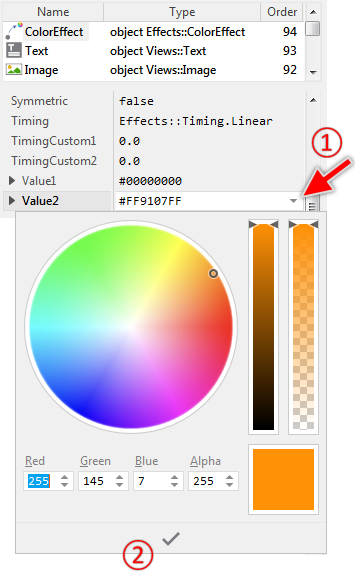
According to the above parameters, the animation effect will interpolate between a transparent and fully opaque white color. Since flashing a white text is less exciting, let's modify the property Value2 so that the text will flash with e.g. orange color. For this purpose:
★Click on the property Value2 and open its Assistant window.
★In the Assistant window, select the orange color.
★To confirm the selection, click on the button  at the bottom of the Assistant window. The following figure demonstrates the steps:
★Press the key F5 to start the Prototyper.
★Again after a few seconds close the Prototyper window.
As you could convince yourself, after changing the effect's end key value, the text flashes with orange color. The results are almost what we expected. The only thing we do not like so much is the abrupt transition to the start value, the moment the animation restarts. It does not look very smart. To improve this:
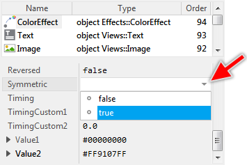
★Change the property Symmetric of the effect object to true as shown in the figure below:
★Press the key F5 to start the Prototyper.
The welcome dialog is working now as we expected. The text is flashing with orange color and after you have modified the property Symmetric, the animation effect runs forth and back between the key values instead of skipping at the end of the animation.
★Before you continue with the next step, close the Prototyper window again.
7. Integrate the GUI component within the application
In the preceding steps, you have learned how to create and compose a new GUI component. In the following sections, we will address the aspect of how to integrate the new component within the entire application. Actually, as you remember, the application displays two screens: the selection screen and the brewing screen. However, we want that when the application is started, our new welcome screen is shown. For this purpose:
★Switch back to the unit Application.
★Within the unit Application, look for the homonymous class Application:
The class Application, as the name reveals, represents the entire GUI application. Its content corresponds to what you see on the display in your device. When you add a view (or another GUI component) to the application component, this view appears on the display implicitly. Considering a GUI application as composed from interleaved, nested view objects, the application component serves as the root of this tree-like structure. Therefore, we tend to call the instance of the application component as the root object.
From a technical point of view, the application component is an ordinary GUI component enhanced by an additional interface permitting its integration with the display in your device. This is possible because application components are derived from the Mosaic class Core::Root, which, in turn, descends from the class Core::Group serving as the base class for all GUI components. Thus an application component inherits the functionality every ordinary GUI component supports per default. In other words, the application component is just another GUI component. You see the ancestry of the Application class in the upper text row of the corresponding brick.
★Double-click on the brick Application to open the corresponding class. Its contents appear as usual in a new Composer page:
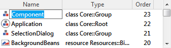
As you see in the screenshot above, the application GUI component already displays the selection screen. How is it possible? Please take a look in the Inspector window. There you will see that the application component contains two embedded objects: SelectionDialog and BrewingDialog:
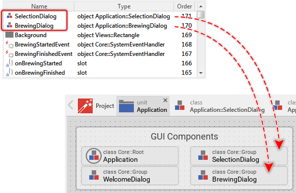
The first object is an instance of the class Application::SelectionDialog. We have analyzed this class in the preceding sections and as you remember, it is designed to represent the selection screen GUI component. Being a part of the application component, the SelectionDialog object implicitly becomes visible. The second object BrewingDialog is, in turn, an instance of the class Application::BrewingDialog. It represents the screen, which is shown during the brewing process only. Actually, it is hidden, so you can't see it.
Regardless of whether the BrewingDialog is actually hidden or not, its visibility is also affected by the stacking order of objects within the application component. You can see the stacking order in the Inspector column Order. Accordingly, the SelectionDialog has a higher order than BrewingDialog and overlays it.
What we want, however, is the new welcome screen to be shown in the application. As you probably assume, to achieve this, you will need to create an embedded object of the class Application::WelcomeDialog, which represents the welcome screen GUI component. The following steps describe what you have to do:
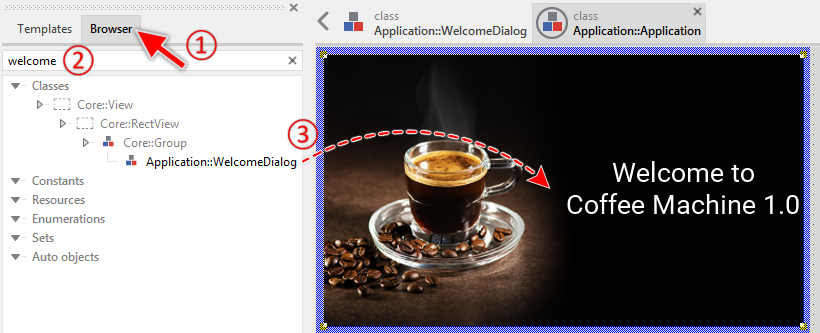
★In the Gallery window (on the left of the Composer), switch to the Browser view.
★Enter in the Search ... edit field the text welcome. It serves as a filter for the displayed entries.
★Select the item Application::WelcomeDialog.
★Drag the selected item Application::WelcomeDialog to the Canvas area.
★Release the mouse within the Canvas area.
★Eventually, arrange (move) the just added component to correctly fill the Canvas area. The following figure demonstrates the steps:
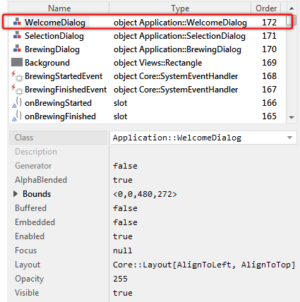
With this operation, you have created a new embedded object (an instance) of the class Application::WelcomeDialog. Immediately after this operation, the Canvas area is updated and shows our new welcome screen. You can also see a new embedded object WelcomeDialog within the Inspector window:
★Just below the Canvas area, look for the brick Init.
★Double-click on this brick to reveal its contents in the Code Editor:
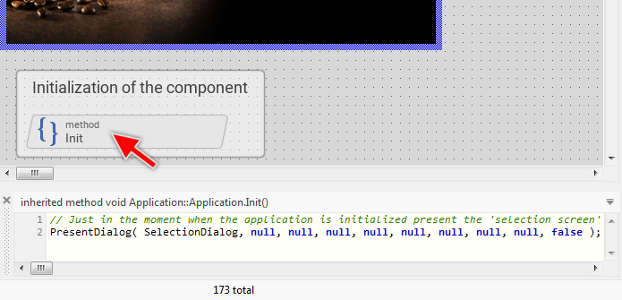
The method Init is automatically executed, just in the moment when an instance of the corresponding class is created. If you are familiar with object-oriented languages like C++, you can compare Init with a constructor. According to the above screenshot, the Init method invokes a PresentDialog method with SelectionDialog object as a parameter. What PresentDialog exactly does is beyond the scope of this Quick Tour article. For the moment, it is sufficient to understand, that this operation controls the navigation within the application. It makes the SelectionDialog to the component, the user actually interacts with.
★Modify the implementation of the method as follows (just append a second PresentDialog method invocation with WelcomeDialog as a parameter):
// Just at the moment when the application is initialized, present the 'selection screen' PresentDialog( SelectionDialog, null, null, null, null, null, null, null, null, false ); // ... and overlay it by the 'welcome screen'. PresentDialog( WelcomeDialog, null, null, null, null, null, null, null, null, false );
★Press the shortcut Ctrl+F5 to start the Prototyper for the entire GUI application.
With the above modification, you made the WelcomeDialog to the component that the user actually interacts with. The SelectionDialog moves to the background and is not visible anymore. From this arises the problem where WelcomeDialog remains permanently visible so you can't interact with the SelectionDialog anymore. Solution: the welcome screen should disappear automatically after a short period of e.g. 5 seconds, restoring the underlying SelectionDialog.
★Close the Prototyper window again.
★In Composer, switch back to the WelcomeDialog. As you have already learned, you do this by clicking on the corresponding tab in the Navigation bar. An alternative approach is to double-click in Composer on the displayed component or in Inspector on the corresponding member WelcomeDialog.
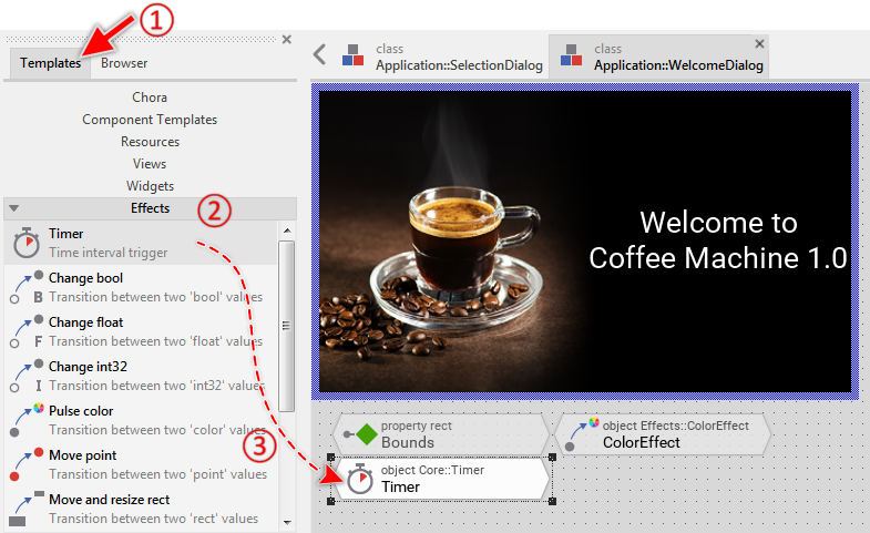
★In the Gallery window, switch to the Templates view.
★Then open the folder Effects.
★From the folder, select the item Timer and drag it to the Composer. The following figure demonstrates the required steps:
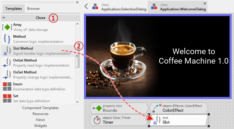
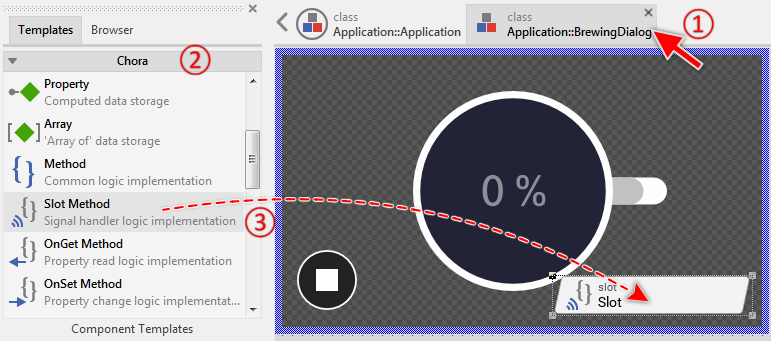
★Now open the Gallery folder Chora.
★From this folder, select the item Slot Method and also drag it to the Composer. The following figure shows the steps:
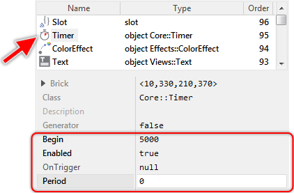
★In the Composer, select the previously added Timer object.
★By using the Inspector, change the timer's properties Begin, Enabled and Period to values as shown in the following image. With this, you can configure a single-shot timer, which expires 5 seconds after the component has been instantiated:
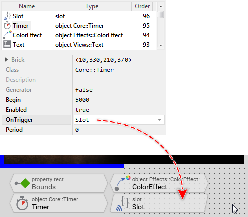
★Then change the timer's property OnTrigger to refer to the previously added slot method Slot. Accordingly, when the timer expires, the slot method is signaled and its implementation is executed:
★Double-click on the brick Slot to open its contents in the Code Editor:
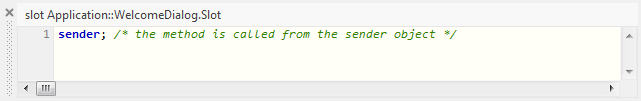
★Modify the implementation of the method as follows (Replace the old code by the code shown below):
if ( IsDialog(false)) Owner.DismissDialog( this, null, null, null, null, null, false );
After being triggered by the timer, the slot method will invoke the method DismissDialog with this as a parameter. DismissDialog is the counterpart of the above used PresentDialog method. In our concrete example, the invocation of DismissDialog hides the actual component (this), restoring the previously presented component SelectionDialog. The user should be able to interact with the selection screen now.
Please note, DismissDialog is called in the context of Owner. Owner is a variable referring to the component which actually displays this component. Since the welcome screen is embedded within the application component, Owner refers to the instance of the application component. The method DismissDialog is thus invoked in the context of the application component, which is important since the corresponding PresentDialog was also called in the context of the application component.
★Press the shortcut Ctrl+F5 to start the Prototyper for the entire GUI application.
Now, the welcome screen disappears automatically and you can interact with the selection screen and start the brewing process. The unique irritating aspect is the long period of 5 seconds to wait until the screens have been exchanged. Solution: let's enhance the welcome screen so that it is dismissed when the user touches it.
★Close the Prototyper window again.
★From the Gallery folder Event Handlers, add the item Simple Touch Handler to the Canvas area:
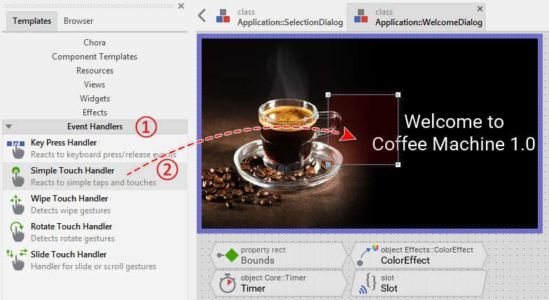
★Arrange the just added touch handler to occupy the entire Canvas area. For this purpose, click and drag on the four corners of the handler as shown below:
The just added touch handler provides a simple but powerful approach of how to specify a touch sensitive area. All you have to do is arrange the touch handler within the component and connect it with slot methods to execute when the user touches the area. In our concrete case, we would like the touch handler to trigger the already existing slot method Slot implementing the DismissDialog invocation. To do that, please follow these steps:
★As long as the touch handler is still selected, look for its property OnPress.
★Change this property to the value Slot:

★Press the shortcut Ctrl+F5 to start the Prototyper for the entire GUI application.
Now, you can dismiss the welcome screen just by touching on it and without having to wait for the timer expiration. Thus, the welcome screen is integrated within the application and it works. Nevertheless, we can make it better. Actually, when you dismiss the welcome screen, the transition to the selection screen occurs immediately. An animation would be nicer.
★Close the Prototyper window again.
★Switch to the component Application::Application:
★Modify the implementation of its Init method as shown in the code below (three of the null parameter in the last PresentDialog invocation are changed to specify concrete transition animations:
// Just at the moment when the application is initialized, present the 'selection screen' PresentDialog( SelectionDialog, null, null, null, null, null, null, null, null, false ); // ... and overlay it by the 'welcome screen'. PresentDialog( WelcomeDialog, null, Effects::SlideUpCentered, null, null, Effects::ShowHideCentered, Effects::SlideUpCentered, null, null, false );
The many parameters of PresentDialog configure the transitions (animations) to perform when dialogs are presented and dismissed. With the above modification, you have specified the slide up animation to apply on the welcome screen and simultaneously on the component overlaid by it (in our case on the selection screen). Thus when the welcome screen is dismissed, the dialogs are exchanged with a slide up animation. The concrete parameters for this animation (duration and timing) are preconfigured in the specified Mosaic transition object Effects::SlideUpCentered. This object exists for your convenience only. In praxis, you can configure your own transition objects according to the desired animation parameters.
★Press the shortcut Ctrl+F5 to start the Prototyper for the entire GUI application. Now the transition between the screens is performed with an animation.
★Close the Prototyper window again.
8. Implement an interface to a GUI component
In the practice, when you create a new GUI component, you will also design an interface permitting the configuration of the component instances at the design and runtime. Let's imagine an ordinary push button component. Such push buttons usually display a caption or an icon indicating the particular function of the button within the application. Without the possibility to configure the button, it would be necessary to implement every button as an individual component with its individual caption or icon. By implementing an interface, it is sufficient to have a generic button component with the caption or icon being configurable via the interface.
The following section demonstrates how you add such interface to our welcome screen component. As you remember, the welcome screen displays a text containing the version number of the device. Now let's assume, this version number varies depending on the device hardware used. Our interface should thus allow to explicitly specify the version number to show on the welcome screen.
In Embedded Wizard, you use for this purpose so-called properties. The property can be considered as a variable. It stores data within the component and every instance of the component may store different data. The difference to the ordinary variable is that every time the property is modified (a value is assigned to the property), an associated onset method is executed. Within the method, the component can react to the alternation of the property and, for example, update its appearance. In our concrete case, the property should store the version number and modifying the property will update the text shown in the component.
★Switch back to the component WelcomeDialog.
★From the Gallery folder Chora, add the item Property. The following figure demonstrates the steps:
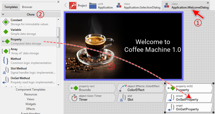
★Select the first brick Property of the three just added and press the key F2 to rename it.
★Enter in Inspector the new name Version for the property and confirm by pressing the key Enter.
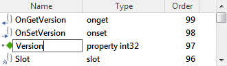
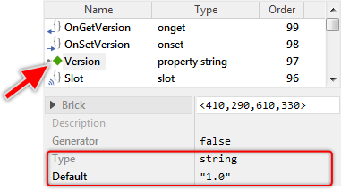
★As long as the member Version is still selected, look in the middle area of the Inspector for its attributes Type and Default. Change them as shown in the following figure:
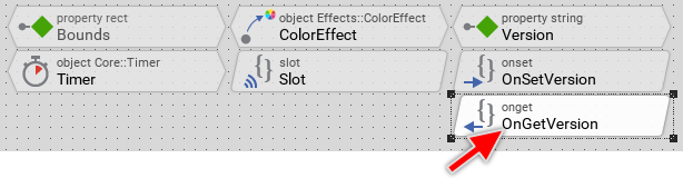
★Now select the brick OnGetVersion and press the key Del to delete it. This brick represents an onget method, which is executed when evaluating the property. In our case, we don't want any particular functionality to be triggered when reading the property:
★Double-click on the brick OnSetVersion to reveal its implementation in the Code Editor. This brick represents the onset method associated with the property:
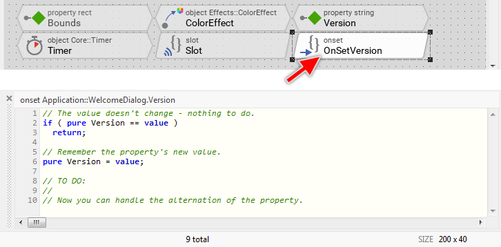
From the screenshot above, you can see the Code Editor with the actual (default) implementation of the onset method. Interesting in this context are the used keywords pure and value. With pure, the implementation can access the memory where the property actual content is stored. The keyword value, in turn, represents the new value just being assigned to the property.
By comparing both expressions in the if-condition, the onset method verifies whether the assigned value is equal to the value already stored in the property. If this is true, the onset method exits without executing any further code. In the other case, when the values differ, the implementation of the onset method will store the new value within the property (line 6). The unique missing operation in this template is the update of the displayed text as a reaction to the alternation of the property. For this purpose:
★Modify the implementation of the OnSetVersion method as shown below. In particular, the last code line is added:
// The value doesn't change - nothing to do. if ( pure Version == value ) return; // Remember the property's new value. pure Version = value; Text.String = "Welcome to\nCoffee Machine " + value;
With the last code line, the onset method performs an assignment to the property String of the object Text. The assigned expression is a string resulting from the concatenation of a string literal (enclosed between the double quote signs) and the new value of our property. The concatenation itself is expressed by the + (plus) operator. Accordingly, every time a new value is assigned to our property Version, the text view is updated and shows the new version number.
★Now, switch back to the component Application::Application.
★Select the object WelcomeDialog.
★In the middle area of the Inspector, look for its property Version.
★Change this property to other value, for example, "2.3" (Be aware of the double quote signs that belong to the expression). The following figure demonstrates the steps:
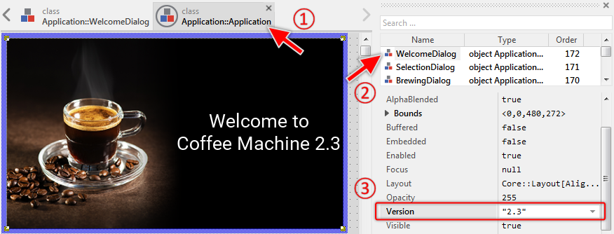
As you see in the Inspector window from the screenshot above, our welcome screen now exposes the new property Version. You are able to select this property and modify it exactly as you did in the past steps with other properties of other objects. Moreover, the moment you modified the property, the welcome screen is being updated, showing a new text with the just specified version number "2.3". This works automatically because modifying the property triggers the execution of its associated onset method. And, as you remember, this onset method performs code to update the text view with a new string.
9. Communicate with the device
In this section, we will address the aspect of how to implement the communication between the GUI and the device. In our small example, the device is the coffee machine with a heater and water pump. The user starts the brewing process by simply touching on the play push button found in the selection screen. This intention is communicated to the device, which thereupon activates the appropriate hardware components. Simultaneously, the brewing screen appears, showing the progress of the operation. The brewing screen remains visible until the brewing is finished.
What we would like to have now is a new stop button in the brewing screen, permitting the user to abort the running process prematurely. For this purpose we will enhance the brewing screen by a new button and take care of the communication with the device to stop the brewing process. Let's go!
★Switch back to the unit Application.
★Within the unit Application, double-click on the component BrewingDialog to open it in a new Composer page:
The following screenshot shows the just opened BrewingDialog class in the Composer:
★From the Gallery folder Widgets, add the item Push Button to the Canvas area as demonstrated in the figure below:

★As long as the just added push button is still selected, look for its property Appearance.
★Open the Assistant window for this property and select the option Application::PushButtonConfig:
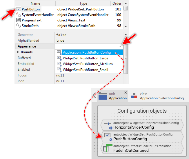
The just added push button, as well as all other widgets found in the Gallery folder Widgets, are configurable. Immediately after being added, the widget appears with its default configuration. What you have done in the preceding step is to assign another configuration object to the button. You have assigned the object Application::PushButtonConfig, which as you remember from the explanation at the beginning of this article, contains all resources and parameters to determine the desired appearance of the push button. The push button changes thereupon its appearance as demonstrated in the screenshot below:
★Resize the push button to at least 70x70 pixel to show completely its content.
★Eventually, move the push button to the bottom-left corner of the Canvas area. The following figure demonstrates the expected results:
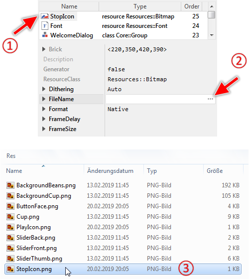
Well, the push button appears empty except its round border. The button should, however, show a stop icon. As you have learned in the preceding steps Embedded Wizard manages all images as bitmap resources. Since the project does not contain actually any bitmap resource representing the adequate stop icon, we have to add such new resource. Please keep in mind that being a global entity, the resource can exist within a unit only. Thus:
★Navigate to the unit Application.
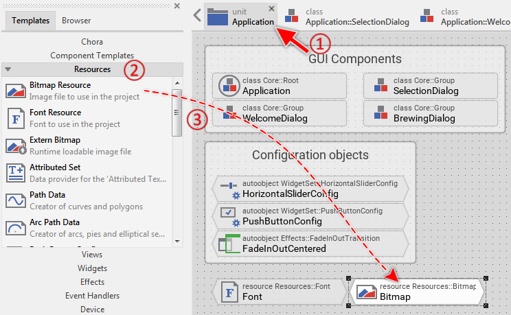
★In the Gallery window, switch to the folder Resources.
★From the folder, add the item Bitmap Resource to the Composer. The following figure demonstrates the steps:
★Press F2 to rename the just added bitmap resource.
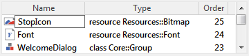
★Rename the resource to StopIcon and confirm the operation by pressing the key Enter as shown in the figure below:
The image content for the bitmap resource has to be provided as a file in the format PNG, JPG, GIF or BMP. We prefer the format PNG since it supports transparency, which is essential in modern GUI applications. To create the image files you can use external graphic editors like GIMP, Photoshop, Affinity Designer, etc.. In our example, we have already prepared the adequate image so you don't need to paint it in a graphic editor. The image is stored in the file .\Res\StopIcon.png just below the directory corresponding to this example. The following steps describe how to associate the image file to our new bitmap resource:
★As long as the just added bitmap resource is still selected, look for its attribute FileName.
★On the right of the attribute, click on the small icon  to open the associated Assistant window.
★In the thereupon shown file selection window, navigate to the subordinated folder Res.
★Within the folder Res, select the file StopIcon.png. The following figure demonstrates the steps:
★Switch back to the Composer with component BrewingDialog.
★Once back in the Composer of the BrewingDialog, make sure that the previously added push button is still selected.
★In the Inspector, change the button's property Icon to the name of our new bitmap resource Application::StopIcon. The button changes immediately the appearance showing now the stop icon:
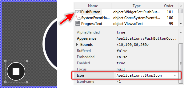
The stop button is configured now. Actually, it does not have any practical function - there is no connection between the push button and the device. We will thus analyze the interface to communicate between the GUI and the device. As you remember, the bricks representing this interface are found in the unit Application. Thus:
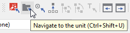
★Switch back to the unit Application. An alternative approach on how you can do it is clicking on the button from the toolbar or (if you prefer) the corresponding shortcut CtrlShiftU.
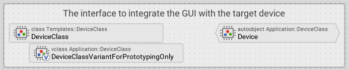
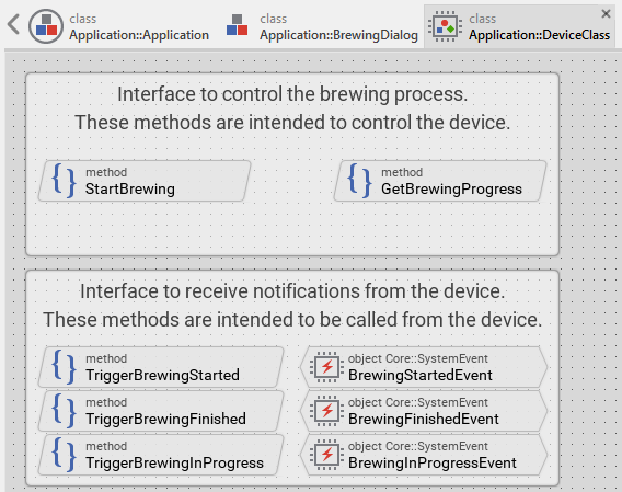
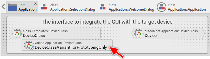
★Within the unit Application, look for the bricks enclosed in the annotation The interface to integrate the GUI with the target device.
★Double-click on the brick DeviceClass to open its content in a new Composer page:
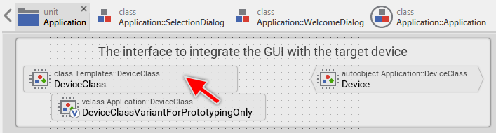
The brick DeviceClass implements a class serving as the interface to the device. As you see in the screenshot below, this interface actually consists of a few methods. In particular, the first annotation encloses the methods to start the brewing process and to query its actual status. These methods are thus used from the GUI to trigger some operations in the device. In turn, the bricks enclosed within the second annotation are intended to be used by the device to send notifications important for the GUI:
★Double-click on the method StartBrewing to open its content in the Code Editor:
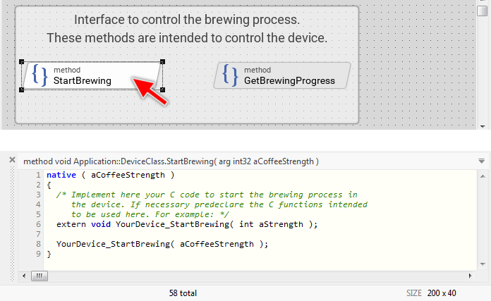
The implementation of the method StartBrewing limits to an invocation of an extern C function YourDevice_StartBrewing(). For the moment, let's assume such function exists somewhere in the main software (or middleware) and calling it will activate the heater and the water pump of the device. Much more interesting is the fact that, the external C function is invoked from Chora code. The syntax of Chora and the syntax of C are combined together within one and the same method.
Chora programming language is designed to be highly platform-independent and as such, it does not implement any operation to access nor communicate with the device. Instead, you can inject into the Chora method a code sequence implemented in the native syntax of the particular target system. You can combine the Chora and native code. As you see from the screenshot above, the native code is enclosed within a native statement.
During the code generation, the code sequence enclosed within a native statement is taken over as it is without evaluating or modifying it. In this manner, you can enrich the platform-independent Chora code with target specific code to control the device. The Chora compiler itself does not evaluate the native code. In fact, it has no idea about its syntax nor function.
This means in praxis that, in the application running on the device every execution of the method StartBrewing will call the enclosed C function. The selection screen, in turn, implements code to invoke the method StartBrewing every time the user touches the enclosed play push button. In other words, the activation of the push button invokes the StartBrewing method, which on its part calls the C function to initiate the brewing process.
Once understand this principle, we can focus on the enhancement of the DeviceClass by a new method to stop the active brewing process. It will be the counterpart of the StartBrewing method. For this purpose:
★From the Gallery folder Chora, add the item Method to the Composer:
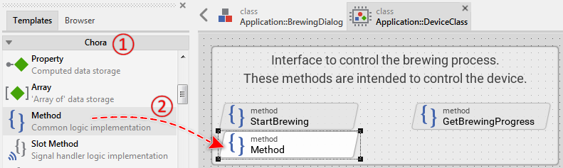
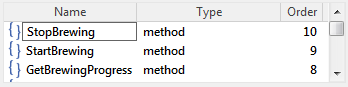
★Rename the just added method to StopBrewing:
★Double-click on the just added method to open its content in the Code Editor:
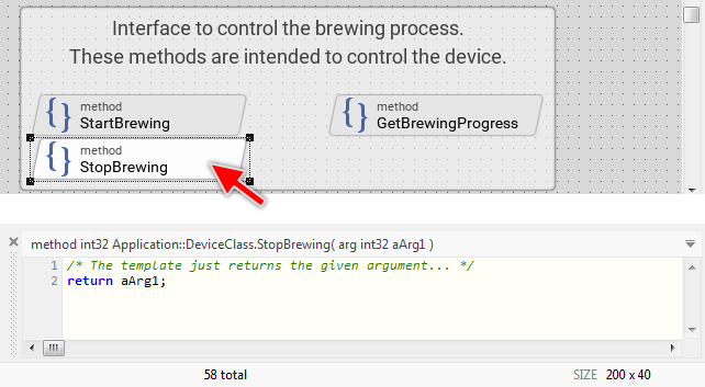
As you can see from the screenshot above, the newly added method is per default declared as expecting an int32 argument (a 32-bit signed integer value) and returning an int32 result. In our case, however, we want the method to neither expect nor return a value. For this purpose, you will have to modify the declaration of the method:
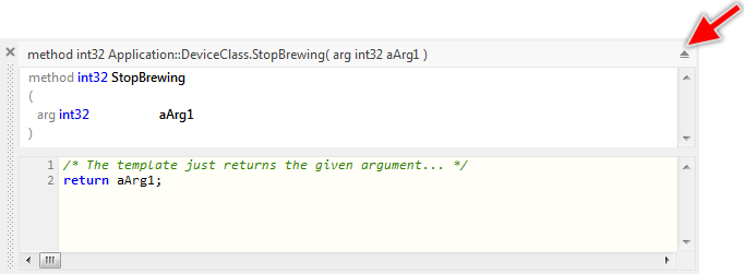
★At the right end of the Code Editor, click on the  icon to reveal the Declaration area of the opened method:
★Within the Declaration area, single-click on the first row containing the return type of the method (the row with the text method int32 StopBrewing) in order to select the row (note: don't double click on it, just single click to select the row):
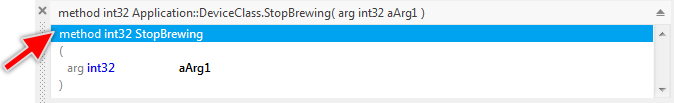
★Once the entire row is selected, press the key Del. This causes the return type to be deleted.
★Now click on the row containing the method's argument (the row with the text arg int32 aArg1) and delete also it.
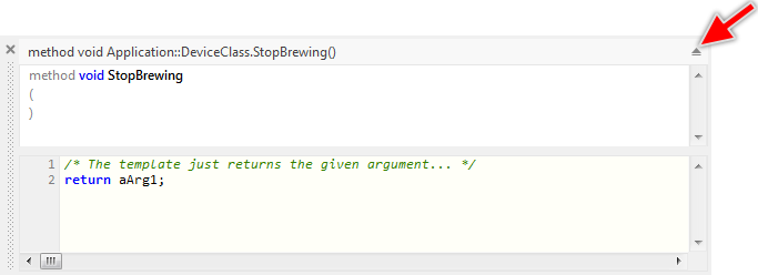
★Once you have adapted the method declaration, hide the Declaration area again by clicking on the  icon. The following figure demonstrates the resulting view of the method declaration just before you close the Declaration area:
★Still in the Code Editor, replace the original implementation of the new method by the following code:
native { /* Implement here your C code to stop the brewing process in the device. If necessary, predeclare the C functions intended to be used here. For example: */ extern void YourDevice_StopBrewing( void ); YourDevice_StopBrewing(); }
Assuming the C function YourDevice_StopBrewing is implemented in the main software or middleware of the device, the function will be called every time our new method StopBrewing is executed. As its name indicates, the job of the function YourDevice_StopBrewing is to abort the actual brewing process. Thus, if we want to stop the brewing process when the user activates the stop button, we have to invoke the new method StopBrewing:
★Switch to the Composer page containing the BrewingDialog component.
★From the Gallery folder Chora, add a new Slot Method to the Composer:
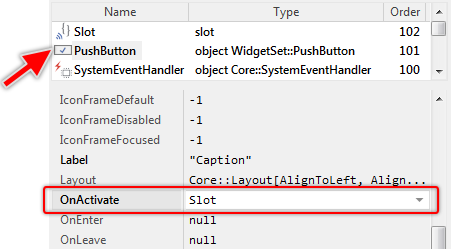
★Select the PushButton.
★Then modify its property OnActivate, so that it refers to the just added slot method Slot. The following figure demonstrates this:
★Finally, open the Slot method and implement it as follows:
Application::Device.StopBrewing();
According to this modification, when the user presses the stop button, the slot method is triggered and StopBrewing() is invoked. The expression Application::Device on the left of the invoked method addresses an autoobject (a global instance of Application::DeviceClass). The method is thus invoked in context of this object.
★Press the shortcut Ctrl+F5 to start the Prototyper for the entire GUI application.
★Test the application. In particular, try to abort the brewing process by pressing the stop button.
Evidently, the stop button is not working as expected. The brewing process continues regardless of how often you press the button. The reason for this is, the native code within the method StopBrewing is intended for the execution in the target device. During the prototyping, the Embedded Wizard has no idea about the particular target device and accordingly, no idea what the concrete C function YourDevice_StopBrewing() does. This implementation can work in the target device only. This aspect is reported as a warning in the Log window, which can be found at the bottom-left corner of the Embedded Wizard window:
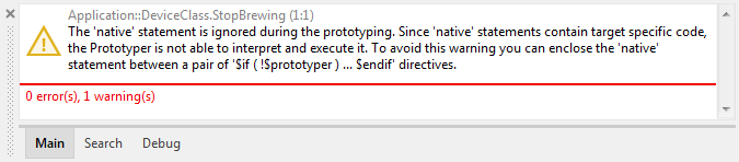
Thus if there is no real device available during the prototyping session, how is it possible to start the brewing process directly in the Prototyper window by simply pressing the play button? Well, the answer is simple: this behavior is simulated. The project contains for this purpose a separate implementation of the DeviceClass containing a timer to simulate the progress of the brewing process. This so-called class variant is used selectively during the prototyping session only and has no effect in the resulting application for the real device.
★Close the Prototyper window again.
★Navigate back to the unit Application.
★In the unit, look for the brick DeviceClassVariantForPrototypingOnly:
From the upper text row in the brick, you will see that the brick represents a variant of the class Application::DeviceClass (the member type is vclass). This means that the implementation contained within the vclass will enhance, override or even replace the implementation found in the original class. Wherever the original class is used, the modified implementation from the vclass is also taken into account. An object instantiated from the original class behaves in praxis as if it would be an instance of the variant class.
★Select the vclass member and look in Inspector for both its attributes VariandCond and VariantOf:
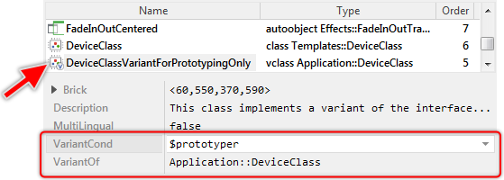
The attribute VariantOf determines the original class, the vclass should override. The attribute VariantCond is much more interesting. It specifies a condition when the variant is taken into account. Actually, this attribute is configured with the expression $prototyper. This expression results in the values true or false depending on whether the application is tested in the Prototyper window or the code is generated for the target system. Accordingly, when you run the application in the prototyping environment, the variant replaces the original implementation of the device interface and adds the functionality for the simulation purpose. When generating code for the target system, the variant is ignored.
★Double-click on the member DeviceClassVariantForPrototypingOnly to open its content in a new Composer page:
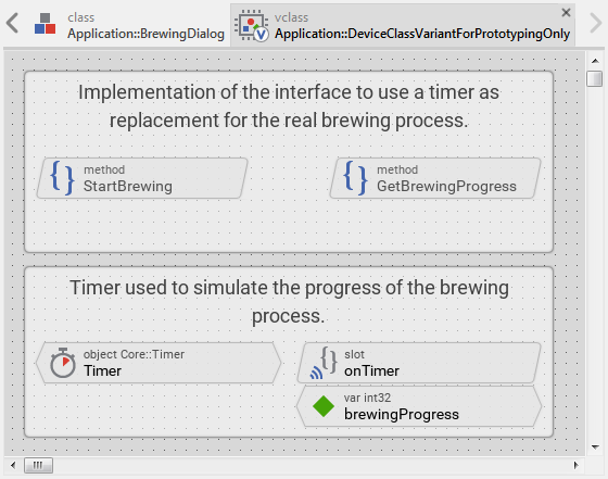
The variant class appears in a new Composer page with members similar to the ones found in the original class DeviceClass. In the screenshot above, you will recognize the methods StartBrewing and GetBrewingProgress that we have analyzed in the preceding steps. These bricks appear with gray text colors, which indicates that the corresponding members are inherited from the original class. They override (replace) the implementation from the original class.
The bricks enclosed in the annotation just below implement the functionality to simulate the brewing process. The object Timer drives the simulation and the variable brewingProgress stores the brewing's actual progress as a value in range 0 .. 100.
★Double-click on the method member StartBrewing to open its content in the Code Editor:
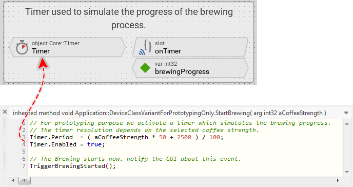
As you see from the screenshot above, the method StartBrewing activates a timer and triggers an event about this device state alternation. Nothing else. This begins the brewing simulation. Please note the calculated timer resolution. In our simulation, the timer resolution depends on the desired coffee strength. The stronger the coffee, the slower the timer and the brewing process takes more time.
Every timer expiration signals the associated slot method onTimer, which thereupon is executed. The implementation of the slot method thus drives the simulated brewing process.
★Double-click on the method member onTimer to open its content in the Code Editor:
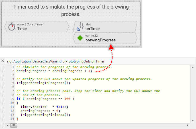
From the screenshot above, you can see the method increments the variable brewingProgress and triggers an event about this device state alternation. As soon as the variable brewingProgress has reached the value 100, the timer is stopped. The simulated brewing is finished.
The method GetBrewingProgress has the function to return a value corresponding to the actual brewing progress. It is evaluated in the brewing screen to show to the user the progress of the operation. The returned value lies in the range 0..100. With a real device, the method would query the value from the main software or middleware. In the case of the simulation, we limit to return the value actually stored in the variable brewingProgress. You can see this in the screenshot below:
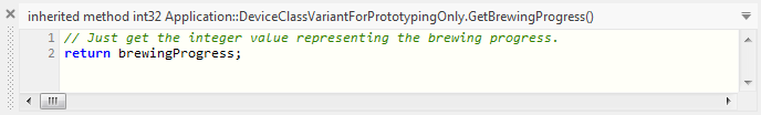
★Double-click on the method member GetBrewingProgress to open its content in the Code Editor:
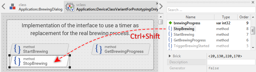
The reason why you are actually not able to stop the active brewing process by pressing the stop button is because the corresponding StopBrewing method is not yet adapted for the simulation case. The method is implemented in the original class DeviceClass and not overridden in this variant class. You will need to override this method and implement code to stop the timer. Since all inherited but not overridden members are listed in the Inspector window only, you will find the method StopBrewing there:
★In the upper area of the Inspector, look for the member StopBrewing.
★Select this member.
★Press and hold down the keys CtrlShift.
★Drag the selected member (while pressing the keys CtrlShift) from the Inspector window to the Composer.
★Release the mouse button and then the keys CtrlShift. The following figure demonstrates the steps on how to override an inherited method:
★Double-click on the member StopBrewing to open its implementation in the Code Editor.
★Replace its actual implementation with the following code. Accordingly, the implementation of the method stops the timer and notifies the GUI about this device state alternation:
if ( Timer.Enabled ) { // Stop the timer immediately. Timer.Enabled = false; // Notify the GUI about its abort. TriggerBrewingFinished(); brewingProgress = 0; // Also notify the GUI that the progress status has changed TriggerBrewingInProgress(); }
★Press the shortcut Ctrl+F5 to start the Prototyper for the entire GUI application.
★Try to stop the brewing process. It should work now.
★Close the Prototyper window again.
10. Generate code
The final step in the development cycle with Embedded Wizard is the code generation. During this code generation, the Embedded Wizard evaluates all members used in your project, compiles Chora code, converts images and fonts in a format that is adequate for the target system, eliminates unused members and optimizes the entire project. The output of the code generation are files you can integrate into the build process of your main software. To start the code generation:
★In the upper area of Embedded Wizard window, click on the tool button . If you prefer, you can use the shortcut F8 to achieve the same effect.
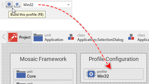
The code generation is performed according to configuration parameters specified in a profile member. You remember from the beginning of this article, there was a profile member named Win32 existing in the project. This profile was configured to generate code for Microsoft Win32 operating system as a target. As you can see from the combo-box on the right of the tool button , this exact profile Win32 is actually the selected one. In future, if you create GUI applications for different target systems, you can manage in your project several profile members. By selecting the right profile member in the combo-box, you determine the rules for code generation and for the prototyping.
The code generation usually takes a few seconds. You see the progress of this operation in the Log window in the bottom-left corner of the Embedded Wizard. In the case where some errors are encountered, these will also be reported in this Log window. By double-clicking on an error message, Embedded Wizard will direct you to the affected project member or Chora code. Since we have no errors implemented, the outputs in the Log window look like the screenshot shown below:
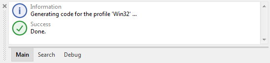
Now, let's explore the generated files. Per default, the files are stored in a directory named after the profile member (Win32) just below the directory containing the project.
★By using the Windows File Explorer, navigate to your Documents folder.
★Then navigate to the subfolder Embedded Wizard 9.20\Examples\QuickTour. Please note, if the installed Embedded Wizard is newer than 9.20, you will have to navigate to the corresponding directory (e.g. Embedded Wizard 9.50).
★Within the QuickTour folder, open the subfolder Win32. The following is the content of this folder:
Within the Win32 folder, you will see many C header and code files (*.h and *.c). Every *.c file corresponds to the homonymous unit. For example, in our project, there is a unit Application containing all GUI components, resources and members of the interface that connect GUI with the device. The contents from this unit and the contents in the generated file Application.c thus correlate as:
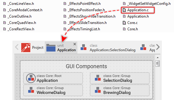
★Open the file Application.c in your preferred editor (e.g. in Microsoft Visual Studio).
★Search in the file for the function ApplicationDeviceClass_StopBrewing().
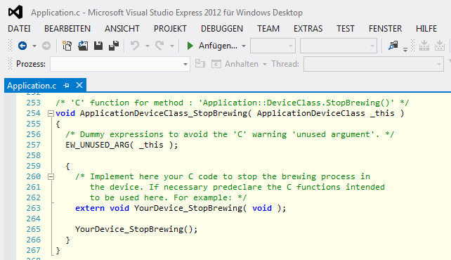
The C function ApplicationDeviceClass_StopBrewing() corresponds to the method StopBrewing that you have implemented within the class Application::DeviceClass in one of the preceding steps. As you remember, this method contained some native code that triggers the device to stop the active brewing process. This code is found within the corresponding C function ApplicationDeviceClass_StopBrewing().
As next step, you would add the generated files to your build process (or make file) and compile from them the resulting binary for the target device. In praxis, the corresponding steps depend on the particular target system. Therefore, addressing this aspect is beyond the scope of this Quick Tour article. Precise instructions are found in the Getting started articles from the documentation Build Environments.
That's all!
We hope this Quick Tour article has helped you to learn the basic concepts of Embedded Wizard so that you can now start your own project. Please note that this Quick Tour article describes all aspects very superficially. More detailed documentation can be found in the following articles:
Documentation |
Contents |
|---|---|
Explains the basic concepts of Embedded Wizard more in detail. |
|
Describes diverse workflow aspect more in detail. |
|
Getting started articles for concrete target systems. |
|
Contains the reference of the Embedded Wizard Studio IDE (integrated development environment) and how you work with it. |
|
Contains the reference of the programming language Chora and the bricks used by it. |
|
Contains the reference of the Mosaic framework. |
|
Addresses advance aspects essential for the integration with a real device. |