Using Widgets: Rotary Knob
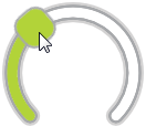
The Mosaic class WidgetSet::RotaryKnob implements a GUI component intended to serve as a Rotary Knob widget. This widget can be used to compose the appearance of other more complex GUI components, in particular to add to them interactive controls permitting the user to set an integer value by simply touching within the knob's area and performing a rotation gesture. Each time the user interacts with a Rotary Knob, the widget sends signals to associated slot methods where your particular implementation is executed. If the Rotary Knob is focused the widget can also be controlled by pressing keys on the keyboard or by using hardware buttons. Per default, the widget reacts on the cursor keys Left and Right.
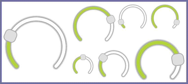
The exact appearance and behavior of the Rotary Knob is determined by a Rotary Knob Config object. This configuration object provides bitmaps, colors and other configuration parameters needed to construct and display the affected Rotary Knob. Embedded Wizard is delivered with a set of prepared Rotary Knob Config objects you can use instantly as they are. However, if desired, you can create your own configuration objects and so customize the Rotary Knob widgets according to your particular design expectations. The following screenshot demonstrates few examples of how Rotary Knobs appear in the canvas area of Composer (and accordingly on the screen in your target device):
The following sections are intended to provide you an introduction and useful tips of how to work with and how to customize the Rotary Knobs. For the complete reference please see the documentation of the WidgetSet::RotaryKnob and WidgetSet::RotaryKnobConfig classes.
Add new Rotary Knob
To add a new Rotary Knob widget just at the design time of a GUI component do following:
★First ensure that the Templates window is visible.
★In Templates window switch to the folder Widgets.
★In the folder locate the template Rotary Knob.
★Drag & Drop the template into the canvas area of the Composer window:
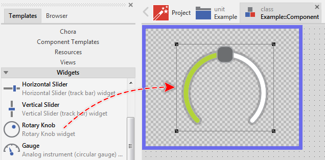
★Eventually name the new added Rotary Knob widget.
Inspect the Rotary Knob
As long as the Rotary Knob widget is selected you can inspect and modify its properties conveniently in the Inspector window as demonstrated with the property Bounds in the screenshot below:
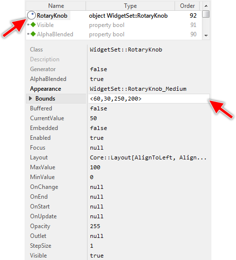
This is in so far worth mentioning as all following sections describe diverse features of the Rotary Knob widget by explicitly referring to its corresponding properties. If you are not familiar with the concept of a property and the usage of Inspector window, please read first the preceding chapter Compositing component appearance.
Arrange the Rotary Knob
Once added, you can freely move the Rotary Knob, or you simply grab one of its corners and resize it in this way. You can control the position and the size of the widget also by directly modifying its property Bounds. If you want the Rotary Knob to appear behind other views you can reorder it explicitly.
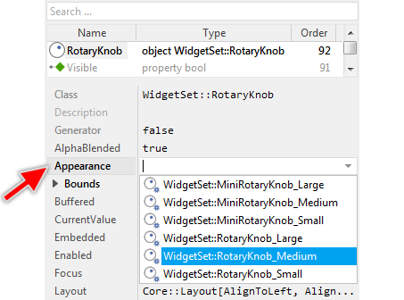
Select the appearance for the Rotary Knob
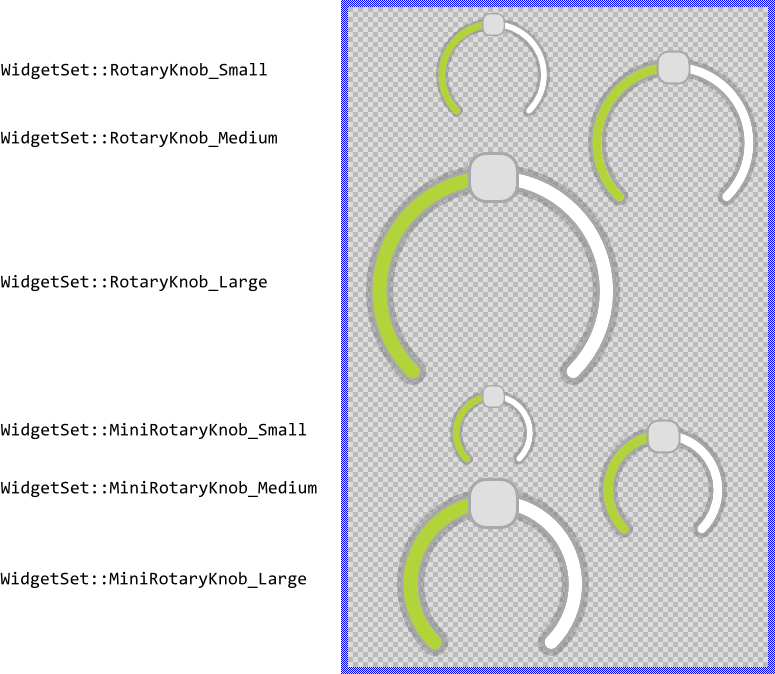
The appearance and partially also the behavior of the Rotary Knob widget can be configured according to your particular design expectation. For demonstration purpose and to help you to quickly create new product prototypes, Embedded Wizard contains six ready to use configurations you can use instantly. The configurations are divided in two sets, every with three sizes small, medium and large. The following figure demonstrates all available default configurations at once:
To use the desired appearance configuration you have to select it in the property Appearance of the affected Rotary Knob widget as demonstrated in the screenshot below. You can use the integrated Inspector Assistant window to conveniently select the right configuration. If you like the provided default configurations then you can use them as they are:
If you prefer to adapt the appearance of the Rotary Knob by yourself, then you have to create a new Rotary Knob Config object and specify in it all the bitmaps, colors as well as other parameters to customize your individual Rotary Knob. Once your configuration object is available, you can select it in the property Appearance exactly as you select one of the configurations provided per default with Embedded Wizard.
Understand the states of the Rotary Knob
During its life time, the Rotary Knob remains always in one of its four possible states. While the user interacts with the widget, touches it for example, the widget switches between the states fourth and back. Understanding these states is especially essential when you intend to customize your own individual Rotary Knob. The following table provides an overview of all Rotary Knob states:
State name |
Example |
Description |
|---|---|---|
Default |
|
The state Default determines a widget, which is ready to be touched by the user or it is ready to become focused. |
Active |
|
The state Active is true, if the user actively touches the Rotary Knob's thumb. If the widget is focused it can become active also when the user presses the predetermined key on the keyboard or a hardware button. You can imagine, in the Active state, the user interacts actively with the widget. |
Focused |
|
The state Focused indicates the actually focused widget. The user can control this widget by simply pressing predetermined keys on the keyboard or by pressing hardware buttons. Please note, unless otherwise configured, the focused Rotary Knobs are controlled by pressing the cursor keys Left or Right. |
Disabled |
|
The state Disabled is true for every not available Rotary Knob (the property Enabled of the widget is false). Such widgets will ignore any user inputs. |


Determine the Rotary Knob's value range and its current value
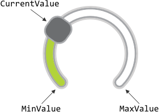
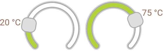
The Rotary Knob widget is intended to allow the user to conveniently change an integer value. When the user touches and drags on (rotates) the widget's thumb, the value changes. Similarly, if the Rotary Knob is actually focused and the user presses a dedicated key on the keyboard, the value changes. This alternation is reflected in the widget's property CurrentValue. By evaluating this property you can simply query the value which is actually set in the affected Rotary Knob. Accordingly, when you modify the property CurrentValue, the affected widget will implicitly update the position of its thumb as well as the length of the both tracks (Please note, depending on the selected configuration, the Rotary Knob may appear without the thumb or without the tracks).
The possible value range for the property CurrentValue is determined by the both properties MinValue and MaxValue, both corresponding to the begin and to the end of the thumb's range of motion (seen in clockwise direction). Thus, the value of the property CurrentValue lies always between MinValue and MaxValue. When the user drags on (rotates) the thumb, the new value is interpolated within this range. The following figure demonstrates the relations between the three properties:
The value MinValue has not to be necessarily less than MaxValue. If your application case it requires, you can initialize MinValue so that it is greater than MaxValue. For example, you can configure MinValue to be 100 and MaxValue to be 0. Then when the user drags on the thumb in a clockwise direction, the widget's CurrentValue is getting smaller. However, you should note, that when initializing MinValue and MaxValue with the same value, the possible value range is empty and the widget will not work.
With the further property StepSize you can optionally determine an increment for the Rotary Knob's current value which should be taken in account while the user interacts with the widget. Per default, this property is initialized with 1 which means, that the widget's value can change in steps of 1. If you initialize this property with a value greater than 1, the Rotary Knob will automatically adjust the property CurrentValue to be a multiple of the specified StepSize. For example, if you have a Rotary Knob configured with MinValue=-30, MaxValue=30 and StepSize=8, the widget will rest only at the discrete positions: -24, -16, -8, 0, 8, 16, 24 as well as at the both ends of its possible value range -30 and 30.
The initialization of the property StepSize has also an effect on how the Rotary Knob reacts when the user controls it via keyboard. Unless otherwise configured, pressing the key Left causes the widget to rotate its thumb counterclockwise. In turn, by pressing the key Right the widget rotates the thumb clockwise. The value stored in the property StepSize determines the corresponding alternation of the widget's current value. According to the example above, when the widget's current value is 8 and the user presses the key Right, its value changes to 16.
Implement Rotary Knob's slot methods
While the user interacts with the Rotary Knob widget, the widget sends signals to associated slot methods. Within the slot method your particular implementation can react and process the event. The slot methods are connected to the widget by simply storing them in the for this purpose available properties. The following table describes them:
Property |
Description |
|---|---|
Slot method associated to this property receives a signal as soon as the user touches the Rotary Knob's thumb or, if it is focused, presses the key on the keyboard to control the widget. In other words, this event is triggered at the beginning of the interaction between user and the Rotary Knob. |
|
Slot method associated to this property receives a signal as soon as the user lifts the finger from the Rotary Knob or, if the widget was controlled by preceding keyboard event, the user releases the key again. In other words, this event is triggered at the end of the interaction between user and the Rotary Knob. |
|
Slot method associated to this property receives a signal as soon as the user has dragged the Rotary Knob's thumb causing the widget's current value to be changed. The user can drag the thumb either by touching it with a finger or, if the affected Rotary Knob is actually focused, by pressing a predetermined key on the keyboard. |
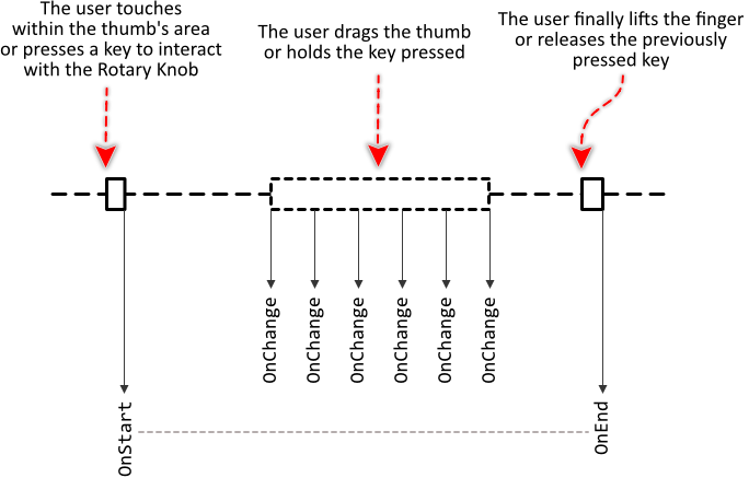
The following sequence diagram demonstrates a typical order in which the slot methods receive signals while the user interacts with the Rotary Knob. Please note, that every interaction starts with a signal sent to the OnStart and ends with a signal sent to the OnEnd slot method. In between, the widget will send signals to OnChange slot method, every time the user drags the thumb:
Providing slot methods for all properties is not obligatory. In typical application cases it is sufficient to implement the slot method for the OnChange event only leaving all other properties initialized with the value null. You can initialize the properties with already existing slot methods or you add a new one and implement it as desired. The following steps describe how to do this:
★First add a new slot method to your GUI component.
★Assign the slot method to the corresponding property of the affected Rotary Knob widget (e.g. to the property OnChange).
★Open the slot method for editing.
★In the Code Editor implement your desired operation to execute when the event occurs.
Usually, in the implementation of the slot method you will evaluate the widget's current value. You can, for example, use it to adjust a setting in the device, etc. The following code demonstrates it:
var Example::DeviceClass device = Example::Device; device.OvenTemperature = RotaryKnob.CurrentValue;
Connect the Rotary Knob with a data provider
To simplify the development of GUI applications, the Rotary Knob implements a technique permitting you to connect a widget directly to a data provider. Once connected, the widget will remain in sync with the value stored actually in this provider. Similarly, if the user drags on the Rotary Knob's thumb, the associated value changes automatically. This technique corresponds to the model-view-controller (MVC) programming paradigm, where the Rotary Knob has the function of the view and controller and the associated data provider serves as model. If you associate in your application several Rotary Knobs to one and the same data provider value, the underlying mechanisms will ensure, that when dragging on one of the widgets all other affected widgets do update their state automatically.
The connection between the Rotary Knob and the data provider is established by assigning to the Rotary Knob's property Outlet a reference to a property existing within the data provider and storing the interesting value. Since Rotary Knob is intended to deal with integer values, the property suitable to be connected via reference to the widget has to be declared with int32 as its data type. Accordingly, the value of the referenced property corresponds to the widget's current value.
Summarized, after assigning a reference to an existing int32 property to the Rotary Knob's own property Outlet, the widgets adapts its own state to automatically correspond to the actual value of the associated property. When the user interacts with the widget (drags on the thumb), the associated property is modified. You don't need to write a single line of code to benefit from this mechanisms. The aspects underlying this technique are explained in the sections Outlet properties and Notifications and Observer.
The following example demonstrates the practical application case with several Rotary Knobs connected to a common int32 property serving as data provider. When you download and start the example, you see three Rotary Knobs widgets and an Image view. The Rotary Knobs are connected to the view's property Opacity. When you drag on one of the widgets, the state of the property changes, the image appears more or less transparent and the both remaining widgets are updated accordingly:
Please note, the example presents eventually features available as of version 9.00
Arrange other views on the Rotary Knob's thumb
Unlike other widgets like the Toggle Button, the Rotary Knob has no additional label nor icon, which can serve as decoration to give the user an idea of the function behind the widget. If you want such additional decoration, please use the available views. For example, you can add a Text view and arrange it above or below the Rotary Knob, as you prefer. This Text view could serve then as a label.
In particular situations, however, you will want the additional decoration views to be automatically arranged at predetermined positions. For example, you can arrange the views to appear always side by side of the thumb, so that when the thumb position changes, the views are moved accordingly. The WidgetSet::RotaryKnob class provides for such application cases various useful methods. The following table gives you a short overview of them:
Method |
Description |
|---|---|
Returns the actual rotation angle of the thumb expressed in degree counterclockwise relative to the positive X-axis. |
|
Returns the minimal rotation angle of the thumb expressed in degree counterclockwise relative to the positive X-axis. This corresponds to the begin of thumb's range of motion (seen clockwise). |
|
Returns the maximal rotation angle of the thumb expressed in degree counterclockwise relative to the positive X axis. This corresponds to the end of the thumb's range of motion (seen clockwise). |
|
Returns the position around which the thumb is rotated. |
You can call those methods whenever your GUI component implementation requires the corresponding information. More sophisticated, however, is to join the update mechanism provided natively by the Rotary Knob widget. Precisely, when you assign a slot method to the widget's property OnUpdate, the slot method will receive postsignals every time the thumb's position changes. Accordingly, within the slot method you can react on this notification and e.g. arrange other views at the new position. The following steps describe how to do this:
★First add a new slot method to your GUI component.
★Assign the slot method to the property OnUpdate of the Rotary Knob widget.
★Open the slot method for editing.
★In the Code Editor implement your desired arrangement algorithm by using the values returned from the above described Rotary Knob methods.
Assuming, your GUI component contains a Rotary Knob named TemperatureRotaryKnob and a Text view named TemperatureValue. Furthermore let's assume you want the Text view to appear arranged automatically at position corresponding to the of the thumb separated by an additional small margin. In such application case implement the slot method with following Chora code:
// Calculate the position for the label 140 pixel away from the center around it // the thumb is rotated. var float radius = 140.0; var float ofsX = radius * math_cos( -TemperatureRotaryKnob.GetThumbAngle()); var float ofsY = radius * math_sin( -TemperatureRotaryKnob.GetThumbAngle()); // Arrange the label view to appear centered at the above calculated position TemperatureValue.Bounds.origin = point( int32( ofsX ), int32( ofsY )) + TemperatureRotaryKnob.GetCenterPosition() - TemperatureValue.Bounds.orect.center; // If you want, you can also adapt the text to be displayed in the view depending // on the widget's current value. TemperatureValue.String = string( TemperatureRotaryKnob.CurrentValue ) + " °C";
With such implementation, every time the thumb in the Rotary Knob changes its position, the Text view is updated automatically. This is also the case, when the entire widget is moved. The decoration views follow automatically the movements:
The following example project demonstrates this application case. When you download and open the example, you will see two Rotary Knobs with their associated and automatically arranged Text views:
Please note, the example presents eventually features available as of version 9.00
Disable the Rotary Knob
If you want the Rotary Knob to not react to user inputs, you have to disable it explicitly. You achieve this by setting the property Enabled of the affected widget to the value false. Thereupon the Rotary Knob enters in the Disabled state and its appearance changes to indicate to the user, that the associated function is actually not available. Please read the section Control the Enabled state of nested components for further details and more precise explanation.
Control the visibility of the Rotary Knob
If desired, you can hide the Rotary Knob so it is not visible to the user. You achieve this by setting the property Visible of the affected widget to the value false. Please read the section Control the visibility of nested components for further details and more precise explanation.
Customize your own Rotary Knob
Newly added Rotary Knobs use an appearance configuration provided per default with Embedded Wizard installation. As described above these default configurations are available in six different sizes you can select easily. If you like them, you can use them as they are. However, should the widgets in your GUI design have another appearance, then you will need to provide your own appearance configuration.
To provide a new configuration you create an object of the class WidgetSet::RotaryKnobConfig and initialize its properties with all the bitmaps, colors and other parameters particular to your own design. Once this object is available, you can assign it to every Rotary Knob you want to appear with this configuration similarly as you select one of the per default provided configurations. If necessary, you can create several different configuration objects and use them simultaneously within your application. You can even customize every Rotary Knob instance individually.
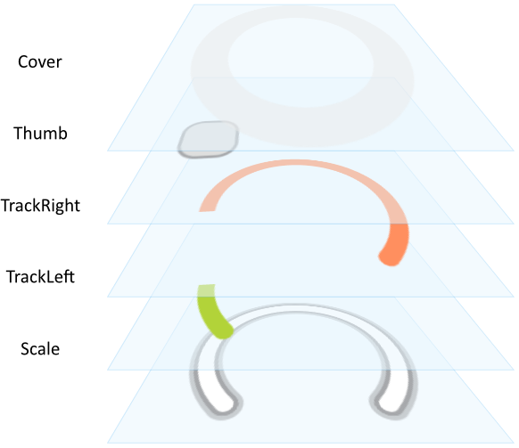
Before you start to customize your own Rotary Knobs you should understand two important aspects. As first recall the section Rotary Knob states. When you customize a Rotary Knob, you will specify for every possible widget state individual parameters. Understanding these states is thus essential. Furthermore, you have to understand from which views the Rotary Knobs are composed of. In the configuration object you can individually specify parameters for every view. The following table provides an overview of the views existing internally within every Rotary Knob:
View name |
Description |
|---|---|
Scale |
An image view displayed centered in the background of the Rotary Knob widget. |
TrackLeft |
A filled path view displaying a circle segment between the thumb's leftmost position (clockwise) and its actual position. |
TrackRight |
A filled path view displaying a circle segment between the thumb's actual position and its rightmost position (clockwise). |
Thumb |
A warp image view displayed and rotated per default around the center of the Rotary Knob. The rotation angle corresponds to widget's current value. |
Cover |
An image view displayed centered in the foreground of the Rotary Knob widget and covering so eventually the Thumb and the TrackLeft and TrackRight views. |
The following figure demonstrates once more the above described views existing internally in every Rotary Knob. Please note how the views are arranged one above the other. Accordingly, the Scale view resides always in the background of the widget while the view Cover is displayed above all other views:
Please note, the set of views existing within the Rotary Knob as well as the order in which the views are arranged is finished implemented in the Rotary Knob component and can't be modified. With the configuration object you can customize the appearance of the affected views only. Adding new views or changing their Z-order is not possible. In such case and in all other cases when you expect the Rotary Knob to appear and behave beyond our default implementation, you will need to implement your own widget component. Please see the section Widgets versus Component templates.
The following sections are intended to provide you an introduction and useful tips of how to work with the Rotary Knob Config object. For the complete reference please see the documentation of the WidgetSet::RotaryKnobConfig class.
Add new Rotary Knob Config object
Depending on your application case, you have the option to add the configuration object as an embedded object directly to a GUI component or to add it as an autoobject to a unit. The first case is suitable if you want the configuration object to be used only by Rotary Knobs existing locally within the GUI component. The second case, in turn, is appropriate if you intend to share the configuration object among multiple GUI components like a kind of common resource.
To add a new Rotary Knob Config object do following:
★Depending on your preferred option switch to the Composer page for the respective GUI component class or the unit where you want to add the Rotary Knob Config object.
★Then ensure that the Templates window is visible.
★In Templates window switch to the folder Resources.
★In the folder locate the template Rotary Knob Config.
★Drag & Drop the template into the Composer window:
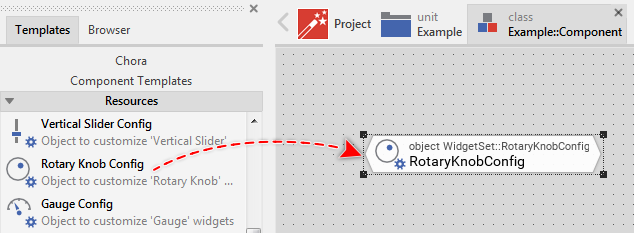
★Eventually name the new added Rotary Knob Config object.
Inspect the Rotary Knob Config object
As long as the Rotary Knob Config object is selected you can inspect and modify its properties conveniently in the Inspector window as demonstrated with the property CoverActive in the screenshot below:
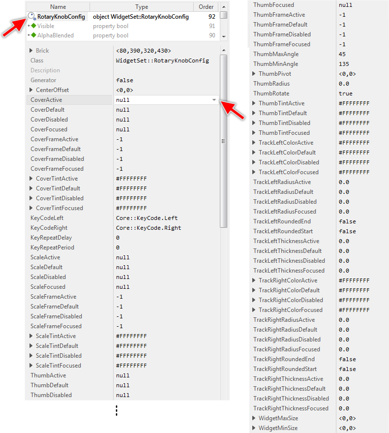
This is in so far worth mentioning as the following sections describe diverse features of the Rotary Knob Config object by explicitly referring to its corresponding properties. If you are not familiar with the concept of a property and the usage of Inspector window, please read first the preceding chapter Compositing component appearance.
Specify bitmaps and colors for the Rotary Knob's scale image
As explained in the section above the Scale view occupies the background of every Rotary Knob. With the following properties you specify the bitmap resources as well as other parameters to be used by this view depending on the widget's actual state:
Property |
Description |
|---|---|
With these properties you specify the bitmap resource the Rotary Knob has to display in its background Scale view. You have to specify the bitmaps individually for every possible widget state. If you leave one property initialized with the value null, the background remains empty (transparent) as long as the widget is in the corresponding state. |
|
These properties are relevant only if the bitmap resource specified in the corresponding above described property ScaleDefault, ScaleActive, ScaleFocused or ScaleDisabled contains more than one frame. In such case you use them to determine the desired frame number. Is one of the bitmaps additionally configured as containing an animated sequence you can initialize the corresponding ScaleFrame... property with the value -1 to instruct the Rotary Knob to automatically play the animation as long as the widget remains in this state. |
|
The effect of these four properties depends on the type of the bitmap resource specified in the corresponding above described property ScaleDefault, ScaleActive, ScaleFocused or ScaleDisabled. In case of alpha-only bitmaps you use the properties to determine the colors to tint the bitmaps. In all other cases you can use the alpha value of the corresponding ScaleTint... property to simply modulate the opacity of the affected bitmap. |
The specified bitmaps are displayed centered vertically and horizontally within the Rotary Knob's area. If the bitmaps are larger than the available area, the bitmaps are simply clipped at the edges of the Rotary Knob.
If you leave all four properties ScaleDefault, ScaleActive, ScaleFocused and ScaleDisabled initialized with null, the Rotary Knob will appear without any background.
Specify the radius, thickness and colors for the Rotary Knob's left track
As explained in the section above the TrackLeft view displays a circle segment between the thumb's leftmost position (seen clockwise) and its actual position. From this results the effect of a circular track behind the thumb. With the following properties you specify the thickness, radius, color and other parameters to be used by this view depending on the widget's actual state. In other words, you use them to configure the appearance of the track displayed on the left of the widget's thumb:
Property |
Description |
|---|---|
With these properties you specify the thickness in pixel for the circle segment displayed in the background view TrackLeft. You have to specify the thickness individually for every possible widget state. If you leave one property initialized with the value 0.0, the view remains empty (transparent) as long as the widget is in the corresponding state. |
|
With these properties you specify the radius in pixel for the circle segment. You have to specify the radius individually for every possible widget state. Per default, the center of the circle segment corresponds to the center of the Rotary Knob itself. |
|
With these properties you specify the color to tint the circle segment. You have to specify the colors individually for every possible widget state. |
|
This property determines an optional displacement in pixel between the center of the Rotary Knob and the center of the displayed circle segment. Please note, modifying this property affects also the position of the thumb and the right track. |
|
With these properties you configure whether the circle segment should start/end with a flat or rounded cap. |
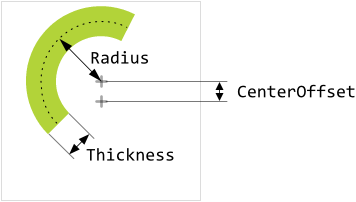
The track is displayed as a circle segment with thickness, radius and color specified in the above described properties (for example TrackLeftThicknessActive, TrackLeftRadiusActive and TrackLeftColorActive). The center of the circle corresponds per default to the center of the Rotary Knob itself. If necessary, you can specify an additional displacement in the property CenterOffset. The following figure demonstrates the effect of these properties (the gray thin border indicates the area of the Rotary Knob widget):
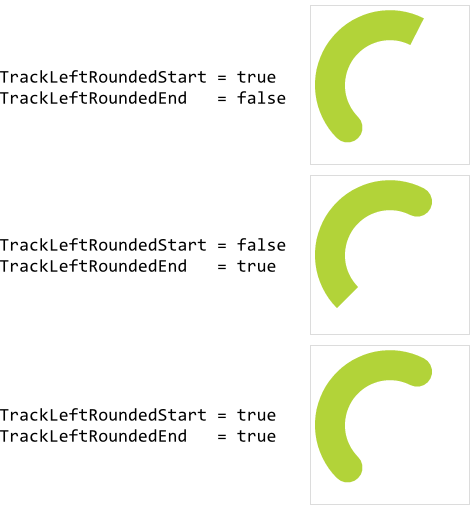
Per default, the circle segment is displayed with flat caps. If you initialize the property TrackLeftRoundedStart with the value true, the cap at the start of the segment (at the position corresponding to the leftmost thumb's position) will appear rounded. Similarly, initializing the property TrackLeftRoundedEnd with true will cause the cap at the end of the track (at the position corresponding to the actual thumb's position) to appear rounded. The following figure demonstrates the effect of these properties:
If you leave all four properties TrackLeftThicknessDefault, TrackLeftThicknessActive, TrackLeftThicknessFocused and TrackLeftThicknessDisabled initialized with 0.0, the Rotary Knob will appear without any track on the left side (seen clockwise) of the thumb.
Specify the radius, thickness and colors for the Rotary Knob's right track
As explained in the section above the TrackRight view displays a circle segment between the thumb's actual position and its rightmost position (seen clockwise). From this results the effect of a circular track behind the thumb. With the following properties you specify the thickness, radius, color and other parameters to be used by this view depending on the widget's actual state. In other words, you use them to configure the appearance of the track displayed on the right of the widget's thumb:
Property |
Description |
|---|---|
With these properties you specify the thickness in pixel for the circle segment displayed in the background view TrackRight. You have to specify the thickness individually for every possible widget state. If you leave one property initialized with the value 0.0, the view remains empty (transparent) as long as the widget is in the corresponding state. |
|
With these properties you specify the radius in pixel for the circle segment. You have to specify the radius individually for every possible widget state. Per default, the center of the circle segment corresponds to the center of the Rotary Knob itself. |
|
With these properties you specify the color to tint the circle segment. You have to specify the colors individually for every possible widget state. |
|
This property determines an optional displacement in pixel between the center of the Rotary Knob and the center of the displayed circle segment. Please note, modifying this property affects also the position of the thumb and the left track. |
|
With these properties you configure whether the circle segment should start/end with a flat or rounded cap. |
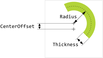
The track is displayed as a circle segment with thickness, radius and color specified in the above described properties (for example TrackRightThicknessActive, TrackRightRadiusActive and TrackRightColorActive). The center of the circle corresponds per default to the center of the Rotary Knob itself. If necessary, you can specify an additional displacement in the property CenterOffset. The following figure demonstrates the effect of these properties (the gray thin border indicates the area of the Rotary Knob widget):
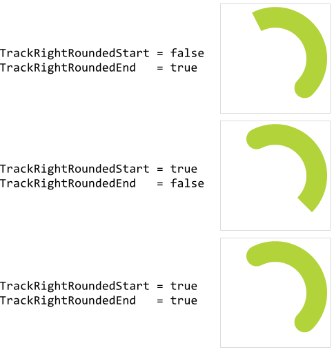
Per default, the circle segment is displayed with flat caps. If you initialize the property TrackRightRoundedStart with the value true, the cap at the start of the segment (at the position corresponding to the actual thumb's position) will appear rounded. Similarly, initializing the property TrackRightRoundedEnd with true will cause the cap at the end of the track at the position corresponding to the rightmost thumb's position) to appear rounded. The following figure demonstrates the effect of these properties:
If you leave all four properties TrackRightThicknessDefault, TrackRightThicknessActive, TrackRightThicknessFocused and TrackRightThicknessDisabled initialized with 0.0, the Rotary Knob will appear without any track on the right side (seen clockwise) of the thumb.
Specify bitmaps and colors for the Rotary Knob's thumb image
As explained in the section above the Thumb view is displayed in the foreground of the widget. The view is rotated (per default around the center of the Rotary Knob's area) according to the widget's current value. With the following properties you specify the bitmap resources as well as other parameters to be used by this view depending on the widget's actual state. In other words, you use them to configure the appearance of the thumb image in the foreground of the widget:
Property |
Description |
|---|---|
With these properties you specify the bitmap resource the Rotary Knob has to display in its foreground Thumb view. You have to specify the bitmaps individually for every possible widget state. If you leave one property initialized with the value null, the thumb remains empty (transparent) as long as the widget is in the corresponding state. |
|
These properties are relevant only if the bitmap resource specified in the corresponding above described property ThumbDefault, ThumbActive, ThumbFocused or ThumbDisabled contains more than one frame. In such case you use them to determine the desired frame number. Is one of the bitmaps additionally configured as containing an animated sequence you can initialize the corresponding ThumbFrame... property with the value -1 to instruct the Rotary Knob to automatically play the animation as long as the widget remains in this state. |
|
The effect of these four properties depends on the type of the bitmap resource specified in the corresponding above described property ThumbDefault, ThumbActive, ThumbFocused or ThumbDisabled. In case of alpha-only bitmaps you use the properties to determine the colors to tint the bitmaps. In all other cases you can use the alpha value of the corresponding ThumbTint... property to simply modulate the opacity of the affected bitmap. |
|
This property determines the pivot position (the anchor) in all specified thumb bitmaps (ThumbDefault, ThumbActive, ThumbFocused and ThumbDisabled) around it these bitmaps should be rotated. The position is expressed in pixel relative to the top-left corner of the thumb bitmap. |
|
With this property you specify the radius in pixel for the circle segment determing the track along which the thumb should be moved. Per default, the center of the circle segment corresponds to the center of the Rotary Knob itself. |
|
This property controls whether the thumb image appears rotated or whether it is only moved along the circle segment determining the track for the thumb. The property can assume values true or false. |
|
This property determines an optional displacement in pixel between the center of the Rotary Knob and the center of the circle segment determining the track along which the thumb image is moved. Please note, modifying this property affects also the center position for the left and right tracks. |
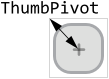
The specified bitmaps will appear rotated with an angle resulting from the widget's current value. This corresponds to the position where the left and right tracks join together. The thumb overlays this position. Per default, the thumb bitmaps are rotated around the center of the Rotary Knob itself with the pivot point found at the top-left corner of the respective bitmap.
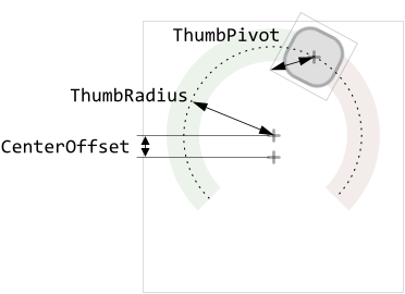
In practice, depending on the design of your widget, you will expect the bitmap to have another pivot point. You specify it in the property ThumbPivot as distance to the bitmap's top-left corner. We recommend to design the thumb bitmaps as if they were not rotated (0° degree relative to the positive X-axis). Then it is easy to determine the correct pivot point as well as the angles for the rotation range. The following figure demonstrates this aspect (the thin gray border indicates the area of the thumb bitmap):
With the property ThumbRadius you specify the radius of a circle segment along which the thumb is moved. The center position of the circle corresponds per default to the center of the Rotary Knob widget. If necessary, you can also specify an additional displacement for the center position in the property CenterOffset. Accordingly, the thumb has not necessarily to be rotated around the center of the widget. The following figure demonstrates the effect of the involved properties (the thin gray borders indicate the area of the Rotary Knob and the thumb bitmap):
Per default the thumb image is moved along the circle segment and rotated accordingly to its actual position. With the property ThumbRotate you can explicitly suppress the rotation. If you initialize ThumbRotate with false, the thumb image is only moved along the circle segment without being rotated itself:

If you leave all four properties ThumbDefault, ThumbActive, ThumbFocused and ThumbDisabled initialized with null, the Rotary Knob will appear without any thumb. In this case, the length of the left and/or right tracks express the widget's actual position.
Specify the rotation range for the Rotary Knob
To work correctly, the Rotary Knob needs to know the range in which the user may rotate the thumb. This range is expressed in degree counterclockwise relative to the positive X-axis by specifying the leftmost and rightmost angles in the respective properties ThumbMinAngle and ThumbMaxAngle:

The both specified rotation angles correspond to the values MinValue and MaxValue of the Rotary Knob's value range. Accordingly, while the user interacts with the widget or the widget's value changes, the thumb is rotated between the both angles. Please note, the value specified in the property ThumbMinAngle determines also the start position of the left track. Similarly, the property ThumbMaxAngle correlates with the end position of the right track. This is even true, if the Rotary Knob is configured to appear without any thumb. The specified angles determine thus the length of the left and right tracks.
Specify bitmaps and colors for the Rotary Knob's cover image
As explained in the section above the Cover view occupies the foreground of every Rotary Knob. Thus as its name indicates, it is intended to be used as a kind of cover, mask, etc. overlaying the thumb and the tracks. With the following properties you specify the bitmap resources as well as other parameters to be used by this view depending on the widget's actual state:
Property |
Description |
|---|---|
With these properties you specify the bitmap resource the Rotary Knob has to display in its foreground Cover view. You have to specify the bitmaps individually for every possible widget state. If you leave one property initialized with the value null, the foreground remains empty (transparent) as long as the widget is in the corresponding state. |
|
These properties are relevant only if the bitmap resource specified in the corresponding above described property CoverDefault, CoverActive, CoverFocused or CoverDisabled contains more than one frame. In such case you use them to determine the desired frame number. Is one of the bitmaps additionally configured as containing an animated sequence you can initialize the corresponding CoverFrame... property with the value -1 to instruct the Rotary Knob to automatically play the animation as long as the widget remains in this state. |
|
The effect of these four properties depends on the type of the bitmap resource specified in the corresponding above described property CoverDefault, CoverActive, CoverFocused or CoverDisabled. In case of alpha-only bitmaps you use the properties to determine the colors to tint the bitmaps. In all other cases you can use the alpha value of the corresponding CoverTint... property to simply modulate the opacity of the affected bitmap. |
The specified bitmaps are displayed centered vertically and horizontally within the Rotary Knob's area. If the bitmaps are larger than the available area, the bitmaps are simply clipped at the edges of the Rotary Knob.
If you leave all four properties CoverDefault, CoverActive, CoverFocused and CoverDisabled initialized with null, the Rotary Knob will appear without any foreground.
Configure how the Rotary Knob should react on touch events
Depending on the configuration of the Rotary Knob, the widget will handle touch events in different ways. Generally, the widget reacts on touch events when the user touches inside the area of the thumb image. Thereupon, when the user drags the finger, the thumb will follow. If the user touches outside the thumb, the widget simply ignores the events and nothing happens.
This behavior changes if you configure the widget to appear without any thumb (the above described property ThumbDefault and eventually ThumbFocused are null). In such case the user can touch elsewhere inside the widget's area and by simply dragging the finger modify its current value. With every alternation of the value, the widget will adjust the length of its left and right tracks (if these are configured) so that the user can notice the effect of the made interaction.
Configure how the Rotary Knob should react on keyboard events
The Rotary Knobs are not limited to be controlled only by using the touch screen. If a widget is actually focused the user can rotate its thumb by simply pressing dedicated keys on the keyboard or by using hardware buttons. The corresponding key codes are set per default to the values Core::KeyCode.Left and Core::KeyCode.Right. Accordingly, when the user presses the key Left the thumb is rotated in counterclockwise direction. If the user presses the key Right the thumb rotates in clockwise direction. With the properties KeyCodeLeft and KeyCodeRight you can determine another keys to be used for this purpose. Please see the section Configure the filter condition for more details how you select a key code.
With the further property KeyRepeatPeriod you can determine the speed, with it the widget should autonomously continue moving the thumb while the user holds the key pressed. The value of this property is expressed in milliseconds. For example, initializing KeyRepeatPeriod with 100 instructs the widget to behave as if the user repeats to press the key an average every 100 ms (ten times a second). Accordingly, the longer the user holds the key pressed the larger the movement of the thumb and the greater the change of the widget's value.
If your widgets are configured to use this key repetition mode, you can specify in the property KeyRepeatDelay the initial delay in milliseconds how long the widget has to wait before it will start to move the thumb autonomously. For example, if you initialize this property with 500 and the user presses the predetermined key to control the widget, the widget waits a half second. Then, if the user still holds the key pressed, the widget starts to move its thumb autonomously with the speed resulting from the property KeyRepeatPeriod.
If you don't want the key repetition mode, just initialize the property KeyRepeatPeriod with the value 0. If you want your Rotary Knobs to ignore any keyboard events, initialize the both properties KeyCodeLeft and KeyCodeRight with the value Core::KeyCode.NoKey. Such widgets will then react to touch screen events only. Please note, if you have configured your widgets to not be able to react to keyboard events, the widgets are also automatically suppressed from being able to become focused.
Configure the Rotary Knob size constraints
With the both properties WidgetMinSize and WidgetMaxSize you can configure size constraints for all Rotary Knobs using your configuration object. For example, if your Rotary Knobs can not become smaller than 100x50 pixel, initialize the property WidgetMinSize with the value <100,50>. Similarly, by initializing the property WidgetMaxSize you determine the maximum size the widgets may assume at the runtime. Trying to resize the widgets beyond the specified size constraints will be automatically suppressed.
Per default, the properties are initialized with the values <0,0> which means, that no constraints have to be taken in account. If desired, you can also specify constraints only for the width or the height of the widget. For example, if your widgets are flexibly resizable in the horizontal direction but they should have fixed height of 100 pixel, you initialize the both properties with the value <0,100>.
Modify provided default Rotary Knob Config objects
The above sections explained how you create and configure your own Rotary Knob Config objects practically from scratch. This is usual when you have your own GUI design. However, if you prefer to use the configurations provided per default with Embedded Wizard and you want only few settings to be changed, it is more convenient to create a copy of the existing configuration object and adapt the affected property only. Let's assume you want to use the WidgetSet::RotaryKnob_Large configuration but with different color for the left track. In such case do following:
★As explained in the section Duplicate an existing autoobject locate the object WidgetSet::RotaryKnob_Large and copy it to one of your own project units.
★Rename the just created copy to not confound it with the original object.
★As long as the copied object is selected you can inspect and modify its properties conveniently in the Inspector window. Change its property TrackLeftColorDefault, TrackLeftColorActive, TrackLeftColorFocused and TrackLeftColorDisabled now.
★Once you have adapted all properties as expected, you can assign the copied configuration object to every affected Rotary Knob.
CAUTION
Directly modifying the original configuration objects provided with Embedded Wizard is not recommended. The objects are part of the Mosaic framework and Embedded Wizard will prevent you from being able to save any modification made in this framework. Therefore always create and modify copies of the objects.