Working with Embedded Wizard: Configuring component layout
In the preceding chapter Compositing component appearance you learned how to assemble a GUI component from views or other embedded components. An important aspect in this context was the size of the Canvas area. This area determines implicitly the dimension of how instances of the GUI component will appear on the screen. When you create a new GUI component, e.g. a push button, you should thus in the first step adjust the size of the Canvas area so it assumes the dimension for the typical button in your application. This, of course, depends on your particular GUI design as well as on the available screen resolution.
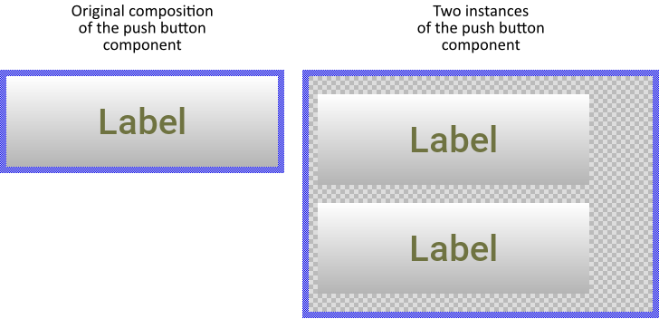
Then in the following step you will compose the appearance of the GUI component. You do this usually by filling the Canvas area with the desired views. For example, in case of a simple push button you can arrange a Filled Rectangle as the background of the button and a Text view as its label. The following screenshot demonstrates such composition. With this arrangement you have determined the default appearance and the default size of all instances you create later from this push button component:

When a component changes its size
The size of a GUI component is not necessarily fixed. Depending on the application case, instances of one and the same GUI component can be resized dynamically and individually. You can imagine, that you can adjust the size of push button according to the width of the displayed label. From this arises the question, how the instance of the button will react to its size alternation?
Per default, when the size of the component is reduced, the views existing inside it are simply clipped at the new edges of the component. In turn if the component is enlarged, the new exposed component areas appear empty and transparent. The following figure demonstrates two instances of a push button, one after being reduced and the other after being enlarged:

For every component you intend to resize, it is important that the implementation of the component does take care of the arrangement of all the views embedded inside it.
Configure the layout constraints
Every view provides a property Layout. With this property you configure conveniently how the view should react when the superior component is resized. The property Layout is declared as a set data type, which means that you can activate and deactivate the various layout options individually.
Primarily with the options you control the alignment between the edges of the view and the corresponding edges of the component. For example, activating the option AlignToRight will cause the view to maintain the originally defined distance between its own right edge and the right edge of the component area itself. The view seems to stick right aligned when the component is resized. If this option is not active, the distance is ignored.
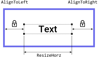
Secondarily you can determine whether the view itself is allowed to change its size vertically and/or horizontally. For example, with the active option ResizeHorz the affected view will adapt automatically its own width when the width of the component changes. How exactly the size does change depends in particular on the other Align... options configured in the Layout property. If the options AlignToLeft and AlignToRight are active, the view is resized so that its left and right edges keep constant distances to the component edges. The following figure demonstrates this:

If ResizeHorz is enabled without the associated Align... options, then the view is resized proportionally to the ratio between its own width and the width of the GUI component defined originally. Similarly, if you activate AlignToLeft and AlignToRight without enabling the ResizeHorz option, the component will pull on the view so it remains arranged with a proportionally equal distance to the both edges without changing the size of the view.
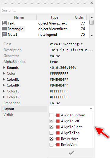
When you intend to configure the Layout property, the Inspector window supports you with an adequate Assistant window, where you can conveniently activate the desired layout options:
★First select the view (or several views) in question.
★In Inspector locate the property Layout.
★Show the Assistant window for the located property Layout.
★In the Assistant window activate the desired layout options and apply the changes:

Accordingly, in the above push button example, you can enabled all options in the Layout properties of the background Filled Rectangle and the label Text views. The both views will then stick at the edges of the component and will be resized when the component is resized. The following figure demonstrates two instances of a push button, one after being reduced and the other after being enlarged. Now, after being configured with their Layout properties the views do assume the push button area:

The following example demonstrates a GUI component containing various views configured with different options for their Layout properties. The component is resized with an animation so you can see and analyze how the embedded views react to the size changes of the superior component:
Please note, the example presents eventually features available as of version 8.10
Implement your own layout algorithm
The above described possibility to configure layout constraints is sufficient for many application cases. If you want the component to arrange the embedded views in a more intelligent way, you can implement your own layout algorithm. For this purpose the component's basis class Core::Group defines a method UpdateLayout. In your component you can override this method and implement there your particular functionality to arrange the views. With this approach you can even hide and show views depending on the size of the component.
The UpdateLayout method is called automatically by the Mosaic framework when the affected component is resized. You don't need or even you should not call this method directly. It is sufficient, that you override and implement the method. Usually, when you have created a new empty GUI component as described in Creating new components the component contains already the overridden UpdateLayout method.
★If your component doesn't contain the overridden UpdateLayout method, you have to override it first.
★Then you can open the method and ...
★... by using the Code Editor implement your desired layout algorithm.
For example, let's assume you want to implement a push button able to display an icon and a label text. Per default, as long as the push button is large enough the icon and the label should be arranged horizontally side by side. When the width of the button is reduced, the label should be arranged below the icon. Finally, if there is no space for both, the label disappears and the button displays the icon only. The following Chora code demonstrates the implementation of such UpdateLayout method:
// Always invoke the inherited version of the method. Note, the // parameter aSize contains the actual size of the GUI component. super( aSize ); // Get the size of the icon and label var point labelSize = Text.GetContentArea().size; var point iconSize = Image.Bitmap.FrameSize; var int32 margin = 10; // Is there enough space to arrange the icon and label // horizontally side by side? Take in account additional // margins between the views and the component edges. if (( aSize.x - iconSize.x - labelSize.x - ( 3 * margin )) >= 0 ) { // Calculate the positions for the icon and label. Both should // be centered vertically within the component. var point iconPos = point( margin, ( aSize.y - iconSize.y ) / 2 ); var point labelPos = point( margin, ( aSize.y - labelSize.y ) / 2 ); // Adjust the position for the label, so it appears on the right of // the icon labelPos.x = labelPos.x + iconPos.x + iconSize.x; // Now arrange the icon and the label at the calculated positions Image.Bounds = rect( iconPos, iconPos + iconSize ); Text.Bounds = rect( labelPos, labelPos + labelSize ); // In this case the label is visible Text.Visible = true; } // Or is there enough space to arrange the icon and the label // vertically one below the other? Again take additional margins // in account. else if (( aSize.y - iconSize.y - labelSize.y - ( 3 * margin )) >= 0 ) { // Calculate the positions for the icon and label. Both should // be centered horizontally within the component. var point iconPos = point(( aSize.x - iconSize.x ) / 2, margin ); var point labelPos = point(( aSize.x - labelSize.x ) / 2, margin ); // Adjust the position for the label, so it appears below the icon labelPos.y = labelPos.y + iconPos.y + iconSize.y; // Now arrange the icon and the label at the calculated positions Image.Bounds = rect( iconPos, iconPos + iconSize ); Text.Bounds = rect( labelPos, labelPos + labelSize ); // In this case the label is visible Text.Visible = true; } // Evidently, the button is too small for both the icon and the // label. Display the icon only centered within the button's area. else { // In this case, the entire area of the button is occupied by the // icon ... Image.Bounds = rect( <0,0>, aSize ); // ... and the label is not visible Text.Visible = false; }
The function of this implementation is demonstrated in the example below. Here the push button component is resized with an animation effect. Depending on its actual size, the button presents different layouts: with icon and label arranged horizontally, vertically, or even without the label:
Please note, the example presents eventually features available as of version 8.10
Layout and Touch Handler
Although Touch Handlers are not visible, they are arranged within the Canvas area exact as you do with any other view. Accordingly, every Touch Handler provides also its own Layout property. If necessary, you can configure the Handler to adjust its size and position so that it fits after the alternation of the component's size. Similarly, if you implement your own layout algorithm in the overridden UpdateLayout method you can arrange there the Touch Handlers as desired.
Outline Box
Layout specific aspects can also be handled by the Outline Box. You can consider it as a kind of container to manage other sibling views. The interesting aspect in this context is that the Outline Box can automatically arrange the views vertically and horizontally side by side. This is ideal to layout menus or toolbars containing items or buttons, etc. For more details see the description of the Outline Box.
