Creating components from templates: Gauge
With this template you can add a new Gauge component to your project. Gauge is a kind of virtual instrument intended to display values (e.g. voltage, speed, sound volume, etc.). The widget is not suitable to be controlled by the user interactively. If you are looking for such interactive component, please see Rotary Knob.
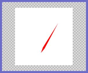
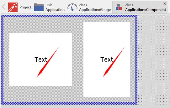
Components created with this template are intended to be adapted to your particular design expectations. After adding the new Gauge you should edit the component, change its appearance and if desired also its behavior. Once you have adapted the component, you can embed instances of this Gauge wherever you need in your GUI project. Because it serves as template, it is intentionally kept very simple. Nevertheless, Gauges created by the template are working widgets. If desired, they can already be used as they are. The following figure demonstrates the default appearance of the Gauge created by using the here described component template:
The approach with component templates has two functions. Primarily the templates should simplify the development of new components. Instead of creating the Gauge from scratch you can use the available template. The second function is more educative. The template implements fully working Gauge component you can investigate and learn about the corresponding programming aspects. The template is well documented. It contains annotations and inline comments with instructions helping you to understand how the component works and how it can be adapted to your particular needs.
This chapter provides an overview how the Gauge component template is used within your own application and how you adapt this component according to your particular needs. You will find here also further details concerning the internal implementation of the Gauge component.
Component templates versus ready-to-use widgets
Besides the here described Gauge component template, Embedded Wizard provides also a ready to use Gauge widget. It is finished implemented and ready to be used as it is. Within a certain limits, the appearance and partially also the behavior of the Gauge widget can be configured. The advantage of the approach is, that to customize it you don't need to write a single line of code. The flexibility of the provided widget, however, is limited by its implementation.
With the component template you are not limited. But you have to take care of the adaptation of the so created component. You have to write code. More deep understanding is required. Summarized, the ready to use widgets follow a convenient, simple but also limited approach where you don't need to write a single line of code. With the here described component templates you have to write code by which you are flexible to create very individual and sophisticated widgets. Which of the both approaches applies to you does depend on your application case. By understanding the differences in the both concepts you can select the optimal one.
Add new Gauge component
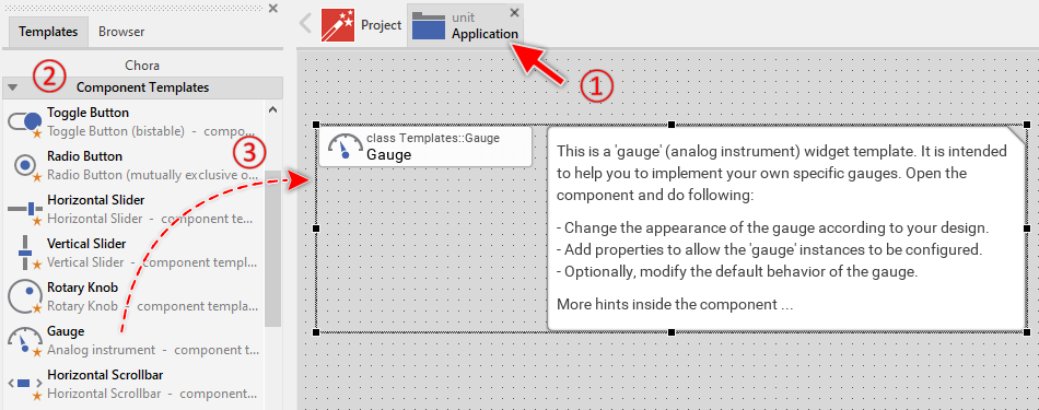
To create a new Gauge component from a template you simply Drag & Drop it between the Templates window and the Composer with an opened unit. This is important in that by using the component templates you add in fact a new class to your project. Classes, in turn, can exist within units only. The following are the typical steps to create a new Gauge component from a template:
★First switch to the Composer page for the respective unit, where you want to add the new Gauge component.
★Then ensure that the Templates window is visible.
★In Templates window switch to the folder Component Templates.
★In the folder locate the Gauge template.
★Drag & Drop the template into the Composer window:
★Eventually name the new added component.
The new created Gauge component appears accompanied by annotation providing helpful tips how to proceed. If undesired, you can select and delete the annotation.
Use the Gauge component
Once you have created the Gauge component, you can use it to assemble more complex components. Technically seen, you embed an instance of the Gauge class in-place within some superior GUI component. At the runtime, the superior GUI component takes care of the correct initialization and the displaying of all embedded components, so they appear similarly as you have composed them at the design time.
Step 1. Add new Gauge instance
The following are the typical steps to create a new instance of an already existing Gauge component:
★First switch to the Composer page for the respective GUI component, where you want to add the new Gauge.
★Then ensure that the Browser window is visible.
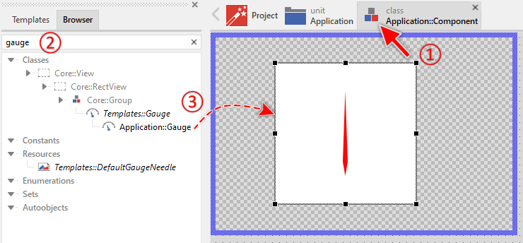
★Within the Browser locate the class of the previously created Gauge. This can be done easily with Browser's own filter function.
★Select the found class in the Browser window.
★Drag & Drop the selected class into the Composer area.
★Eventually name the new instance according to its function within the GUI component (e.g. MicrophoneVolume).
Component templates are intended to create widgets which can be modified and adapted to your particular design expectations. In the following sections you will learn how to do this. Originally, if not yet modified, the Gauge appears composed of an image representing the needle and a background filling the component. When the displayed value changes, the image is rotated. Our intention is to keep the component templates as minimalistic as possible so they don't distract you with less important design details.
Step 2. Inspect the Gauge instance
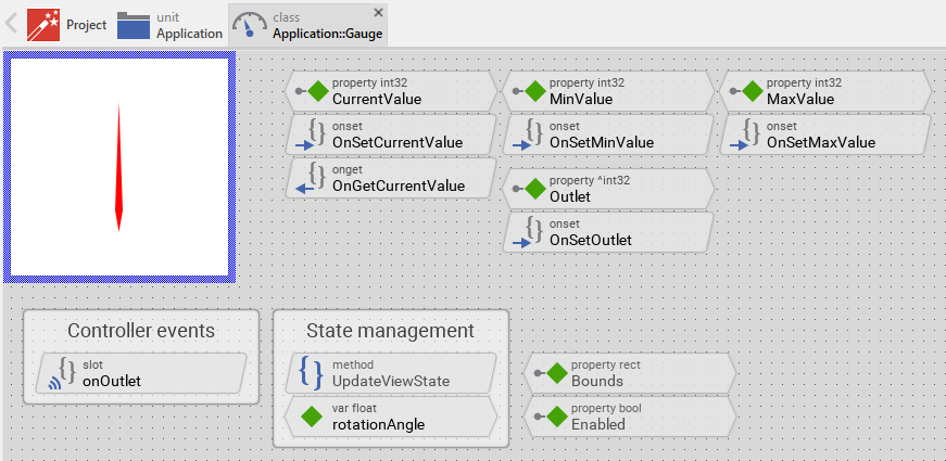
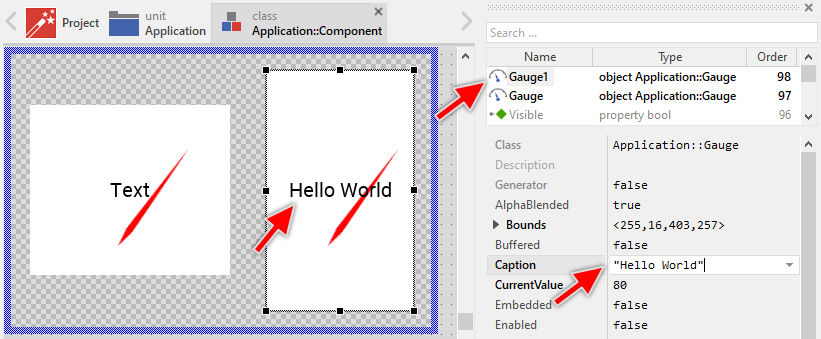
As long as the Gauge is selected you can inspect and modify its properties conveniently in the Inspector window as demonstrated with the property Bounds in the screenshot below. This is in so far worth mentioning as diverse features of the Gauge are controlled by the corresponding properties. If you are not familiar with the concept of a property and the usage of Inspector window, please read first the preceding chapter Compositing component appearance.
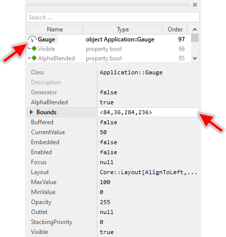
The Gauge component descends from the Mosaic class Core::Group. Consequently, most of the properties listed in the above screenshot are inherited from this base class. Particular to the Gauge are only few following properties:
Property |
Description |
|---|---|
CurrentValue |
The property CurrentValue stores the momentary value of the Gauge. This value corresponds to the actual rotation of the needle and it is limited automatically to the range specified by the properties MinValue and MaxValue. |
MaxValue |
The property MaxValue defines the maximum value for the widget's property CurrentValue. This corresponds to the value at the right end of the needle's rotation range. |
MinValue |
The property MinValue defines the minimum value for the widget's property CurrentValue. This corresponds to the value at the left end of the needle's rotation range. |
Outlet |
The property Outlet can refer to any other int32 property the widget should remain synchronized with. When the referred property is modified by other widget or by the application logic, the Gauge is automatically notified to remain in sync with the property. This approach follows the model-view-controller (MVC) programming paradigm, where the Gauge has the function of the view and the property referred via Outlet serves as model. See also Outlet properties. |
Step 3. Arrange the Gauge within the superior component
Once added to the component, you can freely move the Gauge instance, or you simply grab one of its corners and resize it in this way. You can control the position and the size of the component also by directly modifying its property Bounds. If you want the Gauge to appear behind other views you can reorder it explicitly.
Step 4. Determine the Gauge's value range and its current value
The Gauge is intended to display an integer value as position of a needle on a scale. This position corresponds to the widget's property CurrentValue. By evaluating this property you can simply query the value which is actually displayed in the affected widget. Accordingly, when you modify the property CurrentValue, the affected Gauge will implicitly update the position (the rotation) of its needle. For example:
// Evaluate the current value of the Gauge. if ( Gauge.CurrentValue > 80 ) ... [...] // Change the value of the Gauge. Gauge.CurrentValue = 50;
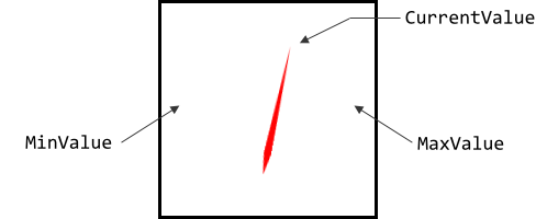
The possible value range for the property CurrentValue is determined by the both properties MinValue and MaxValue, whereby the value specified in the property MinValue corresponds to the leftmost position of the needle and the value of the property MaxValue to the rightmost position. Thus, the value of the property CurrentValue lies always between MinValue and MaxValue. The following figure demonstrates the relations between the three properties:
Step 5. Connect the Gauge with a data provider
To simplify the development of GUI applications, the Gauge implements a technique permitting you to connect it directly to a data provider. Once connected, the widget will remain in sync with the value stored actually in this provider. This technique corresponds to the model-view-controller (MVC) programming paradigm, where the Gauge has the function of the view and the associated data provider serves as model. If you associate in your application several Gauges and other widgets to one and the same data provider value, the underlying mechanisms will ensure, that after interacting with one widget all other affected Gauges do update their state automatically.
The connection between the Gauge and the data provider is established by assigning to the Gauge's property Outlet a reference to a property existing within the data provider and storing the interesting value. Since Gauge is intended to deal with integer values, the property suitable to be connected via reference to the Gauge has to be declared with int32 as its data type. Accordingly, the value of the referenced property corresponds to the Gauge's current value.
Summarized, after assigning a reference to an existing int32 property to the Gauge's own property Outlet, the widget adapts its own state to automatically correspond to the actual value of the associated property. You don't need to write a single line of code to benefit from this mechanisms. The aspects underlying this technique are explained in the sections Outlet properties and Notifications and Observer.
Open the component for editing
Component templates are intended to create widgets which can be adapted and enhanced to your particular design expectations. For this purpose, once you have added a new Gauge component to your project, you can open the component class for editing. Thereupon the implementation of the component appears in a new Composer page:
Originally, if not yet modified, the Gauge appears composed of an image (representing the needle) and a rectangle filling the background of the component. Our intention is to keep the component templates as minimalistic as possible so they don't distract you with less important design details. Especially the rotation of the needle image corresponds to widget's CurrentValue property.
This default functionality is implemented by following members belonging to the Gauge. These members are explicitly intended to be modified. Understanding this internal structure is thus the first step before you start to adapt the Gauge to your particular needs:
Icon |
Member |
Description |
|---|---|---|
|
CurrentValue |
The property CurrentValue stores the momentary value of the Gauge. This value corresponds to the actual rotation of the needle and it is limited automatically to the range specified by the properties MinValue and MaxValue. |
|
MinValue |
The property MinValue defines the minimum value for the widget's property CurrentValue. This corresponds to the value at the left end of the needle's rotation range. |
|
MaxValue |
The property MaxValue defines the maximum value for the widget's property CurrentValue. This corresponds to the value at the right end of the needle's rotation range. |
|
OnSetCurrentValue |
The onset method belongs to the property CurrentValue. Each time the value of the property is changed, the code implemented in the method is executed to update the rotation of the needle. |
|
OnGetCurrentValue |
The onget method belongs to the property CurrentValue. Each time the value of the property is evaluated within an expression, the code implemented in the method is executed to ensure that the returned value lies within the range specified in the properties MinValue and MaxValue. |
|
OnSetMinValue |
The onset method belongs to the property MinValue. Each time the value of the property is changed, the code implemented in the method is executed to update the rotation of the needle. |
|
OnSetMaxValue |
The onset method belongs to the property MaxValue. Each time the value of the property is changed, the code implemented in the method is executed to update the rotation of the needle. |
|
Outlet |
The property Outlet can refer to any other int32 property the widget should remain synchronized with. When the referred property is modified by other widget or the application logic, the Gauge is automatically notified to remain in sync with the property. This approach follows the model-view-controller (MVC) programming paradigm, where the Gauge has the function of the view and the property referred via Outlet serves as model. See also Outlet properties. |
|
OnSetOutlet |
The onset method belongs to the property Outlet. Each time a new property reference is assigned to Outlet, the code implemented in the method is executed to register the Gauge as observer for the referred property. |
|
onOutlet |
This internal slot method will receive a signal, if the value of the property referred by Outlet has been changed by another widget or by the application logic. In response to this notification, the Gauge will update its own CurrentValue property to reflect the new value of the referred property. |
|
Background |
This Filled Rectangle view displays in the template the background of the Gauge. The background is white per default. |
|
Needle |
This Warp Image view represents the needle. The image is rotated around a predetermined position. The rotation angle corresponds to CurrentValue within the range determined by the properties MinValue and MaxValue. |
|
UpdateViewState |
This method is invoked automatically after the state of the component has been changed. In case of the Gauge, the method updates the view Needle so it reflects the widget's current state. |
|
rotationAngle |
This variable stores the current state of the Gauge. Here it is the rotation angle of its needle. |


Understand the state management of the component
During its lifetime, the Gauge will assume different states. To track its current state the Gauge manages the above mentioned state variable: rotationAngle. The variable is evaluated and updated within the implementation of the method UpdateViewState. The following code snippet demonstrates the corresponding operations:
// The following variables determine the left/right end of the scale and are expressed // in degree. var float minAngle = 150.0; var float maxAngle = 30.0; var float newRotationAngle = minAngle; // Convert the gauge's current value to a rotation angle within the scale range // specified by minAngle .. maxAngle. if ( MaxValue != MinValue ) newRotationAngle = ( float( CurrentValue - MinValue ) * ( maxAngle - minAngle )) / float( MaxValue - MinValue ) + minAngle; [...] // Remember the new state rotationAngle = newRotationAngle;
Per default, the local variable rotationAngle stores the latest angle to rotate the needle. This angle correlates directly with the value of the property CurrentValue and the range specified by the properties MinValue and MaxValue. If CurrentValue is equal MinValue, the needle is rotated to the left end position. If CurrentValue is equal MaxValue, the needle is rotated to the right end position. All other intermediate values result in the needle rotation angle being interpolated linearly within this range of motion.
In this default implementation, the needle can rotate in the range between 150° and 30°. You can modify this default implementation and, for example, calculate with other angles. Let's assume you want to limit the rotation range of the needle to 90° between 135° and 45°. In such case, you would need to make following modifications in the Gauge component:
★In the method UpdateViewState change the initialization of the local variable minAngle and maxAngle according to the desired range:
var int32 minAngle = 135; var int32 maxAngle = 45;
If desired, you are free to add further state variables to your Gauge or even remove the existing functionality if it is not needed in your case. Let's assume, the Gauge should manage an overload state. The state would become true if CurrentValue exceeds a predetermined threshold value (e.g. 90% of the possible value range). If your application case requires the Gauge to distinguish this additional state, you do following:
★Add new variable to your Gauge component.
★Rename the variable to reflect the corresponding state, e.g. overload.
★Configure the data-type of the variable to bool.
★In the UpdateViewState method adapt the implementation as follows:
// The following variables determine the left/right end of the scale and are expressed // in degree. var float minAngle = 150.0; var float maxAngle = 30.0; var float newRotationAngle = minAngle; var bool isOverload = false; // Convert the gauge's current value to a rotation angle within the scale range // specified by minAngle .. maxAngle. Also estimate the 'overload' state. if ( MaxValue != MinValue ) { newRotationAngle = ( float( CurrentValue - MinValue ) * ( maxAngle - minAngle )) / float( MaxValue - MinValue ) + minAngle; // Estimate the new value for the state 'overload'. Here, the state is 'true' if // CurrentValue is greater than or equal to 90% of the possible value range: isOverload = ((( CurrentValue - MinValue ) * 10 ) / ( MaxValue - MinValue )) >= 9; } [...] // Remember the new state rotationAngle = newRotationAngle; overload = isOverload;
If you decide to enhance the Gauge by further states, please note that you will eventually need to explicitly request an invocation of the UpdateViewState method in order to update the component as effect of the state alternation. This is especially the case when the state alternation is triggered by some timer or any other external event. In your implementation you use for this purpose the method InvalidateViewState. How this work can be seen in the property CurrentValue. When new value is assigned to this property, its associated onset method OnSetCurrentValue is invoked. This method requests thus the invocation of UpdateViewState:
// Store the new value ... pure CurrentValue = value; // ... and finally, force an update. InvalidateViewState();
Thereupon the UpdateViewState method can handle the alternation of CurrentValue and update the variable rotationAngle accordingly. The alternation of the variable rotationAngle affects consequently the rotation of the angle.
Adapt the appearance of the component
Originally, if not yet modified, the Gauge appears composed of a rectangle and an image. The image represents the needle. It is rotated according to the gauge's CurrentValue property. Our intention is to keep the component templates as minimalistic as possible so they don't distract you with less important design details. It's up to you to adapt the widget to have the expected appearance. The available possibilities are explained in the following sections. Please note, that you can combine the different approaches according to your application case:
1. Modify existing views
The Gauge template contains per default the views Background and Needle. If desired, you can modify the views. For example, you can display them with other colors depending on the actual state of the widget. For this purpose you change the implementation of the above explained method UpdateViewState responsible for tracking the state alternations within the Gauge.
When you open the method UpdateViewState you will see that it does not only update the state variables but also updates the views existing within the component. Accordingly, depending on the actual state of the Gauge the rotation of the view Needle is adapted to correspond to the just calculated rotation angle:
[...] // Calculate the position where to pin the needle within the gauge area. // Per default, the needle is centered horizontally and vertically. var point needleSize = Needle.Bitmap.FrameSize; var point needlePivot = Needle.SourceAnchor; var point dstPos = point( Bounds.w / 2, ( Bounds.h - needleSize.y ) / 2 + needlePivot.y ); // Let the needle appear at the calculated position with the calculated // rotation angle. Needle.RotateAndScale( dstPos, newRotationAngle - 90.0, 1.0, 1.0 );
If desired, you can enhance this implementation and, for example, colorize the needle depending on its actual rotation. The needle could then appear green in the left section of the gauge and red in the right section. For this purpose you add following code to the method UpdateViewState:
// Colorize the needle according to its actual rotation angle. if ( newRotationAngle <= 90.0 ) Needle.Color = #FF0000FF; // <-- red color else Needle.Color = #00FF00FF; // <-- green color
Also possible: the above section explained how to enhance the component by new states (e.g. overload). If you have followed these steps, you can evaluate now this new state and depending on it colorize the Needle view. The needle will then appear red if the overload state is true:
// Colorize the needle according to widget's actual 'overload' state: if ( isOverload ) Needle.Color = #FF0000FF; // <-- red color else Needle.Color = #00FF00FF; // <-- green color
In its original version, the Needle view displays the bitmap Templates::DefaultGaugeNeedle. It is a very simple designed ALPHA8 bitmap which can be colorized at the runtime. The easiest way to modify the appearance of the Gauge is thus providing another bitmap. This can be even a bitmap imitating the appearance of a real needle. Following steps explain this task:
★By using a graphic editor (e.g. Photoshop Elements, GIMP, Affinity Designer, etc.) design an image of the desired needle. Store it as PNG file.
★Add the image file to your project as new bitmap resource.
★Open the Gauge component for editing.
★Select the view Needle.
★Assign the bitmap resource to the view's property Bitmap.
★Modify the view's property SourceAnchor. It determines the pivot point within the bitmap around which the bitmap is rotated.
★Eventually remove the constant - 90.0 or change it to another value in the following line of the UpdateViewState method. This constant determines an additional rotation to apply on the image, so it appears correctly aligned. Alternative approach would be to take in account the correct rotation already at the design time when you create the image file in the graphic editor:
// Let the needle appear at the calculated position with the calculated // rotation angle. Needle.RotateAndScale( dstPos, newRotationAngle - 90.0, 1.0, 1.0 );
★Adapt the calculation of the variable dstPos. This is the position within the Gauge component around which the needle will rotate. Per default, the position is centered, whereby in the vertical direction it is moved by the size of the needle:
var point needleSize = Needle.Bitmap.FrameSize; var point needlePivot = Needle.SourceAnchor; var point dstPos = point( Bounds.w / 2, ( Bounds.h - needleSize.y ) / 2 + needlePivot.y );
2. Remove existing views
If not needed, you can delete the per default existing views Background and Needle. Doing this, please don't forget to also remove all references to the deleted views from the implementation of the UpdateViewState method. Otherwise you will get error messages next time the Composer contents is reloaded. To avoid this error message we recommend to perform the steps in following order:
★In the UpdateViewState method verify the implementation to not refer anymore to the undesired view.
★Now you can delete the affected view.
3. Add further views to the component
You can add further views to your Gauge. For example, you can add a Text view to display some caption. Or you add an Image view to display an icon within the widget. The appearance of the views (e.g. colors) can be fixed, predetermined at the design time. Or it can change according to the actual state of the Gauge. For example, the text color can change according to the value displayed in the Gauge. Following steps explain the workflow:
★First add the desired view to the component. For example add a Text view.
★Name the just added view according to its function in the component. For example CaptionText.
★In order to arrange the view within the Gauge, move the view, or you simply grab one of its corners and resize it in this way. If you want the view to appear behind other views you can reorder it explicitly.
★In Inspector window configure the properties of the just added view. For example, in case of the Text view you can select the font to render the text.
★In the UpdateViewState method adapt the implementation to update the properties of the view according to the widget's current state. This can be, for example, the color of the Text view depending on the actual state of the widget. For this purpose you could add following code to the method:
if ( newRotationAngle < 90.0 ) CaptionText.Color = #FF0000FF; // red color else CaptionText.Color = #00FF00FF; // green color
Also possible: the above section explained how to enhance the component by new states (e.g. overload). If you have followed these steps, you can evaluate now this new state and depending on it colorize the text view. The text will then appear red if the overload state is true:
// Colorize the text according to widget's actual 'overload' state: if ( isOverload ) CaptionText.Color = #FF0000FF; // <-- red color else CaptionText.Color = #00FF00FF; // <-- green color
4. Replace existing views
Also possible, you can replace the existing views by other views. For example, in the original version, the Gauge displays the needle as a rotated image. To make the component more sophisticated, you could replace the here used Warp Image view by e.g. Filled Path view and so raster the needle as vector graphic. For this purpose:
★Think about which view is adequate as replacement for the old view existing per default in the component. An overview of existing views is found in the section Using Views.
★Delete the old view.
★Add the desired view to the component.
★Name the just added view to have the name of the previously removed view.
★Eventually move the view, or you simply grab one of its corners and resize it in this way. If you want the view to appear behind other views you can reorder it explicitly.
★If necessary, in Inspector window configure the properties of the just added view.
★If necessary, modify the implementation of other methods existing in the component if these evaluate/modify the properties of the replaced view.
Configure the layout of the component
The initial size of the Gauge is determined by the thick blue border surrounding the Canvas area. It corresponds to the size that all instances of this Gauge component will have by default. If desired, you can adjust the Canvas area and change this default size accordingly. This could be for example the case when you plan to create a large Gauge. For this purpose you click and drag the edges of the surrounding border (see also Resize the Canvas area). Once the size is changed, you can then adapt (move, resize) the views existing within the component. For example, to make the Gauge wider you adjust its right edge:
The resulting size of the Gauge, however, is not necessarily fixed. It can be adjusted for each component instance individually when the instance is arranged within a superior GUI component or it can change dynamically at the runtime. The GUI application can thus contain multiple instances of the Gauge, each with another size. From this arises the question, how the Gauge will react to its size alternation?
In case of the views existing per default in the Gauge template (e.g. Background), the views are automatically adjusted to fill the area of the widget. All other views you have eventually added later to the Gauge are not adjusted automatically.
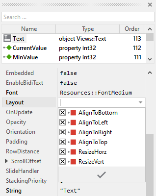
To control the adjustment you have to explicitly configure for each view its Layout property. (see also Configure component layout). Let's assume, in order to display some caption text you have added a Text view to the Gauge. Then you have arranged the view within the Canvas area according to your design expectation. If you want now that the view grows and shrinks according to size changes of the Gauge, you enable in the property Layout of this view following settings:
Now the Gauge knows how to react to its size changes. Each widget instance can have individual size and the enclosed views are automatically arranged within the available area:
Implement the interface of the component
When creating your own Gauge component you should ensure that instances of the widget can be configured to control all the features implemented in it. For example, if you have enhanced the component to display some caption text, you should allow this text to be specified individually for each instance. In this way several Gauge instances can exist at the same time, each displaying another caption.
To control the features in your component you use properties. A property can be understood as variable where the corresponding setting is stored, e.g. the caption text to display in the Gauge. When the value of the property changes, the component can react to it and update its appearance accordingly. The properties reflect thus the settings within your widget. Together they form the interface of the component.
Usually, each particular setting within a component is represented by the corresponding property. Thus, a Gauge where color and icon can be configured will require two properties: one for the color and one for the icon bitmap. In its original version, the Gauge contains already four properties CurrentValue, MinValue, MaxValue and Outlet. It allows the component instance to configure its actual state (the value and the value range) or to exchange data with the component. In order to enhance this interface by your own properties, following steps are necessary:
★Add a new property to the Gauge component.
★Name the property according to the setting it should represent. For example, the property intended to store the caption text could be named Caption.
★Determine the data type of the property. For example, the property intended to store the caption text will store a string.
★Determine the initialization value of the property. This value should correspond to the widget's default state. For example, the property intended to store the caption text should be initialized with exact the string the widget will display if no other text is specified (e.g. "Text").
★The property is accompanied by its onget method. Except particular cases, this method is not needed and can be deleted now.
★The property is accompanied by its onset method. Open this method for editing.
★Adapt the implementation of the onset method so it updates the Gauge according to its new value. For example, in case of the property intended to store the caption text, you will probably update some Text view where the caption is displayed:
// The value doesn't change - nothing to do. if ( pure Caption == value ) return; // Remember the property's new value. pure Caption = value; // Update the view to display the just modified caption. CaptionText.String = value;
That is all. Now when you deal with instances of the Gauge component, you can evaluate and modify the properties similarly to how you access variables. Especially, when an instance is selected, you see in Inspector window the property and can change it there. The modification is immediately visible in the Composer window:
If desired, the properties can also be modified at the runtime of your application. The caption, for example, can be adapted to provide useful information for the user concerning the corresponding operation. For this purpose you access and modify the affected property directly within Chora code:
var string engineName = ... // Let the Gauge display concrete details to the associated value. Gauge.Caption = "Engine: " + engineName;
Understand the Outlet updates
The Gauge can be connected via its property Outlet with any other int32 property the widget should remain synchronized with. When the referred property is modified by other widgets or by the application logic, the component is automatically notified to remain in sync with the property. This approach follows the model-view-controller (MVC) programming paradigm, where the Gauge has the function of the view and the property referred via Outlet serves as model. See also Outlet properties.
In order to react to alternations of the referred property (to receive notifications broadcasted by other widgets connected with the same property), the Gauge implements the method onOutlet. Each time the referred property is notified, this slot method is automatically invoked and following code is executed:
// Read the current value of the associated property and update accordingly // the state of the gauge. if ( Outlet != null ) CurrentValue = Outlet^;
In order to be invoked, the method onOutlet needs to be registered with the referred property as so-called observer. The corresponding code is implemented in the onset method OnSetOutlet. Thus, just in the moment when a property reference is assigned to the Gauge's Outlet property, following code is executed:
// Check if the new outlet differs from the currently used outlet if ( pure Outlet == value ) return; // Detach from the previous outlet if ( pure Outlet != null ) detachobserver onOutlet, pure Outlet; // Store the new outlet ... pure Outlet = value; // ... and attach to the new one if ( value != null ) attachobserver onOutlet, value; // Finally, retrieve the current state of the property associated via 'Outlet'. if ( value != null ) postsignal onOutlet;
Perform state changes with animations
In the section Adapt the appearance of the component you learned how state alternations within the Gauge are processed and how views existing in the component are updated in order to reflect the actual state. As example, when the property CurrentValue changes, the rotation of the needle is updated.
The default implementation performs such appearance updates instantly, just in the moment when the respective alternation took place. If desired, you can modify the Gauge to update its appearance with animations. Such Gauge can fade-in/out the views, modulate their colors, move the views within the component or rotate the needle smoothly. For this purpose you use the Animation Effects. With an Animation Effect you can animate a property of a view existing in the component.
The above section explained how to enhance the component by new states (e.g. overload). If you have followed these steps, you can evaluate now this new state and depending on it colorize the Needle view. The needle will then appear red if the overload state is true and green when it is false. If you want this color transition to be performed with an animation, following are the necessary steps:
★Depending on the data type of the property to animate, add the appropriate Animation Effect to the gauge. For example, to animate a color property, add a Pulse color effect.
★Connect the effect object with the property to animate. For example, if you want to animate the color of the Needle view, connect the Pulse color effect with the property Color of the Needle view.
★Configure the duration and eventually the desired timing (easing) for the animation.
★Once started, the effect will animate the property endlessly. In our case, however, the animation should stop at its end. For this purpose set the effect's property NoOfCycles to the value 1.
★Configure the key values for the animation. In case of the pulse color effect, it is the start and the end color. For example, to animate the color between green and red, configure the effect's property Value1 with the #00FF00FF (green) and the property Value2 with #FF0000FF (red). This step is appropriate if the key values are fixed, known at the design time. Otherwise, the key values must be set at runtime shortly before the effect is triggered.
★Open the method UpdateViewState and modify its implementation to trigger the effect object when the component switches between the states overload and not overload. For example in case of the above mentioned pulse color effect to animate the color of the Needle, following implementation could be adequate:
[...] var float newRotationAngle = ...; var bool isOverload = ...; [...] // Switching from not overload -> overload state. Start the animation. if ( isOverload && !overload ) { ColorEffect.Reversed = false; ColorEffect.Enabled = true; } // Switching from overload -> not overload state. Start the animation. else if ( !isOverload && overload ) { ColorEffect.Reversed = true; ColorEffect.Enabled = true; } [...] // Remember the new state rotationAngle = newRotationAngle; overload = isOverload;
★Since the properties of the affected views are now modified with animations, you will eventually need to adapt their initial values to correspond to the default state of the widget. For example, you might need to set the property Color of the view Needle to the value #00FF00FF (default color is green).
If desired, you can also animate the rotation of the needle, so it slides smoothly when the CurrentValue property changes. Usually you connect the effect object with the property to animate. In case of the here described needle animation, the rotation is not controlled by properties but by a dedicated method RotateAndScale. Therefore you have to implement some glue code between the effect object and the RotateAndScale method. The following are the steps how to do this:
★Add a Change float effect. This is because the needle rotation is expressed as a floating point value.
★Add a new slot method to the component.
★Assign the just added slot method to effect object's property OnAnimate. The effect will thereupon trigger the method while it is performing the animation.
★Implement the slot method with following code:
// Calculate the position where to pin the needle within the gauge area. // Per default, the needle is centered horizontally and vertically. var point needleSize = Needle.Bitmap.FrameSize; var point needlePivot = Needle.SourceAnchor; var point dstPos = point( Bounds.w / 2, ( Bounds.h - needleSize.y ) / 2 + needlePivot.y ); // Let the needle appear at the calculated position with the rotation angle // resulting from the animation effect. Needle.RotateAndScale( dstPos, FloatEffect.Value - 90.0, 1.0, 1.0 );
★Configure the duration and eventually the desired timing (easing) for the animation.
★Once started, the effect will run endlessly. In our case, however, the animation should stop at its end. For this purpose set the effect's property NoOfCycles to the value 1.
★Open the method UpdateViewState and remove the following code section to not rotate the Needle instantly. The rotation is controlled now by the animation effect implemented in a slot method explained above:
// REMOVE FOLLOWING CODE from the method UpdateViewState() var point needleSize = Needle.Bitmap.FrameSize; var point needlePivot = Needle.SourceAnchor; var point dstPos = point( Bounds.w / 2, ( Bounds.h - needleSize.y ) / 2 + needlePivot.y ); Needle.RotateAndScale( dstPos, newRotationAngle - 90.0, 1.0, 1.0 );
★The method UpdateViewState should trigger the effect object when the component switches the states. For example in case of the change float effect to animate the rotation of the Needle, following implementation should be added to the method in the place of the above removed code section:
[...] // If the needle rotation changes, start the effect to smoothly rotate // the needle between its actual and the new position. if ( newRotationAngle != rotationAngle ) { FloatEffect.Enabled = false; FloatEffect.Value1 = FloatEffect.Value; // <-- the latest angle FloatEffect.Value2 = newRotationAngle; FloatEffect.Enabled = true; } [...]