Creating components from templates: Graph
With this template you can add a new Graph component to your project. Graph is a component intended to collect and display data values as a curve. As such this widget is not suitable to be controlled by the user interactively. However, the Graph can be connected to a Slide Touch Handler and so permit an interactive scrolling of the displayed curve.
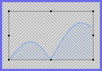
Components created with this template are intended to be adapted to your particular design expectations. After adding the new Graph you should edit the component, change its appearance and if desired also its behavior. Once you have adapted the component, you can embed instances of this Graph wherever you need in your GUI project. Because it serves as template, it is intentionally kept very simple. Nevertheless, Graphs created by the template are working widgets. If desired, they can already be used as they are. The following figure demonstrates the default appearance of the Graph created by using the here described component template:
The approach with component templates has two functions. Primarily the templates should simplify the development of new components. Instead of creating the Graph from scratch you can use the available template. The second function is more educative. The template implements fully working Graph component you can investigate and learn about the corresponding programming aspects. The template is well documented. It contains annotations and inline comments with instructions helping you to understand how the component works and how it can be adapted to your particular needs.
This chapter provides an overview how the Graph component template is used within your own application and how you adapt this component according to your particular needs. You will find here also further details concerning the internal implementation of the Graph component.
Add new Graph component
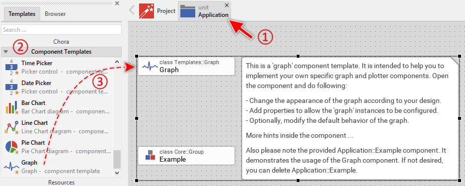
To create a new Graph component from a template you simply Drag & Drop it between the Templates window and the Composer with an opened unit. This is important in that by using the component templates you add in fact a new class to your project. Classes, in turn, can exist within units only. The following are the typical steps to create a new Graph component from a template:
★First switch to the Composer page for the respective unit, where you want to add the new Graph component.
★Then ensure that the Templates window is visible.
★In Templates window switch to the folder Component Templates.
★In the folder locate the Graph template.
★Drag & Drop the template into the Composer window:
In order to demonstrate the usage of the Graph component, the template includes an Example component. If not needed, just select and delete the Example class.
★Eventually name the new added component.
The new created Graph component appears accompanied by annotation providing helpful tips how to proceed. If undesired, you can select and delete the annotation.
Use the Graph component
Once you have created the Graph component, you can use it to assemble more complex components. Technically seen, you embed an instance of the Graph class in-place within some superior GUI component. At the runtime, the superior GUI component takes care of the correct initialization and the displaying of all embedded components, so they appear similarly as you have composed them at the design time.
Step 1. Add new Graph instance
The following are the typical steps to create a new instance of an already existing Graph component:
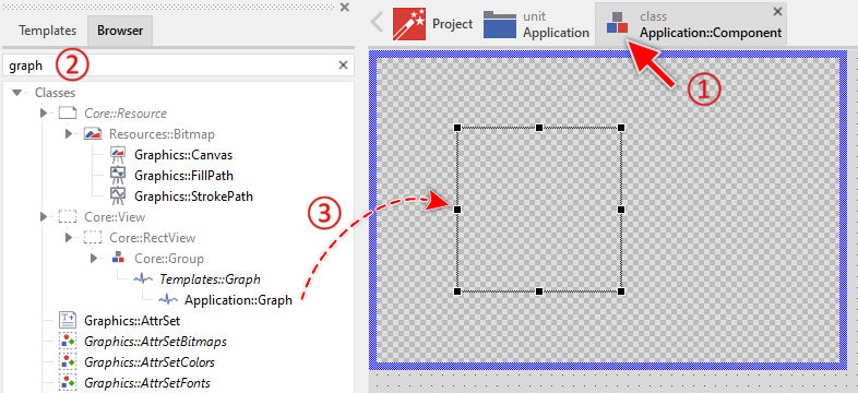
★First switch to the Composer page for the respective GUI component, where you want to add the new Graph.
★Then ensure that the Browser window is visible.
★Within the Browser locate the class of the previously created Graph. This can be done easily with Browser's own filter function.
★Select the found class in the Browser window.
★Drag & Drop the selected class into the Composer area.
★Eventually name the new instance according to its function within the GUI component.
Component templates are intended to create widgets which can be modified and adapted to your particular design expectations. In the following sections you will learn how to do this. Originally, if not yet modified, the Graph displays a curve stroked and filled with solid colors. Our intention is to keep the component templates as minimalistic as possible so they don't distract you with less important design details.
Please note, the just added graph is still empty (it does not contain any data). Therefore no curve is shown.
Step 2. Inspect the Graph instance
As long as the Graph is selected you can inspect and modify its properties conveniently in the Inspector window as demonstrated with the property Bounds in the screenshot below. This is in so far worth mentioning as diverse features of the Graph are controlled by the corresponding properties. If you are not familiar with the concept of a property and the usage of Inspector window, please read first the preceding chapter Compositing component appearance.
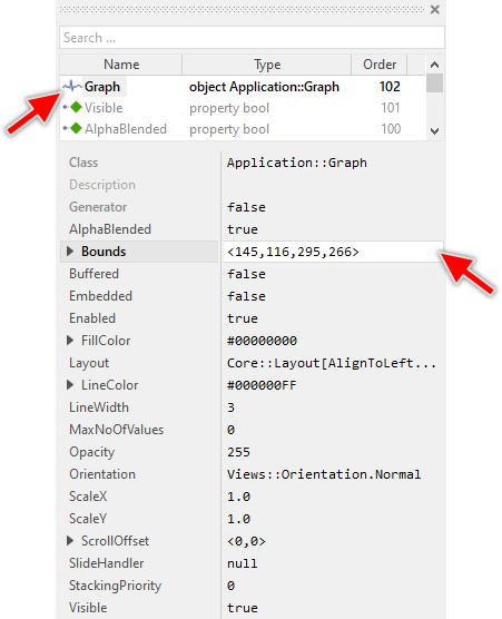
The Graph component descends from the Mosaic class Core::Group. Consequently, most of the properties listed in the above screenshot are inherited from this base class. Particular to the Graph are only few following properties:
Property |
Description |
|---|---|
FillColor |
The property FillColor stores the color to fill the shape determined by the line segments. |
LineColor |
The property LineColor stores the color to draw the line segments between the data values. |
LineWidth |
The property LineWidth stores the width of the drawn line segments expressed in pixel. |
MaxNoOfValues |
The property MaxNoOfValues determines the maximum number of data entries this graph component may store at the runtime. Trying to add more values will discard the oldest values and shift the entire graph accordingly. |
Orientation |
The property Orientation determines whether the graph should be displayed with normal or rotated orientation. |
ScaleX |
The property ScaleX determines the scaling factor in X-direction. |
ScaleY |
The property ScaleY determines the scaling factor in Y-direction. |
ScrollOffset |
The property ScrollOffset stores the displacement of the graph content. Changing of this property automatically causes the graph to move the displayed curves. |
SlideHandler |
The property SlideHandler provides an interface, where a Slide Touch Handler can be attached. In this manner the handler can control the graph and the user can scroll the graph content by simply touching the slide handler on the screen. |
Step 3. Arrange the Graph within the superior component
Once added to the component, you can freely move the Graph instance, or you simply grab one of its corners and resize it in this way. You can control the position and the size of the component also by directly modifying its property Bounds. If you want the Graph to appear behind other views you can reorder it explicitly.
IMPORTANT
Please note, this document is actually UNDER CONSTRUCTION. It is incomplete. We are working on it ...