Creating components from templates: Pie Chart
With this template you can add a new Pie Chart component to your project. Pie Chart is a component intended to display diagrams composed of slices. As such this widget is not suitable to be controlled by the user interactively.
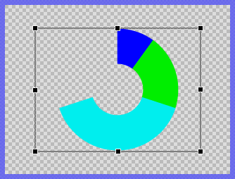
Components created with this template are intended to be adapted to your particular design expectations. After adding the new Pie Chart you should edit the component, change its appearance and if desired also its behavior. Once you have adapted the component, you can embed instances of this Pie Chart wherever you need in your GUI project. Because it serves as template, it is intentionally kept very simple. Nevertheless, Pie Charts created by the template are working widgets. If desired, they can already be used as they are. The following figure demonstrates the default appearance of the Pie Chart created by using the here described component template:
The approach with component templates has two functions. Primarily the templates should simplify the development of new components. Instead of creating the Pie Chart from scratch you can use the available template. The second function is more educative. The template implements fully working Pie Chart component you can investigate and learn about the corresponding programming aspects. The template is well documented. It contains annotations and inline comments with instructions helping you to understand how the component works and how it can be adapted to your particular needs.
This chapter provides an overview how the Pie Chart component template is used within your own application and how you adapt this component according to your particular needs. You will find here also further details concerning the internal implementation of the Pie Chart component.
Add new Pie Chart component
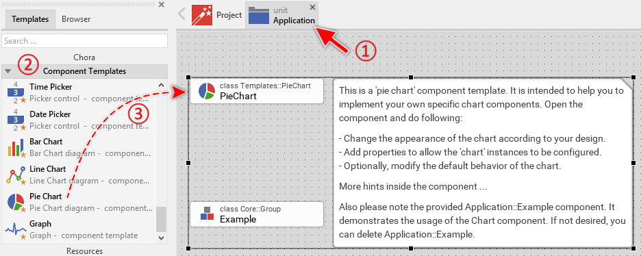
To create a new Pie Chart component from a template you simply Drag & Drop it between the Templates window and the Composer with an opened unit. This is important in that by using the component templates you add in fact a new class to your project. Classes, in turn, can exist within units only. The following are the typical steps to create a new Pie Chart component from a template:
★First switch to the Composer page for the respective unit, where you want to add the new Pie Chart component.
★Then ensure that the Templates window is visible.
★In Templates window switch to the folder Component Templates.
★In the folder locate the Pie Chart template.
★Drag & Drop the template into the Composer window:
In order to demonstrate the usage of the Pie Chart component, the template includes an Example component. If not needed, just select and delete the Example class.
★Eventually name the new added component.
The new created Pie Chart component appears accompanied by annotation providing helpful tips how to proceed. If undesired, you can select and delete the annotation.
Use the Pie Chart component
Once you have created the Pie Chart component, you can use it to assemble more complex components. Technically seen, you embed an instance of the Pie Chart class in-place within some superior GUI component. At the runtime, the superior GUI component takes care of the correct initialization and the displaying of all embedded components, so they appear similarly as you have composed them at the design time.
Step 1. Add new Pie Chart instance
The following are the typical steps to create a new instance of an already existing Pie Chart component:
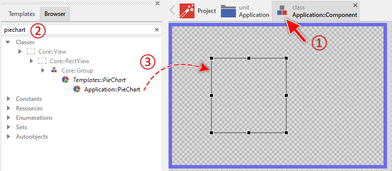
★First switch to the Composer page for the respective GUI component, where you want to add the new Pie Chart.
★Then ensure that the Browser window is visible.
★Within the Browser locate the class of the previously created Pie Chart. This can be done easily with Browser's own filter function.
★Select the found class in the Browser window.
★Drag & Drop the selected class into the Composer area.
★Eventually name the new instance according to its function within the GUI component.
Component templates are intended to create widgets which can be modified and adapted to your particular design expectations. In the following sections you will learn how to do this. Originally, if not yet modified, the Pie Chart displays the values as circle segments filled with solid colors. Our intention is to keep the component templates as minimalistic as possible so they don't distract you with less important design details.
Please note, the just added pie chart is still empty (it does not contain any data). Therefore no circle segments are shown.
Step 2. Inspect the Pie Chart instance
As long as the Pie Chart is selected you can inspect and modify its properties conveniently in the Inspector window as demonstrated with the property Bounds in the screenshot below. This is in so far worth mentioning as diverse features of the Pie Chart are controlled by the corresponding properties. If you are not familiar with the concept of a property and the usage of Inspector window, please read first the preceding chapter Compositing component appearance.
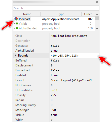
The Pie Chart component descends from the Mosaic class Core::Group. Consequently, most of the properties listed in the above screenshot are inherited from this base class. Particular to the Pie Chart are only few following properties:
Property |
Description |
|---|---|
Displacement |
The property Displacement stores the offset in pixel to move the slices away from the center of the chart. This results in the slices being separated. |
NoOfValues |
The property NoOfValues stores how many slices are currently managed within the chart component. This value should correspond to the number of data entries the chart presents to the user. |
OnLoadValue |
The property OnLoadValue should refer to a slot method, which will be invoked by the chart component in order to load the data for a given slice. Within the slot method the index of the affected slice can be accessed and its new value and color can be specified. For this purpose the variables Index, Value and Color should be used. |
Radius |
The property Radius specifies the outer radius of the pie slices. If this value is 0 (zero), the radius is calculated automatically from the bounds of the Pie chart GUI component. |
StartAngle |
The property StartAngle specifies the angle where the first slice starts. Changing this property has the effect of the entire chart being rotated. For example, in order to arrange the first slice at the clock position 12:00, initialize this property with the value -90. |
Width |
The property Width specifies the width of a ring (or donut). If this value is 0 (zero), the chart displays slices instead of rings. |
Step 3. Arrange the Pie Chart within the superior component
Once added to the component, you can freely move the Pie Chart instance, or you simply grab one of its corners and resize it in this way. You can control the position and the size of the component also by directly modifying its property Bounds. If you want the Pie Chart to appear behind other views you can reorder it explicitly.
IMPORTANT
Please note, this document is actually UNDER CONSTRUCTION. It is incomplete. We are working on it ...