Creating components from templates: List Box
With this template you can add a new List Box component to your project. List box is a widget the user can interact with in order to scroll a list of items and select an item from this list. To display the available items the List Box implements a list and list item components. When the user selects an item within the List Box, the component sends signals to associated slot methods where your particular implementation is executed. If the List Box is focused the component can also be controlled by pressing keys on the keyboard or by using hardware buttons.
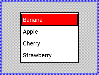
Components created with this template are intended to be adapted to your particular design expectations. After adding the new List Box you should edit the component, change its appearance and if desired also its behavior. Once you have adapted the component, you can embed instances of this List Box wherever you need in your GUI project. Because it serves as template, it is intentionally kept very simple. Nevertheless, List Boxs created by the template are working widgets. If desired, they can already be used as they are. The following figure demonstrates the default appearance of the List Box created by using the here described component template:
The approach with component templates has two functions. Primarily the templates should simplify the development of new components. Instead of creating the List Box from scratch you can use the available template. The second function is more educative. The template implements fully working List Box component you can investigate and learn about the corresponding programming aspects. The template is well documented. It contains annotations and inline comments with instructions helping you to understand how the component works and how it can be adapted to your particular needs.
This chapter provides an overview how the List Box component template is used within your own application and how you adapt this component according to your particular needs. You will find here also further details concerning the internal implementation of the List Box component.
Add new List Box component
To create a new List Box component from a template you simply Drag & Drop it between the Templates window and the Composer with an opened unit. This is important in that by using the component templates you add in fact a new class to your project. Classes, in turn, can exist within units only. The following are the typical steps to create a new List Box component from a template:
★First switch to the Composer page for the respective unit, where you want to add the new List Box component.
★Then ensure that the Templates window is visible.
★In Templates window switch to the folder Component Templates.
★In the folder locate the List Box template.
★Drag & Drop the template into the Composer window:
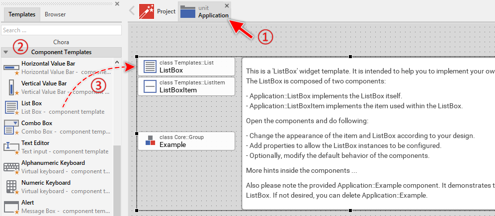
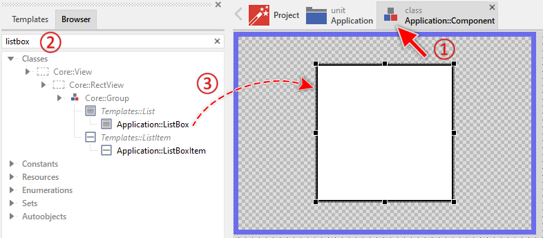
The List Box template is composed of multiple components: ListBox, ListBoxItem and Example. Here, the ListBoxItem component implements the appearance and the behavior of a single list box item. The ListBox component implements the list itself. For example, it takes care of scrolling and selecting the items. Finally, the Example component implements a simple example demonstrating the usage of the list box.
★If not needed, just select and delete the Example class.
★Eventually name the new added components ListBox and ListBoxItem.
The new created List Box component appears also accompanied by annotation providing helpful tips how to proceed. If undesired, you can select and delete the annotation.
Use the List Box component
Once you have created the List Box component, you can use it to assemble more complex components. Technically seen, you embed an instance of the List Box class in-place within some superior GUI component. At the runtime, the superior GUI component takes care of the correct initialization and the displaying of all embedded components, so they appear similarly as you have composed them at the design time.
Step 1. Add new List Box instance
The following are the typical steps to create a new instance of an already existing List Box component:
★First switch to the Composer page for the respective GUI component, where you want to add the new List Box.
★Then ensure that the Browser window is visible.
★Within the Browser locate the class of the previously created List Box. This can be done easily with Browser's own filter function.
★Select the found class in the Browser window.
★Drag & Drop the selected class into the Composer area.
★Eventually name the new instance according to its function within the GUI component (e.g. Options).
Component templates are intended to create widgets which can be modified and adapted to your particular design expectations. In the following sections you will learn how to do this. Originally, if not yet modified, the List Box appears as a white rectangle surrounded by a border. The list box items are displayed as text. Our intention is to keep the component templates as minimalistic as possible so they don't distract you with less important design details.
Please note, the just added list box is still empty. Therefore no items are shown.
Step 2. Inspect the List Box instance
As long as the List Box is selected you can inspect and modify its properties conveniently in the Inspector window as demonstrated with the property Bounds in the screenshot below. This is in so far worth mentioning as diverse features of the List Box are controlled by the corresponding properties. If you are not familiar with the concept of a property and the usage of Inspector window, please read first the preceding chapter Compositing component appearance.
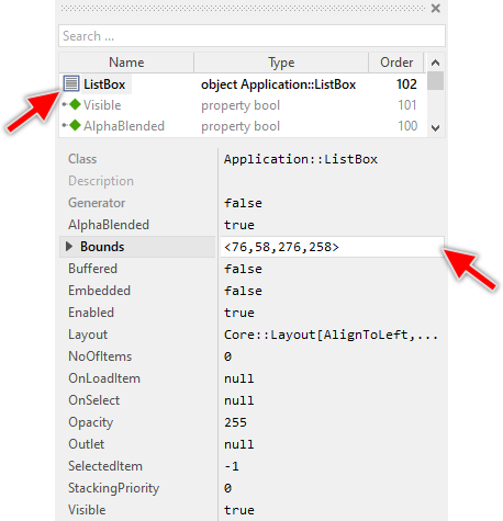
The List Box component descends from the Mosaic class Core::Group. Consequently, most of the properties listed in the above screenshot are inherited from this base class. Particular to the List Box are only few following properties:
Property |
Description |
|---|---|
NoOfItems |
The property NoOfItems stores how many items are currently managed within the ListBox. This value should correspond to the number of options the ListBox offers to the user. |
OnLoadItem |
The property OnLoadItem should refer to a slot method, which will be invoked by the ListBox in order to load an item with its corresponding content. Within the slot method the affected item can be accessed and initialized via variable View. |
OnSelect |
The property OnSelect can refer to a slot method, which will receive a signal each time the user has selected an item within the ListBox. Thereupon the method's logic will be executed. In the associated slot method you can evaluate SelectedItem to estimate which item has been selected. |
Outlet |
The property Outlet can refer to any other int32 property the widget should remain synchronized with. When the user selects an item, the affected property is automatically updated to reflect the item's number. On the other hand, when the referred property is modified by another component, the ListBox is automatically notified to remain in sync with the property. This approach follows the Model-View-Controller (MVC) programming paradigm. Here the ListBox represents the view and controller. The property referred via Outlet can be seen as a part of the model. See also Outlet properties. |
SelectedItem |
The property SelectedItem stores the index of the currently selected item or -1 if no item is selected. The first item has the index 0, the second 1, and so far. |
Step 3. Arrange the List Box within the superior component
Once added to the component, you can freely move the List Box instance, or you simply grab one of its corners and resize it in this way. You can control the position and the size of the component also by directly modifying its property Bounds. If you want the List Box to appear behind other views you can reorder it explicitly.
IMPORTANT
Please note, this document is actually UNDER CONSTRUCTION. It is incomplete. We are working on it ...