Creating components from templates: Radio Item
With this template you can add a new Radio Item component to your project. Radio Item is a simple widget the user can press in order to select an option within a list of available options. Each time the user interacts with the Radio Item, the component sends signals to associated slot methods where your particular implementation is executed. If the Radio Item is focused the component can also be controlled by pressing keys on the keyboard or by using hardware buttons. Generally menu items are used within menus only. Therefore when using a Radio Item you will also need to add at least one Menu component to your project.
Components created with this template are intended to be adapted to your particular design expectations. After adding the new Radio Item you should edit the component, change its appearance and if desired also its behavior. Once you have adapted the component, you can embed instances of this Radio Item wherever you need in your GUI project. Because it serves as template, it is intentionally kept very simple. Nevertheless, Radio Items created by the template are working widgets. If desired, they can already be used as they are.
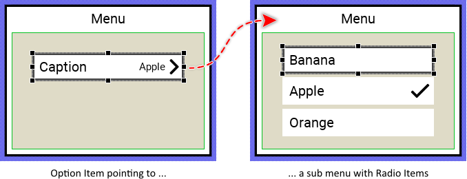
The following figure demonstrates the default appearance of the Radio Item created by using the here described component template. Please note, that Radio Items are used in sub menus containing the available options. The here described template includes also an additional Option Item which exists to refer the sub menu. When the user activates the Option Item, the corresponding sub menu is presented where the user can select the desired option:
The approach with component templates has two functions. Primarily the templates should simplify the development of new components. Instead of creating the Radio Item from scratch you can use the available template. The second function is more educative. The template implements fully working Radio Item component you can investigate and learn about the corresponding programming aspects. The template is well documented. It contains annotations and inline comments with instructions helping you to understand how the component works and how it can be adapted to your particular needs.
This chapter provides an overview how the Radio Item component template is used within your own application and how you adapt this component according to your particular needs. You will find here also further details concerning the internal implementation of the Radio Item component.
Add new Radio Item component
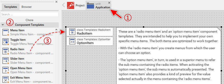
To create a new Radio Item component from a template you simply Drag & Drop it between the Templates window and the Composer with an opened unit. This is important in that by using the component templates you add in fact a new class to your project. Classes, in turn, can exist within units only. The following are the typical steps to create a new Radio Item component from a template:
★First switch to the Composer page for the respective unit, where you want to add the new Radio Item component.
★Then ensure that the Templates window is visible.
★In Templates window switch to the folder Component Templates.
★In the folder locate the Radio Item template.
★Drag & Drop the template into the Composer window:
The Radio Item template is composed of two components: RadioItem and OptionItem. The RadioItem is intended to create sub-menus containing all possible options the user can select from (like radio buttons). The OptionItem, in turn, is used in superior menus to refer to this sub menu and display which radio item is currently selected in the associated sub menu. When the user activates the option item, the associated sub menu is presented automatically. For more details concerning the relations between the option and the radio items, see the description at the beginning of this chapter.
★Eventually name the new added RadioItem and OptionItem components.
The new created Radio Item and Option Item components appear accompanied by annotation providing helpful tips how to proceed. If undesired, you can select and delete the annotation.
Use the Radio Item
Once you have created the Radio Item component, you can use it to assemble menu components. Technically seen, you embed an instance of the Radio Item class in-place within a superior Menu GUI component. At the runtime, the superior Menu GUI component takes care of the correct initialization, arrangement and the displaying of all embedded item components.
Please note, the Radio Item components are used to compose menus where the user makes the choice from available options. Such menus contain two or more Radio Items. The Option Item components, in turn, are used in superior menus to refer the sub menu containing the Radio Items. In such case the Option Items displays which Radio Item in the corresponding sub menu is actually selected. When the user activates the Option Item, the sub menu is presented and the user can now select other Radio Item.
Step 1. Add new Radio Item instance
The following are the typical steps to create a new instance of an already existing Radio Item component:
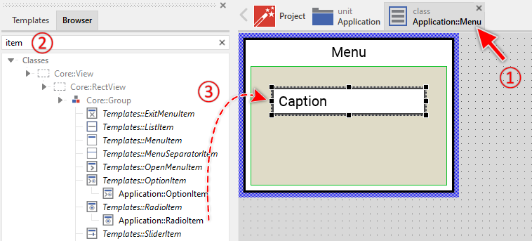
★First switch to the Composer page for the respective Menu GUI component, where you want to add the new Radio Item.
★Then ensure that the Browser window is visible.
★Within the Browser locate the class of the previously created Radio Item. This can be done easily with Browser's own filter function.
★Select the found class in the Browser window.
★Drag & Drop the selected class into the Composer area.
★Eventually name the new instance according to its function within the menu component.
Component templates are intended to create widgets which can be modified and adapted to your particular design expectations. In the following sections you will learn how to do this. Originally, if not yet modified, the Radio Item will appear as white rectangle with item caption text. Our intention is to keep the component templates as minimalistic as possible so they don't distract you with less important design details.
Step 2. Inspect the Radio Item instance
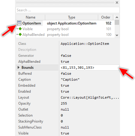
As long as the Radio Item is selected you can inspect and modify its properties conveniently in the Inspector window as demonstrated with the property Bounds in the screenshot below. This is in so far worth mentioning as diverse features of the Radio Item are controlled by the corresponding properties. If you are not familiar with the concept of a property and the usage of Inspector window, please read first the preceding chapter Compositing component appearance.
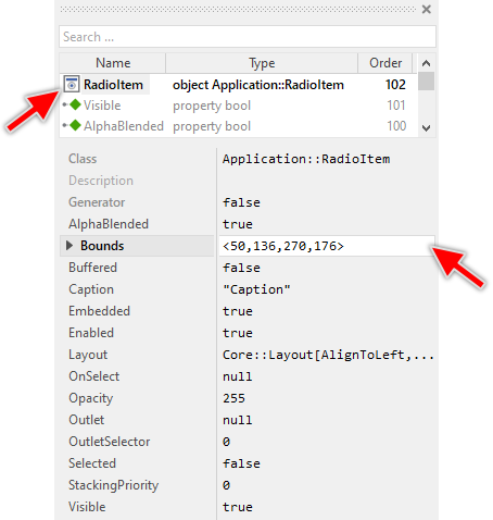
The Radio Item component descends from the Mosaic class Core::Group. Consequently, most of the properties listed in the above screenshot are inherited from this base class. Particular to the Radio Item are only few following properties:
Property |
Description |
|---|---|
Caption |
The property Caption stores the text to display within the item. |
OnSelect |
The property OnSelect can refer to a slot method, which will receive a signal as soon as the user has selected the radio item. Thereupon the method's logic will be executed. |
Outlet |
The property Outlet can refer to any other int32 property the item should remain synchronized with. When the user selects the radio item, the affected property is automatically updated to the value found in the property OutletSelector. On the other hand, when the referred property is modified by another component, the radio item is automatically notified to remain in sync with the property. The item appears selected, when the referred property has the value equal to OutletSelector. This approach follows the Model-View-Controller (MVC) programming paradigm. Here the radio item represents the view and controller. The property referred via Outlet can be seen as a part of the model. See also Outlet properties. |
OutletSelector |
The property OutletSelector contains a value identifying the radio item within a group of radio items. At the runtime, the item compares this value with the value of the property referred by Outlet and if both are equal, the radio item assumes the selected state (its property Selected is true). If the values are different, the radio item appears not selected. This selector is useful to build a group of radio item that refers to the same outlet. Different selectors for each radio item manages automatically the group of radio items. |
Selected |
The property Selected stores the current state of the radio item. As long as the property is false, the item should appear in the not-selected state. As long as the property is true, the item should appear in selected state. |
Step 3. Arrange the Radio Item within the Menu component
The position of the Radio Item doesn't matter. The Menu component will automatically arrange the items within its area and if necessary enlarge or reduce their size. Moreover, the size of the menu itself is adapted to the number and to the size of the enclosed items. This layout algorithm is part of the Menu component template. Consequently, when you move an item within the menu, it does not have any effect on its final position.
However, the order in which the items will be displayed at the runtime does correspond to the order in which the item objects are stored within the menu component. This is the order in which the items have been originally added. Consequently, the first added item appears at the top of the menu while the last added item is arranged at the end of the menu. See also the column Order in the members area of the Inspector window:
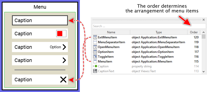
★If necessary you can reorder the item objects in the Inspector window to correspond to the order in which the items should appear in the menu.
Even if the position of an item doesn't matter, we recommend to move the item objects within the menu so you have a good overview of the items existing inside it. If the menu area is too small, you can enlarge it by clicking and dragging the thick blue Canvas border. Resizing the Canvas area of the menu manually has no effect on the final size of the menu. At the runtime the menu will adapt its size to the number and the size of the enclosed items.
Use the Option Item
Once you have created the Radio Item component, you can use its Option Item to assemble menu components. Technically seen, you embed an instance of the Option Item class in-place within a superior Menu GUI component. At the runtime, the superior Menu GUI component takes care of the correct initialization, arrangement and the displaying of all embedded item components.
Please note, the Option Item components are used in superior menus to refer a sub menu containing Radio Items. In such case the Option Items displays which Radio Item in the corresponding sub menu is actually selected. When the user activates the Option Item, the sub menu is presented and the user can now select other Radio Item.
Step 1. Add new Option Item instance
The following are the typical steps to create a new instance of an already existing Option Item component:
★First switch to the Composer page for the respective Menu GUI component, where you want to add the new Option Item.
★Then ensure that the Browser window is visible.
★Within the Browser locate the class of the previously created Option Item. This can be done easily with Browser's own filter function.
★Select the found class in the Browser window.
★Drag & Drop the selected class into the Composer area.

★Eventually name the new instance according to its function within the menu component.
Component templates are intended to create widgets which can be modified and adapted to your particular design expectations. In the following sections you will learn how to do this. Originally, if not yet modified, the Option Item will appear as white rectangle with item caption text and second text displaying the content of the actually selected Radio Item from the associated sub menu. The arrow image on the right indicates that a sub menu will be presented when the item is activated. Our intention is to keep the component templates as minimalistic as possible so they don't distract you with less important design details.
Step 2. Inspect the Option Item instance
As long as the Option Item is selected you can inspect and modify its properties conveniently in the Inspector window as demonstrated with the property Bounds in the screenshot below. This is in so far worth mentioning as diverse features of the Option Item are controlled by the corresponding properties. If you are not familiar with the concept of a property and the usage of Inspector window, please read first the preceding chapter Compositing component appearance.
The Option Item component descends from the Mosaic class Core::Group. Consequently, most of the properties listed in the above screenshot are inherited from this base class. Particular to the Option Item are only few following properties:
Property |
Description |
|---|---|
Caption |
The property Caption stores the text to display within the item. |
Outlet |
The property Outlet can refer to any other int32 property the item should remain synchronized with. When the user selects a Radio Item, the affected property is automatically updated to the value found in the item's property OutletSelector. On the other hand, when the referred property is modified by another component, the Option Item is automatically notified to remain in sync with the property. This approach follows the Model-View-Controller (MVC) programming paradigm. Here the item represents the view and controller and the property referred via Outlet can be seen as a part of the model. See also Outlet properties. |
Selection |
The property Selection stores a value representing the current selection. This corresponds to the value OutletSelector of the actually selected item. |
SubMenuClass |
The property SubMenuClass determines the class of the menu GUI component to create and present when the user activates the menu item. This menu should consist of Radio Menu items. |
Step 3. Arrange the Option Item within the Menu component
The position of the Option Item doesn't matter. The Menu component will automatically arrange the items within its area and if necessary enlarge or reduce their size. Moreover, the size of the menu itself is adapted to the number and to the size of the enclosed items. This layout algorithm is part of the Menu component template. Consequently, when you move an item within the menu, it does not have any effect on its final position.
However, the order in which the items will be displayed at the runtime does correspond to the order in which the item objects are stored within the menu component. This is the order in which the items have been originally added. Consequently, the first added item appears at the top of the menu while the last added item is arranged at the end of the menu. See also the column Order in the members area of the Inspector window:
★If necessary you can reorder the item objects in the Inspector window to correspond to the order in which the items should appear in the menu.
Even if the position of an item doesn't matter, we recommend to move the item objects within the menu so you have a good overview of the items existing inside it. If the menu area is too small, you can enlarge it by clicking and dragging the thick blue Canvas border. Resizing the Canvas area of the menu manually has no effect on the final size of the menu. At the runtime the menu will adapt its size to the number and the size of the enclosed items.
IMPORTANT
Please note, this document is actually UNDER CONSTRUCTION. It is incomplete. We are working on it ...