Creating components from templates: Menu
With this template you can add a new Menu component to your project. Menu is a complex component intended to manage and automatically arrange menu items. At the runtime the user can interact with the menu, scroll and activate the items. Please note that the items are available as separate component templates. When using the Menu component template in your project you will probably also add at least one Menu Item component. The following table provides an overview of the available Menu Item component templates:
Icon |
Template name |
Description |
|---|---|---|
|
Menu item is a simple widget the user can press in order to perform an action. Once you have added the menu item component to a unit, you can embed instances of this item wherever you edit a menu in your GUI project. |
|
|
Toggle item is a simple menu item widget the user can press in order to toggle a value. It is also suitable to serve as a 'check box item'. Once you have added the menu item component to a unit, you can embed instances of this item wherever you edit a menu in your GUI project. |
|
|
Radio item is a simple menu item widget the user can press in order select an option. Once you have added the menu item component to a unit, you can embed instances of this item wherever you edit a menu in your GUI project. |
|
|
Slider item is a simple menu item widget the user can interact with in order to change a number value by touching and dragging a knob. Once you have added the menu item component to a unit, you can embed instances of this item wherever you edit a menu in your GUI project. |
|
|
Open menu item is a simple menu item widget the user can press in order to enter a sub menu. Once you have added the menu item component to a unit, you can embed instances of this item wherever you edit a menu in your GUI project. |
|
|
Exit menu item is a simple menu item widget the user can press in order to leave the actual menu and return to the superior menu. Once you have added the menu item component to a unit, you can embed instances of this item wherever you edit a menu in your GUI project. |
|
|
Menu separator item is a very simple widget intended to separate menu items within a menu. As such the menu separator item doesn't react to user inputs. Once you have added the menu separator item component to a unit, you can embed instances of this item wherever you edit a menu in your GUI project. |


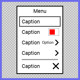
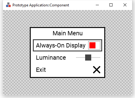
Components created with this template are intended to be adapted to your particular design expectations. After adding the new Menu you should edit the component, change its appearance and if desired also its behavior. Once you have adapted the component, you can embed instances of this Menu wherever you need in your GUI project. Because it serves as template, it is intentionally kept very simple. Nevertheless, Menus created by the template are working widgets. If desired, they can already be used as they are. The following figure demonstrates the default appearance of the Menu created by using the here described component template and diverse menu item templates:
The approach with component templates has two functions. Primarily the templates should simplify the development of new components. Instead of creating the Menu from scratch you can use the available template. The second function is more educative. The template implements fully working Menu component you can investigate and learn about the corresponding programming aspects. The template is well documented. It contains annotations and inline comments with instructions helping you to understand how the component works and how it can be adapted to your particular needs.
This chapter provides an overview how the Menu component template is used within your own application and how you adapt this component according to your particular needs. You will find here also further details concerning the internal implementation of the Menu component.
Add new Menu component
To create a new Menu component from a template you simply Drag & Drop it between the Templates window and the Composer with an opened unit. This is important in that by using the component templates you add in fact a new class to your project. Classes, in turn, can exist within units only. The following are the typical steps to create a new Menu component from a template:
★First switch to the Composer page for the respective unit, where you want to add the new Menu component.
★Then ensure that the Templates window is visible.
★In Templates window switch to the folder Component Templates.
★In the folder locate the Menu template.
★Drag & Drop the template into the Composer window:
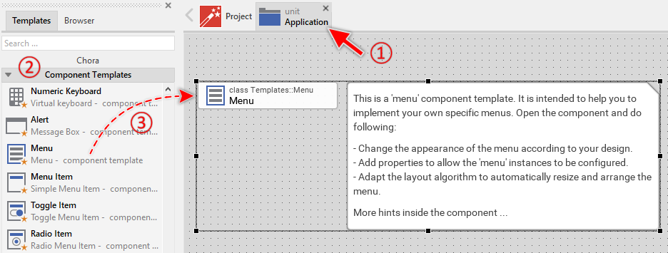
★Eventually name the new added component.
The new created Menu component appears accompanied by annotation providing helpful tips how to proceed. If undesired, you can select and delete the annotation.
Use the Menu component
Once you have created the Menu component, you can use it to assemble one or more application specific menus. From technical point of view, you fill the Menu component with all desired menu items. At the runtime, when the Menu component is presented to the user, the component takes care of correct displaying the items, handling user inputs and scrolling large menus containing many items.
Step 1. Subclassing the Menu component
Except very simple use cases, GUI applications implement more than one menu. Complex applications integrate an entire tree-like menu system composed of a top-level and several nested sub-level menus. When interacting with such menu system the user navigates between superior and sub menus forth and back conveniently. In more sophisticated use cases an application can even implement multiple separate context specific menu systems. In other words, an application may contain multiple menus, each containing a completely different set of menu items.
For reasons of efficiency and reusability it is less recommended to create the individual menus each as a separate copy of the Menu component template. Instead, consider the once created Menu component as a generic, common menu implementation. The individual menus (e.g. MainMenu, SettingsMenu, NetworkMenu, VideoMenu, EngineMenu, etc.) are just components descending from the generic Menu component. In this manner, the implementation of the Menu component is not duplicated. Nevertheless, the descending menu components inherit the common implementation and all menus appear and behave equally. See also Subclassing components.
The following are the typical steps to create a new component by deriving it from the already existing, generic Menu component. Please note, since components are classes they can exist within units only:
★First switch to the Composer page for the respective unit, where you want to add the derived menu component.
★Then ensure that the Browser window is visible.
★Within the Browser locate the class of the previously created Menu. This can be done easily with Browser's own filter function.
★Select the found class in the Browser window.
★Press and hold the keys CtrlShift.
★Drag & Drop the selected class into the Composer area.
★Release the keys CtrlShift.
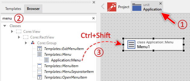
★Eventually name the new component according to its function within the menu system (e.g. MainMenu).
You can repeat the above steps for all individual menus you plan to implement in your application. Each derived menu component appears in the unit as a separate brick. From technical point of view it is a separate class descending from the common Menu component class.
Step 2. Fill the menu with menu items
The following are the typical steps to fill a menu with menu items. Technically seen, you embed an instance of the item class in-place within a superior menu component. At the runtime, the menu component takes care of the correct initialization, arrangement and the displaying of all embedded item components:
★First switch to the Composer page for the respective menu component, where you want to add the items (e.g. MainMenu component).
★Then ensure that the Browser window is visible.
★Within the Browser locate the class of the desired item, e.g. the class ToggleItem. This can be done easily with Browser's own filter function. An overview of the available item types is found the table at the beginning of this chapter.
★Select the found class in the Browser window.
★Drag & Drop the selected class into the Composer area.
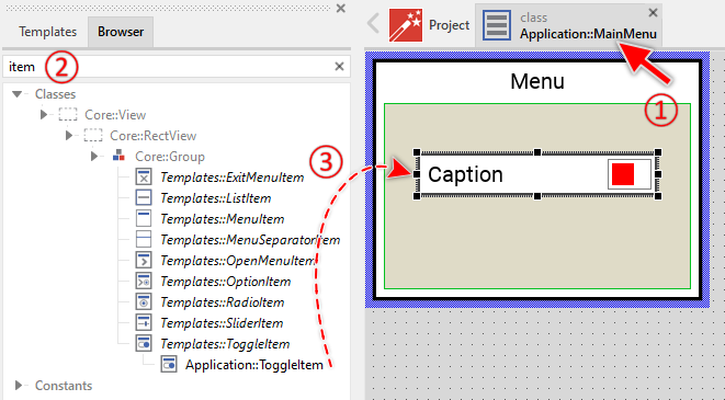
★Eventually name the new item instance according to its function within the menu component.
★Eventually modify the properties of the item (e.g. you can change its Caption property, etc.).
★You can repeat the above steps for all required items.
Step 3. Arrange the items within the menu component
The position of the items doesn't matter. The Menu component will automatically arrange the items within its area and if necessary enlarge or reduce their size. Moreover, the size of the menu itself is adapted to the number and to the size of the enclosed items. This layout algorithm is part of the Menu component template. Consequently, when you move an item within the menu, it does not have any effect on its final position.
However, the order in which the items will be displayed at the runtime does correspond to the order in which the item objects are stored within the menu component. This is the order in which the items have been originally added. Consequently, the first added item appears at the top of the menu while the last added item is arranged at the end of the menu. See also the column Order in the members area of the Inspector window:
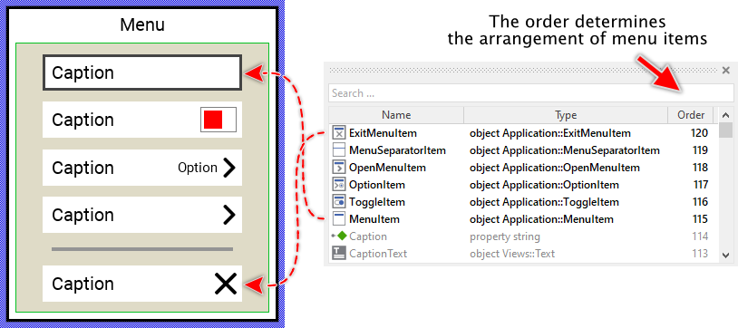
★If necessary you can reorder the item objects in the Inspector window to correspond to the order in which the items should appear in the menu.
Even if the position of an item doesn't matter, we recommend to move the item objects within the menu so you have a good overview of the items existing inside it. If the menu area is too small, you can enlarge it by clicking and dragging the thick blue Canvas border. Resizing the Canvas area of the menu manually has no effect on the final size of the menu. At the runtime the menu will adapt its size to the number and the size of the enclosed items.
Step 4. Present the Menu
The usual approach is to present menus programmatically as so-called dialogs. The following code demonstrates how to achieve this. It creates an instance of the concrete menu component (e.g. Application::MainMenu) and presents it as dialog using the method PresentDialog():
// Create a new instance of the menu component ... var Application::MainMenu menu = new Application::MainMenu; // ... and present it as dialog. rootthis.PresentDialog( menu, null, null, null, null, null, null, null, null, false );
Component templates are intended to create widgets which can be modified and adapted to your particular design expectations. In the following sections you will learn how to do this. Originally, if not yet modified, the Menu appears as a white rectangle surrounded by a border and displaying a caption text. Additionally all items existing within the menu are automatically arranged from top to bottom. Our intention is to keep the component templates as minimalistic as possible so they don't distract you with less important design details:
Step 2. Arrange the Menu on the screen
When using the above described PresentDialog() method, the menu is arranged in the center of the superior GUI component. In case of rootthis it is the center of the entire screen. If desired, you can provide in the second parameter of the PresentDialog() method a transition object configured to apply other layout rules to the presented dialog. The transition objects also permit you to display the Menu with additional animations (e.g. sliding). For more details see the section Customize provided Dialog transition animations.
IMPORTANT
Please note, this document is actually UNDER CONSTRUCTION. It is incomplete. We are working on it ...