Using Views: Wallpaper
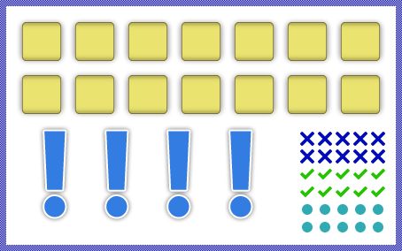
The Mosaic class Views::Wallpaper implements a graphical object specialized to fill a rectangular area with multiple copies (tiles) of an image. This so-called Wallpaper view can be used to compose the appearance of a GUI component, in particular to fill its background area. The following screenshot demonstrates few examples of how Wallpaper views appear in the canvas area of Composer (and accordingly on the screen in your target device):

The following sections are intended to provide you an introduction and useful tips of how to work with the Wallpaper view. For the complete reference please see the documentation of the Views::Wallpaper class.
Add new Wallpaper view
To add a new Wallpaper view just at the design time of a GUI component do following:
★First ensure that the Templates window is visible.
★In Templates window switch to the folder Views.
★In the folder locate the template Wallpaper.
★Drag & Drop the template into the canvas area of the Composer window:

★Eventually name the new added Wallpaper view.
Inspect the Wallpaper view
As long as the Wallpaper view is selected you can inspect and modify its properties conveniently in the Inspector window as demonstrated with the property Bounds in the screenshot below:

This is in so far worth mentioning as all following sections describe diverse features of the Wallpaper view by explicitly referring to its corresponding properties. If you are not familiar with the concept of a property and the usage of Inspector window, please read first the preceding chapter Compositing component appearance.
Arrange the Wallpaper view
Once added, you can freely move the Wallpaper view, or you simply grab one of its corners and resize it in this way. You can control the position and the size of the view also by directly modifying its property Bounds. If you want the Wallpaper view to appear behind other views you can reorder it explicitly.
Specify the bitmap for the Wallpaper view
The content to display within a Wallpaper view is determined by its property Bitmap. Usually, you initialize this property with the name of an existing bitmap resource member, which is typical for all immutable contents like, screen backgrounds and any other decorations well known already at the design time. With the Inspector Assistant you can conveniently select the right resource when you edit the initialization expression for the property Bitmap.
From technical point of view, you can initialize the property Bitmap with any instance of a class descended from the Mosaic class Resources::Bitmap. In particular, you can use an instance of the Resources::ExternBitmap class if you want to display bitmap contents, you have e.g. received just at the runtime. Or you render the bitmap dynamically into a Graphics::Canvas object and assign it to the Wallpaper view.
Please note, every new added Wallpaper view uses the Resources::DefaultBitmap bitmap resource as place holder to display something on the screen. In addition to it, Embedded Wizard Studio provides a set of default bitmap resources with icons for typical application cases. They are intended to help you when you start to create a prototype of your new product.
Scroll the content within the Wallpaper view
If desired, you can scroll pixel-wise the content of the Wallpaper view. For this purpose use the property ScrollOffset. You can determine the vertical and the horizontal displacement individually. With positive values the bitmap tiles are scrolled right/down. With negative values left/up. For example (the gray borders visualize the view areas):

Colorize alpha-only bitmaps
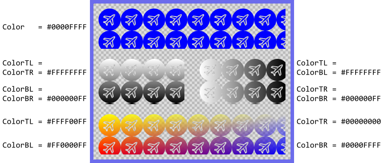
Alpha-only bitmaps don't provide any colors. Instead they contain pure opacity information. Thus if you assign an alpha-only bitmap to the Wallpaper view, you have to specify which color you want the bitmaps to be colorized with when they are shown on the screen otherwise the bitmaps appear with white color.
To specify the color you use the property Color. Alternatively you can configure the bitmaps to be colorized with a color gradient. For this purpose you specify the colors for the four corners of the Wallpaper view (top-left, top-right, bottom-right and bottom-left) individually by using the corresponding properties ColorTL, ColorTR, ColorBR and ColorBL. The gradient colors are interpolated linearly between the specified values. Using colors with alpha < 255 causes the bitmaps to appear semi- or even transparent. For example:

Please note, before the version 11.00 the common property Color and the individual properties ColorTL.. ColorBR were intended to be used exclusively. You could specify either the common color for the entire image or individual colors for its four corners. Using both approaches simultaneously produced unexpected results depending on the order in which the properties were initialized. This confused the users.
Starting with the version 11.00 the Wallpaper view calculates the resulting colors by modulating the values from the individual properties ColorTL..ColorBR by the value from the common property Color. In this manner, you are able to specify colors in all properties simultaneously avoiding the unpredictable behavior found in the preceding version. From technical point of view, the modulation is performed by multiplying the color components (red, green, blue, alpha) from the individual property (e.g. ColorTL) with the corresponding components from the common property Color.
Modulate the opacity of the displayed bitmap
Using the property Opacity you can modulate the original opacity of the displayed bitmaps, so they appear semi-transparent even if the original content was opaque. The valid values for the property Opacity are 0 .. 255, whereby the smaller the value the more transparent the resulting image. For example:

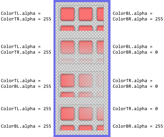
Additionally you can specify for every corner (top-left, top-right, bottom-right and bottom-left) an individual opacity value resulting in the bitmaps being modulated by an opacity gradient. For this purpose modify the alpha values of the corresponding properties ColorTL, ColorTR, ColorBR and ColorBL. For example (the gray borders visualize the view areas):

Select the frame number of a multi-frame bitmap resource
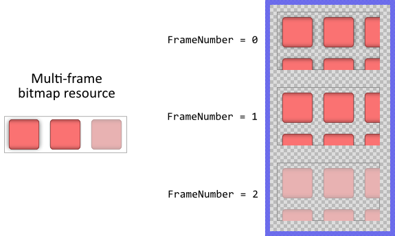
If you assign a multi-frame bitmap resource to the Wallpaper view, the view uses always one (per default the first available) frame to fill its area. To use another frame you have to specify its number by using the property FrameNumber. In the following example you see three Wallpaper views, each configured to display another frame from one and the same multi-frame bitmap resource:

Multi-frame bitmaps are ideal wherever several versions of one and the same image are necessary. For example, a button can display different versions of its background depending on whether the user actually presses the button or not. Instead of creating individual bitmap resources for every possible button state you store the different versions of the background as frames within one multi-frame bitmap resource.
Control the playback of an animated bitmap resource
A multi-frame bitmap resource can be configured as containing a short animation sequence. When such bitmap is assigned to the Wallpaper view, the animation sequence can be played automatically.
To control the playback you use the property Animated or you send signals to the slot methods StartAnimation and StopAnimation. Per default the Wallpaper view plays the sequence endless as long as the property Animated is true. You can disable this behavior by additionally setting the property Endless to false.
Once finished the animation, the Wallpaper view sends a signal to a slot method assigned to its property OnFinished. In this manner you can trigger other animation effects or simply perform operations you want to complete just after the playback is done.
Control the visibility of the Wallpaper view
The visibility of the Wallpaper view is controlled primarily by the property Visible and the content of the assigned bitmap. Also the specified opacity and eventually the color values may affect the resulting appearance of the Wallpaper view.
Per default the views appear alpha-blended over the contents lying behind them unless you explicitly disable this mode by setting the property AlphaBlended to the value false. In such case, the images will overwrite the contents in the background. For example:

TIP
In the complete GUI application an individual view is visible on the screen only when all of its superior Owner components are visible too, the view itself does lie within the visible area of the superior components and the view is not covered by other sibling views nor components.
