Using Views: Attributed Text
The Mosaic class Views::AttrText implements a graphical object specialized to display text enriched with attributes to control the text output. Similarly to HTML these attributes determine the alignment, the colors and fonts to print the text. Additionally the text can be combined with images and hyperlinks can be defined. This so-called Attributed Text view can be used to compose the appearance of a GUI component, in particular to display help pages and other formatted text information like button captions, etc. The following screenshot demonstrates few examples of how Attributed Text views appear in the canvas area of Composer (and accordingly on the screen in your target device):
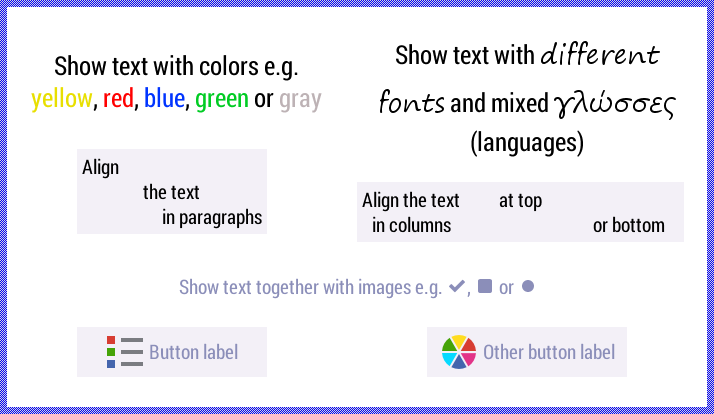
The following sections are intended to provide you an introduction and useful tips of how to work with the Attributed Text view. For the complete reference please see the documentation of the Views::AttrText class.
Add new Attributed Text view
To add a new Attributed Text view just at the design time of a GUI component do following:
★First ensure that the Templates window is visible.
★In Templates window switch to the folder Views.
★In the folder locate the template Attributed Text.
★Drag & Drop the template into the canvas area of the Composer window:
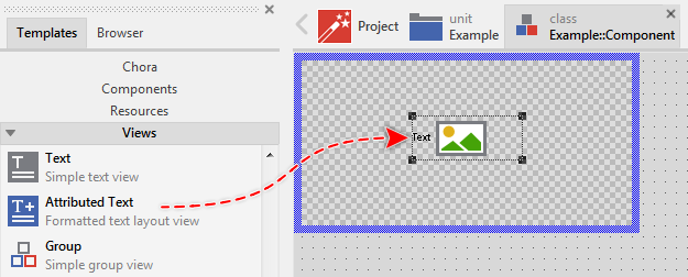
★Eventually name the new added Attributed Text view.
Inspect the Attributed Text view
As long as the Attributed Text view is selected you can inspect and modify its properties conveniently in the Inspector window as demonstrated with the property Bounds in the screenshot below:
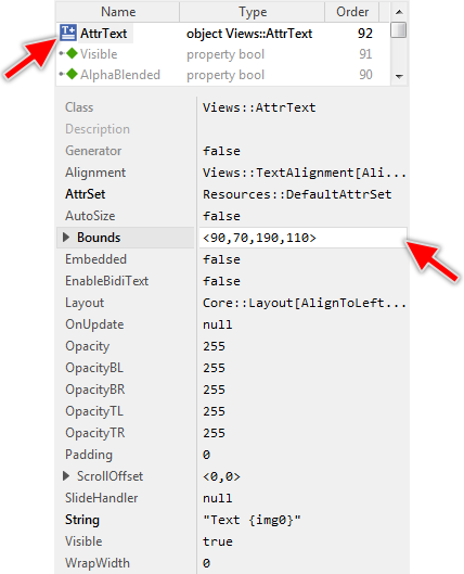
This is in so far worth mentioning as all following sections describe diverse features of the Attributed Text view by explicitly referring to its corresponding properties. If you are not familiar with the concept of a property and the usage of Inspector window, please read first the preceding chapter Compositing component appearance.
Arrange the Attributed Text view
Once added, you can freely move the Attributed Text view, or you simply grab one of its corners and resize it in this way. You can control the position and the size of the view also by directly modifying its property Bounds. If you want the Attributed Text view to appear behind other views you can reorder it explicitly.
Add new Attributed Set object
The Attributed Text view requires all colors, fonts and bitmaps involved within the displayed text being provided in advance in so-called Attributed Set object. You can imagine the Attributed Set as a kind of container destined to store and manage lists with colors, fonts and bitmaps. Thus, when you use Attributed Text views you will also need to manage in your project at least one Attributed Set object. Of course, if your application case it requires, you can manage as many Attributed Set objects in your project as you want.
The following sections are intended to provide you an introduction and useful tips of how to work with the Attributed Set object. For the complete reference please see the documentation of the Graphics::AttrSet class.
Depending on your application case, you have the option to add the Attributed Set as an embedded object directly to a GUI component or to add it as an autoobject to a unit. The first case is suitable if you want the Attributed Set being used locally within the GUI component only. The second case, in turn, is appropriate if you intend to share the Attributed Set among multiple GUI components like a kind of common resource.
To add a new Attributed Set object do following:
★Depending on your preferred option switch to the Composer page for the respective GUI component class or the unit where you want to add the Attributed Set object.
★Then ensure that the Templates window is visible.
★In Templates window switch to the folder Resources.
★In the folder locate the template Attributed Set.
★Drag & Drop the template into the Composer window:
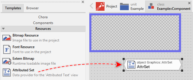
★Eventually name the new added Attributed Set object.
Inspect the Attributed Set object
As long as the Attributed Set object is selected you can inspect and modify its properties conveniently in the Inspector window as demonstrated with the property Color0 in the screenshot below:
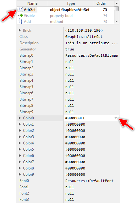
This is in so far worth mentioning as the following sections describe diverse features of the Attributed Set object by explicitly referring to its corresponding properties. If you are not familiar with the concept of a property and the usage of Inspector window, please read first the preceding chapter Compositing component appearance.
Specify colors in the Attributed Set
The Attributed Set is a container object where you store colors to use by an Attributed Text view. Every Attributed Set can manage up to 256 different color values identified by the corresponding index numbers 0 .. 255. The simplest way to specify the desired colors is to use the convenience properties Color0 .. Color9. All you have to do is to initialize them with the desired color values. This approach, however, is limited to 10 entries.
If your application requires more colors to be managed within an Attributed Set, you have first to call the method SetMaxNoOfColors() in order to enlarge the Attributed Set object appropriately. Once the capacity is determined, you assign the color values by calling the method SetColor(). The following Chora code demonstrates how to initialize an Attributed Set object to store 30 color values:
// If you plan to store more than 10 colors, enlarge the Attributed // Set first. Here the capacity of the object is increased to 30 entries. SomeAttrSetObject.SetMaxNoOfColors( 30 ); // Store the value for color #0 and #1 SomeAttrSetObject.SetColor( 0, #FF0000FF ); SomeAttrSetObject.SetColor( 1, #FFFF00FF ); [...] // Store the value for color #10 SomeAttrSetObject.SetColor( 10, #123400FF ); [...] // Store the value for the last color #29 SomeAttrSetObject.SetColor( 29, #FFFFFFFF );
Similarly, you can query the current capacity of an Attributed Set object and the color values stored in it by using GetMaxNoOfColors() and GetColor() as counterparts of the above described methods.
Specify fonts in the Attributed Set
The Attributed Set is a container object where you store fonts to use by an Attributed Text view. Every Attributed Set can manage up to 256 different fonts identified by the corresponding index numbers 0 .. 255. The simplest way to specify the desired font is to use the convenience properties Font0 .. Font3. Usually, you initialize these properties with the names of existing font resource members. This approach, however, is limited to 4 entries.
If your application requires more fonts to be managed within an Attributed Set, you have first to call the method SetMaxNoOfFonts() in order to enlarge the Attributed Set object appropriately. Once the capacity is determined, you assign the font resources by calling the method SetFont(). The following Chora code demonstrates how to initialize an Attributed Set object to store 6 fonts:
// If you plan to store more than 4 fonts, enlarge the Attributed // Set first. Here the capacity of the object is increased to 6 entries. SomeAttrSetObject.SetMaxNoOfFonts( 6 ); // Store the fonts #0 and #1 SomeAttrSetObject.SetFont( 0, SomeUnit::SomeCaptionFont ); SomeAttrSetObject.SetFont( 1, SomeUnit::SomeLabelFont ); [...] // Store the last two fonts #4 and #5 SomeAttrSetObject.SetFont( 4, SomeUnit::SomeMessageBlockFont ); SomeAttrSetObject.SetFont( 5, SomeUnit::SomeAnnotationFont );
Similarly, you can query the current capacity of an Attributed Set object and the fonts stored in it by using GetMaxNoOfFont() and GetFont() as counterparts of the above described methods.
From technical point of view, you can initialize the Attributed Set with any instance of a class descended from the Mosaic class Resources::Font. In particular, if your Platform Package contains a TrueType font engine, you can use an instance of the Resources::ExternFont class and render the text with fonts, you determine at the runtime.
Please note, every new added Attributed Set uses the Resources::DefaultFont font resource as font number 0 (zero). It serves as place holder to see something on the screen when the new Attributed Set is used. Usually you will modify this initialization and use your own font resources. If desired, you can also use one of the other default font resources intended to help you when you start to create a prototype of your new product.
Specify bitmaps in the Attributed Set
The Attributed Set is a container object where you store bitmaps (the images) to use by an Attributed Text view. Every Attributed Set can manage up to 256 different bitmaps identified by the corresponding index numbers 0 .. 255. The simplest way to specify the desired bitmap is to use the convenience properties Bitmap0 .. Bitmap9. Usually, you initialize these properties with the names of existing bitmap resource members. This approach, however, is limited to 10 entries.
If your application requires more bitmaps to be managed within an Attributed Set, you have first to call the method SetMaxNoOfBitmaps() in order to enlarge the Attributed Set object appropriately. Once the capacity is determined, you assign the bitmap resources by calling the method SetBitmap(). The following Chora code demonstrates how to initialize an Attributed Set object to store 30 bitmaps:
// If you plan to store more than 10 bitmaps, enlarge the Attributed // Set first. Here the capacity of the object is increased to 30 entries. SomeAttrSetObject.SetMaxNoOfBitmaps( 30 ); // Store the bitmaps #0 and #1 SomeAttrSetObject.SetBitmap( 0, SomeUnit::SomeIconOk ); SomeAttrSetObject.SetBitmap( 1, SomeUnit::SomeIconCancel ); [...] // Store the the bitmap #10 SomeAttrSetObject.SetBitmap( 10, SomeUnit::SomeIconError ); [...] // Store the last bitmap #29 SomeAttrSetObject.SetBitmap( 29, SomeUnit::SomeIconHelp );
Similarly, you can query the current capacity of an Attributed Set object and the bitmaps stored in it by using GetMaxNoOfBitmaps() and GetBitmap() as counterparts of the above described methods.
From technical point of view, you can initialize the Attributed Set with any instance of a class descended from the Mosaic class Resources::Bitmap. In particular, you can use an instance of the Resources::ExternBitmap class if you want to display bitmap contents, you have e.g. received just at the runtime. Or you render the bitmap dynamically into a Graphics::Canvas object and assign it to the Attributed Set object.
Please note, every new added Attributed Set uses the Resources::DefaultBitmap bitmap resource as bitmap number 0 (zero). It serves as place holder to see something on the screen when the new Attributed Set is used. Usually you will modify this initialization and use your own bitmap resources. In addition to it, Embedded Wizard Studio provides a set of default bitmap resources with icons for typical application cases. They are intended to help you when you start to create a prototype of your new product.
Assign an Attributed Set to the Attributed Text view
The Attributed Text view renders its text by using colors, fonts and bitmaps from an Attributed Set object specified in its property AttrSet. Usually, you initialize this property with the name of a previously added Attributed Set object. With the Inspector Assistant you can conveniently select the right object when you edit the initialization expression for the property AttrSet.
Once established the relation between an Attributed Text view and an Attributed Set object, the modification of the Attributed Set will automatically trigger all associated views to update their displayed content. In other words, you can freely assign new color values, fonts and bitmaps to an Attributed Set object and cause thus the associated views to update instantly their aspect.
IMPORTANT
Newly added Attributed Text views use a predefined default Attributed Set object named Resources::DefaultAttrSet. It is thus appropriate to create and use your own Attributed Set objects when working with Attributed Text views. In any case you should avoid modifying the predefined original object Resources::DefaultAttrSet.
Specify the text
The text to display by the Attributed Text view is determined by its property String. This property expects an initialization expression resulting in a valid string operand. This is usually a string literal (e.g. "Caption") or the name of an existing string constant member. In particular, the usage of a constant is preferable wherever you plan to localize the text for different languages.
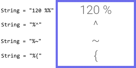
Please note, that there are few special characters, the Attributed Text view interprets as format instructions instead of displaying them. This affects the signs: { (open curly brace), ^ (circumflex), ~ (tilde) and % (percent). In order to display such sign, you have to prefix it within the string explicitly by an additional % (percent) character. For example:
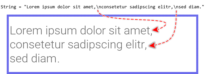
If the specified text contains \n (new-line) characters, the text portions lying in-between are treated and displayed as individual text rows. In other words, if you intend to display a multiline text block, you separate the rows simply by \n (new-line) characters. The \n (new-line) character itself is not visible in the resulting text:
Please note, that to appear correctly, the signs used within the text should also be available in the specified fonts. In order to reduce the size of the resulting application, you have to determine for every font resource, which glyphs you intend to use at the runtime of your application. Not specified glyphs are then excluded. Trying to show them anyway will result in dummy signs, usually small boxes, displayed on the screen. For example, if the font resource doesn't include the typical German Umlaut ÄÖÜ nor the Eszett ß signs, the German text appears incomplete:

Specify the attributes
In addition to the real text, the specified string may contain any number of attributes to control the desired text formatting, like font and color selection. To distinguish the attributes from the actual text, every attribute is enclosed between a pair of {..} (curly braces). For example with the string literal "{clr8}Hello world" the Attributed Text displays the text Hello world with the indicated color number 8 from the associated Attributed Set object. The curly braces and the text enclosed inside them are not displayed. It is interpreted as a kind of instruction. The complete description of all attributes and the corresponding features is found in the following sections.
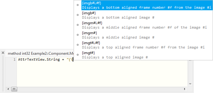
When you enter a string literal in the Code Editor, the integrated Assistant window displays a list with the available attributes as soon as you have entered the { (curly brace) sign. Thereupon you can select the desired attribute in a convenient manner. To use this feature also when editing initialization expressions in the Inspector window, you can link the Inspector to Code Editor. The following figure demonstrates the mentioned Assistant while entering some string literal in the Code Editor:
If you assign a text without any attributes specified inside it, the entire text will be displayed as a single left aligned paragraph with the color number 0 (zero) and font number 0 (zero) taken from the associated Attributed Set object.
TIP
The attributes start with the special character { which permits you to enter them conveniently by using the keyboard. However, since being a special character it is not visible. In order to display the { sign, you have to prefix it explicitly by the % (percent) sign, as described in the section Specify the text.
Enable RTL (right-to-left) and bidirectional text processing
Per default the characters within the specified text are displayed from left-to-right (LTR) according to their original storage order. To display text with right-to-left (RTL) direction as it is usual for the Arabic and Hebrew languages you have to explicitly enable the bidirectional text processing. For this purpose set the property EnableBidiText of the affected Attributed Text view to the value true.
With the enabled bidirectional text processing the Attributed Text view performs the Unicode Bidirectional Algorithm according to the rules specified in Unicode Standard Annex #9. This includes reordering of text fragments containing RTL characters, shaping of Arabic glyphs and building of Arabic mandatory ligatures. The algorithm does not affect the attributes found inside the text. If you leave the property EnableBidiText initialized with its default value false none of these steps are applied.
In Arabic and Hebrew scripts the text rows appear per default right aligned. To achieve this effect you should thus explicitly initiate every paragraph existing in the text with {parr} attribute. Alternatively you can use the attribute {para} which then causes the Attributed Text view to determine the actual alignment dynamically depending on the base direction of the affected paragraph content (depending on the first strong LTR or RTL character found in the paragraph). Please see also Layout the text in paragraphs.
Specify the color of a text span
With the attribute {clr#} you specify the color for the immediately following text. The attribute expects in its operand # a decimal number identifying the desired color from the associated Attributed Set object. For example, the attribute {clr13} refers to the color stored at the position 13 in the Attributed Set object. The following figure demonstrates the relation between the attributes in the original text, the values stored in the Attributed Set object and the resulting text displayed on the screen:
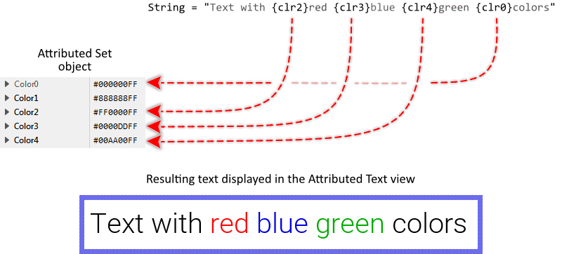
If there is no {clr#} attribute specified at the begin of the text, the Attributed Text view assumes per default the color number 0 (zero). This is demonstrated in the above figure with the initial text fragment Text with, which is not prefixed by any {clr#} attributes. If the attribute refers to a color value not available in the Attributed Set object, the transparent color #00000000 is used causing the affected text span to become invisible.
The {clr#} attribute is a serial format instruction affecting the text following it until another {clr#} attribute is found. The effect of this attribute is however limited to the actual paragraph only. The next following paragraph starts again with the color value stored at the position 0 (zero) within the Attributed Set object.
Specify the font of a text span
With the attribute {fnt#} you specify the font for the immediately following text. The attribute expects in its operand # a decimal number identifying the desired font from the associated Attributed Set object. For example, the attribute {fnt6} refers to the font stored at the position 6 in the Attributed Set object. The following figure demonstrates the relation between the attributes in the original text, the values stored in the Attributed Set object and the resulting text displayed on the screen:
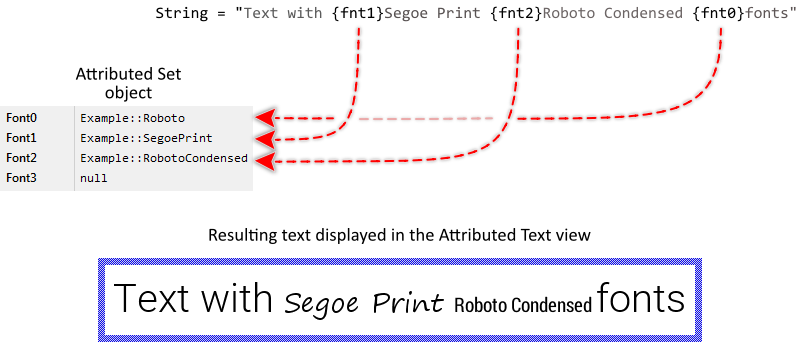
If there is no {fnt#} attribute specified at the begin of the text, the Attributed Text view assumes per default the font number 0 (zero). This is demonstrated in the above figure with the initial text fragment Text with, which is not prefixed by any {fnt#} attributes. If the attribute refers to a font not available in the Attributed Set object, the font with the number 0 (zero) is used automatically.
The {fnt#} attribute is a serial format instruction affecting the text following it until another {fnt#} attribute is found. The effect of this attribute is however limited to the actual paragraph only. The next following paragraph starts again with the font stored at the position 0 (zero) within the Attributed Set object.
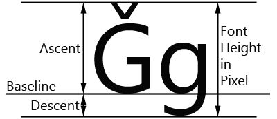
Please note, that within a single text row all text fragments are aligned on a common baseline even if the fragments are formatted with different fonts. The baseline as well as the height of the row are calculated from the largest ascent and largest descent metrics of the fonts used in the affected text row. The following figure demonstrates the relation between the font height and its ascent and descent metrics:
Underline text span
With the attribute {ul+} you specify the immediately following text to be displayed underlined until the counterpart attribute {ul-} is found. As such it is useful to emphasize important fragments within the text. The following figure demonstrates the relation between the attributes in the original text and the resulting text displayed on the screen:
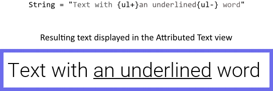
The color of the drawn line corresponds to the color specified for the affected text fragment. Similarly, the thickness of the line corresponds to the thickness of the - (hyphen) sign taken from the font used to display the text fragment. Accordingly when you mix different fonts and colors within one and the same underlined text fragment, the thickness and colors of the drawn line may vary. The following figure demonstrates it:

The {ul+} attribute is a serial format instruction affecting the text following it until the counterpart {ul-} attribute is found. The effect of this attribute is however limited to the actual paragraph only. The next following paragraph starts again with the underline mode disabled. Additionally please note, that nesting of multiple {ul+} attributes has no effect.
Display a bitmap within the text
With the attribute {img#} you specify a bitmap to display inplace together with the surrounding text. The attribute expects in its operand # a decimal number identifying the desired bitmap from the associated Attributed Set object. For example, the attribute {img13} refers to the bitmap stored at the position 13 in the Attributed Set object. The following figure demonstrates the relation between the attributes in the original text, the values stored in the Attributed Set object and the resulting text displayed on the screen:
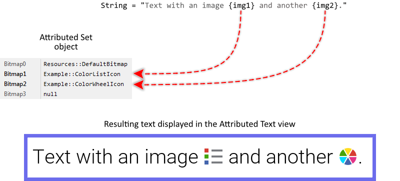
If the height of the bitmap is less than the of the corresponding text row, the bitmap is displayed vertically centered within the available row area. By using the {imgt#} version of the above described attribute (with an additional t in its name) the bitmap will appear aligned at the top edge of the row. Similarly, to align the bitmap at the bottom edge the attribute {imgb#} is available.
In fact, the above described attribute {img#} exists just for your convenience as an alias for the {imgm#} version (with m in its name standing for middle). The both are thus equivalent. The following figure demonstrates the alignment effect depending on the used version of the {img#} attribute:

Please note, if the attribute refers to a bitmap not available in the Attributed Set object, the bitmap with the number 0 (zero) is used automatically.
Select a frame of a multi-frame bitmap
In case of a multi-frame bitmap referred in the above described attributes {img#}, {imgt#}, {imgb#} and {imgm#} the Attributed Text view displays always one (per default the first available) frame. To display another frame you have to specify explicitly its number in an optional operand of the attribute.
This optional operand is separated by a . (dot) sign from the main operand referencing the bitmap itself and it is expected to be a decimal number. For example, {img8.2} selects the third frame of the bitmap stored at the position 8 in the Attributed Set object (third because the frames are counted starting with 0 (zero)). If the optional operand is omitted, the first available frame 0 (zero) is used per default. In the following example you see the Attributed Text view displaying the different frames from one and the same multi-frame bitmap resource:
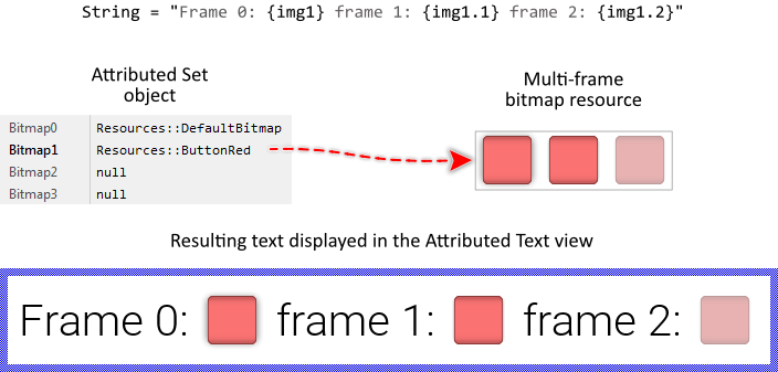
Multi-frame bitmaps are ideal wherever several versions of an image are necessary. For example, icons to display together with the text. Instead of creating individual bitmap resources for every possible icon you store the different icons as frames within one multi-frame bitmap resource.
Please note, if the {img#} attribute refers to a bitmap not available in the Attributed Set object, the bitmap with the number 0 (zero) is used automatically. Similarly referring to a not available bitmap frame results in the frame number 0 (zero) being displayed implicitly.
Display alpha-only bitmaps
Using the above described attributes {img#}, {imgt#}, {imgb#} and {imgm#} the bitmaps are displayed with their original colors unless the affected bitmap is an alpha-only bitmap. Such bitmaps don't provide any colors. Instead they contain pure opacity information.
Thus if you refer an alpha-only bitmap in the Attributed Text view, the bitmap is displayed with the color specified in the latest preceding {clr#} attribute. In other words, the alpha-only bitmaps appear with exact the same color as the surrounding text. The following example demonstrates it (It is assumed, that the associated Attributed Set stores at its position 1 an alpha-only bitmap - an airplane icon for example):

Layout the text in paragraphs
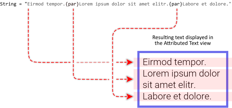
With the attribute {par} you initiate a new text paragraph. Paragraphs are a convenient feature to separate the text in independent blocks, which are then displayed one below the other. If there is no {par} attribute specified, the text is implicitly considered as belonging to a single paragraph. The following figure demonstrates the relation between the {par} attributes and the resulting text displayed on the screen (the paragraph areas are highlighted reddish in the resulting image):
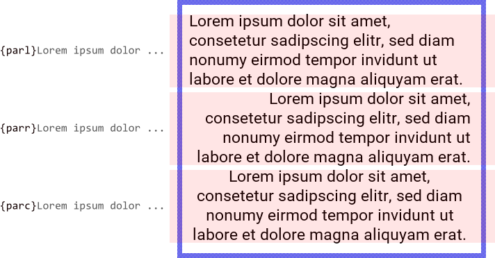
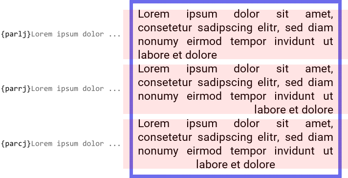
Per default, the text rows belonging to a paragraph are left aligned. By using the {parr} version of the attribute (with an additional r in its name) the rows will appear right aligned. Accordingly, the attribute version {parc} centers the rows horizontally. In fact, the above described attribute {par} exists just for your convenience as an alias for the {parl} version (with l in its name standing for left). The both are thus equivalent. The following figure demonstrates the alignment effect depending on the used version of the {par} attribute:
If the Attributed Text view is intended to show bidirectional text with horizontal alignment depending on the actually displayed content, you should initiate the paragraphs with {para} attribute (with a in its name) instead of {parl} or {parr}. In such case the correct alignment will be derived from the base direction of the affected paragraph (which depends on the first strong LTR or RTL character found in the paragraph text). Consequently paragraphs containing right-to-left (RTL) scripts like Arabic and Hebrew will appear right aligned while left-to-right (LTR) text is automatically left aligned.
Regardless of the desired horizontal alignment you can additionally instruct the view to justify the space signs (blanks) lying between words of wrapped text rows, so the rows appear filling the entire width available for the paragraph. To achieve this you append the additional j at the end of the respective attribute name (j stands for justified). For example, to display left aligned and justified text use the attribute {parlj}. In turn with the attribute {paraj} you enable the justified mode and instruct the Attributed Text view to align the paragraph according to its base direction. The following figure demonstrates the effect of the additionally enabled justified mode:
Initiating a new paragraph resets implicitly the previously selected color and font to the values stored at the respective 0 (zero) positions within the associated Attributed Set object. Similarly, if the preceding paragraph ends with an active underline mode, the mode is disabled in the new paragraph. In other words, every new paragraph begins pre-configured with attributes as if it were the begin of the text.
TIP
Please note, that to start a new text row you can also separate it from the preceding row by the \n (new-line) sign as described in the section Specify the text. In such case, however, the new row is still considered as being a part of the current paragraph, which means that it is displayed with the font, color and underline mode specified in advance.
Configure paragraph margins
The above described paragraph attributes {parl}, {parr}, {parc} and {para} accept up to four optional operands to determine the margins between the four sides of the paragraph and the paragraph content. Per default, if the operands are omitted, the paragraph content is displayed without any additional margins. Using the margins you can control the text layout more precisely. For example, you can add additional padding between paragraphs or you arrange one paragraph to appear indented below another one:

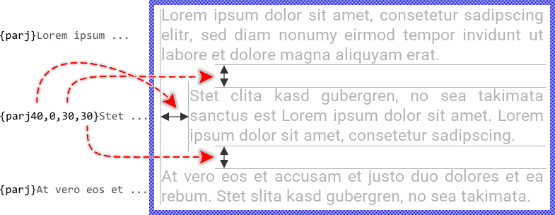
The operands have to be specified as , (comma) separated positive decimal numbers strictly in the order for the left, right, upper and bottom margin. The numbers are interpreted per default as pixel values. For example, the attribute {parl10,20,30,40} instructs the Attributed Text view to add 10 pixel margin on the left side of the content, 20 pixel on its right side, 30 pixel above it and 40 pixel below it. The following figure demonstrates the relation between the numbers and the affected margins:
If an operand is omitted, the corresponding margin is implicitly assumed as being 0 (zero). For example, in the attribute {parc,,5,10} the first and the second operands are not specified resulting in the left and right margins being 0. Similarly, the attribute {parl10,20} doesn't specify any operands for the upper and bottom margins, which are 0 then.
The operands for the left and right margins can alternatively be expressed in percent of the original paragraph width. This can be achieved by simply appending the % (percent) sign at the corresponding decimal number. For example, the attribute {parl10%,10%,5,5} calculates for the left and the right margins with 10 % of the entire paragraph width. The remaining 80 % are occupied by the actual content of the paragraph. Please note, that this alternative notation is not applicable to the upper and bottom margins, which can be expressed only in pixel.
Determine the paragraph background color
The above described paragraph attributes {parl}, {parr}, {parc} and {para} accept an optional operand to specify a color to fill the background of the affected paragraph. Per default, if the operand is omitted, the paragraph is displayed with transparent background.
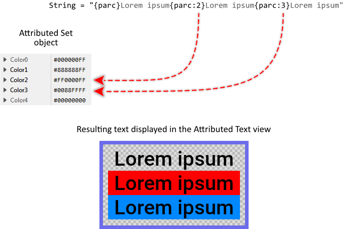
The operand is prefixed by a : (colon) sign and it has to be a decimal number identifying the desired color from the associated Attributed Set object. For example, the attribute {parc:13} instructs the paragraph to be filled with the color stored at the position 13 in the Attributed Set object. The following figure demonstrates the relation between the optional operand, the values stored in the Attributed Set object and the resulting text displayed on the screen:
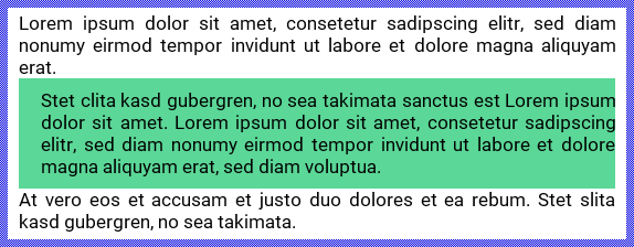
The background color operand can be combined with the above described paragraph margin operands. For example, the attribute {parj20,,10,10:6} configures the paragraph with additional margins and background color number 6. The areas reserved for the margins are in this case also filled with the specified color:
If the attribute refers to a color value not available in the Attributed Set object, the transparent color #00000000 is used causing the affected paragraph background to become transparent as if no background color were specified.
Layout the text in columns
Similarly to the above described technique to layout the text sections one below the other as independent paragraphs you can also instruct the Attributed Text view to arrange the text sections side by side in columns. However, unlike the paragraphs, this layout is limited to maximal three columns. If your application case requires more columns to be arranged side by side, you can interleave them as described below.
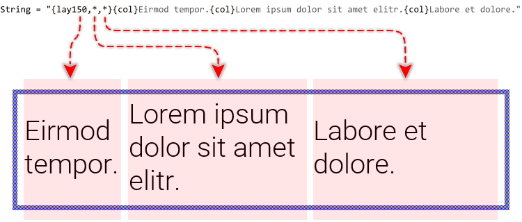
The column layout is introduced by an attribute {lay#1,#2} or {lay#1,#2,#3} depending on whether you intend to layout the text in two or three columns. The operands #1, #2 and #3 determine the width of the respective column. They are expected to be positive decimal numbers or * (asterisk) signs. The numbers are interpreted per default as pixel values. The * (asterisk) sign, in turn, implies a column occupying the remaining available space.
For example, the attribute {lay100,200} introduces a two-column layout with its first (left) column occupying 100 pixel and the second (right) column 200 pixel of the horizontally available space. In turn, the attribute {lay30,*,*} introduces a three-column layout with its first column of 30 pixel and the second and third column sharing equally the remaining available space.
Once determined the number of columns and their respective width, you use the attribute {col} to start with the content of a column. Wherever the next column begins, you use again {col}. In every case the usage of this attribute is obligatory otherwise the Attributed Text view is not able to recognize which portion of the text should by associated with which column. The following figure demonstrates the relation between the {lay#1,#2,#3} and {col} attributes and the resulting text displayed on the screen (the layout areas are highlighted reddish in the resulting image):
The operands in the {lay#1,#2,#3} attribute can alternatively be expressed in percent of the originally available width. This can be achieved by simply appending the % (percent) sign at the corresponding decimal number. For example, the attribute {lay25%,25%,*} calculates for the left and the second column with 25 % of the available width. The remaining 50 % are occupied by the third column as its width is specified with the * (asterisk) sign.
Per default, the content belonging to a column is centered vertically within the layout area. By using the {colt} version of the attribute (with an additional t in its name) the content will appear aligned at the upper edge of the area. Accordingly, the attribute version {colb} aligns the content at the bottom edge.
In fact, the above described attribute {col} exists just for your convenience as an alias for the {colm} version (with m in its name standing for middle). The both are thus equivalent. The following figure demonstrates the alignment effect depending on the used version of the {col} attribute:
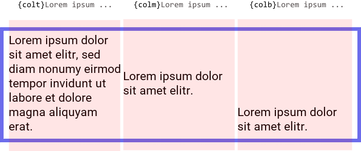
Please note, that the height of the entire layout results implicitly from the highest displayed column. As you see in the above figure, the first column is the highest one. Accordingly the remaining both columns are aligned on it.
The column layout can be combined conveniently with the above described paragraphs. In this manner, you can divide the text in columns and within every column display several paragraphs, every with an individually configured alignment, margins and background colors. In the following example, the left column contains two paragraphs configured as left and right aligned. In turn, the right column contains one paragraph centered horizontally in its area:

If desired you can specify multiple column layouts. The layouts appear then arranged one below the other. Similarly, you can mix the column layouts and paragraphs alternately. In every cases, it is required to terminate explicitly the preceding column layout before beginning with a new one. This is done by applying the attribute {end} just after the last column. Without it, the following content is considered as being still part of the preceding column. The following example shows a column layout and paragraph arranged one below the other:

The possibility to mix the paragraphs and column layouts provide a very powerful technique to layout advanced text contents in manner similar to HTML. It is even possible to interleave multiple column layouts resulting in complex tables. The following example contains a main column layout with a nested layout in its left column:

Configure column margins
The above described column attributes {colt}, {colm} and {colb} accept up to four optional operands to determine the margins between the four sides of the column and the column content. Per default, if the operands are omitted, the column content is displayed without any additional margins. Using the margins you can control the text layout more precisely. For example, you can add additional padding between columns or you arrange one column so that it appears lower compared with the sibling columns:

The operands have to be specified as , (comma) separated positive decimal numbers strictly in the order for the left, right, upper and bottom margin. The numbers are interpreted per default as pixel values. For example, the attribute {colt10,20,30,40} instructs the Attributed Text view to add 10 pixel margin on the left side of the content, 20 pixel on its right side, 30 pixel above it and 40 pixel below it. The following figure demonstrates the relation between the numbers and the affected margins:
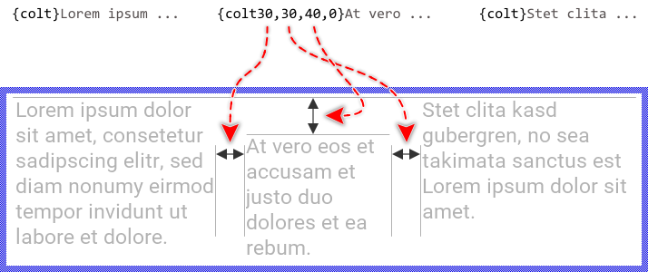
If an operand is omitted, the corresponding margin is implicitly assumed as being 0 (zero). For example, in the attribute {colm,,5,10} the first and the second operands are not specified resulting in the left and right margins being 0. Similarly, the attribute {colt10,20} doesn't specify any operands for the upper and bottom margins, which are 0 then.
The operands for the left and right margins can alternatively be expressed in percent of the original column width. This can be achieved by simply appending the % (percent) sign at the corresponding decimal number. For example, the attribute {colt10%,10%,5,5} calculates for the left and the right margins with 10 % of the entire column width. The remaining 80 % are occupied by the actual content of the column. Please note, that this alternative notation is not applicable to the upper and bottom margins, which can be expressed only in pixel.
Determine the column background color
The above described column attributes {colt}, {colm} and {colb} accept an optional operand to specify a color to fill the background of the affected column. Per default, if the operand is omitted, the column is displayed with transparent background.
The operand is prefixed by a : (colon) sign and it has to be a decimal number identifying the desired color from the associated Attributed Set object. For example, the attribute {colb:13} instructs the column to be filled with the color stored at the position 13 in the Attributed Set object. The following figure demonstrates the relation between the optional operand, the values stored in the Attributed Set object and the resulting text displayed on the screen:

The background color operand can be combined with the above described column margin operands. For example, the attribute {colt10,10,20:6} configures the column with additional margins and background color number 6. The areas reserved for the margins are in this case also filled with the specified color:

If the attribute refers to a color value not available in the Attributed Set object, the transparent color #00000000 is used causing the affected column background to become transparent as if no background color were specified.
Add links
With the attribute {lnk:#} you mark the begin of a dedicated, so-called link area. The attribute expects in its unique operand a name identifying the link. Later you can use this name to locate and enumerate the link in the displayed text. The Attributed Text view accepts the link names being composed of any signs except } (closed curly brace). The end of a link area is marked by the attribute {lnk} (without any operands). For example, the attribute {lnk:home} defines the begin of the link named home.
As the attribute name already suggests, with a link you can store in the original text some information to use as reference to other contents. Similarly to hyperlinks in HTML, when the user taps the area occupied by a link, you can load the Attributed Text view with new contents resulting from the name of the hit link.
Having the links specified in the text, you can also conveniently query the position and the size of the displayed contents resulting from the enclosed text fragments and e.g. align other views on them just at the runtime. In this manner you can add decorations, borders, etc. to highlight the displayed text.
The both attributes {lnk:#} and {lnk} are accepted within a paragraph only. Furthermore, nesting of these attributes is not possible. Visually, the attributes have no effect.
Wrap the text in multiple rows automatically
The Attributed Text wraps the displayed content in rows according to the paragraphs and columns specified inside the text. As described in the section Specify the text you can also separate the text rows by \n (new-line) characters and so layout multiline text blocks easily.
Text longer than the available space (usually the width of the Attributed Text view minus the area occupied by eventual columns and margins on the left or right of a text) is wrapped automatically is several rows. The automatic text wrap applies primarily to space characters (blanks). The words, in turn, are not split unless the word contains special format characters. The following table provides an overview of the available format characters and the resulting effects. Using them, you can control the text layout more accurately:
Character |
Effect |
|---|---|
~ |
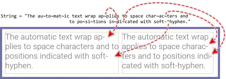
The signs ~ (tilde) are treated as soft-hyphens. They determine potential candidates to wrap a word. These signs are not displayed until the text wrap took place at their position. In such case the affected text row is terminated with an additional hyphen - sign indicating that the word has been broken there. |
^ |
The signs ^ (circumflex) are treated as silent soft-hyphens. They determine potential candidates to wrap a word. These signs are never displayed nor replaced by any hyphen even if the text wrap took place at their position. They are simply silent. |
\x00AD |
The standardized character code for a soft-hyphen. It has the same effect as described above with the sign ~ (tilde) and exists for compatibility purpose with UNICODE character set. |
\x00A0 |
The standardized character code for a non-breaking space (NBSP). The character is displayed as a blank without being taken in account as potential wrap position. |
The following figure demonstrates the effect of the above described special characters to automatically wrap the words. As you see, enriching the text with ~ and ^ characters allows the Attributed Text view to automatically determine the ideal positions for the syllabication depending on the available space (indicated by the thin blue borders):
TIP
The special characters ~ and ^ exist for your convenience permitting you to enter them directly by using the keyboard. However, since being special characters they are not visible. In order to display the ~ or ^ sign, you have to prefix it explicitly by the % (percent) sign, as described in the section Specify the text.
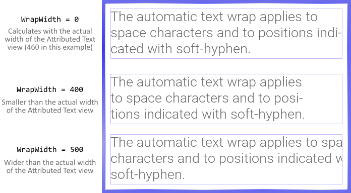
Per default, the complete text layout and thus the text wrap is calculated depending on the actual width of the Attributed Text view. Changing the size of the view will thus cause the text layout to update accordingly. With the property WrapWidth you can override this behavior and specify explicitly other width to layout the text irrespective of the actual size of the Attributed Text view. This is in particular useful, if you intend to align or scroll horizontally the resulting text block. By assigning the value 0 (zero) to the property WrapWidth the Attributed Text view restores again its default wrap behavior. For example:
Align the content within the Attributed Text view area
Per default, the Attributed Text view displays the content centered within the area determined by the property Bounds. If the content is larger than the available area, the parts lying outside it are simply clipped and are not visible.
If desired, with the property Alignment you can determine other behavior. In particular, you can specify view edges at which the content should be aligned vertically. Moreover, if the Attributed Text view is configured with WrapWith less than its actual width you can additionally control the horizontal alignment of the resulting content. The following figure demonstrates few examples of how the initialization of the property Alignment affects the Attributed Text view (the thin blue borders indicate the areas of the respective views):
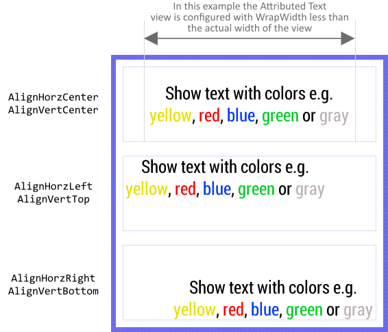
Please note, the Attributed Text view treats the displayed content as a single coherent text block. The property Alignment determines how this entire block should be arranged within the area of the Attributed Text view. It doesn't affect the alignment of the individual paragraphs and columns found within the text.
As consequence, the options AlignHorzJustified and AlignVertCenterBaseline have no effect. To enable the justified text alignment, the appropriate attribute (e.g. {parlj}) has to be used within the text. Concerning the baseline alignment, the Attributed Text view already aligns the contents of a text row on its common base line. The possibility to center the resulting entire text block on the baseline, however, is not supported by the Attributed Text view.
If the Attributed Text view is intended to show bidirectional text with horizontal alignment depending on the actually displayed content and the view is configured with WrapWith other than its actual width, you can activate the option AlignHorzAuto instead of AlignHorzLeft or AlignHorzRight. In such case the horizontal alignment of the entire text block is derived from the base direction of the displayed text (which depends on the first strong LTR or RTL character found in the original text). Consequently with right-to-left (RTL) scripts like Arabic and Hebrew the entire text block will appear right aligned while with left-to-right (LTR) text the block is automatically left aligned.
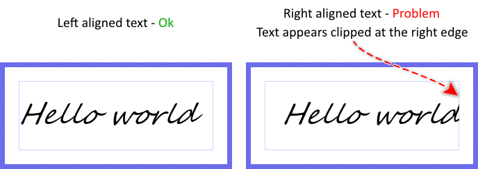
You should remind, that the text alignment does depend on the metric information provided by the original designer of the selected TrueType fonts. Especially italic fonts designed to appear slanted may cause problems with the last glyph in a right aligned row. Such glyph may appear clipped. The following figure demonstrates the problem (the thin blue borders indicate the areas of the Attributed Text views):
To help you to deal with such problems, the Attributed Text view implements the property Padding where you can specify a margin the Attributed Text view should additionally add at its left and right edges. With this margin you win additional space where the unexpectedly clipped glyphs can appear as expected. In the following figure you see the Attributed Text view with the right aligned text and additionally specified padding:
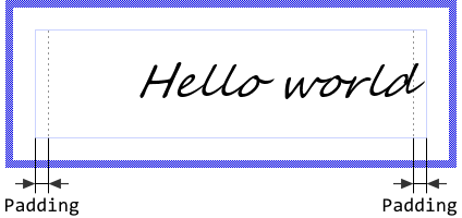
The property Padding expects its value being expressed in pixel. However, which value you specify, is particular to the used fonts. Usually you will need to try several values until you get the expected results. Also please note, specifying the padding does shrink the available area where text can be displayed within the Attributed Text view. Therefore it is reasonable to enlarge the Attributed Text view to compensate the additional padding. For example, if you set the property Padding to the value 12 then enlarge the Attributed Text view by 24 pixel horizontally. With this the Attributed Text view will appear as if it were configured without padding.
Scroll the content within the Attributed Text view area
Besides the possibility to align the content within an Attributed Text view you can also scroll it pixel-wise. For this purpose use the property ScrollOffset. You can determine the vertical and the horizontal displacement individually. With positive values the content is scrolled right/down. With negative values left/up. For example (the thin blue borders indicate the view areas):

TIP
If you want the text to be scrolled automatically (so-called marquee text) add a Move point effect to your GUI component, configure the effect according to your desired animation and connect it to the ScrollOffset property of the text view you want to animate.
Configure the Attributed Text view to adjust its size automatically
With the property AutoSize you can instruct the Attributed Text view to automatically adjust its height and eventually its vertical position when new text or different Attributed Set object is assigned to it. Similarly changing the fonts or bitmaps in the associated Attributed Set object may cause the Attributed Text view to adjust its height and position. In other words, the view will assume the height of the displayed content.
The width and eventually the horizontal position are not automatically adjusted. When changing the content, the Attributed Text view will always retain its latest width. Only when the value of the property WrapWidth is modified and AutoSize is true the view will adjust its width and eventually its horizontal position to match the new value.
You can combine AutoSize with the alignment options. For example, if you have configured the Attributed Text view to align the content at its bottom-right corner, changing the font in the associated Attributed Set object will move the top edge of the view by maintaining the left edge and the bottom-right corner fixed. This is demonstrated in the following screenshot (the thin blue borders indicate the actual view area):

Modulate the opacity of the displayed content
Using the property Opacity you can modulate the opacity of the displayed content, so that it appears semi-transparent even if the colors and bitmaps provided in the Attributed Set object were opaque. The valid values for the property Opacity are 0 .. 255, whereby the smaller the value the more transparent the resulting text. For example:
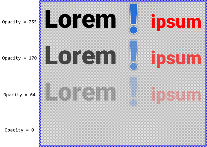
Alternatively you can specify for every corner (top-left, top-right, bottom-right and bottom-left) an individual opacity value resulting in the Attributed Text view content being modulated by an opacity gradient. For this purpose modify the corresponding properties OpacityTL, OpacityTR, OpacityBR and OpacityBL. For example:
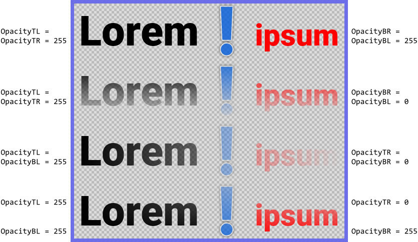
Please note, before the version 11.00 the common property Opacity and the individual properties OpacityTL.. OpacityBR were intended to be used exclusively. You could specify either the common opacity for the entire text or individual opacity for its four corners. Using both approaches simultaneously produced unexpected results depending on the order in which the properties were initialized. This confused the users.
Starting with the version 11.00 the Attributed Text view calculates the resulting opacity by modulating the values from the individual properties OpacityTL..OpacityBR by the value from the common property Opacity. In this manner, you are able to specify opacity values in all properties simultaneously avoiding the unpredictable behavior found in the preceding version. From technical point of view, the modulation is performed by multiplying the opacity values from the individual property (e.g. OpacityTL) with the value from the common property Opacity.
Implement hyperlinks navigation
Using the link attributes you can easily mark designated areas within the original text to serve as hyperlinks. Later when the user taps such area, your component can react to it and e.g. load new content corresponding to the name of the affected link. In this manner you can enrich your application by interactive help or documentation contents similarly as it is possible with HTML. The Views::AttrText class provides for such application cases useful methods. The following table gives you a short overview of them:
Method |
Description |
|---|---|
Searches for a link displayed at a given position. This can be e.g. the touch position. |
|
Returns the name of a particular link. |
|
Searches for a link designated with a given name. |
Assuming, your GUI component contains an Attributed Text view named HelpText where you intend to display user help pages connected together by hyperlinks. Every hyperlink is determined by the corresponding link attribute, whereby the name specified in the link attribute identifies the referenced content. Furthermore, let's assume you want to handle touch screen events so that when the user taps the screen you get the name of the hit link. For this purpose:
★Follow the instructions to add a new Simple Touch Handler.
★Arrange the Simple Touch Handler so it covers the destined Attributed Text view.
★Add a new slot method to your GUI component.
★Assign the slot method to the property OnRelease of the previously added Simple Touch Handler.
★Open the slot method for editing.
★In the Code Editor implement the following Chora code:
// Ignore the tap event if the interaction has been passed over // to another handler. if ( SimpleTouchHandler.AutoDeflected ) return; // At the touched screen position search in the Attributed Text for a link. var int32 linkNo = HelpText.FindLinkAtPosition( SimpleTouchHandler.CurrentPos ); // Any link found? if ( linkNo >= 0 ) { // Get the name of the affected link var string linkName = HelpText.GetLinkName( linkNo ); // Assign new content to the Attributed Text view according to the affected // link. HelpText.String = SomeMethodToGetNewContentForHelpPageWithName( linkName ); }
Please note, the example presents eventually features available as of version 8.10
Arrange other views on the content of the Attributed Text view
Sometimes it is necessary to know the position of the text fragments displayed within the Attributed Text view in order to e.g. automatically align other views with them. For example, you can arrange an image view to appear as decoration side by side with a particular text fragment, so that when the text layout changes, the image view is moved accordingly. The Views::AttrText class provides for such application cases various useful methods. The following table gives you a short overview of them:
Method |
Description |
|---|---|
Returns the position and the size of the rectangular area enclosing the entire content (incl. all paragraphs, columns, images, etc.). |
|
Returns the number of links defined originally in the specified text. |
|
Returns the position and the size of a rectangular area enclosing all fragments belonging to a particular link. In simple terms, if the content of a link is broken in several rows, the method returns the union area including all affected rows. |
|
Returns the number of individual fragments belonging to a particular link. In simple terms, if the content of a link is broken in several rows, the method returns the resulting number of rows. |
|
Returns the position and the size of a rectangular area enclosing a particular fragment of a link. In simple terms, if the content of a link is broken in several rows, the method returns the area occupied by the link within the affected row. |
|
Returns the vertical offset to the text baseline for a particular fragment of a link. In simple terms, the method returns the baseline of the text row containing the affected fragment. |
|
Searches in the text for a link with a known name and, if found, returns the consecutive number of the link. |
Except the first listed, all other methods obtain the position and the size of a text fragment by explicitly referring to links defined within the original text. In other words, if you want to align some views with a particular text fragment, you have to enclose this fragment between a pair of {lnk:name}..{lnk} attributes. Knowing the consecutive number of the link you can easily query the area occupied by its content. If the enclosed text is wrapped in several rows, you can query the areas lying in the individual rows. If the consecutive number of the link is unknown, you can obtain it by calling the method FindLinkByName().
You can call those methods whenever your GUI component implementation requires the corresponding information. More sophisticated, however, is to join the update mechanism provided natively by the Attributed Text view. Precisely, when you assign a slot method to the Attributed Text view property OnUpdate, the slot method will receive postsignals every time the text content, its layout or position changes. Accordingly, within the slot method you can react on this notification and e.g. arrange other views at the new position. The following steps describe how to do this:
★First add a new slot method to your GUI component.
★Assign the slot method to the property OnUpdate of the Attributed Text view.
★Open the slot method for editing.
★In the Code Editor implement your desired arrangement algorithm by using the values returned from the above described Attributed Text view methods.
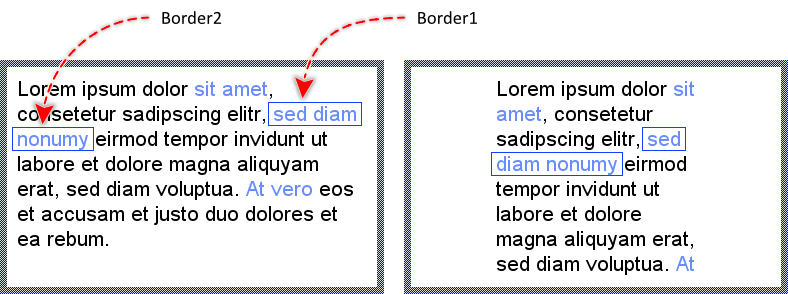
Assuming, your GUI component contains an Attributed Text view named HelpText where you intend to display user help pages connected together by hyperlinks (similarly to HTML). Every hyperlink is determined by the corresponding link attribute. Furthermore let's assume, you have two border views named Border1 and Border2 you want to appear arranged automatically around the fragments of the currently selected hyperlink highlighting it in this manner. In such application case implement the slot method with following Chora code:
// The number of currently selected hyperlink. For example the second // link (link with number 1). var int32 linkNo = 1; // How many fragments belong to the hyperlink? var int32 count = HelpText.GetNoOfLinkRegions( linkNo ); // Adjust the border around the first fragment (number 0). Add // additional 5 pixel margin left and right to the text fragment. if ( count > 0 ) { Border1.Bounds = HelpText.GetLinkRect( linkNo, 0 ) * <5,0>; Border1.Visible = true; } // No area for the affected hyperlink. Hide the border. else Border1.Visible = false; // Adjust the border around the second fragment (number 1). Add // additional 5 pixel margin left and right to the text fragment. if ( count > 1 ) { Border2.Bounds = HelpText.GetLinkRect( linkNo, 1 ) * <5,0>; Border2.Visible = true; } // No area for the affected hyperlink. Hide the border. else Border2.Visible = false;
Please note, that having two border views limits this example to hyperlinks being split in maximal two rows. Should your help documentation contain hyperlinks with longer contents occupying more than 2 rows, you can adapt it accordingly. Similarly, if the hyperlinks in your application are too short to be split, you can simplify the example and work with a single border view. Anyway, with such or similar implementation, every time the text or its layout in the Attributed Text view changes, the borders are updated automatically to surround the area of the affected link:
Please note, the example presents eventually features available as of version 8.10
Connect the Attributed Text view with a Slide Touch Handler
For your convenience the Views::AttrText class implements an interface for easy coupling Attributed Text views with Slide Touch Handlers. In this manner, the user can scroll the content displayed within the Attributed Text view by simply touching the associated Slide Touch Handler. Assuming that you have already an Attributed Text view in your GUI component, then:
★Follow the instructions to add a new Slide Touch Handler.
★Arrange the Slide Touch Handler so it covers the destined Attributed Text view.
★Assign the Slide Touch Handler to the property SlideHandler of the Attributed Text view.
Control the visibility of the Attributed Text view
The visibility of the Attributed Text view is determined primarily by the property Visible, the specified text and the fonts, colors and bitmaps provided in the associated Attributed Set object. The appearance may also be affected by the opacity values.
TIP
In the complete GUI application an individual view is visible on the screen only when all of its superior Owner components are visible too, the view itself does lie within the visible area of the superior components and the view is not covered by other sibling views nor components.
