Creating components from templates: Alert
With this template you can add a new Alert component to your project. Alert is a complex component intended to display a message text with additional push buttons. At the runtime the application presents the Alert to the user in order to inform him/her about an event or to ask the user for a confirmation. When one of the push buttons found in the Alert is activated, the component sends signals to associated slot methods where your particular implementation is executed. If the Alert is focused the component can also be controlled by pressing keys on the keyboard or by using hardware buttons.
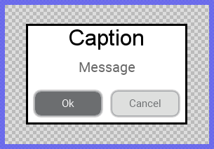
Components created with this template are intended to be adapted to your particular design expectations. After adding the new Alert you should edit the component, change its appearance and if desired also its behavior. Once you have adapted the component, you can embed instances of this Alert wherever you need in your GUI project. Because it serves as template, it is intentionally kept very simple. Nevertheless, Alerts created by the template are working widgets. If desired, they can already be used as they are. The following figure demonstrates the default appearance of the Alert created by using the here described component template:
The approach with component templates has two functions. Primarily the templates should simplify the development of new components. Instead of creating the Alert from scratch you can use the available template. The second function is more educative. The template implements fully working Alert component you can investigate and learn about the corresponding programming aspects. The template is well documented. It contains annotations and inline comments with instructions helping you to understand how the component works and how it can be adapted to your particular needs.
This chapter provides an overview how the Alert component template is used within your own application and how you adapt this component according to your particular needs. You will find here also further details concerning the internal implementation of the Alert component.
Add new Alert component
To create a new Alert component from a template you simply Drag & Drop it between the Templates window and the Composer with an opened unit. This is important in that by using the component templates you add in fact a new class to your project. Classes, in turn, can exist within units only. The following are the typical steps to create a new Alert component from a template:
★First switch to the Composer page for the respective unit, where you want to add the new Alert component.
★Then ensure that the Templates window is visible.
★In Templates window switch to the folder Component Templates.
★In the folder locate the Alert template.
★Drag & Drop the template into the Composer window:
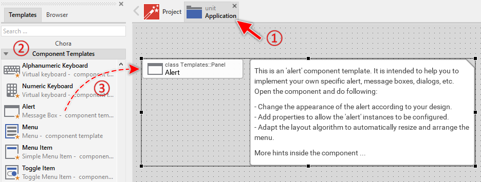
★Eventually name the new added component.
The new created Alert component appears accompanied by annotation providing helpful tips how to proceed. If undesired, you can select and delete the annotation.
Use the Alert component
Once you have created the Alert component, you can use it in your application to display messages to the user or to ask the user for a confirmation. For example, when the user intents to delete a file, an Alert may be displayed asking the user whether or not to proceed.
Step 1. Present a new Alert instance
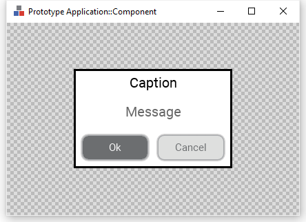
The usual approach is to present alerts programmatically as so-called dialogs. The following code demonstrates how to achieve this. It creates an instance of the previously created Alert component (e.g. Application::Alert) and presents it as dialog using the method PresentDialog():
// Create a new instance of the Alert component ... var Application::Alert alert = new Application::Alert; // ... and present it as dialog. rootthis.PresentDialog( alert, null, null, null, null, null, null, null, null, false );
Component templates are intended to create widgets which can be modified and adapted to your particular design expectations. In the following sections you will learn how to do this. Originally, if not yet modified, the Alert appears as a white rectangle surrounded by a border and displaying a caption and message text. Additional two push buttons are available. Our intention is to keep the component templates as minimalistic as possible so they don't distract you with less important design details:
Step 2. Arrange the Alert on the screen
When using the above described PresentDialog() method, the alert is arranged in the center of the superior GUI component. In case of rootthis it is the center of the entire screen. If desired, you can provide in the second parameter of the PresentDialog() method a transition object configured to apply other layout rules to the presented dialog. The transition objects also permit you to display the Alert with additional animations (e.g. sliding). For more details see the section Customize provided Dialog transition animations.
IMPORTANT
Please note, this document is actually UNDER CONSTRUCTION. It is incomplete. We are working on it ...