Using Widgets: Vertical Slider
The Mosaic class WidgetSet::VerticalSlider implements a GUI component intended to serve as a Vertical Slider widget. This widget can be used to compose the appearance of other more complex GUI components, in particular to add to them interactive controls permitting the user to set an integer value by simply touching and dragging vertically the slider's thumb. Each time the user interacts with a Vertical Slider, the widget sends signals to associated slot methods where your particular implementation is executed. If the Vertical Slider is focused the widget can also be controlled by pressing keys on the keyboard or by using hardware buttons. Per default, the slider reacts on the cursor keys Down and Up.
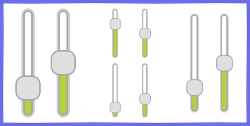
The exact appearance and behavior of the Vertical Slider is determined by a Vertical Slider Config object. This configuration object provides bitmaps, colors and other configuration parameters needed to construct and display the affected Vertical Slider. Embedded Wizard is delivered with a set of prepared Vertical Slider Config objects you can use instantly as they are. However, if desired, you can create your own configuration objects and so customize the Vertical Slider widgets according to your particular design expectations. The following screenshot demonstrates few examples of how Vertical Sliders appear in the canvas area of Composer (and accordingly on the screen in your target device):
The following sections are intended to provide you an introduction and useful tips of how to work with and how to customize the Vertical Sliders. For the complete reference please see the documentation of the WidgetSet::VerticalSlider and WidgetSet::VerticalSliderConfig classes.
Add new Vertical Slider
To add a new Vertical Slider widget just at the design time of a GUI component do following:
★First ensure that the Templates window is visible.
★In Templates window switch to the folder Widgets.
★In the folder locate the template Vertical Slider.
★Drag & Drop the template into the canvas area of the Composer window:
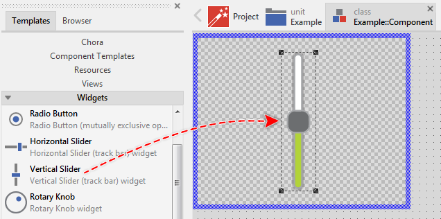
★Eventually name the new added Vertical Slider widget.
Inspect the Vertical Slider
As long as the Vertical Slider widget is selected you can inspect and modify its properties conveniently in the Inspector window as demonstrated with the property Bounds in the screenshot below:
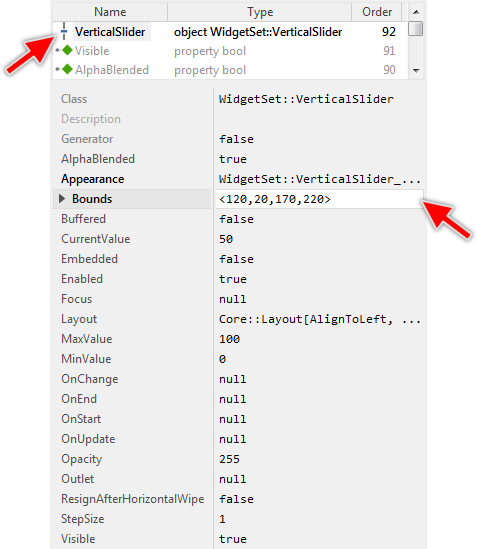
This is in so far worth mentioning as all following sections describe diverse features of the Vertical Slider widget by explicitly referring to its corresponding properties. If you are not familiar with the concept of a property and the usage of Inspector window, please read first the preceding chapter Compositing component appearance.
Arrange the Vertical Slider
Once added, you can freely move the Vertical Slider, or you simply grab one of its corners and resize it in this way. You can control the position and the size of the widget also by directly modifying its property Bounds. If you want the Vertical Slider to appear behind other views you can reorder it explicitly.
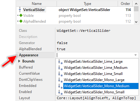
Select the appearance for the Vertical Slider
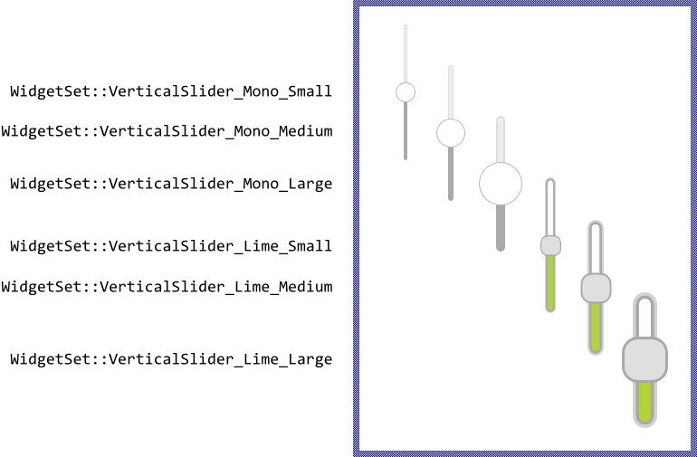
The appearance and partially also the behavior of the Vertical Slider widget can be configured according to your particular design expectation. For demonstration purpose and to help you to quickly create new product prototypes, Embedded Wizard contains six ready to use configurations. The configurations are provided in two different designs we named Mono and Lime. In each design there are three different sizes Small, Medium and Large. The following figure demonstrates all available default configurations at once:
TIP
The design Mono is new in Embedded Wizard 13. This design uses simple visual elements like rounded rectangles and shadows. These can be configured concerning their size and colors in a simple manner. The Lime design, in turn, is based on images. In this case, the size and colors are imposed by the used bitmap resources. On the other hand, by using bitmaps, the configurations can be more expressive and colourful.
To use the desired appearance configuration you have to select it in the property Appearance of the affected Vertical Slider widget as demonstrated in the screenshot below. You can use the integrated Inspector Assistant window to conveniently select the right configuration. If you like the provided default configurations then you can use them as they are:
If you prefer to adapt the appearance of the Vertical Slider by yourself, then you have to create a new Vertical Slider Config object and specify in it all the bitmaps, colors as well as other parameters to customize your individual Vertical Slider. Once your configuration object is available, you can select it in the property Appearance exactly as you select one of the configurations provided per default with Embedded Wizard.
Understand the states of the Vertical Slider
During its life time, the Vertical Slider remains always in one of its four possible states. While the user interacts with the widget, touches it for example, the slider switches between the states fourth and back. Understanding these states is especially essential when you intend to customize your own individual Vertical Slider. The following table provides an overview of all Vertical Slider states:
State name |
Example |
Description |
|---|---|---|
Default |
|
The state Default determines a slider, which is ready to be touched by the user or it is ready to become focused. |
Active |
|
The state Active is true, if the user actively touches the slider's thumb. If the slider is focused it can become active also when the user presses the predetermined key on the keyboard or a hardware button. You can imagine, in the Active state, the user interacts actively with the slider. |
Focused |
|
The state Focused indicates the actually focused slider. The user can control this slider by simply pressing predetermined keys on the keyboard or by pressing hardware buttons. Please note, unless otherwise configured, the focused sliders are controlled by pressing the cursor keys Down or Up. |
Disabled |
|
The state Disabled is true for every not available slider (the property Enabled of the slider is false). Such sliders will ignore any user inputs. |


Determine the Slider's value range and its current value
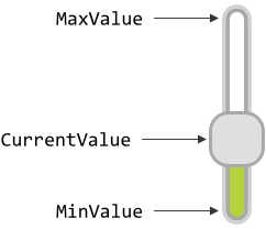
The Vertical Slider widget is intended to allow the user to conveniently change an integer value. When the user touches and drags on the slider's thumb, the value changes. Similarly, if the slider is actually focused and the user presses a dedicated key on the keyboard, the value changes. This alternation is reflected in the slider's property CurrentValue. By evaluating this property you can simply query the value which is actually set in the affected slider. Accordingly, when you modify the property CurrentValue, the affected slider will implicitly update the position of its thumb as well as the height of the both tracks (Please note, depending on the selected configuration, the slider may appear without the thumb or without the tracks).
The possible value range for the property CurrentValue is determined by the both properties MinValue and MaxValue, whereby the value specified in the property MinValue corresponds to the lowermost position of the thumb and the value of the property MaxValue to the uppermost position. Thus, the value of the property CurrentValue lies always between MinValue and MaxValue. When the user drags on the thumb, the new value is interpolated within this range. The following figure demonstrates the relations between the three properties:
The value MinValue has not to be necessarily less than MaxValue. If your application case it requires, you can initialize MinValue so that it is greater than MaxValue. For example, you can configure MinValue to be 100 and MaxValue to be 0. Then when the user drags on the thumb from the bottom up, the slider's CurrentValue is getting smaller. However, you should note, that when initializing MinValue and MaxValue with the same value, the possible value range is empty and the slider will not work.
With the further property StepSize you can optionally determine an increment for the slider's current value which should be taken in account while the user interacts with the widget. Per default, this property is initialized with 1 which means, that the slider's value can change in steps of 1. If you initialize this property with a value greater than 1, the slider will automatically adjust the property CurrentValue to be a multiple of the specified StepSize. For example, if you have a slider configured with MinValue=-30, MaxValue=30 and StepSize=8, the slider will rest only at the discrete positions: -24, -16, -8, 0, 8, 16, 24 as well as at the both ends of its possible value range -30 and 30.
The initialization of the property StepSize has also an effect on how the slider reacts when the user controls it via keyboard. Unless otherwise configured, pressing the key Down causes the slider to move its thumb downwards. In turn, by pressing the key Up the slider moves the thumb upwards. The value stored in the property StepSize determines the corresponding alternation of the slider's current value. According to the example above, when the slider's current value is 8 and the user presses the key Up, its value changes to 16.
Implement Slider's slot methods
While the user interacts with the Vertical Slider widget, the widget sends signals to associated slot methods. Within the slot method your particular implementation can react and process the event. The slot methods are connected to the widget by simply storing them in the for this purpose available properties. The following table describes them:
Property |
Description |
|---|---|
Slot method associated to this property receives a signal as soon as the user touches the slider's thumb or, if the slider is focused, presses the key on the keyboard to control the slider. In other words, this event is triggered at the beginning of the interaction between user and the slider. |
|
Slot method associated to this property receives a signal as soon as the user lifts the finger from the Vertical Slider or, if the slider was controlled by preceding keyboard event, the user releases the key again. In other words, this event is triggered at the end of the interaction between user and the slider. |
|
Slot method associated to this property receives a signal as soon as the user has dragged the slider's thumb causing the slider's current value to be changed. The user can drag the thumb either by touching it with a finger or, if the affected Vertical Slider is actually focused, by pressing a predetermined key on the keyboard. |
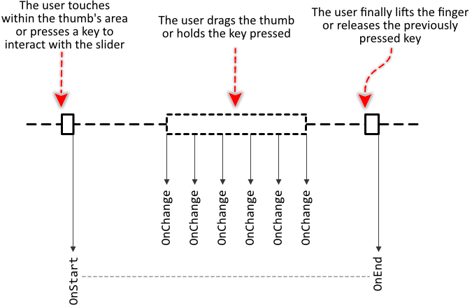
The following sequence diagram demonstrates a typical order in which the slot methods receive signals while the user interacts with the Vertical Slider. Please note, that every interaction starts with a signal sent to the OnStart and ends with a signal sent to the OnEnd slot method. In between, the widget will send signals to OnChange slot method, every time the user drags the thumb:
Providing slot methods for all properties is not obligatory. In typical application cases it is sufficient to implement the slot method for the OnChange event only leaving all other properties initialized with the value null. You can initialize the properties with already existing slot methods or you add a new one and implement it as desired. The following steps describe how to do this:
★First add a new slot method to your GUI component.
★Assign the slot method to the corresponding property of the affected Vertical Slider widget (e.g. to the property OnChange).
★Open the slot method for editing.
★In the Code Editor implement your desired operation to execute when the event occurs.
Usually, in the implementation of the slot method you will evaluate the slider's current value. You can, for example, use it to adjust a setting in the device, etc. The following code demonstrates it:
var Example::DeviceClass device = Example::Device; device.OvenTemperature = VerticalSlider.CurrentValue;
Connect the Vertical Slider with a data provider
To simplify the development of GUI applications, the Vertical Slider implements a technique permitting you to connect a slider directly to a data provider. Once connected, the slider will remain in sync with the value stored actually in this provider. Similarly, if the user drags on the slider's thumb, the associated value changes automatically. This technique corresponds to the model-view-controller (MVC) programming paradigm, where the Vertical Slider has the function of the view and controller and the associated data provider serves as model. If you associate in your application several Vertical Sliders to one and the same data provider value, the underlying mechanisms will ensure, that when dragging on one of the sliders all other affected sliders do update their state automatically.
The connection between the Vertical Slider and the data provider is established by assigning to the Vertical Slider's property Outlet a reference to a property existing within the data provider and storing the interesting value. Since Vertical Slider is intended to deal with integer values, the property suitable to be connected via reference to the slider has to be declared with int32 as its data type. Accordingly, the value of the referenced property corresponds to the slider's current value.
Summarized, after assigning a reference to an existing int32 property to the Vertical Slider's own property Outlet, the sliders adapts its own state to automatically correspond to the actual value of the associated property. When the user interacts with the slider (drags on the thumb), the associated property is modified. You don't need to write a single line of code to benefit from this mechanisms. The aspects underlying this technique are explained in the sections Outlet properties and Notifications and Observer.
The following example demonstrates the practical application case with several Vertical Sliders connected to a common int32 property serving as data provider. When you download and start the example, you see three sliders and an Image view. The sliders are connected to the view's property Opacity. When you drag on one of the sliders, the state of the property changes, the image appears more or less transparent and the other sliders are updated accordingly:
Please note, the example presents eventually features available as of version 9.00
Combine the Vertical Slider with other Touch Handlers
In order to be able to react to user taps the Vertical Slider widget contains an integrated Simple Touch Handler. Every time the user touches within the area of an enabled Vertical Slider, the integrated Touch Handler will start to process the corresponding touch events. As described in the section Combine several Touch Handlers together if there are other Touch Handlers lying behind this Vertical Slider, these handlers will per default not receive any touch events.
This may become problematic in sophisticated application cases when you e.g. intend to use the Vertical Slider embedded within a List or Outline view and you want both to activate the Vertical Slider as well as to scroll the content of the List or Outline by touching on the screen. The problem here: when the user touches within the area of a Vertical Slider, this Vertical Slider starts to process the associated touch events. Other Touch Handler (needed for example to scroll the List or Outline view contents) will not receive any events. Thus, the user can either scroll the contents or control the slider depending on the touched position.
By using the property ResignAfterHorizontalWipe you can instruct the Vertical Slider to behave more cooperatively. Initializing the property with the value true causes the slider to automatically stop to process the actual touch events if the user after touching within the slider's area has dragged slightly the finger horizontally. Thereupon other Touch Handler (e.g. lying behind the slider) can take over and continue with the event processing.
The following example demonstrates the practical usage of the property ResignAfterHorizontalWipe. This example contains a Horizontal List the user can simply scroll by touching within its associated Slide Touch Handler. The items in the list, however, do contain embedded Vertical Sliders. When the user hits one of the sliders, the affected slider will process the touch events. During this touch interaction the user can control the slider but not scroll the list. To solve this problem, the sliders are configured with their property ResignAfterHorizontalWipe set true. Now, when the user hits a Vertical Sliders and then drags the finger horizontally, the Vertical Slider detects it and resigns permitting the Slide Touch Handler to process the events and to scroll the list:
Please note, the example presents eventually features available as of version 9.00
Please note, when the Vertical Slider detects the specified wipe gesture and stops processing the touch events. As described above the Vertical Slider will send signals to the slot methods stored in its property OnEnd as if the user has left the finger and finalized so the interaction.
Combine the Slider with decoration views
Unlike other widgets like the Toggle Button, the Vertical Slider has no additional label nor icon, which can serve as decoration to give the user an idea of the function behind the slider. If you want such additional decoration, please use the available views. For example, you can add a Text view and arrange it above or below the slider, as you prefer. This Text view could serve then as a label.
In particular situations, however, you will want the additional decoration views to be automatically arranged at predetermined positions or to appear according to the current state of the widget. For example, you can arrange the views to appear always side by side of the thumb, so that when the thumb position changes, the views are moved accordingly. The WidgetSet::VerticalSlider class provides for such application cases various useful methods. The following table gives you a short overview of them:
Method |
Description |
|---|---|
Returns the state of the widget according to the latest user interaction. |
|
Returns the state of the widget valid just before the actual state transition animation begun. |
|
Returns the state of the widget valid after the actual state transition animation will finish. |
|
Returns a value in range 0.0..1.0 according to the progress of the actually performed state transition animation. |
|
Returns the actual position of the thumb center. |
|
Returns the lowermost possible position of the thumb center (lower end of the thumb movement range). |
|
Returns the uppermost possible position of the thumb center (upper end of the thumb movement range) |
You can call those methods whenever your GUI component implementation requires the corresponding information. More sophisticated, however, is to join the update mechanism provided natively by the Vertical Slider widget. Precisely, when you assign a slot method to the slider's property OnUpdate, the slot method will receive postsignals every time the state of the widget changes.
Accordingly, within the slot method you can react on this notification and e.g. arrange other views at the new thumb position or update their appearance to correspond to the current state of the widget. The following steps describe how to do this:
★First add a new slot method to your GUI component.
★Assign the slot method to the property OnUpdate of the Vertical Slider widget.
★Open the slot method for editing.
★In the Code Editor implement your desired arrangement algorithm by using the values returned from the above described Vertical Slider methods.
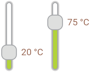
Assuming, your GUI component contains a Vertical Slider named TemperatureSlider and a Text view named TemperatureValue. Furthermore let's assume you want the Text view to appear arranged automatically on the right of the thumb separated by an additional small margin. In such application case implement the slot method with following Chora code:
// Get the current position of the thumb and arrange the Text view centered // horizontally on the right of the thumb separated by a margin of 40 pixel. TemperatureValue.Bounds.origin = TemperatureSlider.GetThumbPosition() + point( 40, -TemperatureValue.Bounds.h / 2 ); // If you want, you can also adapt the text to be displayed in the view depending // on the slider's current value. TemperatureValue.String = string( TemperatureSlider.CurrentValue ) + " °C";
With such implementation, every time the thumb in the Vertical Slider changes its position, the Text view is updated automatically. This is also the case, when the entire slider is moved. The decoration views follow automatically the movements:
If desired, you could additionally adjust the color of the Text view to reflect the current state of the widget. For example, the Text may appear blue as long as the user actively touches the thumb:
// Update the color of the decoration to correspond to the current state of the widget. if ( TemperatureSlider.GetCurrentState() == WidgetSet::CommonState.Active ) TemperatureValue.Color = #7B9ABCFF; else TemperatureValue.Color = #9A6955FF;
The following example project demonstrates this application case. When you download and open the example, you will see two Vertical Sliders with their associated and automatically arranged Text views:
Please note, the example presents eventually features available as of version 13.00
Disable the Vertical Slider
If you want the Vertical Slider to not react to user inputs, you have to disable it explicitly. You achieve this by setting the property Enabled of the affected slider to the value false. Thereupon the Vertical Slider enters in the Disabled state and its appearance changes to indicate to the user, that the associated function is actually not available. Please read the section Control the Enabled state of nested components for further details and more precise explanation.
Control the visibility of the Vertical Slider
If desired, you can hide the Vertical Slider so it is not visible to the user. You achieve this by setting the property Visible of the affected slider to the value false. Please read the section Control the visibility of nested components for further details and more precise explanation.
Customize your own Vertical Slider
Newly added Vertical Sliders use an appearance configuration provided per default with Embedded Wizard installation. As described above these default configurations are available in two different designs and three sizes you can select easily. If you like them, you can use them as they are. However, should the sliders in your GUI design have another appearance, then you will need to provide your own appearance configuration.
To provide a new configuration you create an object of the class WidgetSet::VerticalSliderConfig and initialize its properties with all the bitmaps, colors and other parameters particular to your own design. Once this object is available, you can assign it to every Vertical Slider you want to appear with this configuration similarly as you select one of the per default provided configurations. If necessary, you can create several different configuration objects and use them simultaneously within your application. You can even customize every Vertical Slider instance individually.
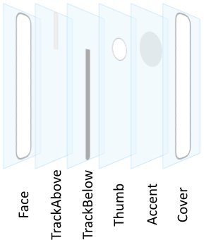
Before you start to customize your own Vertical Sliders you should understand two important aspects. As first recall the section Vertical Slider states. When you customize a Vertical Slider, you will specify for every possible slider state individual parameters. Understanding these states is thus essential. Furthermore, you have to understand from which views (visual elements) the Vertical Sliders are composed of. In the configuration object you can individually specify parameters for every view. The following table provides an overview of the views existing internally within every Vertical Slider:
Visual element |
Description |
|---|---|
Face |
A bitmap frame view filling horizontally centered the entire height in the background of the slider. |
TrackBelow |
A visual element composed of bitmap frame view, filled rectangle and border views filling horizontally centered the background of the slider between its bottom edge and the actual position of the thumb. The bitmap, colors, border width and the height of the track can be configured for each slider state individually. |
TrackAbove |
A visual element composed of bitmap frame view, filled rectangle and border views filling horizontally centered the background of the slider between the actual position of the thumb and the top edge of the slider widget. The bitmap, colors, border width and the height of the track can be configured for each slider state individually. |
Thumb |
A visual element composed of an image, filled rectangle, border and shadow views displayed vertically and horizontally centered at the thumb position according to slider's current value. The bitmap, thumb size, colors, border width, corner rounding and the shadow can be configured for each slider state individually. |
Accent |
A visual element composed of a filled rectangle and border views displayed vertically and horizontally centered at the thumb position according to slider's current value. The size, colors, border width and corner rounding can be configured for each slider state individually. Accent can be seen as a complement to the visual element Thumb. Usually, it serves to accentuate a particular state of the widget (e.g. focused or pressed). |
Cover |
A bitmap frame view filling horizontally centered the entire height of the slider and covering so eventually other views belonging to the widget. As its name indicates, Cover is intended to display decorations in the widget. |
The following figure demonstrates once more the above described views existing internally in every Vertical Slider. Please note how the visual elements are arranged one above the other. Per default, the visual element Face resides in the background of the widget:
Please note, the set of views existing within the Vertical Slider is finished implemented in the Vertical Slider component and can't be modified. With the configuration object you can customize the appearance of the affected views only. If you expect the Vertical Slider to appear and behave beyond our default implementation, you will need to implement your own slider component. Please see the section Widgets versus Component templates.
TIP
Eventually (and depending on your desired design) also possible could be to Enhance the Vertical Slider configuration by additional decoration views.
The following sections are intended to provide you an introduction and useful tips of how to work with the Vertical Slider Config object. For the complete reference please see the documentation of the WidgetSet::VerticalSliderConfig class.
Add new Vertical Slider Config object
Depending on your application case, you have the option to add the configuration object as an embedded object directly to a GUI component or to add it as an autoobject to a unit. The first case is suitable if you want the configuration object to be used only by Vertical Sliders existing locally within the GUI component. The second case, in turn, is appropriate if you intend to share the configuration object among multiple GUI components like a kind of common resource.
To add a new Vertical Slider Config object do following:
★Depending on your preferred option switch to the Composer page for the respective GUI component class or the unit where you want to add the Vertical Slider Config object.
★Then ensure that the Templates window is visible.
★In Templates window switch to the folder Resources.
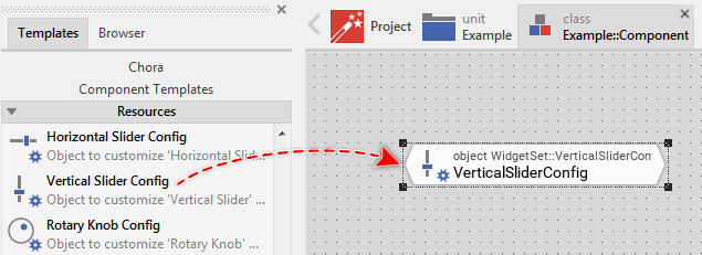
★In the folder locate the template Vertical Slider Config.
★Drag & Drop the template into the Composer window:
★Eventually name the new added Vertical Slider Config object.
Inspect the Vertical Slider Config object
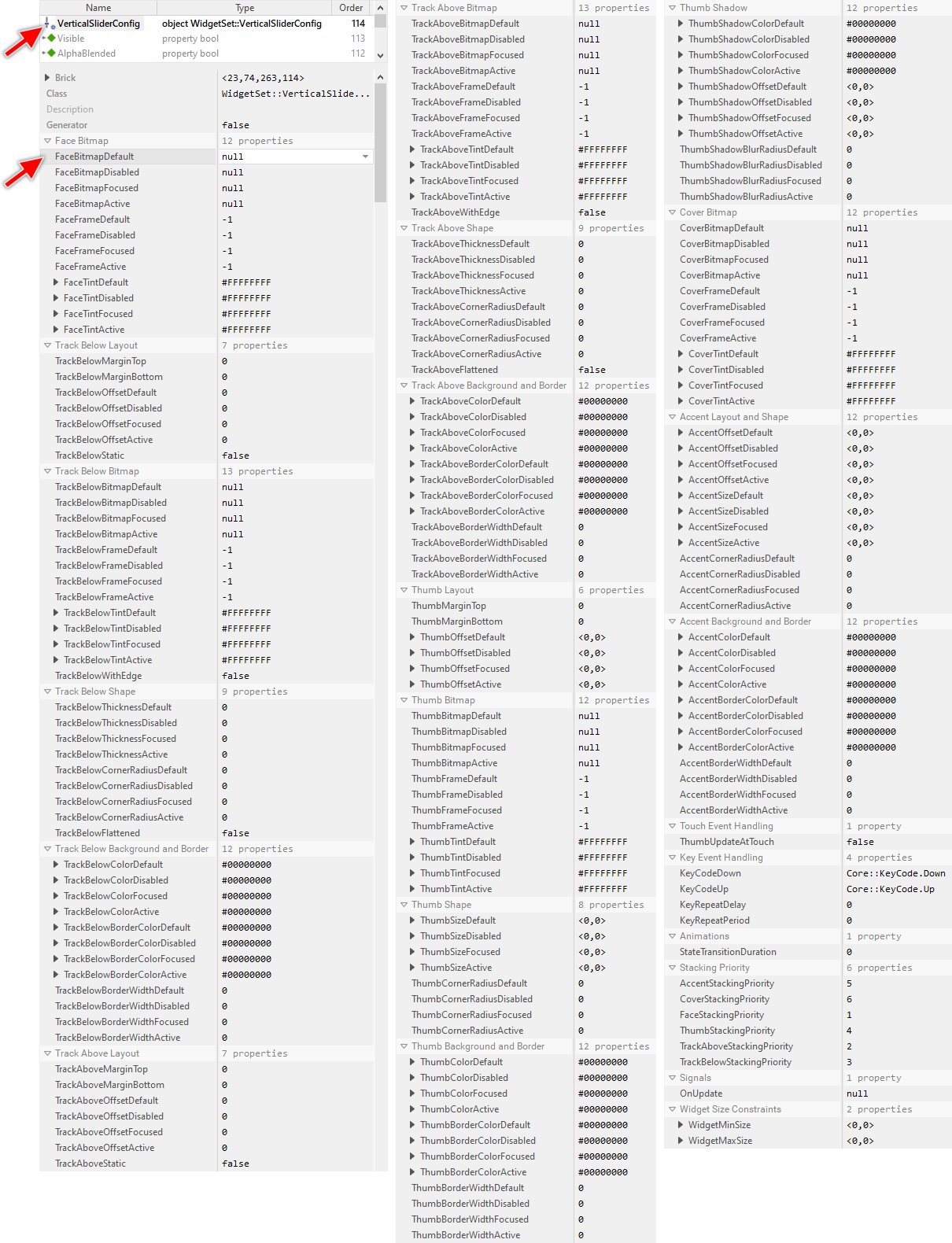
As long as the Vertical Slider Config object is selected you can inspect and modify its properties conveniently in the Inspector window as demonstrated with the property FaceBitmapDefault in the screenshot below. Please note, for better overview the below screenshot has been made with Inspector window being configured to sort the properties by categories:
This is in so far worth mentioning as the following sections describe diverse features of the Vertical Slider Config object by explicitly referring to its corresponding properties. If you are not familiar with the concept of a property and the usage of Inspector window, please read first the preceding chapter Compositing component appearance.
Specify bitmaps and colors for the Slider's face image
As explained in the section above the Face view occupies horizontally centered the entire height in the background of every Vertical Slider. With the following properties you specify the bitmap resources as well as other parameters to be used by this view depending on the slider's actual state. In other words, you use them to configure the appearance of the Vertical Slider's background:
Property |
Description |
|---|---|
With these properties you specify the bitmap resource the Vertical Slider has to display in its background Face view. You have to specify the bitmaps individually for every possible slider state. If you leave one property initialized with the value null, the background remains empty (transparent) as long as the slider is in the corresponding state. |
|
These properties are relevant only if the bitmap resource specified in the corresponding above described property FaceBitmapDefault, FaceBitmapActive, FaceBitmapFocused or FaceBitmapDisabled contains more than one frame. In such case you use them to determine the desired frame number. Is one of the bitmaps additionally configured as containing an animated sequence you can initialize the corresponding FaceFrame... property with the value -1 to instruct the Vertical Slider to automatically play the animation as long as the slider remains in this state. |
|
The effect of these four properties depends on the type of the bitmap resource specified in the corresponding above described property FaceBitmapDefault, FaceBitmapActive, FaceBitmapFocused or FaceBitmapDisabled. In case of alpha-only bitmaps you use the properties to determine the colors to tint the bitmaps. In all other cases you can use the alpha value of the corresponding FaceTint... property to simply modulate the opacity of the affected bitmap. |
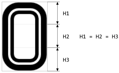
The specified bitmaps will fill horizontally centered the entire height of the Vertical Slider. This is achieved by so-called 9-slice image scaling technique where the intended destination area is filled with slices copied from the original bitmap. In case of the Vertical Slider, however, the slices are copied vertically only. In the horizontal direction, the bitmaps retain their original width and they are just centered within the background area. Therefore, if you want the Vertical Slider to be flexibly resizable, you have to ensure that the used Face bitmaps are composed of three equally sized slices arranged in a single column as shown in the following figure. You should consider this aspect when designing the bitmaps in a graphic editor:
In turn, if the bitmaps in the background of your Vertical Slider are intended to always have the same fixed height, you can ignore the above bitmap design restrictions. Just design your desired bitmaps and explicitly define size constraints for the widget itself to ensure, that its height is fixed and it corresponds to the of the used Face bitmaps.
If you leave all four properties FaceBitmapDefault, FaceBitmapActive, FaceBitmapFocused and FaceBitmapDisabled initialized with null, the Vertical Slider will appear without any background.
Specify bitmaps and colors for the Slider's lower track image
As explained in the section above the TrackBelow view occupies horizontally centered the background area of the slider between its bottom edge and the actual position of the thumb. With the following properties you specify the bitmap resources as well as other parameters to be used by this view depending on the slider's actual state. In other words, you use them to configure the appearance of the track displayed below the slider's thumb:
Property |
Description |
|---|---|
With these properties you specify the bitmap resource the Vertical Slider has to display in its background TrackBelow view. You have to specify the bitmaps individually for every possible slider state. If you leave one property initialized with the value null, the lower track remains empty (transparent) as long as the slider is in the corresponding state. |
|
These properties are relevant only if the bitmap resource specified in the corresponding above described property TrackBelowBitmapDefault, TrackBelowBitmapActive, TrackBelowBitmapFocused or TrackBelowBitmapDisabled contains more than one frame. In such case you use them to determine the desired frame number. Is one of the bitmaps additionally configured as containing an animated sequence you can initialize the corresponding TrackBelowFrame... property with the value -1 to instruct the Vertical Slider to automatically play the animation as long as the slider remains in this state. |
|
The effect of these four properties depends on the type of the bitmap resource specified in the corresponding above described property TrackBelowBitmapDefault, TrackBelowBitmapActive, TrackBelowBitmapFocused or TrackBelowBitmapDisabled. In case of alpha-only bitmaps you use the properties to determine the colors to tint the bitmaps. In all other cases you can use the alpha value of the corresponding TrackBelowTint... property to simply modulate the opacity of the affected bitmap. |
The specified bitmaps will fill horizontally centered the Vertical Slider between its bottom edge and the actual thumb position. This is achieved by so-called 9-slice image scaling technique where the intended destination area is filled with slices copied from the original bitmap. In case of the Vertical Slider, however, the slices are copied vertically only. In the horizontal direction, the bitmaps retain their original width and they are just centered within the slider's area. Therefore, you have to ensure that the used TrackBelow bitmaps are composed of three equally sized slices arranged in a single column as shown in the following figure. You should consider this aspect when designing the bitmaps in a graphic editor:
If you leave all four properties TrackBelowBitmapDefault, TrackBelowBitmapActive, TrackBelowBitmapFocused and TrackBelowBitmapDisabled initialized with null, the Vertical Slider will appear without any track below the thumb.
Specify bitmaps and colors for the Slider's upper track image
As explained in the section above the TrackAbove view occupies horizontally centered the background area of the slider between the actual position of the thumb and the slider's top edge. With the following properties you specify the bitmap resources as well as other parameters to be used by this view depending on the slider's actual state. In other words, you use them to configure the appearance of the track displayed on the right of the slider's thumb:
Property |
Description |
|---|---|
With these properties you specify the bitmap resource the Vertical Slider has to display in its background TrackAbove view. You have to specify the bitmaps individually for every possible slider state. If you leave one property initialized with the value null, the upper track remains empty (transparent) as long as the slider is in the corresponding state. |
|
These properties are relevant only if the bitmap resource specified in the corresponding above described property TrackAboveBitmapDefault, TrackAboveBitmapActive, TrackAboveBitmapFocused or TrackAboveBitmapDisabled contains more than one frame. In such case you use them to determine the desired frame number. Is one of the bitmaps additionally configured as containing an animated sequence you can initialize the corresponding TrackAboveFrame... property with the value -1 to instruct the Vertical Slider to automatically play the animation as long as the slider remains in this state. |
|
The effect of these four properties depends on the type of the bitmap resource specified in the corresponding above described property TrackAboveBitmapDefault, TrackAboveBitmapActive, TrackAboveBitmapFocused or TrackAboveBitmapDisabled. In case of alpha-only bitmaps you use the properties to determine the colors to tint the bitmaps. In all other cases you can use the alpha value of the corresponding TrackAboveTint... property to simply modulate the opacity of the affected bitmap. |
The specified bitmaps will fill horizontally centered the Vertical Slider between the actual thumb position and the slider's top edge. This is achieved by so-called 9-slice image scaling technique where the intended destination area is filled with slices copied from the original bitmap. In case of the Vertical Slider, however, the slices are copied vertically only. In the horizontal direction, the bitmaps retain their original width and they are just centered within the slider's area. Therefore, you have to ensure that the used TrackAbove bitmaps are composed of three equally sized slices arranged in a single column as shown in the following figure. You should consider this aspect when designing the bitmaps in a graphic editor:
If you leave all four properties TrackAboveBitmapDefault, TrackAboveBitmapActive, TrackAboveBitmapFocused and TrackAboveBitmapDisabled initialized with null, the Vertical Slider will appear without any track above the thumb.
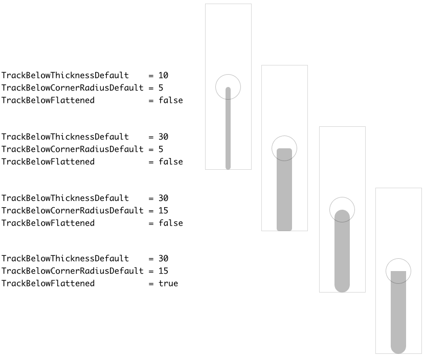
Configure the shape of the Slider's lower track (as scalable vector graphic)
Starting with version 13, the Vertical Slider enhances its visual element TrackBelow by a rectangle and border views. Those new views display the track using scalable vector graphic so that the Vertical Slider is not restricted anymore to use bitmap resources only. To configure the area and the shape of the new views, following properties are available:
Property |
Description |
|---|---|
These properties determine the width in pixel of a filled rectangle and border belonging to the lower track when the slider is in the corresponding state. That means, the properties control the width of the track. |
|
These properties control the rounding at corners of the track views when the slider is in the corresponding state. Normally, the track views have the shape of a rectangle with sharp corners. Specifying a value greater than 0 in these properties rounds the corners. The larger the value, the bigger the rounding effect. |
|
This property controls the appearance of the lower track at its edge corresponding to the actual thumb position. Per default the corners at the edge are rounded according to the value specified in the above mentioned TrackBelowCornerRadiusXXX properties. By configuring the property TrackBelowFlattened with the value true, the corner rounding occurs only when the track has assumed its topmost position. As long as the track is smaller, the edge at the actual thumb position is clipped (it appears flattened). The topmost position for the track is configured by the property TrackBelowMarginTop. |
The following figure demonstrates the effect of diverse property combinations. The gray thin borders indicate the areas of the resulting Slider. The circles indicate the thumb positions. For demonstration purpose the track views are configured to appear with rounded corners:
Please note, per default the track is centered horizontally within the area of the Vertical Slider. As explained in the section Specify the offset and margins for the Slider's lower track this horizontal position as well as the top and bottom margins for the track can be configured.
Configure the colors and borders of the Slider's lower track (as scalable vector graphic)
Starting with version 13, the Vertical Slider enhances its visual element TrackBelow by a rectangle and border views. Those new views display the track using scalable vector graphic so that the Vertical Slider is not restricted anymore to use bitmap resources only. As described in the section above the shape of the new track views can be configured for each widget state individually. With following properties you configure the colors to fill the background of the track and to stroke its borders:
Property |
Description |
|---|---|
These properties determine the color to fill the background of the track when the slider is in the corresponding state. |
|
These properties determine the thickness of the border surrounding the track when the slider is in the corresponding state. |
|
These properties determine the color to stroke the border surrounding the track when the slider is in the corresponding state. To see the border ensure that the properties from the list above configure the border thickness greater than 0. |
The following figure demonstrates the effect of diverse property combinations. The gray thin borders indicate the areas of the resulting Vertical Slider. The circles indicate the thumb positions. For demonstration purpose the track views are configured to appear with rounded corners:
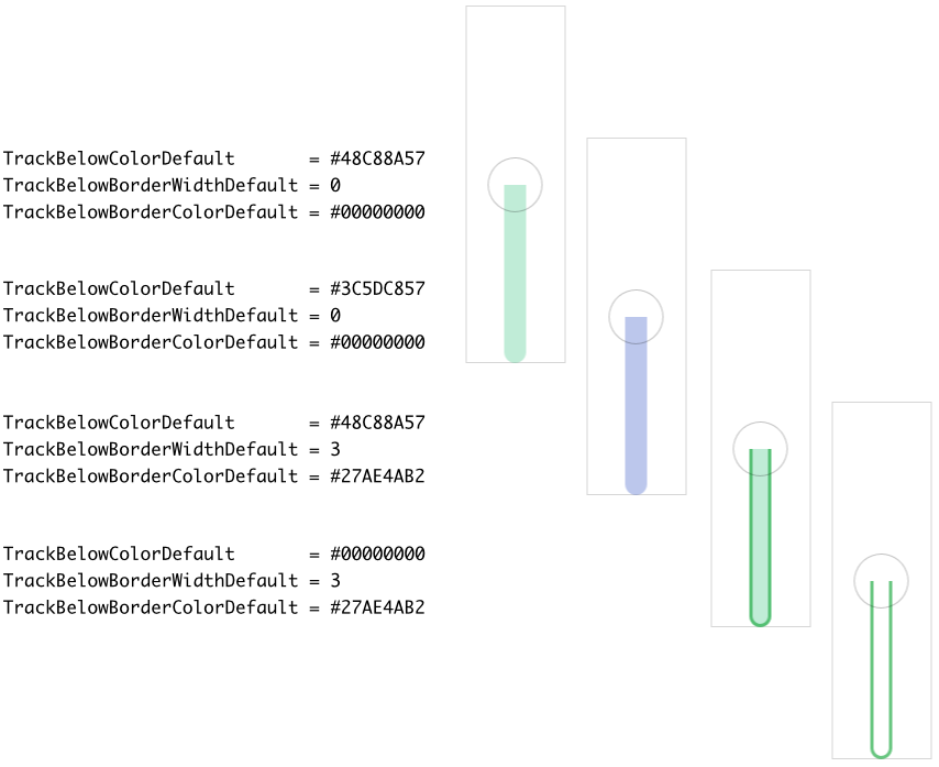
Please note, if the track is configured to fill the background and stroke border around it, the border will always appear in front of the filled background area as demonstrated in the figure above.
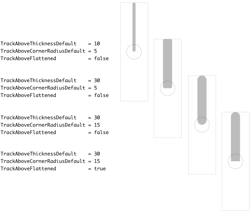
Configure the shape of the Slider's upper track (as scalable vector graphic)
Starting with version 13, the Vertical Slider enhances its visual element TrackAbove by a rectangle and border views. Those new views display the track using scalable vector graphic so that the Vertical Slider is not restricted anymore to use bitmap resources only. To configure the area and the shape of the new views, following properties are available:
Property |
Description |
|---|---|
These properties determine the width in pixel of a filled rectangle and border belonging to the upper track when the slider is in the corresponding state. That means, the properties control the width of the track. |
|
These properties control the rounding at corners of the track views when the slider is in the corresponding state. Normally, the track views have the shape of a rectangle with sharp corners. Specifying a value greater than 0 in these properties rounds the corners. The larger the value, the bigger the rounding effect. |
|
This property controls the appearance of the upper track at its edge corresponding to the actual thumb position. Per default the corners at the edge are rounded according to the value specified in the above mentioned TrackAboveCornerRadiusXXX properties. By configuring the property TrackAboveFlattened with the value true, the corner rounding occurs only when the track has assumed its bottommost position. As long as the track is smaller, the edge at the actual thumb position is clipped (it appears flattened). The bottommost position for the track is configured by the property TrackAboveMarginBottom. |
The following figure demonstrates the effect of diverse property combinations. The gray thin borders indicate the areas of the resulting Slider. The circles indicate the thumb positions. For demonstration purpose the track views are configured to appear with rounded corners:
Please note, per default the track is centered horizontally within the area of the Vertical Slider. As explained in the section Specify the offset and margins for the Slider's upper track this horizontal position as well as the top and bottom margins for the track can be configured.
Configure the colors and borders of the Slider's upper track (as scalable vector graphic)
Starting with version 13, the Vertical Slider enhances its visual element TrackAbove by a rectangle and border views. Those new views display the track using scalable vector graphic so that the Vertical Slider is not restricted anymore to use bitmap resources only. As described in the section above the shape of the new track views can be configured for each widget state individually. With following properties you configure the colors to fill the background of the track and to stroke its borders:
Property |
Description |
|---|---|
These properties determine the color to fill the background of the track when the slider is in the corresponding state. |
|
These properties determine the thickness of the border surrounding the track when the slider is in the corresponding state. |
|
These properties determine the color to stroke the border surrounding the track when the slider is in the corresponding state. To see the border ensure that the properties from the list above configure the border thickness greater than 0. |
The following figure demonstrates the effect of diverse property combinations. The gray thin borders indicate the areas of the resulting Vertical Slider. The circles indicate the thumb positions. For demonstration purpose the track views are configured to appear with rounded corners:
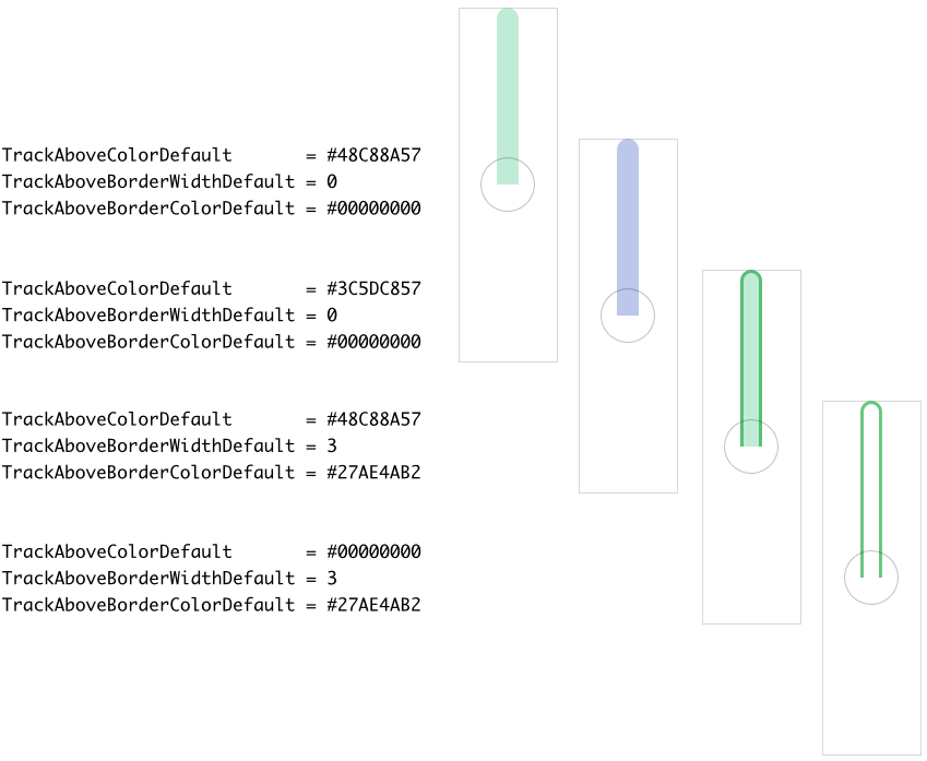
Please note, if the track is configured to fill the background and stroke border around it, the border will always appear in front of the filled background area as demonstrated in the figure above.
Specify the offset and margins for the Slider's lower track
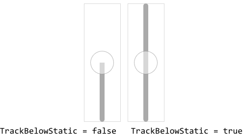
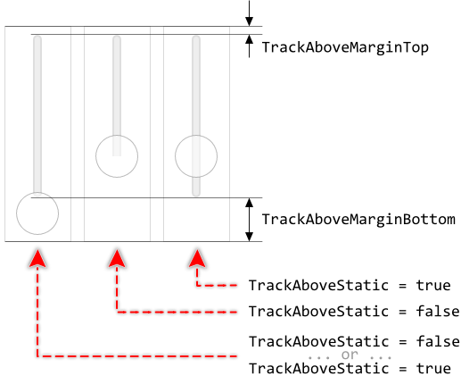
Per default, the lower track fills the area between the bottom edge of the widget and the actual thumb position. When the thumb moves, the height of the track is adjusted automatically. If this is not desired, configure the property TrackBelowStatic with the value true. Now, the height of the lower track is fixed filling vertically the entire area of the Slider regardless of the current thumb position. The following figure demonstrates the effect of this property (the gray borders indicate the areas of the respective slider):
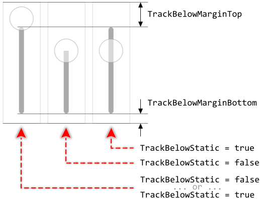
Further properties TrackBelowMarginTop and TrackBelowMarginBottom are useful to determine the minimal distances in pixel between the top/bottom edges of the Slider and the corresponding ends of the track. The so configured margins limit the range in which the track's height may change. Once the margin is reached, the track stops growing. This is also true for tracks configured to have fixed height (property TrackBelowStatic). In such case, the static track will fill the area between the margins. The following figure demonstrates the effect of the margins (the gray borders indicate the areas of the respective slider):
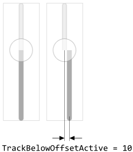
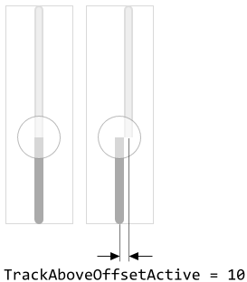
Unless it was explicitly configured, the tracks are centered horizontally within the Slider's area. By using the properties TrackBelowOffsetDefault, TrackBelowOffsetActive, TrackBelowOffsetFocused and TrackBelowOffsetDisabled an additional horizontal displacement for the track can be configured. The resulting track position can thus depend on the current state of the widget. For example, in the Active state the Track views may appear slightly shifted resulting in the visual effect as if the Slider were pressed:
Specify the offset and margins for the Slider's upper track
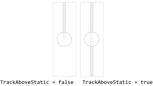
Per default, the upper track fills the area between the top edge of the widget and the actual thumb position. When the thumb moves, the height of the track is adjusted automatically. If this is not desired, configure the property TrackAboveStatic with the value true. Now, the height of the upper track is fixed filling vertically the entire area of the Slider regardless of the current thumb position. The following figure demonstrates the effect of this property (the gray borders indicate the areas of the respective slider):
Further properties TrackAboveMarginTop and TrackAboveMarginBottom are useful to determine the minimal distances in pixel between the top/bottom edges of the Slider and the corresponding ends of the track. The so configured margins limit the range in which the track's height may change. Once the margin is reached, the track stops growing. This is also true for tracks configured to have fixed height (property TrackAboveStatic). In such case, the static track will fill the area between the margins. The following figure demonstrates the effect of the margins (the gray borders indicate the areas of the respective slider):
Unless it was explicitly configured, the tracks are centered horizontally within the Slider's area. By using the properties TrackAboveOffsetDefault, TrackAboveOffsetActive, TrackAboveOffsetFocused and TrackAboveOffsetDisabled an additional horizontal displacement for the track can be configured. The resulting track position can thus depend on the current state of the widget. For example, in the Active state the Track views may appear slightly shifted resulting in the visual effect as if the Slider were pressed:
Configure how to join together the Slider's lower and upper tracks
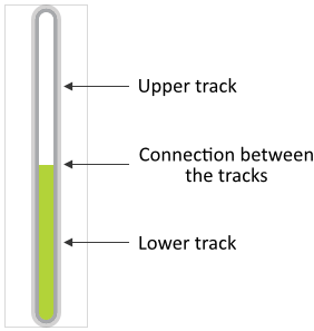
The lower and the upper track images fill the corresponding areas below and above the thumb. As described in the chapters above, it is achieved by so-called 9-slice image scaling technique where the respective area is filled with slices copied from the original track bitmap. The both track images join together at the current thumb position. To produce an effect of the both tracks being connected seamlessly, the tracks are per default truncated at this position. You can imagine, the upper cap of the lower track and the lower cap of the upper track are not displayed. This is demonstrated in the following figure:
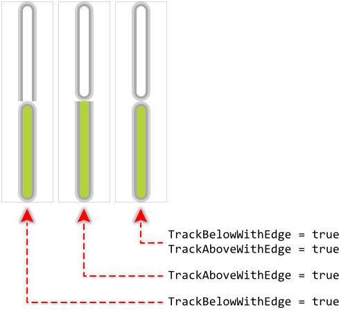
This truncation is not always desired. Depending on the design of your individual slider, it can be necessary to always display the whole track inclusive its both end caps. This can be controlled by modifying the properties TrackBelowWithEdge and TrackAboveWithEdge. If you assign the value true to the property TrackBelowWithEdge, the lower track is not truncated anymore. It appears with its all edges. Similarly, if you initialize TrackAboveWithEdge with true, the upper track is not truncated. You can also combine both. The following figure demonstrates the effect of these properties:
Specify bitmaps and colors for the Slider's thumb image
As explained in the section above the Thumb view is displayed centered at the actual thumb position within the slider's area. With the following properties you specify the bitmap resources as well as other parameters to be used by this view depending on the slider's actual state. In other words, you use them to configure the appearance of the thumb image in the foreground of the slider:
Property |
Description |
|---|---|
With these properties you specify the bitmap resource the Vertical Slider has to display in its foreground Thumb view. You have to specify the bitmaps individually for every possible slider state. If you leave one property initialized with the value null, the thumb remains empty (transparent) as long as the slider is in the corresponding state. |
|
These properties are relevant only if the bitmap resource specified in the corresponding above described property ThumbBitmapDefault, ThumbBitmapActive, ThumbBitmapFocused or ThumbBitmapDisabled contains more than one frame. In such case you use them to determine the desired frame number. Is one of the bitmaps additionally configured as containing an animated sequence you can initialize the corresponding ThumbFrame... property with the value -1 to instruct the Vertical Slider to automatically play the animation as long as the slider remains in this state. |
|
The effect of these four properties depends on the type of the bitmap resource specified in the corresponding above described property ThumbBitmapDefault, ThumbBitmapActive, ThumbBitmapFocused or ThumbBitmapDisabled. In case of alpha-only bitmaps you use the properties to determine the colors to tint the bitmaps. In all other cases you can use the alpha value of the corresponding ThumbTint... property to simply modulate the opacity of the affected bitmap. |
The specified bitmaps will appear centered vertically and horizontally at the position resulting from the slider's current value. This corresponds to the position where the lower and upper tracks join together. The thumb overlays this position.
If you leave all four properties ThumbBitmapDefault, ThumbBitmapActive, ThumbBitmapFocused and ThumbBitmapDisabled initialized with null, the Vertical Slider will appear without any thumb. In this case, the relation between the height of the lower and upper tracks express the slider's actual position.
Configure the shape and the layout of the Slider's thumb (as scalable vector graphic)
Starting with version 13, the Vertical Slider enhances its visual element Thumb by a rectangle, border and shadow views. Those new views display the thumb using scalable vector graphic so that the Vertical Slider is not restricted anymore to use bitmap resources only. To configure the area and the shape of the new views, following properties are available:
Property |
Description |
|---|---|
These properties determine the size of the thumb views when the slider is in the corresponding state. |
|
These properties determine an additional displacement for the thumb views when the slider is the corresponding state. Usually, the thumb views are centered at the current thumb position. By specifying a value other than <0,0> in a ThumbOffsetXXX property causes the thumb views to move by the respective offset. |
|
These properties control the rounding at corners of the thumb views when the slider is in the corresponding state. Normally, the thumb views have the shape of a rectangle with sharp corners. Specifying a value greater than 0 in these properties rounds the corners. The larger the value, the bigger the rounding effect. |
The following figure demonstrates the effect of diverse property combinations. The gray thin borders indicate the areas of the resulting Slider. For demonstration purpose the thumb views are configured to appear with rounded corners:
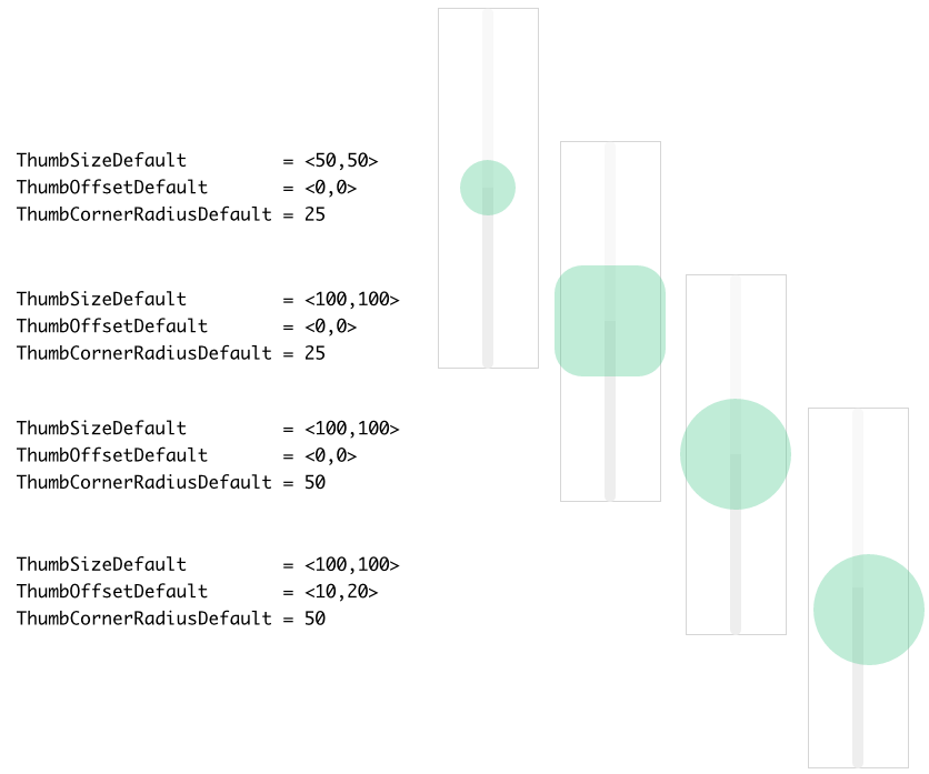
Please note, if the Slider is configured so that parts of its thumb are lying outside the Slider's area, these are not clipped and will remain visible outside the widget as demonstrated in the figure above. These parts, however, are not sensitive to touch or mouse interactions.
Configure the colors and borders of the Slider's thumb (as scalable vector graphic)
Starting with version 13, the Vertical Slider enhances its visual element Thumb by a rectangle, border and shadow views. Those new views display the thumb using scalable vector graphic so that the Vertical Slider is not restricted anymore to use bitmap resources only. As described in the section above the position and the shape of the new thumb views can be configured for each widget state individually. With following properties you configure the colors to fill the background of the thumb and to stroke its borders:
Property |
Description |
|---|---|
These properties determine the color to fill the background of the thumb when the slider is in the corresponding state. |
|
These properties determine the thickness of the border surrounding the thumb when the slider is in the corresponding state. |
|
These properties determine the color to stroke the border surrounding the thumb when the slider is in the corresponding state. To see the border ensure that the properties from the list above configure the border thickness greater than 0. |
The following figure demonstrates the effect of diverse property combinations. The gray thin borders indicate the areas of the resulting Vertical Slider. For demonstration purpose the thumb views are configured to appear with rounded corners:
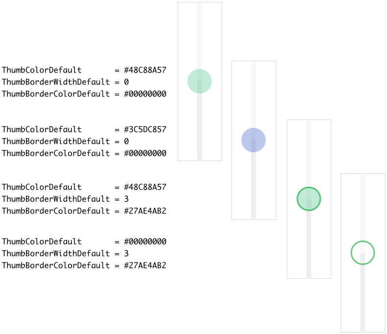
Please note, if the thumb is configured to fill the background and stroke border around it, the border will always appear in front of the filled background area as demonstrated in the figure above.
Configure the shadow of the Slider's thumb (as scalable vector graphic)
Starting with version 13, the Vertical Slider enhances its visual element Thumb by a rectangle, border and shadow views. Those new views display the thumb using scalable vector graphic so that the Vertical Slider is not restricted anymore to use bitmap resources only. As described in the section above the position and the shape of the new thumb views can be configured for each widget state individually. Using the following properties you configure the shadow parameters of the thumb:
Property |
Description |
|---|---|
These properties determine the color of the shadow behind the thumb when the slider is in the corresponding state. |
|
These properties determine the blur radius of the shadow behind the thumb when the slider is in the corresponding state. The greater the value the more blurred the resulting shadow. |
|
These properties determine optional displacement of the shadow behind the thumb when the slider is in the corresponding state. |
The following figure demonstrates the effect of diverse property combinations. The gray thin borders indicate the areas of the resulting Vertical Slider. For demonstration purpose the thumb is configured to appear with rounded corners:
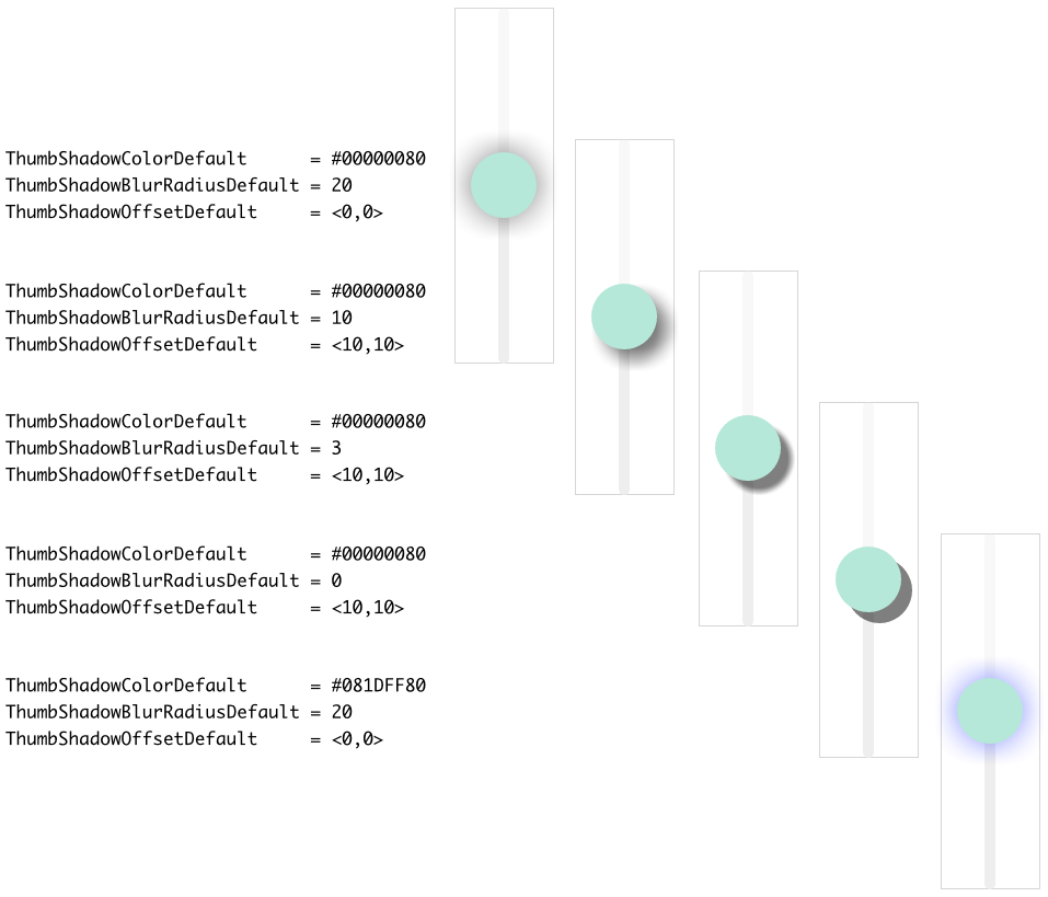
Please note, concerning the stacking order, the shadow always appears in the background of the thumb, just behind its filled rectangle view and/or the border view. Furthermore, if the thumb's background is transparent or semi-transparent, the shadow shines through the background.
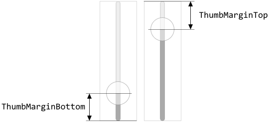
Specify the offset and margins for the Slider's thumb
Per default, the thumb can be moved freely across the entire height of the Vertical Slider. If this is not desired, you can specify in the properties ThumbMarginBottom and ThumbMarginTop additional gaps in pixel between the thumb image and the respective bottom or top edge of the slider. The following figure demonstrates the effect of these properties (the gray borders indicate the areas of the respective slider):
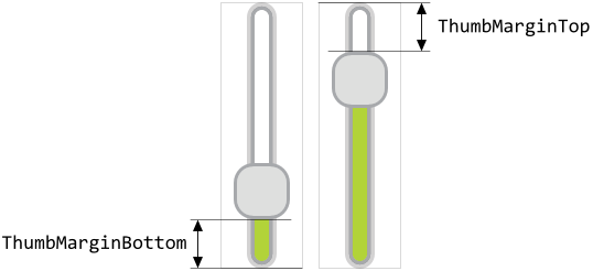
If the Vertical Slider is configured to appear without the thumb image (the property ThumbBitmapDefault, ThumbBitmapActive, ThumbBitmapFocused or ThumbBitmapDisabled is null), the specified margins are still valid. The properties ThumbMarginBottom and ThumbMarginTop determine in this case the minimal distances between the position where the both tracks join together (the expected center position of the thumb) and the respective bottom or top edges of the widget. In other words, by using the properties you can specify the minimum height for the corresponding lower and upper tracks:
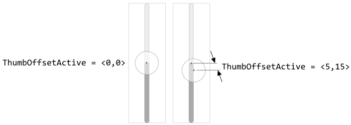
Unless it was explicitly configured, the center of the thumb and the position where the both tracks join together do match. In other words, the thumb appears horizontally centered at the tracks join position. By using the properties ThumbOffsetDefault, ThumbOffsetActive, ThumbOffsetFocused and ThumbOffsetDisabled an additional displacement for the thumb can be configured. The resulting thumb position can thus depend on the current state of the widget. For example, in the Active state the Thumb views may appear slightly shifted resulting in the visual effect as if the thumb were pressed:
Configure the shape and the layout of the Slider's accent
Starting with version 13, the Vertical Slider includes a new visual element named Accent. This new visual element is primarily intended to emphasis the widget's appearance when it is in a particular state (e.g. focused). However, it can also be used alone or combined with other visual elements to achieve desired design effects. The accent is composed of a simple rectangle and border views. The views can be configured to appear with rounded corners. The both views occupy the same area and are per default centered at the current thumb position. To configure this area and the shape of the Accent following properties are available:
Property |
Description |
|---|---|
These properties determine the size of the accent when the slider is in the corresponding state. |
|
These properties determine an additional displacement for the accent when the slider is the corresponding state. Usually, the accent is centered at the current thumb position. By specifying a value other than <0,0> in an AccentOffsetXXX property causes the accent to move by the respective offset. |
|
These properties control the rounding at corners of the accent when the slider is in the corresponding state. Normally, the accent has the shape of a rectangle with sharp corners. Specifying a value greater than 0 in these properties rounds the corners. The larger the value, the bigger the rounding effect. |
The following figure demonstrates the effect of diverse property combinations. The gray thin borders indicate the areas of the resulting Slider. For demonstration purpose the accent is configured to appear with rounded corners:
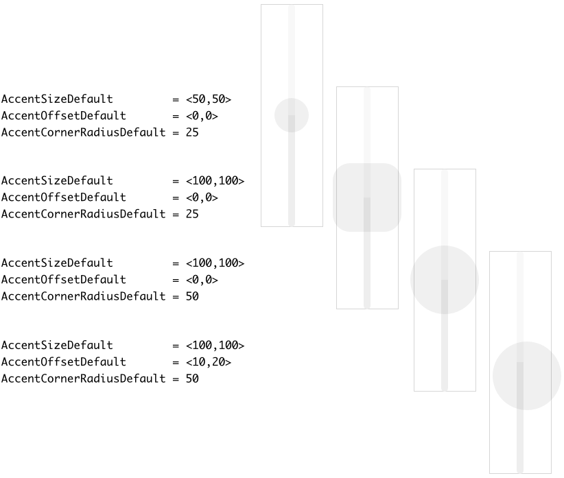
Please note, if the Vertical Slider is configured so that parts of its accent are lying outside the Slider's area, these are not clipped and will remain visible outside the widget as demonstrated in the figure above. These parts, however, are not sensitive to touch or mouse interactions.
Configure the colors and borders of the Slider's accent
Starting with version 13, the Vertical Slider includes a new visual element named Accent. This new visual element is primarily intended to emphasis the widget's appearance when it is in a particular state (e.g. focused). However, it can also be used alone or combined with other visual elements to achieve desired design effects. The accent is composed of a simple rectangle and border views. As described in the section above the position and the shape of the accent can be configured for each widget state individually. With following properties you configure the colors to fill the background of the accent and to stroke its borders:
Property |
Description |
|---|---|
These properties determine the color to fill the background of the accent when the slider is in the corresponding state. |
|
These properties determine the thickness of the border surrounding the accent when the slider is in the corresponding state. |
|
These properties determine the color to stroke the border surrounding the accent when the slider is in the corresponding state. To see the border ensure that the properties from the list above configure the border thickness greater than 0. |
The following figure demonstrates the effect of diverse property combinations. The gray thin borders indicate the areas of the resulting Vertical Slider. For demonstration purpose the accent is configured to appear with rounded corners:
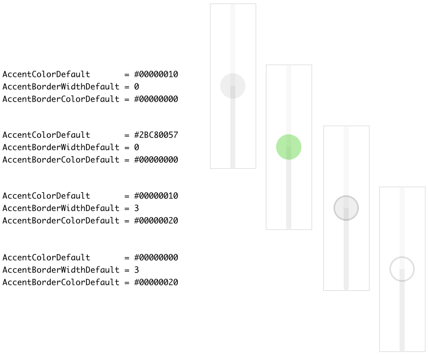
Please note, if the accent is configured to fill the background and stroke border around it, the border will always appear in front of the filled background area as demonstrated in the figure above.
Specify bitmaps and colors for the Slider's cover image
As explained in the section above the Cover view occupies horizontally centered the entire height in the foreground of every Vertical Slider. Thus as its name indicates, it is intended to be used as a kind of cover, mask, etc. overlaying the thumb and the tracks. With the following properties you specify the bitmap resources as well as other parameters to be used by this view depending on the slider's actual state. In other words, you use them to configure the appearance of the Vertical Slider's foreground:
Property |
Description |
|---|---|
With these properties you specify the bitmap resource the Vertical Slider has to display in its foreground Cover view. You have to specify the bitmaps individually for every possible slider state. If you leave one property initialized with the value null, the foreground remains empty (transparent) as long as the slider is in the corresponding state. |
|
These properties are relevant only if the bitmap resource specified in the corresponding above described property CoverBitmapDefault, CoverBitmapActive, CoverBitmapFocused or CoverBitmapDisabled contains more than one frame. In such case you use them to determine the desired frame number. Is one of the bitmaps additionally configured as containing an animated sequence you can initialize the corresponding CoverFrame... property with the value -1 to instruct the Vertical Slider to automatically play the animation as long as the slider remains in this state. |
|
The effect of these four properties depends on the type of the bitmap resource specified in the corresponding above described property CoverBitmapDefault, CoverBitmapActive, CoverBitmapFocused or CoverBitmapDisabled. In case of alpha-only bitmaps you use the properties to determine the colors to tint the bitmaps. In all other cases you can use the alpha value of the corresponding CoverTint... property to simply modulate the opacity of the affected bitmap. |
The specified bitmaps will fill horizontally centered the entire height of the Vertical Slider. This is achieved by so-called 9-slice image scaling technique where the intended destination area is filled with slices copied from the original bitmap. In case of the Vertical Slider, however, the slices are copied vertically only. In the horizontal direction, the bitmaps retain their original width and they are just centered within the slider's area. Therefore, if you want the Vertical Slider to be flexibly resizable, you have to ensure that the used Cover bitmaps are composed of three equally sized slices arranged in a single column as shown in the following figure. You should consider this aspect when designing the bitmaps in a graphic editor:
In turn, if the bitmaps in the foreground of your Vertical Slider are intended to always have the same fixed height, you can ignore the above bitmap design restrictions. Just design your desired bitmaps and explicitly define size constraints for the widget itself to ensure, that its height is fixed and it corresponds to the of the used Cover bitmaps.
If you leave all four properties CoverBitmapDefault, CoverBitmapActive, CoverBitmapFocused and CoverBitmapDisabled initialized with null, the Vertical Slider will appear without any foreground.
Configure how the Vertical Slider should react on touch events
Depending on the configuration of the Vertical Slider, the slider will handle touch events in different ways. Generally, the slider reacts on touch events when the user touches inside the area of the thumb image. Thereupon, when the user drags the finger, the thumb will follow. If the user touches outside the thumb, the slider simply ignores the events and nothing happens.
This behavior changes if you configure the slider to appear without any thumb (the above described property ThumbBitmapDefault and eventually ThumbBitmapFocused are null). In such case the user can touch elsewhere inside the slider's area and by simply dragging the finger modify its current value. With every alternation of the value, the slider will adjust the height of its lower and upper tracks (if these are configured) so that the user can notice the effect of the made interaction.
By setting the property ThumbUpdateAtTouch to the value true the operating mode of the Vertical Slider changes again. Now, when the user touches inside the slider's area, the slider adjusts at first its current value to correspond to the just touched position. In other words, in the moment when the user touches the slider, the slider skips automatically to the affected position. Then the user can interact with the slider as usual. This behavior is true even if the slider has been configured to display a thumb. Thus, with the property ThumbUpdateAtTouch set true the slider will react even if the user touches outside the thumb image.
Configure how the Vertical Slider should react on keyboard events
The Vertical Sliders are not limited to be controlled only by using the touch screen. If a slider is actually focused the user can move its thumb by simply pressing dedicated keys on the keyboard or by using hardware buttons. The corresponding key codes are set per default to the values Core::KeyCode.Down and Core::KeyCode.Up. Accordingly, when the user presses the key Down the thumb is moved downwards. If the user presses the key Up the thumb moves upwards. With the properties KeyCodeDown and KeyCodeUp you can determine another keys to be used for this purpose. Please see the section Configure the filter condition for more details how you select a key code.
With the further property KeyRepeatPeriod you can determine the speed, with it the slider should autonomously continue moving the thumb while the user holds the key pressed. The value of this property is expressed in milliseconds. For example, initializing KeyRepeatPeriod with 100 instructs the slider to behave as if the user repeats to press the key an average every 100 ms (ten times a second). Accordingly, the longer the user holds the key pressed the larger the movement of the thumb and the greater the change of the slider's value.
If your sliders are configured to use this key repetition mode, you can specify in the property KeyRepeatDelay the initial delay in milliseconds how long the slider has to wait before it will start to move the thumb autonomously. For example, if you initialize this property with 500 and the user presses the predetermined key to control the slider, the slider waits a half second. Then, if the user still holds the key pressed, the slider starts to move its thumb autonomously with the speed resulting from the property KeyRepeatPeriod.
If you don't want the key repetition mode, just initialize the property KeyRepeatPeriod with the value 0. If you want your Vertical Sliders to ignore any keyboard events, initialize the both properties KeyCodeDown and KeyCodeUp with the value Core::KeyCode.NoKey. Such sliders will then react to touch screen events only. Please note, if you have configured your sliders to not be able to react to keyboard events, the sliders are also automatically suppressed from being able to become focused.
Configure the Vertical Slider state transition animation
During its life time, the Vertical Slider remains always in one of its four possible states. While the user interacts with the widget, touches it for example, the slider switches between the states fourth and back. Those state transitions occur usually abruptly.
By using the property StateTransitionDuration you can configure the widget to perform all state transitions with an animation. During such animation all colors, size or position values related to the preceding and the current states are interpolated automatically. The property StateTransitionDuration determines the duration of this interpolation in milliseconds. The interpolation itself is performed linearly. If the animation is not desired, leave this property configured with the value 0 (zero).
IMPORTANT
Please note, the animations don't affect transitions between bitmaps used by the widget. When the state alternation occurs, the widget displays the bitmaps corresponding to the actual state immediately.
Configure the Z-order of views belonging to the Vertical Slider
Up to version 12 inclusive the Z-order of visual elements belonging to the Vertical Slider (the order in which the views are displayed one above the other) was fixed predetermined. The Face visual element, for example, was displayed always in the background of the widget while the Thumb and Cover views in the foreground. Starting with the version 13, the Z-order can be modified. For this purpose you specify for each visual element its stacking priority value as integer number. As consequence, visual elements with higher stacking priority will overlap visual elements with lower stacking priority. To configure the stacking priority use following properties:
Property |
Affected visual element |
Default value |
|---|---|---|
The Face view. |
1 |
|
Views belonging to the TrackAbove visual element. |
2 |
|
Views belonging to the TrackBelow visual element. |
3 |
|
Views belonging to the Thumb visual element. |
4 |
|
Views belonging to the Accent visual element. |
5 |
|
The Cover view. |
6 |
Configure the Vertical Slider size constraints
With the both properties WidgetMinSize and WidgetMaxSize you can configure size constraints for all Vertical Sliders using your configuration object. For example, if your Vertical Sliders can not become smaller than 50x100 pixel, initialize the property WidgetMinSize with the value <50,100>. Similarly, by initializing the property WidgetMaxSize you determine the maximum size the sliders may assume at the runtime. Trying to resize the sliders beyond the specified size constraints will be automatically suppressed.
Per default, the properties are initialized with the values <0,0> which means, that no constraints have to be taken in account. If desired, you can also specify constraints only for the width or the height of the slider. For example, if your sliders are flexibly resizable in the vertical direction but they should have fixed width of 50 pixel, you initialize the both properties with the value <50,0>.
Enhance the Vertical Slider configuration by additional decoration views
The appearance of the Slider is limited to the visual elements that compose it. To overcome this limitation you can enrich the Slider by additional decoration views. The section Combine the Slider with decoration views explains how to do this in context of a GUI component containing the Slider. That means, the Slider and the additional decoration views are siblings in context of the superior GUI component. The code necessary to update the appearance of the decoration views is implemented directly within the GUI component.
This approach is practicable when there are only few Sliders you want to combine with decoration views or the Sliders should have different appearance. If you require multiple Sliders to be enhanced by the same set of decoration views, the necessary implementation may become less convenient resulting in the same code being repeated for each Slider instance.
To avoid the code repetition you can associate the necessary update implementation directly to the Slider Config object. The update implementation will then affect all Sliders which are using this configuration object. The Slider Config object provides for this purpose a property OnUpdate. When you assign a slot method to this property, the slot method will receive postsignals every time the state of any of the associated widgets has changed.
Similarly to how the section Combine the Slider with decoration views explains, you implement within the slot method the code to update the position, size and appearance of the decoration views. The approach using the common implementation has however following peculiarities:
★When the slot method is executed, its sender variable refers the instance of the Slider which has triggered the state alternation. Therefore, use sender in the implementation of the slot method to access the affected Slider instance.
★Sliders can exist within multiple GUI components. For example, one widget may exist within an Alert dialog and other may exist within a Settings dialog. These dialogs are completely different GUI components containing a completely different set of views. The implementation of the slot method should therefore avoid accesses to members existing within the GUI component.
★Ideally, the implementation of the slot method operates on the Slider instance only. In particular, it can add to the instance new decoration views, manipulate the views and remove the decoration views again.
★The implementation should avoid modifications on views belonging originally to the Slider. It should limit to views it has created by itself. To identify the own decoration views we recommend the usage of the StackingPriority property. When you assign to a decoration view a stacking priority value, the view can be found later by using the method FindViewWithStackingPriority().
The following code demonstrates a typical implementation of the slot method associated to the OnUpdate property of the Vertical Slider Config object. In this example, we enhance the Vertical Slider by a simple Filled Rectangle view. This decoration view is visible during transitions to the ACTIVE state only:
// Using 'sender' variable get the Vertical Slider instance, which has triggered the update var WidgetSet::VerticalSlider b = (WidgetSet::VerticalSlider)sender; // Within the instance search for our decoration view. Use the 'StackingPriority' value to // identify the view. Here we search for a view with priority == 100. var Core::View v = b.FindViewWithStackingPriority( null, 100, 100, Core::ViewState[]); // Try to type-cast the found view to the expected type (e.g. Rectangle). var Views::Rectangle r = (Views::Rectangle)v; // Show a new or update an already existing decoration view. In this example, the decoration // view should be visible during the transition to the 'ACTIVE' state only. if (( b.GetTransitionEndState() == WidgetSet::CommonState.Active ) && ( b.GetTransitionStartState() != b.GetTransitionEndState())) { var rect a = b.Bounds.orect; var rect q = rect( 0, 0, math_mix( a.w / 2, a.w, b.GetTransitionProgress()), a.h ); // The decoration view is not yet available. Create a new instance and add it to the // Vertical Slider if ( !r ) b.Add( r = new Views::Rectangle, 0 ); // Update the position/size/appearance of the decoration view. r.Bounds = q + a.center - q.center; r.Radius = a.h / 2; r.Color = math_mix( #33333322, #33333300, b.GetTransitionProgress()); // In order to find this view during the next update, identify it with a 'StackingPriority' // value r.StackingPriority = 100; } // The decoration view is not needed anymore. Remove it from the Vertical Slider. else if ( r ) b.Remove( r );
Modify provided default Vertical Slider Config objects
The above sections explained how you create and configure your own Vertical Slider Config objects practically from scratch. This is usual when you have your own GUI design. However, if you prefer to use the configurations provided per default with Embedded Wizard and you want only few settings to be changed, it is more convenient to create a copy of the existing configuration object and adapt the affected property only. Let's assume you want to use the WidgetSet::VerticalSlider_Lime_Large configuration but with different margins below and above the thumb. In such case do following:
★As explained in the section Duplicate an existing autoobject locate the object WidgetSet::VerticalSlider_Lime_Large and copy it to one of your own project units.
★Rename the just created copy to not confound it with the original object.
★As long as the copied object is selected you can inspect and modify its properties conveniently in the Inspector window. Change its property ThumbMarginBottom and ThumbMarginTop now.
★Once you have adapted all properties as expected, you can assign the copied configuration object to every affected Vertical Slider.
CAUTION
Directly modifying the original configuration objects provided with Embedded Wizard is not recommended. The objects are part of the Mosaic framework and Embedded Wizard will prevent you from being able to save any modification made in this framework. Therefore always create and modify copies of the objects.