Using Widgets: Vertical Scrollbar
The Mosaic class WidgetSet::VerticalScrollbar implements a GUI component intended to serve as a Vertical Scrollbar widget. This widget can be used to compose the appearance of other more complex GUI components, in particular to add to them controls intended to show the vertical scroll position and the height of the actually visible area (view) within the body of a large document (content). Each time the user interacts with a Vertical Scrollbar, the widget sends signals to associated slot methods where your particular implementation is executed. Controlling the scrollbars via keyboard or hardware buttons is not intended.
If desired, the scrollbars can also be configured to act as pure passive widgets which then ignore any touch events. Such configured scrollbars are predestined to only show to the user the current position within the scrolled content. To allow the user to scroll the contents another technique (for example the Slide Touch Handler or Key Press Handler) has to be used. Scrollbars can also be configured to disappear automatically when these are not needed, e.g. if the content is already entirely visible so the user has nothing to scroll.
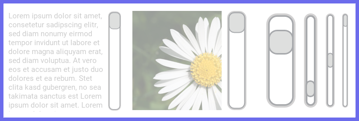
The exact appearance and behavior of the Vertical Scrollbar is determined by a Vertical Scrollbar Config object. This configuration object provides bitmaps, colors and other configuration parameters needed to construct and display the affected Vertical Scrollbar. Embedded Wizard is delivered with a set of prepared Vertical Scrollbar Config objects you can use instantly as they are. However, if desired, you can create your own configuration objects and so customize the Vertical Scrollbar widgets according to your particular design expectations. The following screenshot demonstrates few examples of how Vertical Scrollbars appear in the canvas area of Composer (and accordingly on the screen in your target device):
The following sections are intended to provide you an introduction and useful tips of how to work with and how to customize the Vertical Scrollbars. For the complete reference please see the documentation of the WidgetSet::VerticalScrollbar and WidgetSet::VerticalScrollbarConfig classes.
Add new Vertical Scrollbar
To add a new Vertical Scrollbar widget just at the design time of a GUI component do following:
★First ensure that the Templates window is visible.
★In Templates window switch to the folder Widgets.
★In the folder locate the template Vertical Scrollbar.
★Drag & Drop the template into the canvas area of the Composer window:
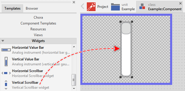
★Eventually name the new added Vertical Scrollbar widget.
Inspect the Vertical Scrollbar
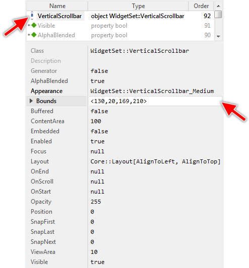
As long as the Vertical Scrollbar widget is selected you can inspect and modify its properties conveniently in the Inspector window as demonstrated with the property Bounds in the screenshot below:
This is in so far worth mentioning as all following sections describe diverse features of the Vertical Scrollbar widget by explicitly referring to its corresponding properties. If you are not familiar with the concept of a property and the usage of Inspector window, please read first the preceding chapter Compositing component appearance.
Arrange the Vertical Scrollbar
Once added, you can freely move the Vertical Scrollbar, or you simply grab one of its corners and resize it in this way. You can control the position and the size of the widget also by directly modifying its property Bounds. If you want the Vertical Scrollbar to appear behind other views you can reorder it explicitly.
Select the appearance for the Vertical Scrollbar
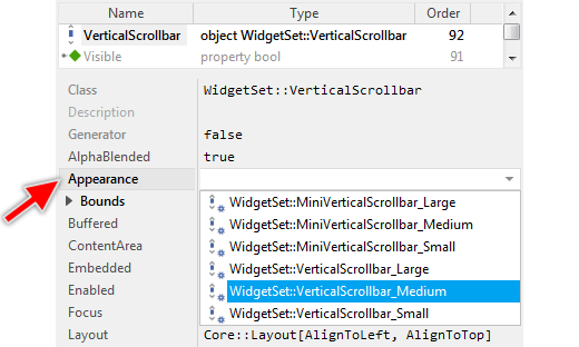
The appearance and partially also the behavior of the Vertical Scrollbar widget can be configured according to your particular design expectation. For demonstration purpose and to help you to quickly create new product prototypes, Embedded Wizard contains six ready to use configurations you can use instantly. The following figure demonstrates all available default configurations at once:
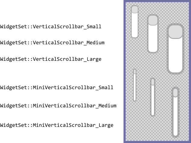
The configurations are divided in two sets, every with three sizes small, medium and large. The first set is predestined to be used wherever you need an interactive scrollbar. The user can touch and drag their thumbs. The second set (called Mini) presents a thinner variant of the scrollbars. These are not interactive and they are configured to automatically disappear when not needed.
To use the desired appearance configuration you have to select it in the property Appearance of the affected Vertical Scrollbar widget as demonstrated in the screenshot below. You can use the integrated Inspector Assistant window to conveniently select the right configuration. If you like the provided default configurations then you can use them as they are:
If you prefer to adapt the appearance of the Vertical Scrollbar by yourself, then you have to create a new Vertical Scrollbar Config object and specify in it all the bitmaps, colors as well as other parameters to customize your individual Vertical Scrollbar. Once your configuration object is available, you can select it in the property Appearance exactly as you select one of the configurations provided per default with Embedded Wizard.
Understand the states of the Vertical Scrollbar
During its life time, the Vertical Scrollbar remains always in one of its three possible states. While the user interacts with the widget, the scrollbar switches between the states fourth and back. Understanding these states is especially essential when you intend to customize your own individual Vertical Scrollbar. The following table provides an overview of all Vertical Scrollbar states:
State name |
Example |
Description |
|---|---|---|
Default |
|
The state Default determines a scrollbar, which is ready to be touched by the user. This is also the case if the scrollbar has been configured as a passive widget not intended to handle any user inputs. |
Active |
|
The state Active is true, if the user actively touches the scrollbar's thumb. You can imagine, in the Active state, the user interacts with the scrollbar. |
Disabled |
|
The state Disabled is true for every not available scrollbar (the property Enabled of the scrollbar is false). Such scrollbars will ignore any user inputs. |


Determine the scrollbar's current scroll position and scroll range
The Vertical Scrollbar widget is intended to show the scroll position and the height of the actually visible area (the view) within the body of a large document (the content). The height of the entire content and the height of its actually visible area are specified in the corresponding properties ContentArea and ViewArea, both as positive integer values. The current scroll position is determined by the property Position as distance relative to the begin of the content. Based on these values the scrollbar calculates the size and the position for its thumb. The following figure demonstrates the relations between the three properties:
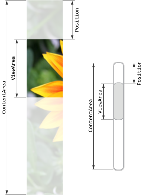
Accordingly, the value of the property Position moves in the range between 0 and ContentArea-ViewArea. If you modify the property Position, ViewArea or ContentArea, the affected scrollbar will implicitly update the position and/or height of its thumb. In turn, if the scrollbar is configured as interactive and the user drags on its thumb, the scrollbar adapts the value of its property Position. By evaluating this property you can simply query which position is actually set in the affected scrollbar.
Please note, if desired, the scrollbar can be configured to not adapt the height of the thumb. In this mode, the thumb will always appear with the smallest possible, fixed height regardless of the actual ratio between the values of the properties ViewArea and ContentArea. Only the vertical position of the thumb changes.
The following example demonstrates how you work with the above mentioned properties. The example contains a Vertical List and a Slide Touch Handler connected together so the user can scroll the list's contents conveniently by simply touching within the list's area. The example contains an additional Vertical Scrollbar intended to show to the user the actual scroll position. Every time the list is scrolled, the scrollbar's properties are updated and the user can recognize the actual position within the list. Please note, this example uses the Mini variant of the per default provided scrollbars. These scrollbars are configured to not react to touch events and to automatically disappear after a short delay:
Please note, the example presents eventually features available as of version 9.00
Implement scrollbar's slot methods
While the user interacts with a Vertical Scrollbar widget and this scrollbar is configured as interactive, the widget sends signals to associated slot methods. Within the slot method your particular implementation can react and process the event. The slot methods are connected to the widget by simply storing them in the for this purpose available properties. The following table describes them:
Property |
Description |
|---|---|
Slot method associated to this property receives a signal as soon as the user touches the scrollbar's thumb. In other words, this event is triggered at the beginning of the interaction between user and the scrollbar. |
|
Slot method associated to this property receives a signal as soon as the user lifts the finger from the Vertical Scrollbar. In other words, this event is triggered at the end of the interaction between user and the scrollbar. |
|
Slot method associated to this property receives a signal as soon as the user has dragged the scrollbar's thumb causing the scrollbar's position to be changed. |
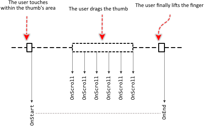
The following sequence diagram demonstrates a typical order in which the slot methods receive signals while the user interacts with the Vertical Scrollbar. Please note, that every interaction starts with a signal sent to the OnStart and ends with a signal sent to the OnEnd slot method. In between, the widget will send signals to OnScroll slot method, every time the user drags the thumb:
Providing slot methods for all properties is not obligatory. In typical application cases it is sufficient to implement the slot method for the OnScroll event only leaving all other properties initialized with the value null. You can initialize the properties with already existing slot methods or you add a new one and implement it as desired. The following steps describe how to do this:
★First add a new slot method to your GUI component.
★Assign the slot method to the corresponding property of the affected Vertical Scrollbar widget (e.g. to the property OnScroll).
★Open the slot method for editing.
★In the Code Editor implement your desired operation to execute when the event occurs.
Usually, in the implementation of the slot method you will evaluate the scrollbar's position. You can, for example, use it to adjust the scroll position of the content associated to the scrollbar. The following code demonstrates:
// Adjust the scroll position of a 'Vertical List' to correspond to the position // determined by the scrollbar. VerticalList.ScrollOffset = -Scrollbar.Position;
The following example project demonstrates how the Vertical Scrollbar is used to scroll the content of a Vertical List. Every time the user touches inside the scrollbar's thumb and drags the finger, the thumb is moved and the slot method associated to the property OnScroll is signaled. The slot method, in turn, contains code to accordingly adjust the scroll position of the list:
Please note, the example presents eventually features available as of version 9.00
Configure scrollbar's snap positions
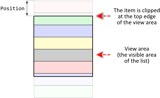
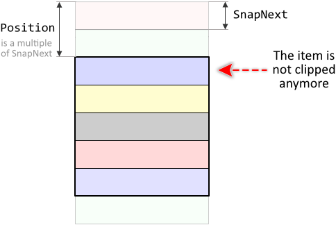
Per default, the Vertical Scrollbar's position can lie anywhere inside the possible range. For example, when the scrollbar is used to scroll items within a Vertical List, the resulting scroll offset can become a value lying in the middle of an item, which then appears ugly clipped:
By using the property SnapNext you can instruct the scrollbar to automatically stop at positions, which are always a multiple of the value stored in SnapNext property. From the user's point of view, the Vertical Scrollbar snaps at those positions when the user after dragging on scrollbar's thumb releases it again. For example, initializing SnapNext with the value 40 will cause the scrollbar to snap at scroll positions 0, 40, 80, 120, ...
With the above described example of a Vertical Scrollbar used to scroll the items within a Vertical List, you can configure the property SnapNext with a value corresponding to the height of a single list item. Later when the user uses the scrollbar to scroll the list, the scrollbar will snap at the borders lying between two items. The first visible list item is not clipped anymore:
If your application case it requires, with the properties SnapFirst and SnapLast you can configure different values for the first and the last snap position. Accordingly, the Vertical Scrollbar will snap first after a distance determined by SnapFirst, then after every further distance determined by SnapNext. The last snap position lies SnapLast far away from the end of the scroll range.
The following example demonstrates how you use the snap positions. The example contains a Vertical List and a Vertical Scrollbar. The user can touch and drag on the scrollbar's thumb causing the list to scroll accordingly. When the user releases the finger, the scrollbar snaps at the next available position:
Please note, the example presents eventually features available as of version 9.00
Disable the Vertical Scrollbar
If the Vertical Scrollbar is configured to be interactive, it can sometimes be necessary to disable the scrollbar, so that it ignores temporarily any touch events. You achieve this by setting the property Enabled of the affected scrollbar to the value false. Thereupon the Vertical Scrollbar enters in the Disabled state and its appearance changes to indicate to the user, that the associated function is actually not available. Please read the section Control the Enabled state of nested components for further details and more precise explanation.
In the case, the Vertical Scrollbar is already configured to not handle any user inputs, the scrollbar will behave as a passive widget. Such scrollbar will ignore any user inputs regardless of whether it is enabled or not.
Control the visibility of the Vertical Scrollbar
If desired, you can hide the Vertical Scrollbar so it is not visible to the user. You achieve this by setting the property Visible of the affected scrollbar to the value false. Please read the section Control the visibility of nested components for further details and more precise explanation. In more sophisticated cases, you can configure the scrollbar to disappear automatically, when it is not needed.
Customize your own Vertical Scrollbar
Newly added Vertical Scrollbars use an appearance configuration provided per default with Embedded Wizard installation. As described above these default configurations are available in two different variants á three sizes you can select easily. If you like them, you can use them as they are. However, should the scrollbars in your GUI design have another appearance or behavior, then you will need to provide your own appearance configuration.
To provide a new configuration you create an object of the class WidgetSet::VerticalScrollbarConfig and initialize its properties with all the bitmaps, colors and other parameters particular to your own design. Once this object is available, you can assign it to every Vertical Scrollbar you want to appear with this configuration similarly as you select one of the per default provided configurations. If necessary, you can create several different configuration objects and use them simultaneously within your application. You can even customize every Vertical Scrollbar instance individually.
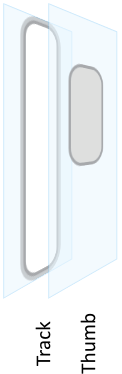
Before you start to customize your own Vertical Scrollbars you should understand two important aspects. As first recall the section Vertical Scrollbar states. When you customize a Vertical Scrollbar, you will specify for every possible scrollbar state individual parameters. Understanding these states is thus essential. Furthermore, you have to understand from which views the Vertical Scrollbars are composed of. In the configuration object you can individually specify parameters for every view. The following table provides an overview of the views existing internally within every Vertical Scrollbar:
View name |
Description |
|---|---|
Track |
A bitmap frame view filling horizontally centered the entire height in the background of the scrollbar. |
Thumb |
A bitmap frame view filling horizontally centered the foreground of the scrollbar at vertical position and with its height adjusted to correspond to the current scroll position and scroll range. |
The following figure demonstrates once more the above described views existing internally in every Vertical Scrollbar. Please note how the views are arranged one above the other. Accordingly, the Track view resides always in the background of the widget while the view Thumb is displayed above it:
Please note, the set of views existing within the Vertical Scrollbar as well as the order in which the views are arranged is finished implemented in the Vertical Scrollbar component and can't be modified. With the configuration object you can customize the appearance of the affected views only. Adding new views or changing their Z-order is not possible. In such case and in all other cases when you expect the Vertical Scrollbar to appear and behave beyond our default implementation, you will need to implement your own scrollbar component. Please see the section Widgets versus Component templates.
The following sections are intended to provide you an introduction and useful tips of how to work with the Vertical Scrollbar Config object. For the complete reference please see the documentation of the WidgetSet::VerticalScrollbarConfig class.
Add new Vertical Scrollbar Config object
Depending on your application case, you have the option to add the configuration object as an embedded object directly to a GUI component or to add it as an autoobject to a unit. The first case is suitable if you want the configuration object to be used only by Vertical Scrollbars existing locally within the GUI component. The second case, in turn, is appropriate if you intend to share the configuration object among multiple GUI components like a kind of common resource.
To add a new Vertical Scrollbar Config object do following:
★Depending on your preferred option switch to the Composer page for the respective GUI component class or the unit where you want to add the Vertical Scrollbar Config object.
★Then ensure that the Templates window is visible.
★In Templates window switch to the folder Resources.
★In the folder locate the template Vertical Scrollbar Config.
★Drag & Drop the template into the Composer window:
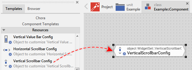
★Eventually name the new added Vertical Scrollbar Config object.
Inspect the Vertical Scrollbar Config object
As long as the Vertical Scrollbar Config object is selected you can inspect and modify its properties conveniently in the Inspector window as demonstrated with the property ThumbActive in the screenshot below:
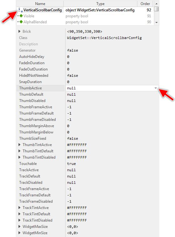
This is in so far worth mentioning as the following sections describe diverse features of the Vertical Scrollbar Config object by explicitly referring to its corresponding properties. If you are not familiar with the concept of a property and the usage of Inspector window, please read first the preceding chapter Compositing component appearance.
Specify bitmaps and colors for the scrollbar's track image
As explained in the section above the Track view occupies horizontally centered the entire height in the background of every Vertical Scrollbar. With the following properties you specify the bitmap resources as well as other parameters to be used by this view depending on the scrollbar's actual state. In other words, you use them to configure the appearance of the Vertical Scrollbar's background:
Property |
Description |
|---|---|
With these properties you specify the bitmap resource the Vertical Scrollbar has to display in its background Track view. You have to specify the bitmaps individually for every possible scrollbar state. If you leave one property initialized with the value null, the background remains empty (transparent) as long as the scrollbar is in the corresponding state. |
|
These properties are relevant only if the bitmap resource specified in the corresponding above described property TrackDefault, TrackActive or TrackDisabled contains more than one frame. In such case you use them to determine the desired frame number. Is one of the bitmaps additionally configured as containing an animated sequence you can initialize the corresponding TrackFrame... property with the value -1 to instruct the Vertical Scrollbar to automatically play the animation as long as the scrollbar remains in this state. |
|
The effect of these three properties depends on the type of the bitmap resource specified in the corresponding above described property TrackDefault, TrackActive or TrackDisabled. In case of alpha-only bitmaps you use the properties to determine the colors to tint the bitmaps. In all other cases you can use the alpha value of the corresponding TrackTint... property to simply modulate the opacity of the affected bitmap. |
The specified bitmaps will fill horizontally centered the entire height of the Vertical Scrollbar. This is achieved by so-called 9-slice image scaling technique where the intended destination area is filled with slices copied from the original bitmap. In case of the Vertical Scrollbar, however, the slices are copied vertically only. In the horizontal direction, the bitmaps retain their original width and they are just centered within the background area. Therefore, if you want the Vertical Scrollbar to be flexibly resizable, you have to ensure that the used Face bitmaps are composed of three equally sized slices arranged in a single column as shown in the following figure. You should consider this aspect when designing the bitmaps in a graphic editor:
In turn, if the bitmaps in the background of your Vertical Scrollbar are intended to always have the same fixed height, you can ignore the above bitmap design restrictions. Just design your desired bitmaps and explicitly define size constraints for the widget itself to ensure, that its height is fixed and it corresponds to the of the used Track bitmaps.
If you leave all three properties TrackDefault, TrackActive and TrackDisabled initialized with null, the Vertical Scrollbar will appear without any background.
Specify bitmaps and colors for the scrollbar's thumb image
As explained in the section above the Thumb view occupies horizontally centered the area in the foreground of every Vertical Scrollbar. The vertical position and the height of the view depends on the scrollbar's position and the specified scroll range. With the following properties you specify the bitmap resources as well as other parameters to be used by this view depending on the scrollbar's actual state. In other words, you use them to configure the appearance of the Vertical Scrollbar's foreground:
Property |
Description |
|---|---|
With these properties you specify the bitmap resource the Vertical Scrollbar has to display in its foreground Thumb view. You have to specify the bitmaps individually for every possible scrollbar state. If you leave one property initialized with the value null, the thumb remains empty (transparent) as long as the scrollbar is in the corresponding state. |
|
These properties are relevant only if the bitmap resource specified in the corresponding above described property ThumbDefault, ThumbActive or ThumbDisabled contains more than one frame. In such case you use them to determine the desired frame number. Is one of the bitmaps additionally configured as containing an animated sequence you can initialize the corresponding ThumbFrame... property with the value -1 to instruct the Vertical Scrollbar to automatically play the animation as long as the scrollbar remains in this state. |
|
The effect of these three properties depends on the type of the bitmap resource specified in the corresponding above described property ThumbDefault, ThumbActive or ThumbDisabled. In case of alpha-only bitmaps you use the properties to determine the colors to tint the bitmaps. In all other cases you can use the alpha value of the corresponding ThumbTint... property to simply modulate the opacity of the affected bitmap. |
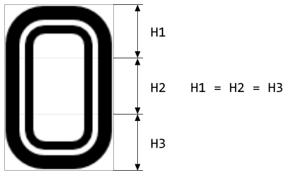
The specified bitmaps will fill horizontally centered the Vertical Scrollbar with a height being proportional to the ratio between the specified size of the view area and content area. This is achieved by so-called 9-slice image scaling technique where the intended destination area is filled with slices copied from the original bitmap. In case of the Vertical Scrollbar, however, the slices are copied vertically only. In the horizontal direction, the bitmaps retain their original width and they are just centered within the background area. Therefore, you have to ensure that the used Thumb bitmaps are composed of three equally sized slices arranged in a single column as shown in the following figure. You should consider this aspect when designing the bitmaps in a graphic editor:
Please note, the scrollbars can be configured to not automatically adapt the height of the thumb. In this mode, the thumb will always appear with its smallest possible, fixed height regardless of the actual ratio between the view area and content area. Only the vertical position of the thumb changes. You can imagine, such configured scrollbar displays the thumb composed of the top and bottom slices only (in the figure above the slices H1 and H3). The middle slice (H2) is omitted. Accordingly, the smallest possible height of the thumb is 2/3 of the height of the original bitmap.
If you leave all three properties ThumbDefault, ThumbActive and ThumbDisabled initialized with null, the Vertical Scrollbar will appear without any foreground.
Specify the margins for the scrollbar's thumb
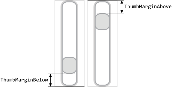
Per default, the thumb can be moved freely across the entire height of the Vertical Scrollbar. If this is not desired, you can specify in the properties ThumbMarginBelow and ThumbMarginAbove additional gaps in pixel between the thumb image and the respective bottom or top edge of the scrollbar. The following figure demonstrates the effect of these properties (the gray borders indicate the areas of the respective scrollbar):
Configure the size behavior of the scrollbar's thumb
Per default, the scrollbar automatically adapts the height of the thumb to correspond to the actual ratio between the specified view and content areas. In this manner, the user can estimate easily how large is the actually visible part of the content in relation to its entire size. As explained above, this is achieved by using the 9-slice image scaling technique where the area destined for the thumb is filled with copies of the three slices taken from the corresponding thumb bitmap:
If this behavior is not desired, you can initialize the property ThumbSizeFixed with the value true. Now, the height of the thumb does not change anymore. The thumb appears with the smallest possible, fixed size. If the property ThumbSizeFixed is true, the scrollbar displays the thumb composed of the top and bottom slices only (in the figure above the slices H1 and H3). The middle slice (H2) is omitted. Accordingly, the thumb is displayed with the smallest possible height of 2/3 of the height of the original thumb bitmap.
Configure how the scrollbar should react on touch events
Depending on the configuration of the Vertical Scrollbar, the scrollbar will handle touch events in different ways. Generally, the scrollbar reacts on touch events when the user touches inside the area of the thumb image. Thereupon, when the user drags the finger, the thumb will follow. If the user touches outside the thumb, the scrollbar simply ignores the events and nothing happens.
If the scrollbar is configured to hide itself automatically after a short delay, the handling of touch events changes. Now, the user can touch elsewhere within the entire area of the scrollbar. This causes the scrollbar to appear again permitting the user to simply touch and drag on the thumb. After finalizing the interaction, the scrollbar disappears again automatically and remains invisible until the user has touched it again.
The scrollbars are per default configured to handle touch events. By initializing the property Touchable with the value false you can suppress this behavior. Now the scrollbar acts as a pure passive widget intended to show to the user the actual scroll position. Interacting with such configured scrollbar is not possible. Even if the scrollbar is configured to automatically disappear after a short delay, the scrollbar will not appear again when the user tries to touch it.
Configure whether the scrollbar should automatically disappear
Per default, the Vertical Scrollbar widgets are visible whole the time. This is even the case if the affected scrollbar is actually not needed because of the associated content being empty or already entirely visible within the respective view area. If this behavior is not desired you can initialize the property HideIfNotNeeded with the value true. Thereupon the affected scrollbars will automatically disappear if the size of the specified content area is less than or equal to the size of the view area. As soon as the content area becomes larger than the view area, the scrollbar appears automatically again.
With the further property AutoHideDelay you can configure the scrollbar to automatically disappear after its state remained unchanged for a predetermined period expressed in milliseconds. For example, initializing the property AutoHideDelay with the value 500 will instruct the scrollbar to disappear 500 ms after its last state alternation. Every time the scrollbar's properties Position, ContentArea or ViewArea change, the scrollbar appears again and the user can notice the alternation. Similarly, the scrollbar reappears automatically when the user touches inside its area. If the user stops to interact with the scrollbar and the scrollbar's state remains unchanged for 500 ms, the scrollbar disappears again.
The hiding and showing of the scrollbar can additionally be configured by using the properties FadeOutDuration and FadeInDuration. As their names imply, the properties permit you to specify the duration in milliseconds for animation to hide (fade-out) and show (fade-in) the scrollbar. The animation affects the opacity of the scrollbar. For example, initializing the property FadeOutDuration with the value 150 will instruct the scrollbar to fade-out it smoothly within 150 ms instead of simply hiding it. If you don't want the fade-in/out animations, leave the properties FadeInDuration and FadeOutDuration initialized with 0.
Configure the scrollbar's snap animation effect
The Vertical Scrollbar can automatically snap at predetermined positions. Accordingly, after the user has touched, dragged and released again the scrollbar's thumb, the scrollbar calculates the next appropriate snap position and adjusts its Position property respectively. Per default, this adjustment is performed instantly - just after the user has released the thumb, the thumb jumps to the estimated snap position.
By using the property SnapDuration you can configure the scrollbars to perform this adjustment with an animation. In such case, the thumb slides smoothly with the FastIn_EasyOut timing to the snap position instead of jumping to it. The property SnapDuration has to be initialized with a value expressed in milliseconds how long the animation should take. If you don't want the animation effect, leave the property SnapDuration initialized with 0.
Configure the Vertical Scrollbar size constraints
With the both properties WidgetMinSize and WidgetMaxSize you can configure size constraints for all Vertical Scrollbars using your configuration object. For example, if your Vertical Scrollbars can not become smaller than 50x100 pixel, initialize the property WidgetMinSize with the value <50,100>. Similarly, by initializing the property WidgetMaxSize you determine the maximum size the scrollbars may assume at the runtime. Trying to resize the scrollbars beyond the specified size constraints will be automatically suppressed.
Per default, the properties are initialized with the values <0,0> which means, that no constraints have to be taken in account. If desired, you can also specify constraints only for the height or the width of the scrollbar. For example, if your scrollbars are flexibly resizable in the vertical direction but they should have fixed width of 100 pixel, you initialize the both properties with the value <100,0>.
Modify provided default Vertical Scrollbar Config objects
The above sections explained how you create and configure your own Vertical Scrollbar Config objects practically from scratch. This is usual when you have your own GUI design. However, if you prefer to use the configurations provided per default with Embedded Wizard and you want only few settings to be changed, it is more convenient to create a copy of the existing configuration object and adapt the affected property only. Let's assume you want to use the WidgetSet::VerticalScrollbar_Large configuration but with different margins above and below the thumb. In such case do following:
★As explained in the section Duplicate an existing autoobject locate the object WidgetSet::VerticalScrollbar_Large and copy it to one of your own project units.
★Rename the just created copy to not confound it with the original object.
★As long as the copied object is selected you can inspect and modify its properties conveniently in the Inspector window. Change its property ThumbMarginBelow and ThumbMarginAbove now.
★Once you have adapted all properties as expected, you can assign the copied configuration object to every affected Vertical Scrollbar.
CAUTION
Directly modifying the original configuration objects provided with Embedded Wizard is not recommended. The objects are part of the Mosaic framework and Embedded Wizard will prevent you from being able to save any modification made in this framework. Therefore always create and modify copies of the objects.