Using Widgets: Value Display
The Mosaic class WidgetSet:: ValueDisplay implements a GUI component intended to serve as a Value Display widget. This widget can be used to compose the appearance of other more complex GUI components, in particular to add to them controls intended to format and display an integer value (e.g. measured value) together with the associated unit. The user can't interact with the widget.
The exact appearance and behavior of the Value Display is determined by a Value Display Config object. This configuration object provides fonts, colors and other layout configuration parameters needed to construct and display the affected Value Display. Embedded Wizard is delivered with a set of prepared Value Display Config objects you can use instantly as they are. However, if desired, you can create your own configuration objects and so customize the Value Display widgets according to your particular design expectations. The following screenshot demonstrates few examples of how Value Displays appear in the canvas area of Composer (and accordingly on the screen in your target device):
The following sections are intended to provide you an introduction and useful tips of how to work with and how to customize the Value Displays. For the complete reference please see the documentation of the WidgetSet:: ValueDisplay and WidgetSet:: ValueDisplayConfig classes.
Add new Value Display
To add a new Value Display widget just at the design time of a GUI component do following:
★First ensure that the Templates window is visible.
★In Templates window switch to the folder Widgets.
★In the folder locate the template Value Display.
★Drag & Drop the template into the canvas area of the Composer window:
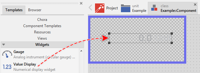
★Eventually name the new added Value Display widget.
Inspect the Value Display
As long as the Value Display widget is selected you can inspect and modify its properties conveniently in the Inspector window as demonstrated with the property Bounds in the screenshot below:
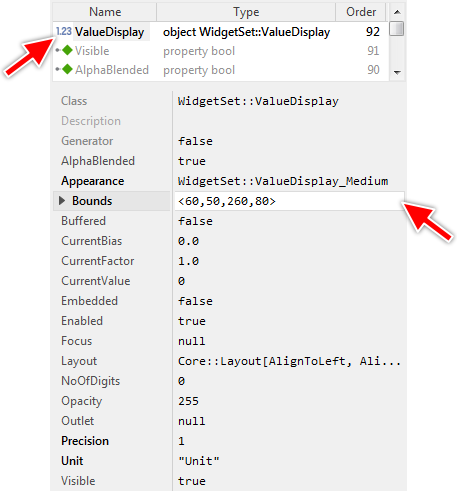
This is in so far worth mentioning as all following sections describe diverse features of the Value Display widget by explicitly referring to its corresponding properties. If you are not familiar with the concept of a property and the usage of Inspector window, please read first the preceding chapter Compositing component appearance.
Arrange the Value Display
Once added, you can freely move the Value Display, or you simply grab one of its corners and resize it in this way. You can control the position and the size of the widget also by directly modifying its property Bounds. If you want the Value Display to appear behind other views you can reorder it explicitly.
Select the appearance for the Value Display
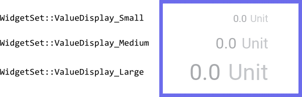
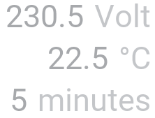
The appearance and partially also the behavior of the Value Display widget can be configured according to your particular design expectation. For demonstration purpose and to help you to quickly create new product prototypes, Embedded Wizard contains three ready to use configurations you can use instantly. All three configurations have in common the same design and they differ only in the available sizes small, medium and large. The following figure demonstrates the three available default configurations at once:
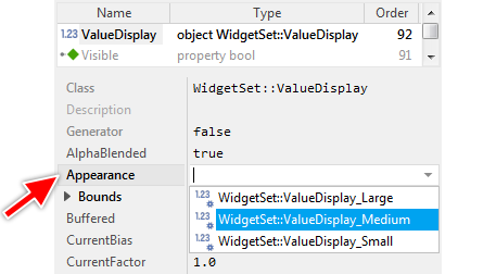
To use the desired appearance configuration you have to select it in the property Appearance of the affected Value Display widget as demonstrated in the screenshot below. You can use the integrated Inspector Assistant window to conveniently select the right configuration. If you like the provided default configurations then you can use them as they are:
If you prefer to adapt the appearance of the Value Display by yourself, then you have to create a new Value Display Config object and specify in it all the fonts, colors as well as other layout parameters to customize your individual Value Display. Once your configuration object is available, you can select it in the property Appearance exactly as you select one of the configurations provided per default with Embedded Wizard.
Determine the Value Display's unit text
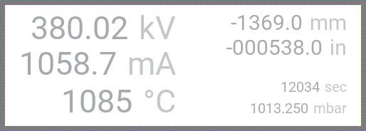
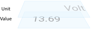
For every Value Display you can specify an individual unit text. This is very useful to provide to the user information about the displayed value (e.g. electrical voltage, temperature, time span, etc.). To specify the desired unit you assign it as string to the Value Display's property Unit. If you want the Value Display to appear without any unit, just assign an empty string "" to this property. The following figure demonstrates few widgets configured to display different units:
The exact appearance of the unit text, its alignment and margins within the Value Display's area, the used font and colors are determined in the associated Value Display Config object. In case of the with Embedded Wizard per default provided Value Display Config objects (WidgetSet::ValueDisplay_Small, WidgetSet::ValueDisplay_Medium and WidgetSet::ValueDisplay_Large), the unit text will appear vertically centered and aligned to the right edge of the Value Display's area.
Regardless of the used configuration object, if there is not enough space within the Value Display to show the complete unit, the unit appears clipped.
Determine the Value Display's content
The Value Display widget is intended to display a number formatted from a value being set in the widget's property CurrentValue. The specified value is stored as an int32 data type and as such it is per default formatted and displayed directly as an integer number. By evaluating this property you can query the value which is actually stored in the affected widget. Accordingly, when you modify CurrentValue, the affected widget will be updated automatically.
In many application cases the specified value and the displayed value are different. For example, voltage may be stored in millivolt and displayed in volt with optional decimal places. Similarly temperature may be stored in Kelvin but displayed in Celsius degree. To deal with such requirement, the widget permits you to configure a conversion function by explicitly specifying a factor to multiply CurrentValue and an offset to add to the result of the multiplication. The both parameters are determined in the corresponding properties CurrentFactor and CurrentBias. The displayed value is calculated as follows:

Accordingly, to convert from millivolt in volt, you have to initialize CurrentFactor with 0.001. In turn, the conversion from Kelvin in Celsius expects the property CurrentBias being initialized with -273.15. If no conversion is desired, just leave CurrentFactor initialized with 1.0 and CurrentBias with 0.0.
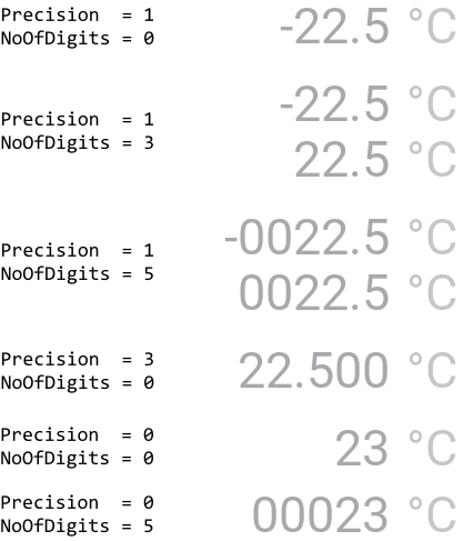
After applying the above conversion step, the widget formats from the resulting value the number. Per default, the widget formats the number with one decimal place. With the property Precision you can specify other number of decimal places. If you initialize Precision with 0, the widget will limit to display the integer part of the resulting number only. The minimum number of digits in the formatted number is determined in the property NoOfDigits. The widget will automatically prepend the formatted number with 0 zero signs until it has reached the specified length. The following figure demonstrates the effect of the both properties:
The exact appearance of the formatted number, its alignment and margins within the Value Display's area, the used font and colors are determined in the associated Value Display Config object. In case of the with Embedded Wizard per default provided Value Display Config objects (WidgetSet::ValueDisplay_Small, WidgetSet::ValueDisplay_Medium and WidgetSet::ValueDisplay_Large), the number will appear vertically centered and aligned to the left end of the displayed unit text, both separated by a small gap. Similarly, the plus/minus sign, the decimal and the digit group (thousands) separators are determined in the associated config object. Per default, no digit group separator is used and the decimal separator is the period sign '.'.
Regardless of the used configuration object, if there is not enough space within the Value Display to show the complete number, the number appears clipped.
Understand the states of the Value Display
During its life time, the Value Display remains always in one of its two possible states. While the widget's current value changes, the widget switches between the states fourth and back. Understanding these states is especially essential when you intend to customize your own individual Value Display. The following table provides an overview of the both states:
State name |
Example |
Description |
|---|---|---|
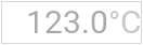
Positive |
|
The state Positive determines a widget displaying actually a positive value or zero. |
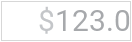
Negative |
|
The state Negative is true, if the displayed value is negative. |

Connect the Value Display with a data provider
To simplify the development of GUI applications, the Value Display implements a technique permitting you to connect a widget directly to a data provider. Once connected, the widget will remain in sync with the value stored actually in this provider. This technique corresponds to the model-view-controller (MVC) programming paradigm, where the Value Display has the function of the view and the associated data provider serves as model. If you associate in your application several Value Displays to one and the same data provider value, the underlying mechanisms will ensure, that all affected Value Displays do update their state automatically.
The connection between the Value Display and the data provider is established by assigning to the Value Display's property Outlet a reference to a property existing within the data provider and storing the interesting value. Since Value Display is intended to deal with integer values, the property suitable to be connected via reference to the widget has to be declared with int32 as its data type. Accordingly, the value of the referenced property corresponds to the widget's current value.
Summarized, after assigning a reference to an existing int32 property to the Value Display's own property Outlet, the widgets adapts its own state to automatically correspond to the actual value of the associated property. You don't need to write a single line of code to benefit from this mechanisms. The aspects underlying this technique are explained in the sections Outlet properties and Notifications and Observer.
The following example demonstrates the practical application case with several Value Displays connected to a common int32 property serving as data provider. When you download and start the example, you see two Value Display widgets, an Image view and an additional slider with it the value can be modified. The Value Displays and the slider are connected to the Image view's property Opacity. When you drag on the slider, the state of the property changes (the image appears more or less transparent) and the both Value Displays are updated accordingly:
Please note, the example presents eventually features available as of version 9.00
Control the visibility of the Value Display
If desired, you can hide the Value Display so it is not visible to the user. You achieve this by setting the property Visible of the affected widget to the value false. Please read the section Control the visibility of nested components for further details and more precise explanation.
Customize your own Value Display
Newly added Value Displays use an appearance configuration provided per default with Embedded Wizard installation. As described above these default configurations are available in three different sizes you can select easily. If you like them, you can use them as they are. However, should the widgets in your GUI design have another appearance, then you will need to provide your own appearance configuration.
To provide a new configuration you create an object of the class WidgetSet:: ValueDisplayConfig and initialize its properties with all the fonts, colors and other layout parameters particular to your own design. Once this object is available, you can assign it to every Value Display you want to appear with this configuration similarly as you select one of the per default provided configurations. If necessary, you can create several different configuration objects and use them simultaneously within your application. You can even customize every Value Display instance individually.
Before you start to customize your own Value Display you should understand two important aspects. As first recall the section Value Display states. When you customize a Value Display, you will specify for every possible widget state individual parameters. Understanding these states is thus essential. Furthermore, you have to understand from which views the Value Displays are composed of. In the configuration object you can individually specify parameters for every view. The following table provides an overview of the views existing internally within every Value Display:
View name |
Description |
|---|---|
Value |
A text view displayed per default in the center of the widget. The corresponding text is formatted from the number stored in the property CurrentValue of the respective widget instance. |
Unit |
A text view displayed per default in the center of the widget. The corresponding text is specified in the property Unit of the respective widget instance. |
The following figure demonstrates once more the above described views existing internally in every Value Display. Please note how the views are arranged one above the other. Accordingly, the Value view resides always in the background of the widget while the view Unit is displayed above it:
Please note, the set of views existing within the Value Display as well as the order in which the views are arranged is finished implemented in the Value Display component and can't be modified. With the configuration object you can customize the appearance of the affected views only. Adding new views or changing their Z-order is not possible. In such case and in all other cases when you expect the Value Display to appear and behave beyond our default implementation, you will need to implement your own widget component. Please see the section Widgets versus Component templates.
The following sections are intended to provide you an introduction and useful tips of how to work with the Value Display Config object. For the complete reference please see the documentation of the WidgetSet:: ValueDisplayConfig class.
Add new Value Display Config object
Depending on your application case, you have the option to add the configuration object as an embedded object directly to a GUI component or to add it as an autoobject to a unit. The first case is suitable if you want the configuration object to be used only by Value Displays existing locally within the GUI component. The second case, in turn, is appropriate if you intend to share the configuration object among multiple GUI components like a kind of common resource.
To add a new Value Display Config object do following:
★Depending on your preferred option switch to the Composer page for the respective GUI component class or the unit where you want to add the Value Display Config object.
★Then ensure that the Templates window is visible.
★In Templates window switch to the folder Resources.
★In the folder locate the template Value Display Config.
★Drag & Drop the template into the Composer window:
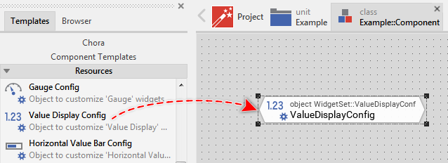
★Eventually name the new added Value Display Config object.
Inspect the Value Display Config object
As long as the Value Display Config object is selected you can inspect and modify its properties conveniently in the Inspector window as demonstrated with the property UnitFont in the screenshot below:
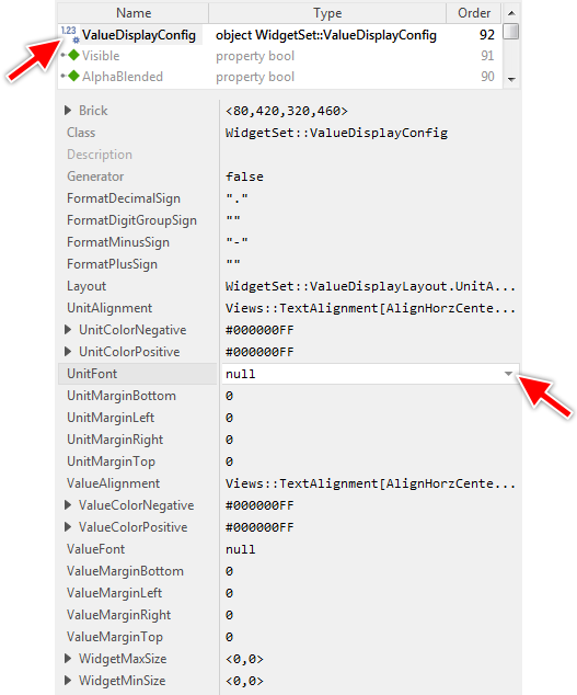
This is in so far worth mentioning as the following sections describe diverse features of the Value Display Config object by explicitly referring to its corresponding properties. If you are not familiar with the concept of a property and the usage of Inspector window, please read first the preceding chapter Compositing component appearance.
Configure how to arrange the unit and value text in a Value Display
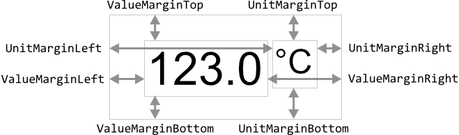
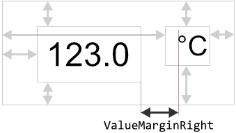
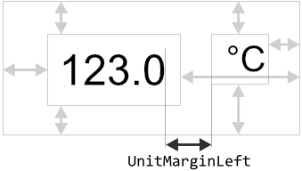
The Value Display widget is intended to display a number (value) together with its associated unit. Per default, the corresponding value and unit views occupy the entire area of the Value Display widget. Thus a long value or unit text would be able to completely fill the widget. If this is not desired, you can specify individual margins for the value and unit views. In this manner you can also divide the widget in the area where the value view is arranged and another area for the unit view.
To configure the margins for the unit view you initialize the properties UnitMarginLeft, UnitMarginRight, UnitMarginTop and UnitMarginBottom. Instead, to configure the margins for the value view use the properties ValueMarginLeft, ValueMarginRight, ValueMarginTop and ValueMarginBottom. In all cases, the properties determine the gaps in pixel between the edges of the affected view and the corresponding edges of the Value Display widget. The following figure demonstrates the effect of these properties (the thin gray borders indicate the areas of the both views and the of the widget itself):
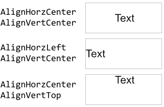
With the further properties UnitAlignment and ValueAlignment you control how the unit text and the formatted number should be aligned within the resulting area of the respective unit and value view. Per default, the text is centered vertically and horizontally. If the text is larger than the available area, the text is simply clipped at the view edges.
The properties UnitAlignment and ValueAlignment are declared as Views::TextAlignment, a set data type, which means that you can activate and deactivate the various alignment options individually. For example, deactivating the option AlignHorzCenter and activating the option AlignHorzLeft will result in the text being aligned at the left edge of the view. The following figure demonstrates few examples of how the initialization of the properties affects the alignment of the displayed text (the gray borders indicate the view areas):
By specifying the margins and the alignment options you are flexible to configure the Value Display widget to arrange the number and unit text individually. Often, however, it is important to have the value or the unit text being aligned at the content shown actually in the adjacent view. Accordingly, changing the content of the first view affects the position of the second view. Such layout mode is configured in the property Layout. The following table provides an overview of the available layout modes you can specify in this property:
Layout |
Example |
Description |
|---|---|---|
UnitAndValueAreIndependent |
|
The both views are arranged independently within the area of a widget. |
AlignValueLeftToUnit |
|
The view intended to display the number (value) should be aligned at the left end of the text displayed in the unit view. Accordingly, when the unit text changes, the width of the value view is adjusted automatically. |
AlignValueRightToUnit |
|
The view intended to display the number (value) should be aligned at the right end of the text displayed in the unit view. Accordingly, when the unit text changes, the horizontal position and the width of the value view is adjusted automatically. |
AlignUnitLeftToValue |
|
The view intended to display the unit should be aligned at the left end of the text displayed in the value (number) view. Accordingly, when the value text changes, the width of the unit view is adjusted automatically. |
AlignUnitRightToValue |
|
The view intended to display the unit should be aligned at the right end of the text displayed in the value (number) view. Accordingly, when the value text changes, the horizontal position and the width of the unit view is adjusted automatically. |


For example, selecting the layout mode AlignValueLeftToUnit instructs the widget to first arrange the unit view according to actual settings of the respective above described margins and alignment properties. Then the value view is arranged, whereby the position of its right edge is calculated relative to the begin position of the unit text by taking in account the eventually specified right edge margin for the value view. The following figure demonstrates this situation:
In turn, selecting the layout mode AlignUnitRightToValue instructs the widget to first arrange the value view (again according to its actual margins and alignment settings). Then the unit view is arranged, whereby the position of its left edge is calculated relative to the end position of the displayed value text by taking in account all eventually specified margins. The following figure demonstrates this situation:
Specify the font and colors for the Value Display's unit text
If you intend to display the unit in your own customized Value Display you will obligatory have to specify in the property UnitFont the font resource to be used to render the unit text. With the properties UnitColorPositive and UnitColorNegative you determine with which colors the unit text should appear according to the actual state of the affected Value Display.
If you leave the property UnitFont initialized with null, the Value Display will appear without any unit text.
Specify the font and colors for the Value Display's value text
In order to render the value text you have to specify in the property ValueFont the desired font resource. With the properties ValueColorPositive and ValueColorNegative you determine with which colors the value text should appear according to the actual state of the affected Value Display.
If you leave the property ValueFont initialized with null, the Value Display will appear without any value text, what is less useful.
Configure how to format the value text in a Value Display
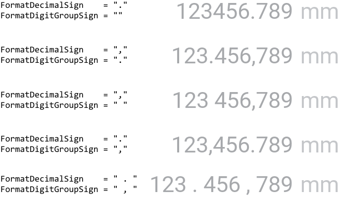
The formatting of numbers is a language or even country specific aspect. Great Britain and the United States, for example, use the period sign '.' as decimal separator. In turn, the most other countries use the comma sign ',' for this purpose. Similarly, the thousands group separator is different depending on the localization region. United States use here the comma ',' sign while in Germany the thousand groups are separated by a simple blank ' '.
By using the properties FormatDecimalSign and FormatDigitGroupSign you can flexibly specify the correct string to be used for this purpose. For example, to format the numbers according to the convention valid in Spain, you initialize the property FormatDecimalSign with "," (string with comma sign) and the property FormatDigitGroupSign with "." (string with period sign). If you initialize the property with an empty string "", the number is formatted without the corresponding sign. The following figure demonstrates the effect of the both properties:
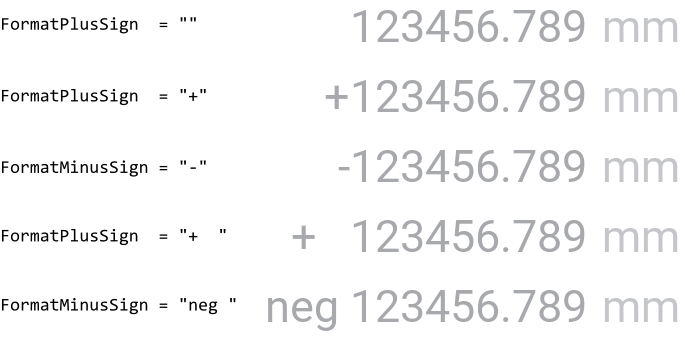
With the both further properties FormatPlusSign and FormatMinusSign you can configure a string to be put in front of the formatted number depending on whether it is positive or negative. The value zero is considered as positive. Usually, the property FormatMinusSign is initialized with "-" (string containing a minus sign). You can, however, specify any other string to be used. For example:
TIP
If you implement an application intended to be used with different languages, you can store the format strings as multi-lingual constants and assign these constants to the above described properties instead of initializing them directly with string literals.
Configure the Value Display's size constraints
With the both properties WidgetMinSize and WidgetMaxSize you can configure size constraints for all Value Displays using your configuration object. For example, if your Value Displays can not become smaller than 100x50 pixel, initialize the property WidgetMinSize with the value <100,50>. Similarly, by initializing the property WidgetMaxSize you determine the maximum size the widgets may assume at the runtime. Trying to resize the widgets beyond the specified size constraints will be automatically suppressed.
Per default, the properties are initialized with the values <0,0> which means, that no constraints have to be taken in account. If desired, you can also specify constraints only for the width or the height of the widget. For example, if your widgets are flexibly resizable in the horizontal direction but they should have fixed height of 100 pixel, you initialize the both properties with the value <0,100>.
Modify provided default Value Display Config objects
The above sections explained how you create and configure your own Value Display Config objects practically from scratch. This is usual when you have your own GUI design. However, if you prefer to use the configurations provided per default with Embedded Wizard and you want only few settings to be changed, it is more convenient to create a copy of the existing configuration object and adapt the affected property only. Let's assume you want to use the WidgetSet::ValueDisplay_Large configuration but with different font for the unit view. In such case do following:
★As explained in the section Duplicate an existing autoobject locate the object WidgetSet::ValueDisplay_Large and copy it to one of your own project units.
★Rename the just created copy to not confound it with the original object.
★As long as the copied object is selected you can inspect and modify its properties conveniently in the Inspector window. Change its property UnitFont now.
★Once you have adapted all properties as expected, you can assign the copied configuration object to every affected Value Display.
CAUTION
Directly modifying the original configuration objects provided with Embedded Wizard is not recommended. The objects are part of the Mosaic framework and Embedded Wizard will prevent you from being able to save any modification made in this framework. Therefore always create and modify copies of the objects.