Using Widgets: Radio Button
The Mosaic class WidgetSet::RadioButton implements a GUI component intended to serve as a bistable Radio Button widget. This widget can be used to compose the appearance of other more complex GUI components, in particular to add to them interactive controls permitting the user to choice from a set of mutually exclusive options. When the user taps within the area of the Radio Button, the affected button becomes selected while other associated Radio Buttons are automatically deselected. Each time the user interacts with a Radio Button, the button sends signals to associated slot methods where your particular implementation is executed. If the Radio Button is focused the button can also be controlled by pressing keys on the keyboard or by using hardware buttons. Per default, the button reacts on the key Enter.
The exact appearance and behavior of the Radio Button is determined by a Radio Button Config object. This configuration object provides bitmaps, fonts, colors and other configuration parameters needed to construct and display the affected Radio Button. Embedded Wizard is delivered with a set of prepared Radio Button Config objects you can use instantly as they are. However, if desired, you can create your own configuration objects and so customize the Radio Button widgets according to your particular design expectations. The following screenshot demonstrates few examples of how Radio Buttons appear in the canvas area of Composer (and accordingly on the screen in your target device):
The following sections are intended to provide you an introduction and useful tips of how to work with and how to customize the Radio Buttons. For the complete reference please see the documentation of the WidgetSet::RadioButton and WidgetSet::RadioButtonConfig classes.
Add new Radio Button
To add a new Radio Button widget just at the design time of a GUI component do following:
★First ensure that the Templates window is visible.
★In Templates window switch to the folder Widgets.
★In the folder locate the template Radio Button.
★Drag & Drop the template into the canvas area of the Composer window:
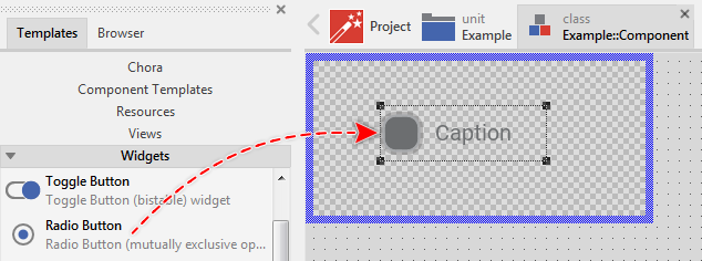
★Eventually name the new added Radio Button widget.
Inspect the Radio Button
As long as the Radio Button widget is selected you can inspect and modify its properties conveniently in the Inspector window as demonstrated with the property Bounds in the screenshot below:
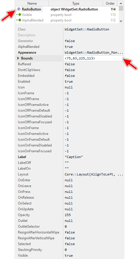
This is in so far worth mentioning as all following sections describe diverse features of the Radio Button widget by explicitly referring to its corresponding properties. If you are not familiar with the concept of a property and the usage of Inspector window, please read first the preceding chapter Compositing component appearance.
Arrange the Radio Button
Once added, you can freely move the Radio Button, or you simply grab one of its corners and resize it in this way. You can control the position and the size of the widget also by directly modifying its property Bounds. If you want the Radio Button to appear behind other views you can reorder it explicitly.
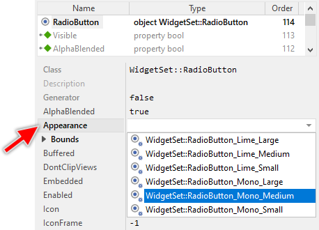
Select the appearance for the Radio Button
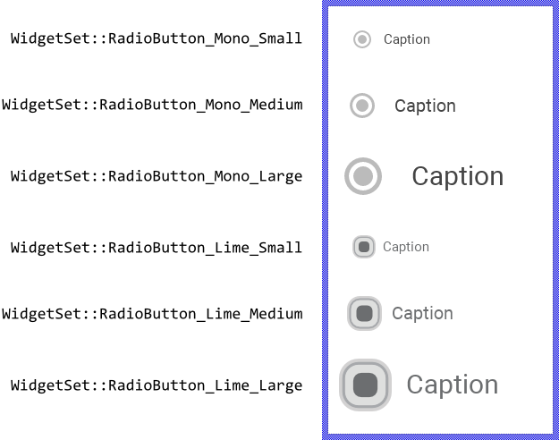
The appearance and partially also the behavior of the Radio Button widget can be configured according to your particular design expectation. For demonstration purpose and to help you to quickly create new product prototypes, Embedded Wizard contains six ready to use configurations. The configurations are provided in two different designs we named Mono and Lime. In each design there are three different sizes Small, Medium and Large. The following figure demonstrates all available default configurations at once:
TIP
The design Mono is new in Embedded Wizard 13. This design uses simple visual elements like rounded rectangles and shadows. These can be configured concerning their size and colors in a simple manner. The Lime design, in turn, is based on images. In this case, the size and colors are imposed by the used bitmap resources. On the other hand, by using bitmaps, the configurations can be more expressive and colourful.
To use the desired appearance configuration you have to select it in the property Appearance of the affected Radio Button widget as demonstrated in the screenshot below. You can use the integrated Inspector Assistant window to conveniently select the right configuration. If you like the provided default configurations then you can use them as they are:
If you prefer to adapt the appearance of the Radio Button by yourself, then you have to create a new Radio Button Config object and specify in it all the bitmaps, fonts, colors as well as other parameters to customize your individual Radio Button. Once your configuration object is available, you can select it in the property Appearance exactly as you select one of the configurations provided per default with Embedded Wizard.
Understand the states of the Radio Button
During its life time, the Radio Button remains always in one of its four possible states. While the user interacts with the widget, touches it for example, the button switches between the states fourth and back. Understanding these states is especially essential when you intend to customize your own individual Radio Button. The following table provides an overview of these four Radio Button states:
State name |
Example |
Description |
|---|---|---|
Default |
|
The state Default determines a button, which is ready to be touched by the user or it is ready to become focused. |
Active |
|
The state Active is true, if the user actively presses the button. If the button is focused it can become active also when the user presses the predetermined key on the keyboard or a hardware button. You can imagine, in the Active state, the button is armed. |
Focused |
|
The state Focused indicates the actually focused button. The user can activate and so toggle this button by simply pressing the predetermined key on the keyboard or by pressing a hardware button. Please note, unless otherwise configured, the focused Radio Buttons are activated by pressing the key Enter. |
Disabled |
|
The state Disabled is true for every not available button (the property Enabled of the button is false). Such buttons will ignore any user inputs. |

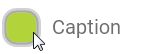


Additionally to the above described four states, every Radio Button distinguishes between the both states On or Off depending on whether it is actually selected or not. This state may toggle from Off to On when the user successfully activates the button. Once toggled in the On state, the button retains it unless the user has activated another button belonging to the same group. Also, this selected state correlates to the current value of the Selected property. Combined together, the Radio Button can assume in total one of eight discrete states as demonstrated in the figure below:
Specify the label text for the Radio Button
For every Radio Button you can specify an individual label text. This is very useful to describe to the user the function of the affected button. To specify the desired label you assign it as string to the Radio Button's property Label. If you want the Radio Button to appear without any label, just assign an empty string "" to this property. Please note, that you can also specify an icon to be displayed in the Radio Button instead of the label.
The exact appearance of the label, its alignment and margins within the Radio Button's area, the used fonts and colors are determined in the associated Radio Button Config object. In case of the with Embedded Wizard per default provided Radio Button Config objects, the label will appear left aligned and vertically centered with a color depending on the actual Radio Button state.
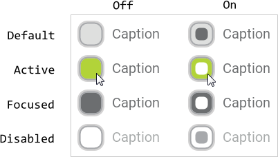
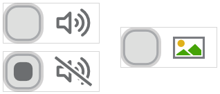
Regardless of the used configuration object, if the label is too long to fit into a single text row, the Radio Button displays the label broken in several rows. If there is not enough space within the Radio Button to display the complete label, the label appears clipped with additional ellipsis signs at its start and/or end positions. The following figure demonstrates it (the thin gray borders indicate the areas of the respective buttons):
Alternatively you can specify individual label strings to be used depending on the actual Radio Button's state On or Off. Accordingly, when the use toggles the button from its Off in On state, the label changes automatically. As soon as the button returns to the Off state, the label changes again. If you want such individual labels strings, assign them to the properties LabelOff and LabelOn instead of using the above described property Label.
Specify the icon bitmap for the Radio Button
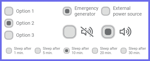
For every Radio Button you can specify an individual icon. This is very useful to visualize to the user the function behind the affected button. To specify the desired icon you assign the corresponding bitmap resource to the Radio Button's property Icon. If you want the Radio Button to appear without any icon, just assign null to this property. Please note, that you can also specify a label to be displayed in the Radio Button instead of the icon. The following figure demonstrates few buttons with associated icons (the thin gray borders indicate the areas of the respective buttons):
If the assigned bitmap resource contains more than one frame (it is a multi-frame bitmap), you have to select the desired frame by specifying its number in the property IconFrame. The first frame has the number 0, the second 1, and so far. If the used multi-frame bitmap is additionally configured as containing an animated sequence, the animation is played automatically if you have initialized the property IconFrame with the value -1. If you don't want the animation to start automatically, initialize this property with a valid frame number, e.g. 0. If you have initialized the property with a number greater than or equal to the count of frames available within the assigned bitmap resource, no icon will appear.
Alternatively you can specify different bitmap frames to be used depending on the actual Radio Button's state On or Off. Accordingly, when the use toggles the button from its Off in On state, the icon changes automatically. As soon as the button returns to the Off state, the icon changes again. If the used bitmap resource contains an animated sequence you can instruct the button to play this animation only when the button enters a predetermined state. If you want such individual icons, specify the corresponding frame numbers in the properties IconOffFrame and IconOnFrame instead of using the above described property IconFrame.
Even more precisely, if required you can specify individual frame numbers for every of the eight possible button states. For example, you can configure the button to display the frame number 0 as long as it remains in the Default state and the frame number 2 when the user actually is touching the button (the button state is Active), etc. To specify the frame numbers individually for every button state you use the corresponding properties IconOffFrameDefault, IconOnFrameDefault, IconOffFrameActive, IconOnFrameActive, IconOffFrameFocused, IconOnFrameFocused, IconOffFrameDisabled and IconOnFrameDisabled.
The exact appearance of the icon, its alignment and margins within the Radio Button's area and the colors to eventually tint alpha-only bitmaps are determined in the associated Radio Button Config object. In case of the with Embedded Wizard per default provided Radio Button Config objects, the icon will appear left aligned and vertically centered and alpha-only bitmaps will be tinted with the same color as used to display the label.
Please note, Embedded Wizard Studio provides a set of default bitmap resources with icons for typical application cases. They are intended to help you when you start to create a prototype of your new product. The bitmaps are available in four different sizes. If you like them, you can simply assign the right bitmap to the property Icon of the Radio Button and in its property IconFrame select the desired frame number.
Determine the Selected state of the Radio Button
The Radio Button is a bistable widget. When the user taps within the button's area or, if the button is actually focused, presses the key on the keyboard to activate it, the button may toggle between its Off and On states. Later, when the user activates another button belonging to the same group of mutually exclusive options, the button returns to its Off state again. These alternations are reflected in the button's property Selected.
By evaluating the property Selected you can simply query, whether the button is actually Off or On. The value false in this property corresponds to the state Off and the value true represents the state On. Similarly, assigning the value false or true to this property will cause the Radio Button to change in the corresponding Off or On state.
Alternating the property Selected affects the respective Radio Button only without having any effect on other buttons, belonging eventually to same group. Therefore, if you set the property Selected of a button to the value true it is rational to set this property for every other button belonging to the same group to the value false. The following code example demonstrates it:
// This button should become selected RadioButton1.Selected = true; // ... while other associated buttons are deselected RadioButton2.Selected = false; RadioButton3.Selected = false; ... RadioButtonN.Selected = false;
Implement Radio Button's slot methods
While the user interacts with the Radio Button widget, the widget sends signals to associated slot methods. Within the slot method your particular implementation can react and process the event. The slot methods are connected to the widget by simply storing them in the for this purpose available properties. The following table describes them:
Property |
Description |
|---|---|
Slot method associated to this property receives a signal as soon as the user touches the Radio Button or, if the button is focused, presses the key on the keyboard to activate the Radio Button. In other words, this event is triggered at the beginning of the interaction between user and the button. |
|
Slot method associated to this property receives a signal as soon as the user lifts the finger from the Radio Button or, if the button was activated by preceding keyboard event, the user releases the key again. In other words, this event is triggered at the end of the interaction between user and the button. |
|
Slot method associated to this property receives signals when while pressing the Radio Button the user drags the finger so it leaves and enters again the button's area. In other words, the button enters the Active state (the button is armed now). This event is also triggered, if the button is focused and the user presses the key on the keyboard to activate the button. |
|
Slot method associated to this property receives signals when while pressing the Radio Button the user drags the finger so it leaves the button's area. In other words, the button leaves the Active state (the button is not armed anymore). This event is also triggered, if the button is focused and the user (after pressing a key on the keyboard to activate the button) releases this key again terminating so the interaction. |
|
Slot method associated to this property receives a signal as soon as the user has activated the button causing it to change from the state Off to On (the button was Off and now it is On). The button is activated when the user (after touching the button) releases the button again while the finger was still within the button's area. If the Radio Button is controlled by keyboard events, the button is activated when the user (after pressing the corresponding key) releases it again. Please note: if the button was already in the On state (the button was already selected), no further signal is sent to OnSelect. |
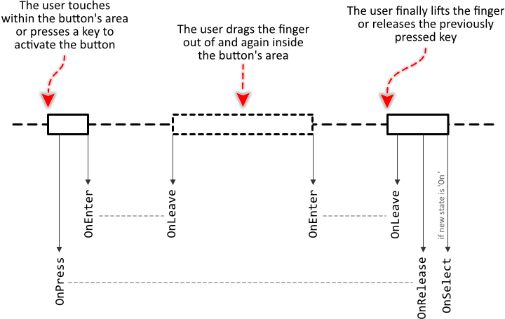
The following sequence diagram demonstrates a typical order in which the slot methods receive signals while the user interacts with the Radio Button. Please note, that every interaction starts with a signal sent to the OnPress and ends with a signal sent to the OnRelease slot method. If the user has begun or finalized the interaction with the finger lying inside the boundary area of the Radio Button, an initial OnEnter and/or a final OnLeave signal is sent. Otherwise, these methods are signaled by pairs when the user enters and leaves the button's area. After successfully activating the button and if the preceding state of the button was Off (the button's state has changed to On) signal is sent to OnSelect slot method:
Providing slot methods for all properties is not obligatory. In typical application cases it is sufficient to implement the slot method for the OnSelect event only leaving all other properties initialized with the value null. You can initialize the properties with already existing slot methods or you add a new one and implement it as desired. The following steps describe how to do this:
★First add a new slot method to your GUI component.
★Assign the slot method to the corresponding property of the affected Radio Button widget (e.g. to the property OnSelect).
★Open the slot method for editing.
★In the Code Editor implement your desired operation to execute when the event occurs.
Although the Radio Button is a bistable widget, the user can toggle it between its Off and On states only. Once the state On is assumed, the button remains in this state until its property Selected is explicitly set to the value false. Therefore, if you intend to group several Radio Buttons together to a set of mutually exclusive options, it is rational in the implementation of the OnSelect slot method to ensure, that except the just selected button all other buttons are deselected again. The following code demonstrates it. Here we assume, you have a single slot method connected to all Radio Buttons belonging to the same group. Within the method, you evaluate the hidden parameter sender to determine, which button has be selected. Accordingly all other buttons can be deselected:
// Depending on the origin of the event (the button which has become // selected) deselect all other buttons. RadioButton1.Selected = ( sender == RadioButton1 ); RadioButton2.Selected = ( sender == RadioButton2 ); RadioButton3.Selected = ( sender == RadioButton3 ); ... RadioButtonN.Selected = ( sender == RadioButtonN ); // Then handle the new selection. Has the user selected the first // option? if ( sender == RadioButton1 ) ... // ... or the second? else if ( sender == RadioButton2 ) ... // ... or the third? else if ( sender == RadioButton3 ) ...
The following example project demonstrates the above explained aspect. The project contains several Radio Buttons connected to a slot method. When the user selects one of the buttons, the slot method is signaled and within the slot method the above demonstrated code is executed to automatically deselect all other buttons:
Please note, the example presents eventually features available as of version 9.00
Connect the Radio Button with a data provider
To simplify the development of GUI applications, the Radio Button implements a technique permitting you to connect a button directly to a data provider. Once connected, the button will remain in sync with the value stored actually in this provider. Similarly, if the user selects the button, the associated value changes automatically. This technique corresponds to the model-view-controller (MVC) programming paradigm, where the Radio Button has the function of the view and controller and the associated data provider serves as model. If you associate in your application several Radio Buttons to one and the same data provider value, the underlying mechanisms will ensure, that after selecting one button all other affected buttons do update their state automatically - the affected buttons behave as if they would belong to a Radio Button group.
The connection between the Radio Button and the data provider is established by assigning to the Radio Button's property Outlet a reference to a property existing within the data provider and storing the interesting value. Since Radio Buttons are intended to be grouped together in order to provide to the user a list of mutually exclusive options, the property suitable to be connected via reference to the button has to be declared with int32 as its data type. Accordingly, the number stored in the referenced property will represent the actually selected option.
Which number in the referenced property does correspond to which button is determined by initializing the button's property OutletSelector. For example, if you initialize OutletSelector with the value 13, the button will appear as selected (in On state) when the referenced property actually contains the same value 13. If it does contain another value, the button will appear deselected (Off state). When the user activates the button (e.g. by tapping on it), the value stored actually in the property OutletSelector is assigned to the property referenced via Outlet causing eventually other Radio Buttons connected to the same property to be updated automatically.
Summarized, after assigning a reference to an existing int32 property to the Radio Button's own property Outlet and specifying the OutletSelector, the button adapts its own state to automatically correspond to the actual value of the associated property. When the user selects the button, the associated property is modified. You don't need to write a single line of code to benefit from this mechanisms. The aspects underlying this technique are explained in the sections Outlet properties and Notifications and Observer.
The following example demonstrates the practical application case with several Radio Buttons connected to a common int32 property serving as data provider. When you download and start the example, you see diverse Radio Buttons and an Image view. The buttons are connected to the view's property Opacity. Every button is configured with an individual value for its OutletSelector property lying in the range 0...255. These correspond to the possible values for the associated Image view's Opacity property. When you tap on one of the buttons, this property is initialized to the specified value causing the image to change its opacity and all other buttons are updated accordingly:
Please note, the example presents eventually features available as of version 9.00
Combine the Radio Button with other Touch Handlers
In order to be able to react to user taps the Radio Button widget contains an integrated Simple Touch Handler. Every time the user touches within the area of an enabled Radio Button, the integrated Touch Handler will start to process the corresponding touch events. As described in the section Combine several Touch Handlers together if there are other Touch Handlers lying behind this Radio Button, these handlers will per default not receive any touch events.
This may become problematic in sophisticated application cases when you e.g. intend to use the Radio Button embedded within a List or Outline view and you want both to activate the Radio Button as well as to scroll the content of the List or Outline by touching on the screen. The problem here: when the user touches within the area of a Radio Button, this Radio Button starts to process the associated touch events. Other Touch Handler (needed for example to scroll the List or Outline view contents) will not receive any events. Thus, the user can either scroll the contents or activate the button depending on the touched position.
By using the properties ResignAfterVerticalWipe and ResignAfterHorizontalWipe you can instruct the Radio Button to behave more cooperatively. Initializing the properties with the value true causes the button to automatically stop to process the actual touch events if the user after touching within the button's area has dragged slightly the finger vertically or horizontally. Thereupon other Touch Handler (e.g. lying behind the button) can take over and continue with the event processing.
The following example demonstrates the practical usage of the property ResignAfterVerticalWipe. This example contains a Vertical List the user can simply scroll by touching within its associated Slide Touch Handler. The items in the list, however, do contain embedded Radio Buttons. When the user hits one of the buttons, the affected button will process the touch events. During this touch interaction the user can activate the button but not scroll the list. To solve this problem, the buttons are configured with their property ResignAfterVerticalWipe set true. Now, when the user hits a Radio Buttons and then drags the finger vertically, the Radio Button detects it and resigns permitting the Slide Touch Handler to process the events and to scroll the list:
Please note, the example presents eventually features available as of version 9.00
Please note, when the Radio Button detects the specified wipe gesture and stops processing the touch events, the affected button will not be activated. As described above the Radio Button will send signals to the slot methods stored in its properties OnLeave and OnRelease as if the user has dragged the finger outside the button's area and then finalized the interaction. The slot method stored in the property OnSelect is in this case never signaled.
Combine the Radio Button with decoration views
The appearance of the Radio Button is limited to visual elements that compose it. Even if it is possible to customize the Radio Button, the number of available visual elements can become a limiting factor when your design requires the widget to appear with complex decorations. In such case, please use the available views. For example, you can add a Rectangle view and arrange it in front of the Radio Button. Such view could then be used to display an animation effect while the user is touching the Radio Button actively.
Usually, doing this, you will want the additional decoration views to be automatically arranged at predetermined positions or to appear according to the current state of the widget. The WidgetSet::RadioButton class provides for such application cases various useful methods. The following table gives you a short overview of them:
Method |
Description |
|---|---|
Returns the state of the widget according to the latest user interaction. |
|
Returns the state of the widget valid just before the actual state transition animation begun. |
|
Returns the state of the widget valid after the actual state transition animation will finish. |
|
Returns a value in range 0.0..1.0 according to the progress of the actually performed state transition animation. |
You can call those methods whenever your GUI component implementation requires the corresponding information. More sophisticated, however, is to join the update mechanism provided natively by the Radio Button widget. Precisely, when you assign a slot method to the button's property OnUpdate, the slot method will receive postsignals every time the state of the widget changes.
Accordingly, within the slot method you can react on this notification and e.g. arrange other views at the current position of the button or update their appearance to correspond to the current state of the widget. The following steps describe how to do this:
★First add a new slot method to your GUI component.
★Assign the slot method to the property OnUpdate of the Radio Button widget.
★Open the slot method for editing.
★In the Code Editor implement your desired arrangement algorithm by using the values returned from the above described Radio Button methods.
Assuming, your GUI component contains a Radio Button named StateButton and a Border view named Border. Furthermore let's assume you want the Border view to appear arranged automatically in front of the button and its color and border width to depend on the actual state of the button. In such application case implement the slot method with following Chora code:
// Display the additional Border only during the transition to the 'ACTIVE' (On or Off) state if ((( StateButton.GetTransitionEndState() == WidgetSet::CommonState.OnActive ) || ( StateButton.GetTransitionEndState() == WidgetSet::CommonState.OffActive )) && ( StateButton.GetTransitionStartState() != StateButton.GetTransitionEndState())) { // The size of the Border corresponds to the size of the button 10 pixel enlarged. var rect a = LightButton.Bounds * <10,10>; // Center the Border rectangle over the button and animate its color and border width. Border.Bounds = a; Border.Radius = 5; Border.Color = math_mix( #FF333344, #33333300, StateButton.GetTransitionProgress()); Border.Width = math_mix( 8, 1, StateButton.GetTransitionProgress()); Border.Visible = true; } // The decoration border is not needed anymore else Border.Visible = false;
The following example project demonstrates this application case. When you download and open the example, you will see two Radio Buttons with their associated and automatically arranged Border views. When the user touches one of the buttons the associated border animates its size, color and border width:
Please note, the example presents eventually features available as of version 13.00
Disable the Radio Button
If you want the Radio Button to not react to user inputs, you have to disable it explicitly. You achieve this by setting the property Enabled of the affected button to the value false. Thereupon the Radio Button enters in the Disabled state and its appearance changes to indicate to the user, that the associated function is actually not available. Please read the section Control the Enabled state of nested components for further details and more precise explanation.
Control the visibility of the Radio Button
If desired, you can hide the Radio Button so it is not visible to the user. You achieve this by setting the property Visible of the affected button to the value false. Please read the section Control the visibility of nested components for further details and more precise explanation.
Customize your own Radio Button
Newly added Radio Buttons use an appearance configuration provided per default with Embedded Wizard installation. As described above these default configurations are available in two different designs and three sizes you can select easily. If you like them, you can use them as they are. However, should the Radio Buttons in your GUI design have another appearance, then you will need to provide your own appearance configuration.
To provide a new configuration you create an object of the class WidgetSet::RadioButtonConfig and initialize its properties with all the bitmaps, fonts, colors and other parameters particular to your own design. Once this object is available, you can assign it to every Radio Button you want to appear with this configuration similarly as you select one of the per default provided configurations. If necessary, you can create several different configuration objects and use them simultaneously within your application. You can even customize every Radio Button instance individually.
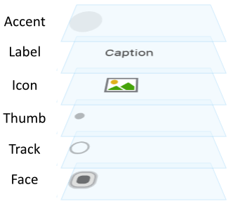
Before you start to customize your own Radio Buttons you should understand two important aspects. As first recall the section Radio Button states. When you customize a Radio Button, you will specify for every possible button state individual parameters. Understanding these states is thus essential. Furthermore, you have to understand from which views (visual elements) the Radio Buttons are composed of. In the configuration object you can individually specify parameters for every view. The following table provides an overview of the views existing internally within every Radio Button:
Visual element |
Description |
|---|---|
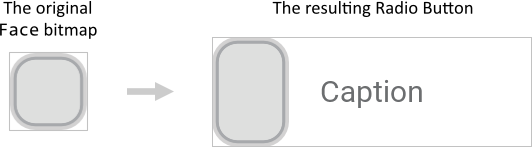
Face |
A bitmap frame view filling per default the entire background of the button. The corresponding bitmap is determined in the configuration object. Thus every Radio Button using this configuration will display the bitmap as its background. |
Track |
A visual element composed of a filled rectangle and border views. The colors and border width can be configured for each button state individually. Track can be seen as a complement to the visual element Thumb. Usually, it is used to indicate the area where Thumb can move. |
Thumb |
A visual element composed of a filled rectangle, border and shadow views. The position, size, colors, border width, corner rounding and the shadow can be configured for each button state individually. Thumb can thus be seen as an alternative or complement to the visual element Face. Per default all corresponding views fill the entire button's area. |
Icon |
An ordinary image view displayed per default in the center of the button. The corresponding bitmap is determined for every button instance individually. |
Label |
An ordinary text view displayed per default in the center of the button. The corresponding text is determined for every button instance individually. In turn, the font, colors, etc. are determined in the parameters of the configuration object. |
Accent |
A visual element composed of a filled rectangle and border views. The position, size, colors, border width and corner rounding can be configured for each button state individually. Accent can be seen as a complement to the visual elements Face and Thumb. Usually, it serves to accentuate a particular state of the widget (e.g. focused or pressed). Per default the views fill the entire button's area. |
The following figure demonstrates once more the above described views existing internally in every Radio Button. Please note how the visual elements are arranged one above the other. Per default, the visual element Face resides in the background of the widget:
Please note, the set of views existing within the Radio Button is finished implemented in the Radio Button component and can't be modified. With the configuration object you can customize the appearance, alignment, etc. of the affected views only. If you expect the Radio Button to appear and behave beyond our default implementation, you will need to implement your own button component. Please see the section Widgets versus Component templates.
TIP
Eventually (and depending on your desired design) also possible could be to Enhance the Radio Button configuration by additional decoration views.
The following sections are intended to provide you an introduction and useful tips of how to work with the Radio Button Config object. For the complete reference please see the documentation of the WidgetSet::RadioButtonConfig class.
Add new Radio Button Config object
Depending on your application case, you have the option to add the configuration object as an embedded object directly to a GUI component or to add it as an autoobject to a unit. The first case is suitable if you want the configuration object to be used only by Radio Buttons existing locally within the GUI component. The second case, in turn, is appropriate if you intend to share the configuration object among multiple GUI components like a kind of common resource.
To add a new Radio Button Config object do following:
★Depending on your preferred option switch to the Composer page for the respective GUI component class or the unit where you want to add the Radio Button Config object.
★Then ensure that the Templates window is visible.
★In Templates window switch to the folder Resources.
★In the folder locate the template Radio Button Config.
★Drag & Drop the template into the Composer window:
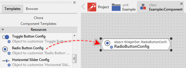
★Eventually name the new added Radio Button Config object.
Inspect the Radio Button Config object
As long as the Radio Button Config object is selected you can inspect and modify its properties conveniently in the Inspector window as demonstrated with the property FaceLayout in the screenshot below. Please note, for better overview the below screenshot has been made with Inspector window being configured to sort the properties by categories:
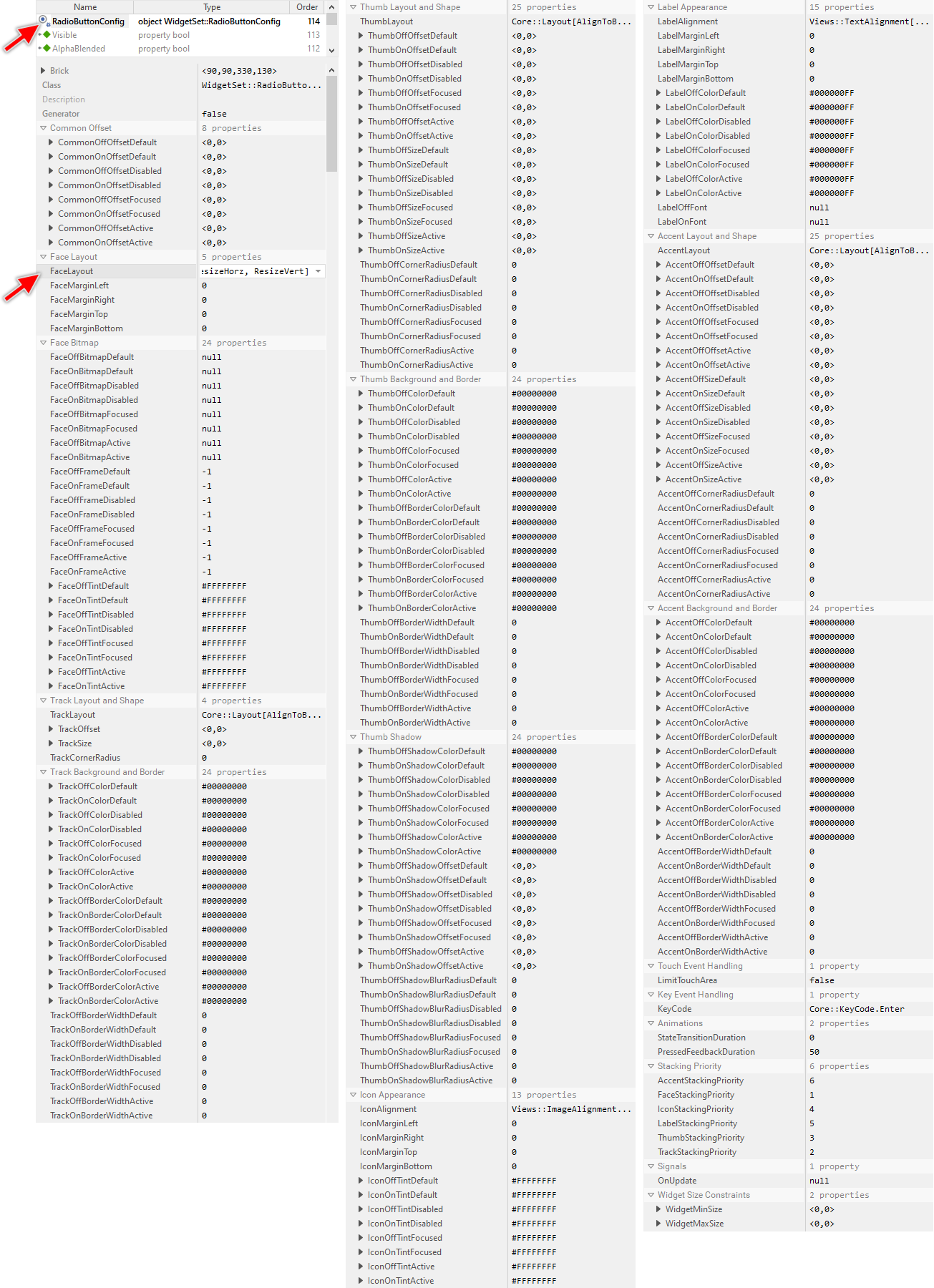
This is in so far worth mentioning as the following sections describe diverse features of the Radio Button Config object by explicitly referring to its corresponding properties. If you are not familiar with the concept of a property and the usage of Inspector window, please read first the preceding chapter Compositing component appearance.
Specify bitmaps and colors for the Radio Button's face image
As explained in the section above the Face view occupies the background area of every Radio Button. With the following properties you specify the bitmap resources as well as other parameters to be used by this view depending on the button's actual state. In other words, you use them to configure the appearance of the Radio Button's background:
Property |
Description |
|---|---|
With these properties you specify the bitmap resource the Radio Button has to display in its background Face view. You have to specify the bitmaps individually for every possible button state. If you leave one property initialized with the value null, the background remains empty (transparent) as long as the button is in the corresponding state. |
|
These properties are relevant only if the bitmap resource specified in the corresponding above described property FaceOffBitmapDefault, FaceOnBitmapDefault, FaceOffBitmapActive, FaceOnBitmapActive, FaceOffBitmapFocused, FaceOnBitmapFocused, FaceOffBitmapDisabled or FaceOnBitmapDisabled contains more than one frame. In such case you use them to determine the desired frame number. Is one of the bitmaps additionally configured as containing an animated sequence you can initialize the corresponding Face...Frame... property with the value -1 to instruct the Radio Button to automatically play the animation as long as the button remains in this state. |
|
The effect of these eight properties depends on the type of the bitmap resource specified in the corresponding above described property FaceOffBitmapDefault, FaceOnBitmapDefault, FaceOffBitmapActive, FaceOnBitmapActive, FaceOffBitmapFocused, FaceOnBitmapFocused, FaceOffBitmapDisabled or FaceOnBitmapDisabled. In case of alpha-only bitmaps you use the properties to determine the colors to tint the bitmaps. In all other cases you can use the alpha value of the corresponding Face...Tint... property to simply modulate the opacity of the affected bitmap. |
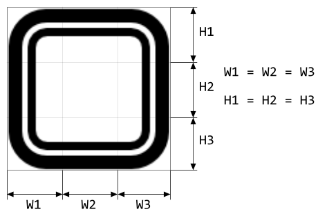
Please note, unless otherwise configured the specified bitmaps will fill the entire background of the Radio Button. This is achieved by so-called 9-slice image scaling technique where the background of the Radio Button is filled with slices copied from the original bitmap. Therefore, if you want the background of your Radio Button to be flexibly resizable, you have to ensure that the used Face bitmaps are composed of nine equally sized slices arranged in three rows and three columns as shown in the following figure. You should consider this aspect when designing the bitmaps in a graphic editor:
In turn, if the bitmaps in the background of your Radio Button are intended to always have the same fixed size, you can ignore the above bitmap design restrictions. Just design your desired bitmaps and as described in the section below configure the Face view to not be resizable. Additionally you can explicitly define size constraints for the widget itself to ensure, that its size is fixed and it corresponds to the of the used Face bitmaps.
If you leave all eight properties FaceOffBitmapDefault, FaceOnBitmapDefault, FaceOffBitmapActive, FaceOnBitmapActive, FaceOffBitmapFocused, FaceOnBitmapFocused, FaceOffBitmapDisabled and FaceOnBitmapDisabled initialized with null, the Radio Button will appear without any background. Only the label and/or icon are displayed.
Configure how to arrange the Radio Button's face image
Per default the specified Face bitmaps do fill the entire background of the Radio Button. By modifying the property FaceLayout you can disable this behavior. Precisely, you can individually determine whether the bitmaps should fill the background vertically and/or horizontally. If not enabled, the Radio Button will display the bitmaps with their original width and/or height and you can additionally determine how the bitmaps should be arranged within the Radio Button area. For example, you can decide to arrange the bitmaps vertically centered and aligned at the buttons's left edge.
The property FaceLayout is declared as Core::Layout, a set data type, which means that you can activate and deactivate the various layout options individually. For example, deactivating the option ResizeHorz will suppress the bitmaps from being able to fill the entire button's width. In such case, if the bitmaps are smaller than the actual area of the Radio Button's background, parts of the background remain empty. By additionally activating the option AlignToLeft the bitmaps will be aligned at the Radio Button's left edge. Instead, if you active only the option AlignToRight the bitmaps will be aligned at the right edge. If you activate both, AlignToLeft and AlignToRight, then the bitmaps will be centered horizontally.
With the property FaceLayout you can flexibly determine how the background of your Radio Button should be filled. When the button is resized at the runtime, the specified layout constraints are applied on the displayed bitmaps causing them to either be stretched or remain aligned at the specified button edges. The following figure demonstrates the effect of an activated FaceLayout option ResizeVert and AlignToLeft. The gray thin borders indicate the areas of the originally used Face bitmap and the of the resulting Radio Button:
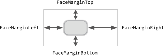
With the further properties FaceMarginLeft, FaceMarginRight, FaceMarginTop and FaceMarginBottom you can determine additional gaps in pixel between the edges of the area destined to display the Face view and the corresponding edges of the Radio Button. Together with the above described property FaceLayout the properties specify the position and size constraints for the Face view. The following figure demonstrates the effect. The outer rectangle represents the entire area of the button itself:
The final position of the Face view can additionally be adjusted by configuring the properties CommonOffOffsetDefault, CommonOffOffsetActive, CommonOffOffsetFocused, CommonOffOffsetDisabled, CommonOnOffsetDefault, CommonOnOffsetActive, CommonOnOffsetFocused and CommonOnOffsetDisabled. The resulting position can thus depend on the current state of the widget. For example, in the Active state the Face view may appear slightly shifted resulting in the visual effect as if the button were pressed. Please note that specifying the common offsets has an effect on the position of the Face, Icon and Label views.
The Face bitmaps serve thus not necessarily to fill the entire button's background. You can use them also as dedicated decorations and align them explicitly within the buttons's area.
Configure the shape and the layout of the Radio Button's track
Starting with version 13, the Radio Button includes a new visual element named Track. This new visual element is primarily intended to indicate the area where Thumb appears and moves. However, it can also be used alone or combined with other visual elements to achieve desired design effects. Unlike the older Face the new visual element does not use any bitmap resources. Instead, it is composed of simple rectangle and border views. The views can be configured to appear with rounded corners. The both views occupy the same area. To configure this area and the shape of the Track following properties are available:
Property |
Description |
|---|---|
This property determines the constraints how the track (composed of a rectangle and border) should be aligned within the button area. Per default the track fills the button widget entirely. |
|
This property determines the size of the track. Unless other constraints have been specified in the property TrackLayout (see above), the track fills the complete button area. With the value specified in the property TrackSize it is possible to enlarge the track. By specifying negative values, the track will shrink accordingly. If TrackLayout is configured to not automatically resize the track, the value specified in the property TrackSize determines the final (fixed) size of the track. |
|
This property determines an additional displacement for the track. Unless other constraints have been specified in the property TrackLayout (see above), the track is aligned at the top-left corner of the button area. The value specified in the property TrackOffset is used to move the track accordingly. |
|
This property determines the rounding at corners of the track. Normally, the track has the shape of a rectangle with sharp corners. Specifying a value greater than 0 in this property rounds the corners. The larger the value, the bigger the rounding effect. |
The property TrackLayout is declared as Core::Layout, a set data type, which means that you can activate and deactivate the various layout options individually. For example, deactivating the option ResizeVert will suppress the track from being able to automatically fill the entire button's height. In such case, the height of the track is determined only by the TrackSize property. If the size is smaller than the actual area of the Radio Button's background, parts of the background remain empty.
By additionally activating the option AlignToTop the track will be aligned at the Radio Button's top edge. Instead, if you active only the option AlignToBottom the track will be aligned at the bottom edge. If you activate both, AlignToTop and AlignToBottom (or you deactivate both), then the track will be centered vertically.
With the property TrackLayout you can flexibly determine how the background of your Radio Button should be filled. When the button is resized at the runtime, the specified layout constraints are applied on the views belonging to the track causing them to appear either stretched or remain aligned at the specified button edges. This configuration can be combined with other properties to additionally adjust the size and/or the position of the track. The following figure demonstrates the effect of diverse property combinations. The gray thin borders indicate the areas of the resulting Radio Button. For demonstration purpose the track is configured to appear with rounded corners:
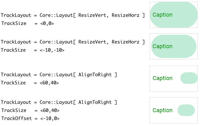
Please note, unlike other visual elements, the shape and position of the track can't be configured for individual widget states. The track is limited to have a static shape regardless of the current state of the Radio Button.
Configure the colors and borders of the Radio Button's track
Starting with version 13, the Radio Button includes a new visual element named Track. This new visual element is primarily intended to indicate the area where Thumb appears and moves. However, it can also be used alone or combined with other visual elements to achieve desired design effects. Unlike the older Face the new visual element does not use any bitmap resources. Instead, it is composed of simple rectangle and border views. As described in the section above layout rules and the shape of the track can be configured. With following properties you configure the colors to fill the background of the track and to stroke its borders:
Property |
Description |
|---|---|
These properties determine the color to fill the background of the track when the button is in the corresponding state. |
|
These properties determine the thickness of the border surrounding the track when the button is in the corresponding state. |
|
These properties determine the color to stroke the border surrounding the track when the button is in the corresponding state. To see the border ensure that the properties from the list above configure the border thickness greater than 0. |
The following figure demonstrates the effect of diverse property combinations. The gray thin borders indicate the areas of the resulting Radio Button. For demonstration purpose the track is configured to appear with rounded corners. The layout of the track is configured to fill the entire Radio Button:
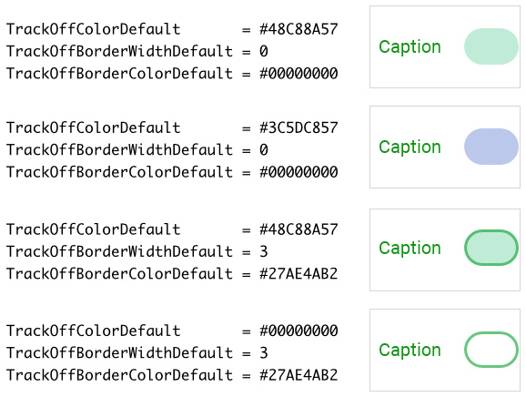
Please note, if the track is configured to fill the background and stroke border around it, the border will always appear in front of the filled background area as demonstrated in the figure above.
Configure the shape and the layout of the Radio Button's thumb
Starting with version 13, the Radio Button includes a new visual element named Thumb. Unlike the older Face the new visual element does not use any bitmap resources. Instead, it is composed of simple rectangle, border and shadow views. The views can be configured to appear with rounded corners. All three views occupy the same area. To configure this area and the shape of the Thumb following properties are available:
Property |
Description |
|---|---|
This property determines the constraints how the thumb (composed of a rectangle, border and shadow behind them) should be aligned within the button area. Per default the thumb fills the button widget entirely. |
|
These properties control the size of the thumb when the button is in the corresponding state. Unless other constraints have been specified in the property ThumbLayout (see above), the thumb fills the complete button area. With the value specified in the properties ThumbXXXSizeXXX it is possible to enlarge the thumb. By specifying negative values, the thumb will shrink accordingly. If ThumbLayout is configured to not automatically resize the thumb, the value specified in the properties ThumbXXXSizeXXX determines the final (fixed) size of the thumb. |
|
These properties determine an additional displacement for the thumb when the button is the corresponding state. Unless other constraints have been specified in the property ThumbLayout (see above), the thumb is aligned at the top-left corner of the button area. The value specified in the properties ThumbXXXOffsetXXX is used to move the thumb accordingly. |
|
These properties control the rounding at corners of the thumb when the button is in the corresponding state. Normally, the thumb has the shape of a rectangle with sharp corners. Specifying a value greater than 0 in these properties rounds the corners. The larger the value, the bigger the rounding effect. |
The property ThumbLayout is declared as Core::Layout, a set data type, which means that you can activate and deactivate the various layout options individually. For example, deactivating the option ResizeVert will suppress the thumb from being able to automatically fill the entire button's height. In such case, the height of the thumb is determined only by the corresponding ThumbXXXSizeXXX property. If the size is smaller than the actual area of the Radio Button's background, parts of the background remain empty.
By additionally activating the option AlignToTop the thumb will be aligned at the Radio Button's top edge. Instead, if you active only the option AlignToBottom the thumb will be aligned at the bottom edge. If you activate both, AlignToTop and AlignToBottom (or you deactivate both), then the thumb will be centered vertically.
With the property ThumbLayout you can flexibly determine how the background of your Radio Button should be filled. When the button is resized at the runtime, the specified layout constraints are applied on the views belonging to the thumb causing them to appear either stretched or remain aligned at the specified button edges. This configuration can be combined with other properties to additionally adjust the size and/or the position of the thumb. The following figure demonstrates the effect of diverse property combinations. The gray thin borders indicate the areas of the resulting Radio Button. For demonstration purpose the thumb is configured to appear with rounded corners:
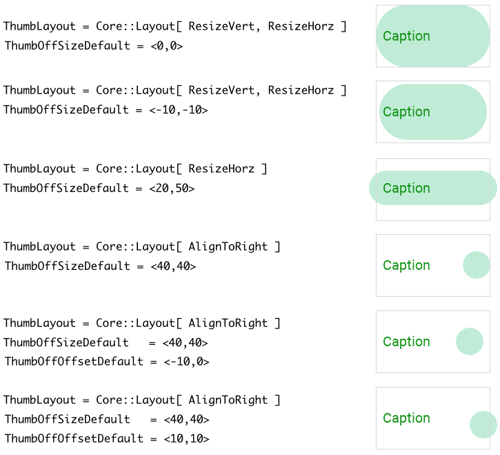
Please note, if the Radio Button is configured so that parts of its thumb are lying outside the Radio Button's area, these are not clipped and will remain visible outside the widget as demonstrated in the figure above. These parts, however, are not sensitive to touch or mouse interactions.
Configure the colors and borders of the Radio Button's thumb
Starting with version 13, the Radio Button includes a new visual element named Thumb. Unlike the older Face the new visual element does not use any bitmap resources. Instead, it is composed of simple rectangle, border and shadow views. As described in the section above layout rules and the shape of the thumb can be configured for each widget state individually. With following properties you configure the colors to fill the background of the thumb and to stroke its borders:
Property |
Description |
|---|---|
These properties determine the color to fill the background of the thumb when the button is in the corresponding state. |
|
These properties determine the thickness of the border surrounding the thumb when the button is in the corresponding state. |
|
These properties determine the color to stroke the border surrounding the thumb when the button is in the corresponding state. To see the border ensure that the properties from the list above configure the border thickness greater than 0. |
The following figure demonstrates the effect of diverse property combinations. The gray thin borders indicate the areas of the resulting Radio Button. For demonstration purpose the thumb is configured to appear with rounded corners. The layout of the thumb is configured to fill the entire Radio Button:
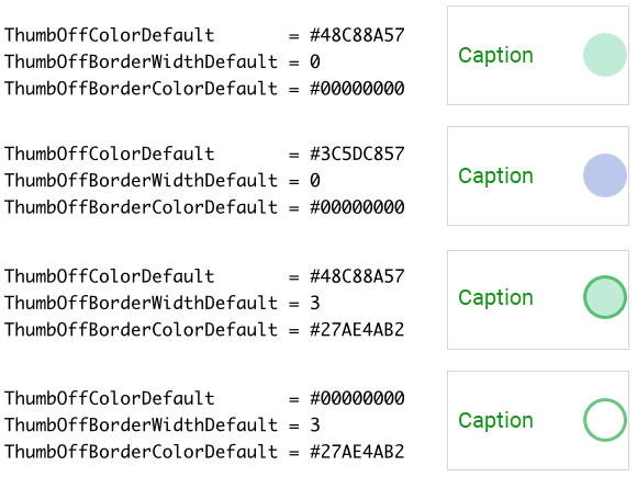
Please note, if the thumb is configured to fill the background and stroke border around it, the border will always appear in front of the filled background area as demonstrated in the figure above.
Configure the shadow of the Radio Button's thumb
Starting with version 13, the Radio Button includes a new visual element named Thumb. Unlike the older Face the new visual element does not use any bitmap resources. Instead, it is composed of simple rectangle, border and shadow views. As described in the section above layout rules and the shape of the thumb can be configured for each widget state individually. Using the following properties you configure the shadow parameters of the thumb:
Property |
Description |
|---|---|
These properties determine the color of the shadow behind the thumb when the button is in the corresponding state. |
|
ThumbOffShadowBlurRadiusDefault ThumbOnShadowBlurRadiusDefault ThumbOffShadowBlurRadiusActive ThumbOffShadowBlurRadiusFocused ThumbOnShadowBlurRadiusFocused |
These properties determine the blur radius of the shadow behind the thumb when the button is in the corresponding state. The greater the value the more blurred the resulting shadow. |
These properties determine optional displacement of the shadow behind the thumb when the button is in the corresponding state. |
The following figure demonstrates the effect of diverse property combinations. The gray thin borders indicate the areas of the resulting Radio Button. For demonstration purpose the thumb is configured to appear with rounded corners. The layout of the thumb is configured to fill the entire Radio Button:
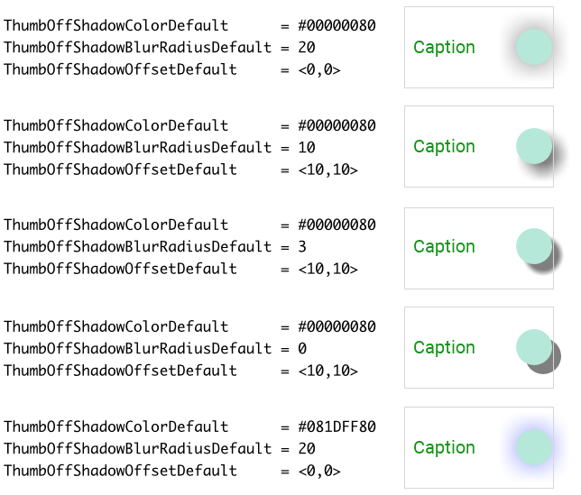
Please note, concerning the stacking order, the shadow always appears in the background of the thumb, just behind its filled rectangle view and/or the border view. Furthermore, if the thumb's background is transparent or semi-transparent, the shadow shines through the background.
Specify colors to tint the Radio Button's icon image
If you intend to display icons in your own customized Radio Buttons you will eventually find as useful the possibility to configure the properties IconOffTintDefault, IconOnTintDefault, IconOffTintActive, IconOnTintActive, IconOffTintFocused, IconOnTintFocused, IconOffTintDisabled and IconOnTintDisabled. The effect of these eight properties depends on the type of the bitmap resource specified as icon in the affected Radio Button instance.
In case of alpha-only bitmaps the properties determine the colors to tint the bitmaps. You have to specify the colors individually for every possible button state. Accordingly, depending on its actual state, the button can display the icon bitmap with different colors. For example, you can configure the properties so that when the user presses the Radio Button (button is in the Active state), the icon appears with a brighter color and when the button is disabled, the icon appears faded. The following figure demonstrates it:
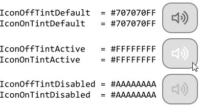
If the affected icon bitmap contains already its own color information (it is not an alpha-only bitmap) you can use the alpha value of the corresponding Icon...Tint... property to simply modulate the opacity of the affected bitmap. For example, if you configure the property IconOffTintDisabled with the value #FFFFFF80 (white, 50% transparent) the icon will appear 50% translucent (slightly faded) if the button is actually disabled and at the same time its Selected state is Off.
Configure how to arrange the Radio Button's icon image
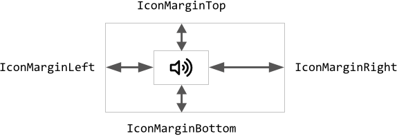
Per default the Icon view occupies the entire area of the Radio Button. Thus a large enough icon would completely fill the button. If this is not desired, by using the properties IconMarginLeft, IconMarginRight, IconMarginTop and IconMarginBottom you can determine additional gaps in pixel between the edges of the Icon view and the corresponding edges of the Radio Button. The following figure demonstrates the effect. The inner rectangle symbolizes the area for the Icon view while the outer rectangle represents the entire area of the button itself:
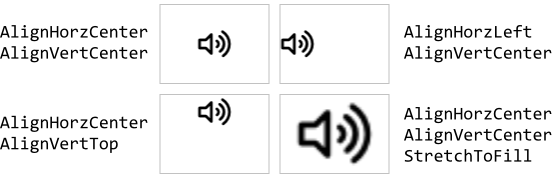
With the further property IconAlignment you can control how the specified icon bitmap should be aligned within the resulting Icon view area. Per default, the bitmap is centered vertically and horizontally. If the bitmap is larger than the available area, the parts lying outside the area are simply clipped and are not visible.
The property IconAlignment is declared as Views::ImageAlignment, a set data type, which means that you can activate and deactivate the various alignment options individually. For example, deactivating the option AlignHorzCenter and activating the option AlignHorzLeft will result in the icon bitmaps being aligned at the left edge of the Icon view. With other options you can even instruct the view to proportionally scale or even stretch the bitmap so it fits within the available area. The following figure demonstrates few examples of how the initialization of the property IconAlignment affects the Radio Button (the gray borders indicate the areas of the Icon views):
With these five properties you are not only able to spare the borders of the Radio Button and align the icon bitmap within the resulting area, but you can also use them to divide the Radio Button in an area for the icon and a second area for the label. Accordingly, your Radio Buttons will be able to display both as demonstrated in the figure below:
The final position of the Icon view can additionally be adjusted by configuring the properties CommonOffOffsetDefault, CommonOffOffsetActive, CommonOffOffsetFocused, CommonOffOffsetDisabled, CommonOnOffsetDefault, CommonOnOffsetActive, CommonOnOffsetFocused and CommonOnOffsetDisabled. The resulting position can thus depend on the current state of the widget. For example, in the Active state the Icon view may appear slightly shifted resulting in the visual effect as if the button were pressed. Please note that specifying the common offsets has an effect on the position of the Face, Icon and Label views.
Specify fonts and colors for the Radio Button's label text
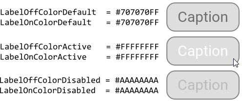
If you intend to display labels in your own customized Radio Buttons you will obligatory have to specify in the properties LabelOffFont and LabelOnFont the font resource (or resources) to be used to render the label text. If no font is specified, no label text is displayed. Additionally, with the properties LabelOffColorDefault, LabelOnColorDefault, LabelOffColorActive, LabelOnColorActive, LabelOffColorFocused, LabelOnColorFocused, LabelOffColorDisabled and LabelOnColorDisabled you determine with which colors the label text should appear.
You have to specify the colors individually for every possible button state. Accordingly, depending on its actual state, the button can display the label text with different colors. For example, you can configure the properties so that when the user presses the Radio Button (button is in the Active state), the label appears with a brighter color and when the button is disabled, the label appears faded. The following figure demonstrates it:
Configure how to arrange the Radio Button's label text
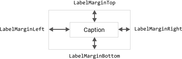
Per default the Label view occupies the entire area of the Radio Button. Thus a long label text would be able to completely fill the button. If this is not desired, by using the properties LabelMarginLeft, LabelMarginRight, LabelMarginTop and LabelMarginBottom you can determine additional gaps in pixel between the edges of the Label view and the corresponding edges of the Radio Button. The following figure demonstrates the effect. The inner rectangle symbolizes the area for the Label view while the outer rectangle represents the entire area of the button itself:
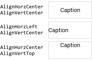
With the further property LabelAlignment you can control how the specified label text should be aligned within the resulting Label view area. Per default, the text is centered vertically and horizontally. If the text is larger than the available area, the text is broken is several rows and parts lying outside the area are replaced by an ellipsis sign.
The property LabelAlignment is declared as Views::TextAlignment, a set data type, which means that you can activate and deactivate the various alignment options individually. For example, deactivating the option AlignHorzCenter and activating the option AlignHorzLeft will result in the label text being aligned at the left edge of the Label view. The following figure demonstrates few examples of how the initialization of the property LabelAlignment affects the Radio Button (the gray borders indicate the areas of the Label views):
With these five properties you are not only able to spare the borders of the Radio Button and align the label text within the resulting area, but you can also use them to divide the Radio Button in an area for the label and a second area for the icon. Accordingly, your Radio Buttons will be able to display both as demonstrated in the figure below:
The final position of the Label view can additionally be adjusted by configuring the properties CommonOffOffsetDefault, CommonOffOffsetActive, CommonOffOffsetFocused, CommonOffOffsetDisabled, CommonOnOffsetDefault, CommonOnOffsetActive, CommonOnOffsetFocused and CommonOnOffsetDisabled. The resulting position can thus depend on the current state of the widget. For example, in the Active state the Label view may appear slightly shifted resulting in the visual effect as if the button were pressed. Please note that specifying the common offsets has an effect on the position of the Face, Icon and Label views.
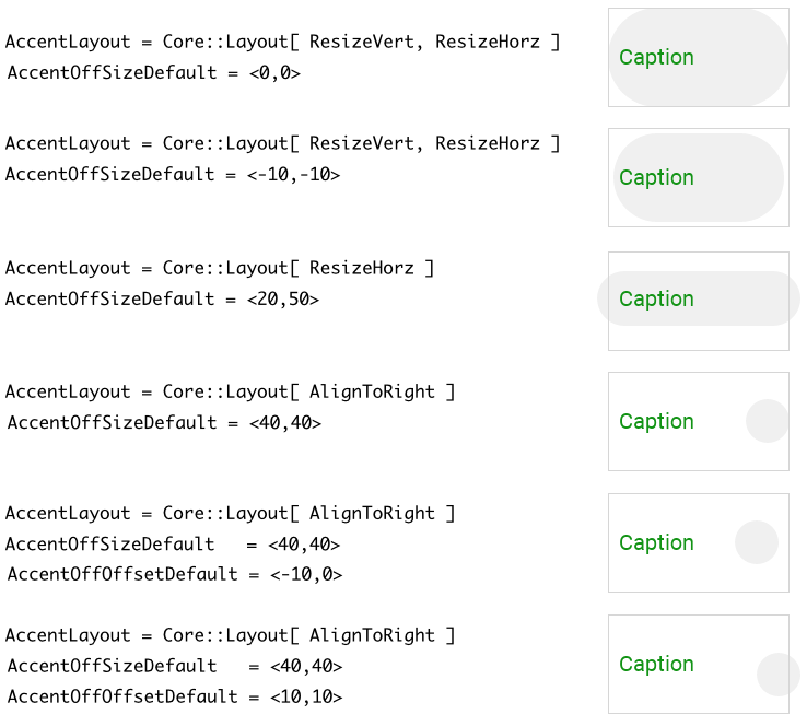
Configure the shape and the layout of the Radio Button's accent
Starting with version 13, the Radio Button includes a new visual element named Accent. This new visual element is primarily intended to emphasis the widget's appearance when it is in a particular state (e.g. focused). However, it can also be used alone or combined with other visual elements to achieve desired design effects. The accent is composed of a simple rectangle and border views. The views can be configured to appear with rounded corners. The both views occupy the same area. To configure this area and the shape of the Accent following properties are available:
Property |
Description |
|---|---|
This property determines the constraints how the accent (composed of a rectangle and border) should be aligned within the button area. Per default the accent fills the button widget entirely. |
|
These properties control the size of the accent when the button is in the corresponding state. Unless other constraints have been specified in the property AccentLayout (see above), the accent fills the complete button area. With the value specified in the properties AccentXXXSizeXXX it is possible to enlarge the accent. By specifying negative values, the accent will shrink accordingly. If AccentLayout is configured to not automatically resize the accent, the value specified in the properties AccentXXXSizeXXX determines the final (fixed) size of the accent. |
|
These properties determine an additional displacement for the accent when the button is the corresponding state. Unless other constraints have been specified in the property AccentLayout (see above), the accent is aligned at the top-left corner of the button area. The value specified in the properties AccentXXXOffsetXXX is used to move the accent accordingly. |
|
These properties control the rounding at corners of the accent when the button is in the corresponding state. Normally, the accent has the shape of a rectangle with sharp corners. Specifying a value greater than 0 in these properties rounds the corners. The larger the value, the bigger the rounding effect. |
The property AccentLayout is declared as Core::Layout, a set data type, which means that you can activate and deactivate the various layout options individually. For example, deactivating the option ResizeVert will suppress the accent from being able to automatically fill the entire button's height. In such case, the height of the accent is determined only by the corresponding AccentXXXSizeXXX property. If the size is smaller than the actual area of the Radio Button's background, parts of the background remain empty.
By additionally activating the option AlignToTop the accent will be aligned at the Radio Button's top edge. Instead, if you active only the option AlignToBottom the accent will be aligned at the bottom edge. If you activate both, AlignToTop and AlignToBottom (or you deactivate both), then the accent will be centered vertically.
With the property AccentLayout you can flexibly determine how the visual element Accent should fill the Radio Button's area. When the button is resized at the runtime, the specified layout constraints are applied on the views belonging to the accent causing them to appear either stretched or remain aligned at the specified button edges. This configuration can be combined with other properties to additionally adjust the size and/or the position of the accent. The following figure demonstrates the effect of diverse property combinations. The gray thin borders indicate the areas of the resulting Radio Button. For demonstration purpose the accent is configured to appear with rounded corners:
Please note, if the Radio Button is configured so that parts of its accent are lying outside the Radio Button's area, these are not clipped and will remain visible outside the widget as demonstrated in the figure above. These parts, however, are not sensitive to touch or mouse interactions.
Configure the colors and borders of the Radio Button's accent
Starting with version 13, the Radio Button includes a new visual element named Accent. This new visual element is primarily intended to emphasis the widget's appearance when it is in a particular state (e.g. focused). However, it can also be used alone or combined with other visual elements to achieve desired design effects. The accent is composed of a simple rectangle and border views. As described in the section above layout rules and the shape of the accent can be configured for each widget state individually. With following properties you configure the colors to fill the background of the accent and to stroke its borders:
Property |
Description |
|---|---|
These properties determine the color to fill the background of the accent when the button is in the corresponding state. |
|
These properties determine the thickness of the border surrounding the accent when the button is in the corresponding state. |
|
These properties determine the color to stroke the border surrounding the accent when the button is in the corresponding state. To see the border ensure that the properties from the list above configure the border thickness greater than 0. |
The following figure demonstrates the effect of diverse property combinations. The gray thin borders indicate the areas of the resulting Radio Button. For demonstration purpose the accent is configured to appear with rounded corners. The layout of the accent is configured to fill the entire Radio Button:
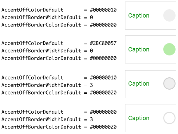
Please note, if the accent is configured to fill the background and stroke border around it, the border will always appear in front of the filled background area as demonstrated in the figure above.
Configure how the Radio Button should react on touch events
Depending on the configuration of the Radio Button, the button will handle touch events in different ways. Per default, the button reacts on touch events when the user touches somewhere within the button's area. This can be the area occupied by the thumb, the icon or the label. The entire button's area is touch sensitive.
This operating mode can be changed by setting the property LimitTouchArea to the value true. Now, the button reacts only when the user touched within the area occupied by the visual elements Face, Thumb or Track. Please note, if parts of the Face or Thumb lie beyond the borders of a Radio Button, these external areas are not clipped but they are not sensitive concerning user interactions.
Specify the key code the Radio Button should react on
The Radio Buttons are not limited to be controlled only by using the touch screen. If a button is actually focused the user can activate it also by simply pressing a dedicated key on the keyboard or by using hardware buttons. The corresponding key code is set per default to the value Core::KeyCode.Enter, which corresponds to the Return key found on every ordinary PC keyboard. With the property KeyCode you can determine another key to be used for this purpose. Please see the section Configure the filter condition for more details how you select a key code.
If you want your Radio Buttons to ignore any keyboard events, initialize the property KeyCode with the value Core::KeyCode.NoKey. Such buttons will then react to touch screen events only. Please note, if you have configured your buttons to not be able to react to keyboard events, the buttons are also automatically suppressed from being able to become focused.
Configure the Radio Button feedback animation
When the user touches the Radio Button or (if the button is actually focused) presses a key to activate it, the button changes in its Active state. Thereupon the appearance of the button is adapted giving the user a visual feedback, that it is armed now. When the user finalizes the interaction, the button returns to its previous state and its appearance changes again.
However, if the user taps the button very quickly, the button has no time to update its appearance and the user will not notice the button's activation. This problem can be corrected by explicitly specifying in the property PressedFeedbackDuration the minimum time in milliseconds the button has at least to appear activated. The property is per default initialized with the value 50 which means, that after quickly taping the button, it appears activated for 50 ms. If your application case it requires, you can specify here other value.
Configure the Radio Button state transition animation
During its life time, the Radio Button remains always in one of its eight possible states. While the user interacts with the widget, touches it for example, the button switches between the states fourth and back. Those state transitions occur usually abruptly.
By using the property StateTransitionDuration you can configure the widget to perform all state transitions with an animation. During such animation all colors, size or position values related to the preceding and the current states are interpolated automatically. The property StateTransitionDuration determines the duration of this interpolation in milliseconds. The interpolation itself is performed linearly. If the animation is not desired, leave this property configured with the value 0 (zero).
IMPORTANT
Please note, the animations don't affect transitions between bitmaps used by the widget. When the state alternation occurs, the widget displays the bitmaps corresponding to the actual state immediately.
Configure the Z-order of views belonging to the Radio Button
Up to version 12 inclusive the Z-order of visual elements belonging to the Radio Button (the order in which the views are displayed one above the other) was fixed predetermined. The Face visual element, for example, was displayed always in the background of the widget while the Icon and Label views in the foreground. Starting with the version 13, the Z-order can be modified. For this purpose you specify for each visual element its stacking priority value as integer number. As consequence, visual elements with higher stacking priority will overlap visual elements with lower stacking priority. To configure the stacking priority use following properties:
Property |
Affected visual element |
Default value |
|---|---|---|
The Face view. |
1 |
|
Views belonging to the Track visual element. |
2 |
|
Views belonging to the Thumb visual element. |
3 |
|
The Icon view. |
4 |
|
The Label view. |
5 |
|
Views belonging to the Accent visual element. |
6 |
Configure the Radio Button size constraints
With the both properties WidgetMinSize and WidgetMaxSize you can configure size constraints for all Radio Buttons using your configuration object. For example, if your Radio Buttons can not become smaller than 100x50 pixel, initialize the property WidgetMinSize with the value <100,50>. Similarly, by initializing the property WidgetMaxSize you determine the maximum size the buttons may assume at the runtime. Trying to resize the buttons beyond the specified size constraints will be automatically suppressed.
Per default, the properties are initialized with the values <0,0> which means, that no constraints have to be taken in account. If desired, you can also specify constraints only for the width or the height of the button. For example, if your buttons are flexibly resizable in the horizontal direction but they should have fixed height of 100 pixel, you initialize the both properties with the value <0,100>.
Enhance the Radio Button configuration by additional decoration views
The appearance of the Radio Button is limited to the visual elements that compose it. To overcome this limitation you can enrich the Radio Button by additional decoration views. The section Combine the Radio Button with decoration views explains how to do this in context of a GUI component containing the Radio Button. That means, the Radio Button and the additional decoration views are siblings in context of the superior GUI component. The code necessary to update the appearance of the decoration views is implemented directly within the GUI component.
This approach is practicable when there are only few Radio Buttons you want to combine with decoration views or the Radio Buttons should have different appearance. If you require multiple Radio Buttons to be enhanced by the same set of decoration views, the necessary implementation may become less convenient resulting in the same code being repeated for each Radio Button instance.
To avoid the code repetition you can associate the necessary update implementation directly to the Radio Button Config object. The update implementation will then affect all Radio Buttons which are using this configuration object. The Radio Button Config object provides for this purpose a property OnUpdate. When you assign a slot method to this property, the slot method will receive postsignals every time the state of any of the associated widgets has changed.
Similarly to how the section Combine the Radio Button with decoration views explains, you implement within the slot method the code to update the position, size and appearance of the decoration views. The approach using the common implementation has however following peculiarities:
★When the slot method is executed, its sender variable refers the instance of the Radio Button which has triggered the state alternation. Therefore, use sender in the implementation of the slot method to access the affected Radio Button instance.
★Radio Buttons can exist within multiple GUI components. For example, one widget may exist within an Alert dialog and other may exist within a Settings dialog. These dialogs are completely different GUI components containing a completely different set of views. The implementation of the slot method should therefore avoid accesses to members existing within the GUI component.
★Ideally, the implementation of the slot method operates on the Radio Button instance only. In particular, it can add to the instance new decoration views, manipulate the views and remove the decoration views again.
★The implementation should avoid modifications on views belonging originally to the Radio Button. It should limit to views it has created by itself. To identify the own decoration views we recommend the usage of the StackingPriority property. When you assign to a decoration view a stacking priority value, the view can be found later by using the method FindViewWithStackingPriority().
The following code demonstrates a typical implementation of the slot method associated to the OnUpdate property of the Radio Button Config object. In this example, we enhance the Radio Button by a simple Filled Rectangle view. This decoration view is visible during transitions to the ACTIVE state only:
// Using 'sender' variable get the Radio Button instance, which has triggered the update var WidgetSet::RadioButton b = (WidgetSet::RadioButton)sender; // Within the instance search for our decoration view. Use the 'StackingPriority' value to // identify the view. Here we search for a view with priority == 100. var Core::View v = b.FindViewWithStackingPriority( null, 100, 100, Core::ViewState[]); // Try to type-cast the found view to the expected type (e.g. Rectangle). var Views::Rectangle r = (Views::Rectangle)v; // Show a new or update an already existing decoration view. In this example, the decoration // view should be visible during the transition to the 'ACTIVE' state only. if ((( b.GetTransitionEndState() == WidgetSet::CommonState.OnActive ) || ( b.GetTransitionEndState() == WidgetSet::CommonState.OffActive )) && ( b.GetTransitionStartState() != b.GetTransitionEndState())) { var rect a = b.Bounds.orect; var rect q = rect( 0, 0, math_mix( a.w / 2, a.w, b.GetTransitionProgress()), a.h ); // The decoration view is not yet available. Create a new instance and add it to the Radio // Button if ( !r ) b.Add( r = new Views::Rectangle, 0 ); // Update the position/size/appearance of the decoration view. r.Bounds = q + a.center - q.center; r.Radius = a.h / 2; r.Color = math_mix( #33333322, #33333300, b.GetTransitionProgress()); // In order to find this view during the next update, identify it with a 'StackingPriority' // value r.StackingPriority = 100; } // The decoration view is not needed anymore. Remove it from the Radio Button. else if ( r ) b.Remove( r );
Modify provided default Radio Button Config objects
The above sections explained how you create and configure your own Radio Button Config objects practically from scratch. This is usual when you have your own GUI design. However, if you prefer to use the configurations provided per default with Embedded Wizard and you want only few settings to be changed, it is more convenient to create a copy of the existing configuration object and adapt the affected property only. Let's assume you want to use the WidgetSet::RadioButton_Lime_Large configuration but with a different font for the label text. In such case do following:
★As explained in the section Duplicate an existing autoobject locate the object WidgetSet::RadioButton_Lime_Large and copy it to one of your own project units.
★Rename the just created copy to not confound it with the original object.
★As long as the copied object is selected you can inspect and modify its properties conveniently in the Inspector window. Change its property LabelOffFont and LabelOnFont now.
★Once you have adapted all properties as expected, you can assign the copied configuration object to every affected Radio Button.
CAUTION
Directly modifying the original configuration objects provided with Embedded Wizard is not recommended. The objects are part of the Mosaic framework and Embedded Wizard will prevent you from being able to save any modification made in this framework. Therefore always create and modify copies of the objects.