Managing scrollable contents: Outline Box
The Mosaic class Core::Outline implements a special kind of view able to group and control other views existing within the same GUI component. This so-called Outline Box limits the visibility of the affected views to its own boundary area. Moving the Outline Box causes the views to be moved accordingly. Moreover, an Outline Box can arrange and scroll the controlled views automatically. In other words, an Outline Box acts like a container for its sibling views without being the real owner of them.
The real owner of a view is always the GUI component containing it. This relation is reflected in the property Owner exposed by every view. The Outline Box is just an auxiliary container imitating few of the convenient features provided originally by the in fact much more complex GUI component itself.
The Outline Box can be used to compose the appearance of a GUI component, in particular to create scrollable menus, control panels or any other kind of toolbars containing automatically arranged buttons. The following sections are intended to provide you an introduction and useful tips of how to work with the Outline Box. For the complete reference please see the documentation of the Core::Outline class.
Add new Outline Box
To add a new Outline Box just at the design time of a GUI component do following:
★First ensure that the Templates window is visible.
★In Templates window switch to the folder Views.
★In the folder locate the template Outline Box.
★Drag & Drop the template into the canvas area of the Composer window:
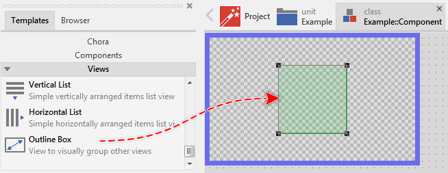
★Eventually name the new added Outline Box.
IMPORTANT
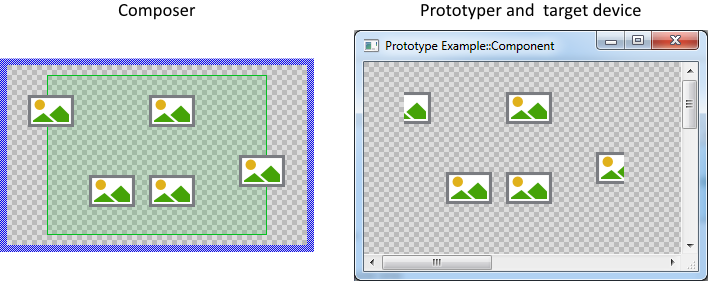
Being an auxiliary view, the Outline Box doesn't provide any own appearance. In order to recognize it while assembling the GUI component in the Composer window, the Outline Box is slightly tinted with green color. This effect exists just for your convenience. In the Prototyper as well as in the target device the Outline Box itself is invisible.
Inspect the Outline Box
As long as the Outline Box is selected you can inspect and modify its properties conveniently in the Inspector window as demonstrated with the property Bounds in the screenshot below:
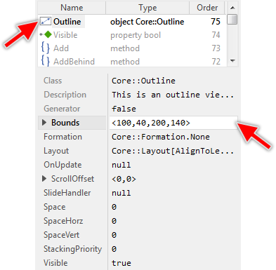
This is in so far worth mentioning as all following sections describe diverse features of the Outline Box by explicitly referring to its corresponding properties. If you are not familiar with the concept of a property and the usage of Inspector window, please read first the preceding chapter Compositing component appearance.
Arrange the Outline Box
Once added, you can freely move the Outline Box, or you simply grab one of its corners and resize it in this way. You can control the position and the size of this view also by directly modifying its property Bounds. If you want the Outline Box to appear behind other views you can reorder it explicitly.
Put a view under the control of the Outline Box
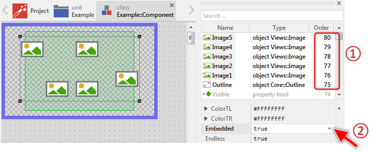
Per default, the views existing in the GUI component are considered as not being under control of any Outline Box. They all simply coexist as sibling views. This changes, when you set the property Embedded of the affected view to the value true. With this, the view switches from being an ordinary view to being content embedded within an Outline Box. Properly setting of the property Embedded is thus the first prerequisite to put the view under the control of an Outline Box.
The second prerequisite is to ensure that the view is arranged in front of the Outline Box. This means that the stacking order of the view has to be higher than the of the Outline Box. Views lying behind the Outline Box can't be controlled by it. If necessary, you can explicitly reorder the views. The current stacking order can be inspected conveniently in the members area of the Inspector window.
Assuming, you want in your component some Image views to appear embedded within an Outline Box. Furthermore, we assume that the Outline Box as well as all affected Image views are already part of the GUI component. In such case do following:
★First select the Outline Box member.
★In the members list of the Inspector window review the stacking order of the Outline Box and the Image views.
★If necessary reorder the Outline Box so it is arranged behind the views to embed. The order of the Outline Box has to be less than the of the Image views.
★Then select the Image views you want to embed.
★In Inspector modify the property Embedded of the selected Image views to the value true.
The following screenshot demonstrates the described example. Here the Outline Box is arranged behind the Image views and all Image views are configured with the property Embedded set to the value true:
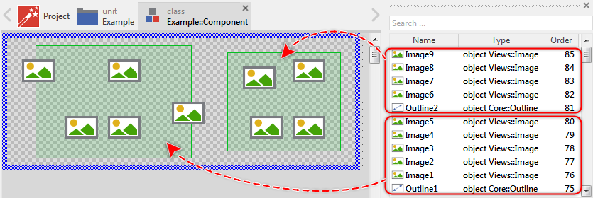
Please note, that being a simple lightweight container it is not possible to nest an Outline Box as an embedded view inside another one. You can, however, manage multiple Outline Boxes within one and the same GUI component. In such case the Outline Box takes care of the embedded views arranged between it and the next higher Outline Box. The following screenshot shows the situation with two Outline Boxes. The first box Outline1 takes care about the Image views Image1..Image5. The second box, in turn, manages the views Image6..Image9:
Put a dynamically created view under the control of the Outline Box
The above explanation focused on views existing within the GUI component already at its design time. In case you want the view to be created dynamically at the runtime of the application and be under the control of the Outline Box, then you have to explicitly assign the value true to the view's property Embedded just before you add the view to the GUI component. For example, you want a new Text view to appear embedded within the Outline Box:
// First create a new instance of the view class 'Views::Text' var Views::Text view = new Views::Text; // Determine the position and the size of the new view relative to // the top-left corner of the component. Also, specify the font, colors // and the string to display in the view. view.Bounds = <10,10,210,50>; view.Color = #000000FF; view.Font = Resources::FontMedium; view.String = "Hello World!"; // Configure the view to act as 'embedded'. view.Embedded = true; // Finally make the just created view be a part of the GUI component. Add( view, 0 );
Please note in the above example, that the method Add arranges the view on top of all other views existing already in the component, including the Outline Box. The view will thereupon overlapp the Outline Box what, as explained above, is a prerequisite for the view to be considered as being embedded within the Outline Box. This is sufficient for the most cases, so you don't need to worry about the stacking position (the Z-order) of the just added view.
However, should your GUI component contain more than one Outline Box, you have to correctly estimate the Z-order for the view in order to be correctly associated to the right Outline Box. For this purpose you can use the method AddBehind specifying in its second parameter a sibling view to arrange the new added view just behind it. For example, if the GUI component contains two Outline Boxes (an upper and lower level Outline Box), and you want the new view to be embedded within the lower level Outline Box, simply specify the upper level Outline Box as the sibling view:
// First create a new instance of the view class 'Views::Text' var Views::Text view = new Views::Text; // Configure the properties of the view view.Bounds = <10,10,210,50>; [...] // Configure the view to act as 'embedded'. view.Embedded = true; // Finally make the just created view be a part of the GUI component. // Note: the view will appear behind 'Outline2' and thus be embedded // within the next underlying Outline Box. AddBehind( view, Outline2 );
Alternatively, you explicitly configure the properties StackingPriority of the Outline Box and the associated views with the same value and so ensure that they are groupped together. You can, for example, configure the StackingPriority property of the lower Outline Box with the value 1 and the the of the upper Outline Box with the value 2. Then when you intent to add a new view, just configure its StackingPriority property to correspond to the value of the Outline Box you want the view to be associated to:
// First create a new instance of the view class 'Views::Text' var Views::Text view = new Views::Text; // Configure the properties of the view view.Bounds = <10,10,210,50>; [...] // Configure the view to act as 'embedded'. view.Embedded = true; // Configure the stacking priority of the view to correspond // to the of the Outline Box to associate the view. view.StackingPriority = Outline1.StackingPriority; // Finally make the just created view be a part of the GUI component. Add( view, 0 );
Finally, if you want to remove a dynamically created view from the GUI component, so it disappears again, just invoke the method Remove. In turn, if you want the view to stay part of the GUI component but you want to toggle its embedded state, just modify the view's property Embedded.
Outline Box and Composer window
The function of the Outline Box is intentionally suppressed when assembling the GUI component in the Composer window. In particular, setting the above mentioned property Embedded has no effect on the affected view. In other words, when working in the Composer window, the views supposedly considered as being embedded are in fact treated as regular views.
This special behavior should help you to keep track of the views while you actively design the GUI component. Without it, the views lying outside the Outline Box would disappear or trying to arrange them would interfere with the layout mechanisms controlled by the Outline Box.
In order to see the component as it will appear on the target device, start it in the Prototyper window. Here the function of the Outline Box is not suppressed anymore. As you see in the screenshot below, in the Prototyper window the Outline Box clips the views lying outside it, as expected:
Use Outline Box to group and clip views
The Outline Box acts like a container for the embedded views. Accordingly it limits the visibility of the views to its own boundary area. Views lying outside it are simply clipped. Being a container operations performed on the Outline Box affect implicitly the views embedded within it. In particular, when the Outline Box is moved, the views enclosed within it do move accordingly. Similarly, changing the property Visible of the Outline Box automatically hides or shows the affected views.
If the size of the Outline Box changes, the views embedded within it can be aligned automatically depending on the constraints specified in their Layout properties. The corresponding layout algorithms are described in the chapter Configuring component layout.
Please note, that as mentioned above the function of the Outline Box is suppressed in the Composer window when editing the corresponding component. Moving the Outline Box or changing its property Visible has thus only an effect when it is done at the runtime of the GUI component within the Prototyper window or even in the target device.
Use Outline Box to scroll the embedded views
With the Outline Box you can easily scroll the embedded content. This is in particular useful, when the embedded content is larger than the boundary area of the Outline Box, which is often the case with menu or panel components displaying many items or widgets.
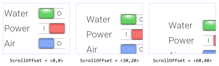
The scrolling is controlled by the property ScrollOffset. With it you can determine the vertical and the horizontal displacement individually. With positive values the content is scrolled right/down. With negative values left/up. The following example shows how this property affects the position of the views embedded within one and the same Outline Box (the thin blue borders indicate the Outline Box areas):
Please note, that as mentioned above the function of the Outline Box is suppressed in the Composer window when editing the corresponding component. Changing the property ScrollOffset has thus only an effect when it is done at the runtime of the GUI component within the Prototyper window or even in the target device.
An alternative approach to scroll the embedded content is to use the method EnsureVisible(). This method expects in its parameter a view you want to expose within the Outline Box. This can, for example, be a menu item currently lying outside the boundary area of the Outline Box. By calling this method, the entire embedded content is scrolled until the specified view has become visible.
Per default, calling EnsureVisible causes the embedded content being scrolled instantly. By preparing a Move point effect and passing it in a parameter to the EnsureVisible() method, the scrolling can be performed with a smooth animation. The following Chora code demonstrates the approach:
// The view you want to ensure to be visible within the Outline Box. // This view has to be one of the embedded within the box. var Core::View view = ...; // Create a new animation effect instance. var Effects::PointEffect effect = new Effects::PointEffect; // Configure the animation duration and the timing (easing) effect.CycleDuration = 250; // milliseconds effect.NoOfCycles = 1; effect.Timing = Effects::Timing.Exp_InOut; // Finally instruct the Outline Box to scroll its content with // the prepared animation until the 'view' is fully visible. OutlineBox.EnsureVisible( view, true, effect, null );
The method EnsureVisible() scrolls the content only when it is necessary, if the specified view is already fully visible, the method returns immediately. Please note the last parameter of the method, which is null in the above example. Using this parameter you can specify a slot method to send a signal to as soon as the scrolling has been finished. Accordingly, your implementation of the slot method can perform operations to complete the task. For example, it is usual to suppress user inputs while performing animations in order to avoid any interferences. With the mentioned slot method you can restore the event handling again when the animation is done. The following example implements this approach:
Please note, the example presents eventually features available as of version 8.10
An alternative approach to control running animations is to use the methods IsScrollEffectActive() and StopScrollEffect(). With the method IsScrollEffectActive() you can easily check whether the affected Outline view is actually performing an animation activated by a preceding EnsureVisible() or AdjustContent() method invocation. If such animation is active, the method returns true and your implementation can react to this situation. The method StopScrollEffect(), in turn, allows you to immediately finish the active animation. With method parameters you determine whether the effect should stop at its actual position or whether it should skip to the previously estimated end position.
Please note, to avoid any interferences, invoking the EnsureVisible() method stops the animation started eventually by the preceding EnsureVisible() or AdjustContent() invocation.
Adjust the scroll position
When the boundary area of the Outline Box is enlarged or the area occupied by the views controlled by the Outline Box changes, the current scroll offset remains unchanged. This can result in an undesired gap appearing at the edges of the Outline Box. Depending on your application case, you will probably need to adjust the Outline Box so it entire area is filled with views as good as possible.
This can be achieved conveniently by calling the method AdjustContent. The method verifies whether there is some gap between the views and the edges of the Outline Box, which can be filled by simply scrolling the views. In such case, the method tries to calculate the minimal scroll adjustment so the undesired gaps disappear.
Per default, calling AdjustContent causes the views being scrolled instantly. By preparing a Move point effect and passing it in a parameter to the AdjustContent() method, the scrolling can be performed with a smooth animation. The following Chora code demonstrates the approach:
// Create a new animation effect instance. var Effects::PointEffect effect = new Effects::PointEffect; // Configure the animation duration and the timing (easing) effect.CycleDuration = 250; // milliseconds effect.NoOfCycles = 1; effect.Timing = Effects::Timing.Exp_InOut; // Finally instruct the Outline Box to adjust the scrolling offset // with the prepared animation. OutlineBox.AdjustContent( effect, null );
The method AdjustContent() scrolls the views only when it is necessary. If there is no gap to fill, the method returns immediately. Please note the last parameter of the method, which is null in the above example. Using this parameter you can specify a slot method to send a signal to as soon as the scrolling has been finished.
Accordingly, your implementation of the slot method can perform operations to complete the task. For example, it is usual to suppress user inputs while performing animations in order to avoid any interferences. With the mentioned slot method you can restore the event handling again when the animation is done. This approach is demonstrated in an example from the section above.
An alternative approach to control running animations is to use the methods IsScrollEffectActive() and StopScrollEffect(). With the method IsScrollEffectActive() you can easily check whether the affected Outline Box is actually performing an animation activated by a preceding AdjustContent() or EnsureVisible() method invocation. If such animation is active, the method returns true and your implementation can react to this situation. The method StopScrollEffect(), in turn, allows you to immediately finish the active animation. With method parameters you determine whether the effect should stop at its actual position or whether it should skip to the previously estimated end position.
Please note, to avoid any interferences, invoking the AdjustContent() method stops the animation started eventually by the preceding AdjustContent() or EnsureVisible() invocation.
Use Outline Box to arrange the views in rows and columns
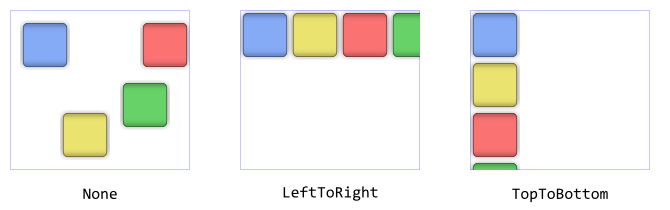
The Outline Box can be configured to automatically arrange the embedded views side by side or one below the other. In such case the originally specified view positions are replaced by positions calculated by the layout algorithm implemented in the Outline Box. This automatism is in particular ideal to automatically arrange menu items or toolbar buttons. This function is controlled by the value stored in the property Formation.
Per default, this property is initialized with the value Core::Formation.None meaning, that no automatic layout is calculated for the embedded views. By assigning the value Core::Formation.LeftToRight to it, the Outline Box is instructed to arrange the embedded views in a single row side by side aligning the row at its left edge. Similarly, the initialization value Core::Formation.TopToBottom causes the views being arranged vertically in a single column aligned at the upper edge of the Outline Box. The following screenshots demonstrate the effect of this property:
The views are arranged according to their stacking order, whereby invisible views are ignored, since their inclusion would lead to gaps in the resulting layout. Accordingly, if the visibility of a view changes at the runtime of the application, the Outline Box reacts to it and updates the layout instantly. Knowing this, you can easily implement menu components, which automatically hide not available menu items. The following example demonstrates it:
Please note, the example presents eventually features available as of version 8.10
Depending on the selected formation the Outline Box can even arrange the views in several rows or columns performing an automatic wrap as soon as a row/column is full. For example, the formation LeftToRight_TopToBottom arranges the views in rows starting at the top-left corner. For the complete list of available values for the Formation property please see Core::Formation.
Align and resize the automatically arranged views
Using the above described property Formation you can easily instruct the Outline Box to automatically arrange its embedded views in a row or column formation. If you have selected a row formation, the views are per default aligned at the upper edge of the Outline Box. If you have selected a column formation the views appear aligned at the left edge. The figures in the section above demonstrate the results of this default alignment.
If desired, you can determine other constraints to control the alignment of the view. For example, you can specify that a view arranged in a row formation should appear bottom aligned or you configure the view to be resized in order to assume the entire available height of the Outline Box.
These view specific alignment constraints are controlled by the property Layout, which is exposed by every view. Since this property is declared with a set data type Core::Layout, it can assume practically any combination of the options defined in this set. This, however, doesn't make sense in every case. Therefore in the following table you find a list of meaningful option combination and the resulting alignment effects:
Active options in the Layout property |
The resulting effect |
|---|---|
AlignToLeft |
This is the default setting causing the view to be aligned at the left edge of the Outline Box. This setting, however, has an effect only when used with an Outline Box configured to arrange the views in a vertical (column) formation. |
AlignToTop |
This is the default setting causing the view to be aligned at the upper edge of the Outline Box. This setting, however, has an effect only when used with an Outline Box configured to arrange the views in a horizontal (row) formation. |
AlignToRight |
This setting causes the view to be aligned at the right edge of the Outline Box. It, however, has an effect only when used with an Outline Box configured to arrange the views in a vertical (column) formation. |
AlignToBottom |
This setting causes the view to be aligned at the bottom edge of the Outline Box. It, however, has an effect only when used with an Outline Box configured to arrange the views in a horizontal (row) formation. |
AlignToLeft + AlignToRight |
This setting causes the view to be aligned in the center between the left and the right edges of the Outline Box. It, however, has an effect only when used with an Outline Box configured to arrange the views in a vertical (column) formation. |
AlignToTop + AlignToBottom |
This setting causes the view to be aligned in the center between the upper and the bottom edges of the Outline Box. It, however, has an effect only when used with an Outline Box configured to arrange the views in a horizontal (row) formation. |
ResizeVert |
This setting causes the view to be resized to fill the area between the upper and the bottom edges of the Outline Box. It, however, has an effect only when used with an Outline Box configured to arrange the views in a horizontal (row) formation. |
ResizeHorz |
This setting causes the view to be resized to fill the area between the left and the right edges of the Outline Box. It, however, has an effect only when used with an Outline Box configured to arrange the views in a vertical (column) formation. |
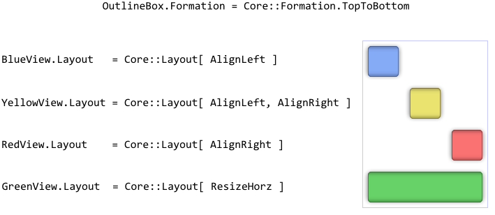
Knowing the above described possibilities you can now specify individual layout constraint for every view. For example, if the Outline Box is configured to arrange the views vertically in a column formation, the views can be aligned or even resized between the left and the right edges of the Outline Box. The following figure demonstrates it (the thin blue border indicates the area of the Outline Box):
Please note, changing the size of the Outline Box causes the automatically arranged views to update their position implicitly. You can thus layout the contents dynamically depending on the available space.
Add padding between automatically arranged views
As described above by using the property Formation you can easily instruct the Outline Box to automatically arrange its embedded views in a row or column formation. Per default, the affected views are arranged close together side by side or one below the other.
If the views appear too close, you can specify additional padding space the Outline Box will automatically add between every pair of the arranged views. The additional padding is expressed in pixel and to control it you use the property Space. The following figure demonstrates how the additionally specified padding affects the views arranged side by side in a row formation:
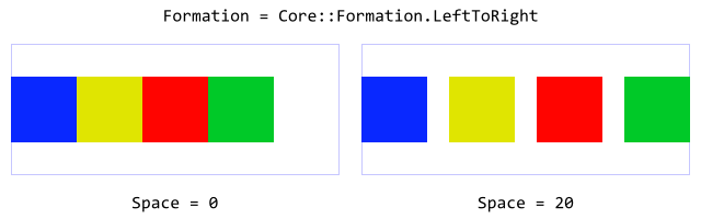
With the additional properties SpaceHorz and SpaceVert you can determine an individual padding for the horizontal and vertical direction. This is very useful if the Outline Box is configured to automatically wrap the controlled views in several rows or columns.
Connect Outline Box with a Slide Touch Handler
For your convenience the Core::Outline class implements an interface for easy coupling Outline Boxes with Slide Touch Handlers. In this manner, the user can scroll the content displayed within the Outline Box by simply touching the associated Slide Touch Handler. Assuming that you have already an Outline Box in your GUI component, then:
★Follow the instructions to add a new Slide Touch Handler.
★Arrange the Slide Touch Handler so it covers the area of the destined Outline Box.
★Assign the Slide Touch Handler to the property SlideHandler of the Outline Box.
The following example demonstrates how you create a simple scrollable menu. The Outline Box takes care of the appropriate menu item arrangement. The Slide Touch Handler, in turn, is responsible for the scrolling the menu items. The user can thus tap the menu items and activate them or scroll the entire menu by touching and dragging it with the finger (or by using a mouse pointer):
Please note, the example presents eventually features available as of version 8.10
TIP
If the views embedded within the Outline Box implement any touch handler, it is convenient to reorder the Slide Touch Handler just behind the Outline Box in order to ensure, that the handler doesn't overlap any of the views managed by the Outline Box. Otherwise the views will be suppressed in the processing of their touch events. See also Combine several touch handlers together.
Enumerate and search views controlled by the Outline Box
Sometimes it is necessary to know the views embedded within an Outline Box. This can, for example, be the case when you need to add some cursor navigation to your menu or control panel. Then when the user presses a key Up, Down, Left or Right your component should react and select the next available menu item or widget lying in the specified direction relative to the currently selected view. Or, much more simple, you want the Text views controlled by the Outline Box being initialized with another font resource. The Core::Outline class provides for such application cases various useful methods. The following table gives you a short overview of them:
Method |
Description |
|---|---|
Returns the total number of views controlled by this Outline Box. |
|
Determines the rectangular area occupied by the views embedded within the Outline Box. |
|
Searches for the view lying in front of the view specified in the method parameter aView. If the parameter aView is null, the method returns the first view belonging to the Outline Box. This allows you to enumerate all affected views, view by view from the background to the front. |
|
Searches for the view lying behind the view specified in the method parameter aView. If the parameter aView is null, the method returns the last view belonging to the Outline Box. This allows you to enumerate all affected views, view by view from the front to the background. |
|
Combines the functionality of FindNextView() and FindPrevView() and tries to find any view lying above or below the specified view. |
|
Searches for a view, which area encloses a given position. |
|
Searches for a view lying in the specified direction relative to the center of a reference view. For example, invoked with the parameter Core::Direction.Right the method tries to find a view placed on the right relative to a reference view. |
|
Searches for a view lying completely or partially within the designated area. |
|
Returns the stacking order of a view. The first view belonging to the Outline Box has the index 0 (zero). The next above view has the index 1, and so far. |
|
Returns the view with the specified stacking order. The first view belonging to the Outline Box has the index 0 (zero). The next above view has the index 1, and so far. |
Let's assume, you are developing a control panel GUI component containing various widgets and you want that the user can navigate between those widgets by using keyboard keys Up, Down, Left or Right. For this purpose do following:
★Follow the instructions to add a new Key Press Handler.
★Configure the property Filter of the Key Press Handler with the value Core::KeyCode.CursorKeys to react to cursor keys only.
★Add a new slot method to your GUI component.
★Assign the slot method to the property OnPress of the previously added Key Press Handler.
★Open the slot method for editing.
★In the Code Editor implement the following Chora code:
var Core::View view = null; var Core::Direction direction = Core::Direction.None; // Depending on the pressed key, determine the direction to look // for the new view to select. switch ( KeyHandler.Code ) { case Core::KeyCode.Up : direction = Core::Direction.Top; case Core::KeyCode.Down : direction = Core::Direction.Bottom; case Core::KeyCode.Left : direction = Core::Direction.Left; case Core::KeyCode.Right : direction = Core::Direction.Right; default :; } // Ask Outline Box to find the view relative to the currently selected view, // which is determined by the property 'Focus'. Ignore all views, which are // invisible or not allowed to be selected. view = Outline.FindViewInDirection( Focus, direction, Core::ViewState[ Enabled, Visible, Focusable ]); // If a view has been found, select it now. If no view was found, the current // selection remains unchanged. if ( view != null ) Focus = view;
Now, when you start the Prototyper, you can use the cursor keys to navigate easily between the widgets embedded within the Outline Box in your panel component:
Please note, the example presents eventually features available as of version 8.20
You can call the above described methods whenever your GUI component implementation requires the corresponding information. More sophisticated, however, is to join the update mechanism provided natively by the Outline Box. Precisely, when you assign a slot method to its property OnUpdate, the slot method will receive postsignals every time the Outline Box is scrolled or the views are rearranged. Accordingly, within the slot method you can react on this notification. The following steps describe how to do this:
★First add a new slot method to your GUI component.
★Assign the slot method to the property OnUpdate of the Outline Box.
★Open the slot method for editing.
★In the Code Editor implement your desired operations by using the values returned from the above described Outline Box methods.
Control the visibility of the Outline Box
The Outline Box itself is not visible, except the Composer window, which shows the Outline Box tinted with green color. The Outline Box provides however a property Visible. This property affects the visibility of the views embedded within the Outline Box.
TIP
In the complete GUI application an individual view is visible on the screen only when all of its superior Owner components are visible too, the view itself does lie within the visible area of the superior components and the view is not covered by other sibling views nor components.