Using Views: Line
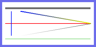
The Mosaic class Views::Line implements a primitive graphical object specialized to display a single straight line segment. This so-called Line view can be used to compose the appearance of a GUI component, in particular to add any separators or borders to it. The following screenshot demonstrates few examples of how Line views appear in the canvas area of Composer (and accordingly on the screen in your target device):
The following sections are intended to provide you an introduction and useful tips of how to work with the Line view. For the complete reference please see the documentation of the Views::Line class.
Add new Line view
To add a new Line view just at the design time of a GUI component do following:
★First ensure that the Templates window is visible.
★In Templates window switch to the folder Views.
★In the folder locate the template Line.
★Drag & Drop the template into the canvas area of the Composer window:
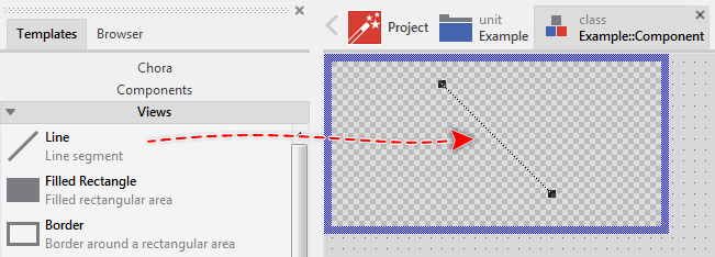
★Eventually name the new added Line view.
Inspect the Line view
As long as the Line view is selected you can inspect and modify its properties conveniently in the Inspector window as demonstrated with the property Point1 in the screenshot below:
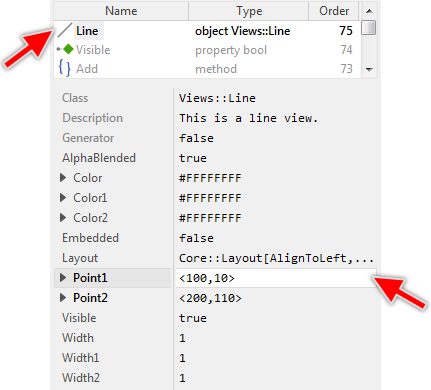
This is in so far worth mentioning as all following sections describe diverse features of the Line view by explicitly referring to its corresponding properties. If you are not familiar with the concept of a property and the usage of Inspector window, please read first the preceding chapter Compositing component appearance.
Arrange the Line view
Once added, you can freely move the Line view, or you just grab one of its both end points and resize it in this way. You can control the position of the view also by directly modifying its properties Point1 and Point2. If you want the Line view to appear behind other views you can reorder it explicitly.
Specify the color of the Line view
To specify the color of the Line view you change its property Color. Alternatively you can configure the line segment to appear stroked with a color gradient. For this purpose you specify the colors for the both line ends individually by using the properties Color1 and Color2. The gradient colors are interpolated linearly between the both specified values. Using color values with alpha < 255 causes the line segment to appear semi- or even transparent. For example:

Specify the width of the Line view
Per default line segments are drawn with 1 pixel thickness. This setting can be controlled by the property Width. Alternatively you can configure the line segment to appear trapezoidal with individual width at its start and end point. For this purpose use the properties Width1 and Width2. For example:
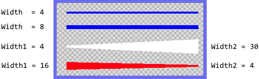
Please note, if your target device doesn't provide any dedicate graphics hardware for drawing line segments, drawing lines with width > 1 pixel may impact the performance of your application if you use this feature extensively. If you want to display a vertical or horizontal bar, use the Filled Rectangle view for this purpose.
Control the visibility of the Line view
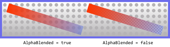
The visibility of the Line view is controlled primarily by the property Visible and the specified color values. Per default the stroked line segments appear alpha-blended over the contents lying behind them unless you explicitly disable this mode by setting the property AlphaBlended to the value false. In such case, the line will overwrite the contents in the background. For example:
TIP
In the complete GUI application an individual view is visible on the screen only when all of its superior Owner components are visible too, the view itself does lie within the visible area of the superior components and the view is not covered by other sibling views nor components.