Using Views: Group
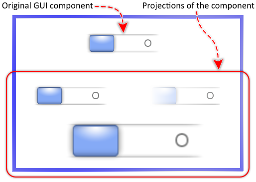
The Mosaic class Views::Group implements a graphical object specialized to show the projection of an existing GUI component. In this manner multiple images of the original component can appear simultaneously at various screen locations, every time with different settings like opacity, scaling, etc. This so-called Group view can be used to compose the appearance of a GUI component, e.g. to add simple visual mirroring effects or while performing fancy fading animations. The following screenshot demonstrates few examples of how Group views appear in the canvas area of Composer (and accordingly on the screen in your target device):
The following sections are intended to provide you an introduction and useful tips of how to work with the Group view. For the complete reference please see the documentation of the Views::Group class.
IMPORTANT
Don't confuse the class Views::Group with the similarly named Core::Group. The Core::Group class is the base class intended to derive and implement new GUI components. The Views::Group class, in turn, is intended to show a projection of a such component. Hence the name similarity.
Add new Group view
To add a new Group view just at the design time of a GUI component do following:
★First ensure that the Templates window is visible.
★In Templates window switch to the folder Views.
★In the folder locate the template Group.
★Drag & Drop the template into the canvas area of the Composer window:
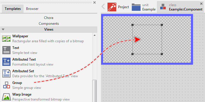
★Eventually name the new added Group view.
Inspect the Group view
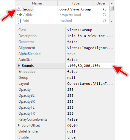
As long as the Group view is selected you can inspect and modify its properties conveniently in the Inspector window as demonstrated with the property Bounds in the screenshot below:
This is in so far worth mentioning as all following sections describe diverse features of the Group view by explicitly referring to its corresponding properties. If you are not familiar with the concept of a property and the usage of Inspector window, please read first the preceding chapter Compositing component appearance.
Arrange the Group view
Once added, you can freely move the Group view, or you simply grab one of its corners and resize it in this way. You can control the position and the size of the view also by directly modifying its property Bounds. If you want the Group view to appear behind other views you can reorder it explicitly.
Connect the Group view with a GUI component
The content to display within a Group view is determined by its property Group. Usually, you initialize this property with a GUI component existing already as an embedded object within the component you are currently editing in Composer (in other words, with a sibling member of the Group view). With the Inspector Assistant you can conveniently select the right object when you edit the initialization expression for the property Group.
Once established the relation between the Group view and a component, you have also to activate the buffered mode for the original component. Without this, the Group view will remain empty. To control the buffered mode, the GUI component provides a property Buffered:
★Select the component you have connected to the Group view.
★In Inspector locate its property Buffered.
★Change this property to true.
From technical point of view, you can initialize the property Group with any instance of a class descended from the Mosaic class Core::Group, except this as representing the currently edited component, since a component can't display a projection of itself recursively. It is even not necessary for the affected component to be visible or be a part of the current screen composition. You can, for example, create a new instance of a GUI component and assign it exclusively to a Group view:
// Create a new instance of a component var Core::Group component = new SomeUnit::SomeGuiComponentClass; // Activate the buffered mode for the just created component instance component.Buffered = true; // Assign it to a Group view SomeGroupView.Group = component;
In the above example, the new created component appears within the area of the SomeGroupView view as if it were a part of the screen composition. In reality, the Group view displays only an image of the original component. Using the above example code as basis, you can implement fancy fading animation effects to perform with the projected component image.
CAUTION
Please consider, that with activating the buffered mode, the component reserves memory for an internal bitmap to store its image inside. The size of the bitmap corresponds to the actual size of the component. In other words, a 200x100 pixel large GUI component will be buffered with a 200x100 pixel large bitmap. Assuming you are working with the RGBA4444 (16-bit per pixel) Platform Package, then the bitmap would occupy ~40 KB of the RAM. Thus, if RAM is a scarce resource in your target device, you should use the buffering (and thus the Group view) with prudence.
Align, scale or stretch the image within the Group view
Per default, the Group view displays the image of the associated component centered within the area determined by the property Bounds. If the component is larger than the available area, the parts lying outside the area are simply clipped and are not visible.
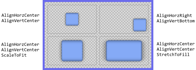
If desired, with the property Alignment you can determine other behavior how the Group view should react when its size and the size of the associated component are different. In particular, you can align the displayed component image at the edges of the Group view or you can instruct the view to proportionally scale or even stretch the image so it fits within the available area. The following figure demonstrates few examples of how the initialization of the property Alignment affects the image layout (the gray borders indicate the view areas):
Please note, if your target device doesn't provide any dedicated graphics hardware for bitmap scale operation, the operations are performed by the CPU, which may impact the performance of your application significantly if you use this feature extensively.
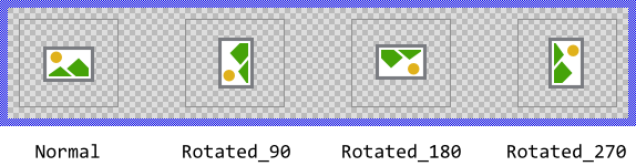
Rotate the image within the Group view
With the property Orientation you can determine the rotation of the image of the associated component in steps of 90 degrees (0, 90, 180 and 270 degrees). The following figure demonstrates how the initialization of the property Orientation affects the image layout (the gray borders indicate the view areas):
Modifying the Orientation property has also an effect on how the image is aligned within the view's area. For example, if you have configured the Group view to align the displayed image at its top-left corner and then you rotate the image 90 degrees counterclockwise, the image will in fact appear aligned to the bottom-left corner of the view. The following figure demonstrates it (the gray borders indicate the view areas):
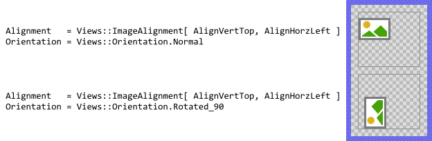
In such case the simplest is you consider the specified alignment constraints as being relative to the edges of the displayed image itself instead of the edges of the Group view. Accordingly, regardless of how you initialize the property Orientation, a left aligned image will stick at its original left edge.
Please note, if your target device doesn't provide any dedicated graphics hardware for bitmap rotate operation, the operations are performed by the CPU, which may impact the performance of your application significantly if you use this feature extensively.
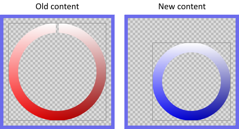
Control the bilinear filtering
Bilinear filtering is a technique to smooth an image when it is scaled or stretched. The problem: through the distortion, the center of a pixel in the resulting image does not necessarily correspond to the center of a pixel in the original content. The simply copying of the pixel color value results then in an ugly image with rough pixel steps. The bilinear filter helps to improve the results by interpolating the color values of the pixels lying around the mapped position.
The usage of the bilinear filter is controlled by the property Quality. Per default the filter is enabled. By initializing Quality with the value false you can deactivate it again. The following figure demonstrates the results depending on the current setting of the property:

TIP
Despite the advantages, you should consider, that with the bilinear filter the image operations are more computing intensive. Thus, if your target device is not powerful nor doesn't provide any dedicated graphics hardware and the Group view scales or stretches the displayed image, deactivating the filter may improve the performance.
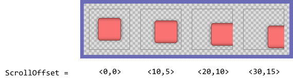
Scroll the image within the Group view
Besides the possibility to align the displayed component image within a Group view you can also scroll it pixel-wise. For this purpose use the property ScrollOffset. You can determine the vertical and the horizontal displacement individually. With positive values the image is scrolled right/down. With negative values left/up. For example (the gray borders visualize the view areas):
Configure the Group view to adjust its size automatically
With the property AutoSize you can instruct the Group view to automatically adjust its size and eventually its position when new component is assigned or the already associated component changes its size. In other words, the Group view will assume the original size of the displayed content.
You can combine AutoSize with the alignment options. For example, if you have configured the Group view to align the component image at its bottom-right corner, assigning new component will move the left and top edges of the view by maintaining the bottom-right corner fixed. This is demonstrated in the following screenshot (the gray borders visualize the view area):
Since with AutoSize mode enabled the Group view assumes automatically the size of the assigned component, scaling or stretching of the image is not useful in such case.
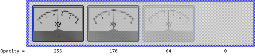
Modulate the opacity of the displayed image
Using the property Opacity you can modulate the original opacity of the displayed component image, so that it appears semi-transparent even if the original content was opaque. The valid values for the property Opacity are 0 .. 255, whereby the smaller the value the more transparent the resulting image. For example:
Alternatively you can specify for every corner (top-left, top-right, bottom-right and bottom-left) an individual opacity value resulting in the component image being modulated by an opacity gradient. For this purpose modify the corresponding properties OpacityTL, OpacityTR, OpacityBR and OpacityBL. For example:
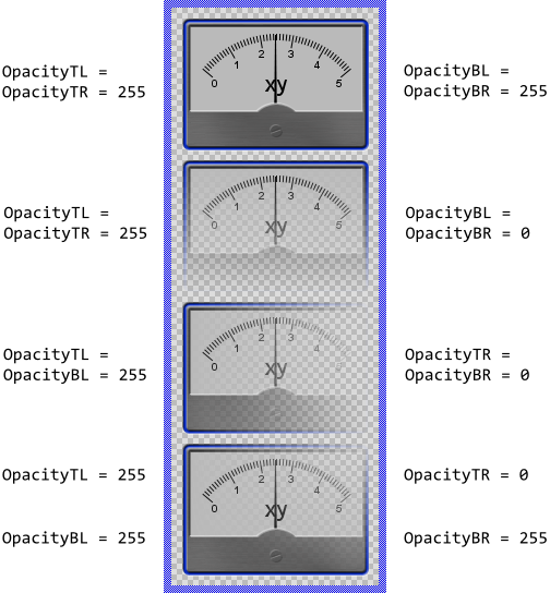
Please note, before the version 11.00 the common property Opacity and the individual properties OpacityTL.. OpacityBR were intended to be used exclusively. You could specify either the common opacity for the entire view or individual opacity for its four corners. Using both approaches simultaneously produced unexpected results depending on the order in which the properties were initialized. This confused the users.
Starting with the version 11.00 the Group view calculates the resulting opacity by modulating the values from the individual properties OpacityTL..OpacityBR by the value from the common property Opacity. In this manner, you are able to specify opacity values in all properties simultaneously avoiding the unpredictable behavior found in the preceding version. From technical point of view, the modulation is performed by multiplying the opacity values from the individual property (e.g. OpacityTL) with the value from the common property Opacity.
Relay touch screen events to the original GUI component
Per default the Group view limits to display the current image of the associated GUI component, so it doesn't react to any user inputs. This behavior can be changed by setting the property RelayCursorEvents to the value true. By enabling this mode the Group view reacts to user touch events and relays them to the original component. In other words, the user can tap within the projection of a component and the original component will process the event. This works even if the component image is scaled, stretched or scrolled within the Group view area.
Use Group view for fade-in and fade-out animations
The Group view is ideal to perform fancy animations and transitions with the image of the original component. For example, you can implement an application which fades-in the image of an embedded component by scaling it dynamically from the center of the screen. Once the image has reached the size of the original component, the Group view disappears and the original component becomes visible. From the users perspective, the component was visible all the time. The following steps describe how such application case can be done:
★First add the desired component to the Composer canvas area and arrange it, so that it appears already at its intended destination position.
★While the component is still selected change in Inspector its property Visible to the value false so the component is originally not visible when the application starts.
★Add a new Group view to the canvas area.
★Connect the Group view with the previously added component.
★Configure the Group view so the displayed component image is stretched to fill the entire Group view area.
★Add a new 'Move and resize rect' animation effect.
★Configure the duration of the effect to e.g. 500 and the number of cycles to 1. Thus the fade-in animation will take 500 milliseconds.
★Connect the effect with the property Bounds of the Group view. Thus the effect is able to animate this property.
★Specify the start and the end values for the effect. The end value should correspond to the destination area where you arranged the component. The start value should be the area where you want the image of the component to appear at the begin of the animation, e.g. a small area in the center of the screen.
★Add a new slot method.
★Connect the slot method to the animation effect in order to handle the effect termination.
★Implement the slot method as follows. It handles the situation when the animation is finished:
// Once finished the animation, the buffer is not needed anymore. // Release the associated memory. Component.Buffered = false; // The original component should appear now. Component.Visible = true; // The Group view, in turn, is not necessary anymore and disappears. GroupView.Visible = false;
★Configure the animation effect to start immediately.
Now, every time you start the Prototyper, the component fades-in with the implemented animation. At the end of the animation, the above slot method is invoked and makes the original component visible. The Group view used during the animation disappears then.
Please note, the example presents eventually features available as of version 8.10
Connect the Group view with a Slide Touch Handler
For your convenience the Views::Group class implements an interface for easy coupling Group views with Slide Touch Handlers. In this manner, the user can scroll the content displayed within the Group view by simply touching the associated Slide Touch Handler. Assuming that you have already a Group view in your GUI component, then:
★Follow the instructions to add a new Slide Touch Handler.
★Arrange the Slide Touch Handler so it covers the destined Group view.
★Assign the Slide Touch Handler to the property SlideHandler of the Group view.
Control the visibility of the Group view
The visibility of the Group view is controlled primarily by the property Visible and the content of the associated component. Also the specified opacity may affect the resulting appearance of the Group view.
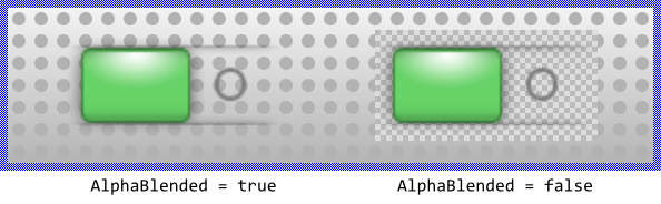
Per default the views appear alpha-blended over the contents lying behind them unless you explicitly disable this mode by setting the property AlphaBlended to the value false. In such case, the component image will overwrite the contents in the background. For example:
TIP
If the Group view remains empty although it is connected with a GUI component, you have probably forgotten to activate the buffered mode for the component. See the section Connect the Group view with a GUI component.
TIP
In the complete GUI application an individual view is visible on the screen only when all of its superior Owner components are visible too, the view itself does lie within the visible area of the superior components and the view is not covered by other sibling views nor components.