Using Views: Filter Group
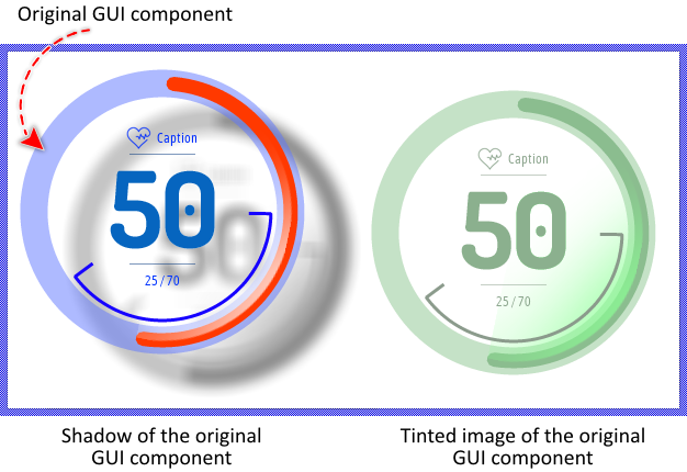
The Mosaic class Views::FilterGroup implements a graphical object specialized to display the projection of an existing GUI component with additional filter effects applied on it. In this manner multiple images of the original component can appear simultaneously at various screen locations, every time with different filter effects. This so-called Filter Group view can be used to compose the appearance of a GUI component, in particular to enrich the component by sophisticated filter effects, like blurring, masking, color tinting or shadowing. The following screenshot demonstrates few examples of how Filter Group views appear in the canvas area of Composer (and accordingly on the screen in your target device). The example uses the Filter Group to tint the image of the original GUI component by a color and to blur it, so it results in a realistic shadow effect:
The following sections are intended to provide you an introduction and useful tips of how to work with the Filter Group view. For the complete reference please see the documentation of the Views::FilterGroup class.
Add new Filter Group view
To add a new Filter Group view just at the design time of a GUI component do following:
★First ensure that the Templates window is visible.
★In Templates window switch to the folder Views.
★In the folder locate the template Filter Group.
★Drag & Drop the template into the canvas area of the Composer window:
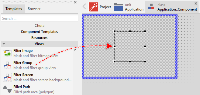
★Eventually name the new added Filter Group view.
Inspect the Filter Group view
As long as the Filter Group view is selected you can inspect and modify its properties conveniently in the Inspector window as demonstrated with the property Bounds in the screenshot below:
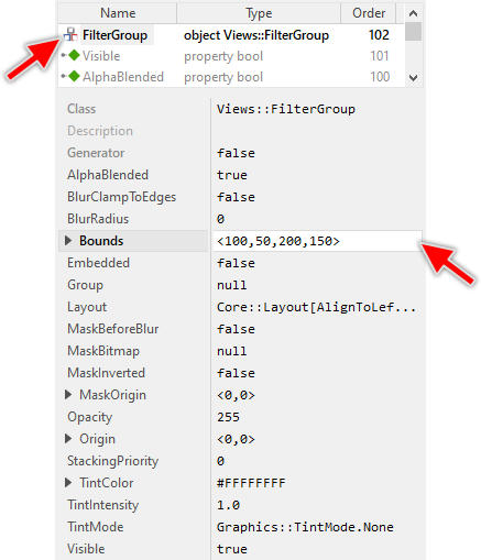
This is in so far worth mentioning as all following sections describe diverse features of the Filter Group view by explicitly referring to its corresponding properties. If you are not familiar with the concept of a property and the usage of Inspector window, please read first the preceding chapter Compositing component appearance.
Arrange the Filter Group view
Once added, you can freely move the Filter Group view, or you simply grab one of its corners and resize it in this way. You can control the position and the size of the view also by directly modifying its property Bounds. If you want the Filter Group view to appear behind other views you can reorder it explicitly.
Connect the Filter Group view with a GUI component
The content to display within a Filter Group view is determined by its property Group. Usually, you initialize this property with a GUI component existing already as an embedded object within the component you are currently editing in Composer (in other words, with a sibling member of the Filter Group view). With the Inspector Assistant you can conveniently select the right object when you edit the initialization expression for the property Group.
Once established the relation between the Filter Group view and a component, you have also to activate the buffered mode for the original component. Without this, the Filter Group view will remain empty. To control the buffered mode, the GUI component provides a property Buffered:
★Select the component you have connected to the Filter Group view.
★In Inspector locate its property Buffered.
★Change this property to true.
From technical point of view, you can initialize the property Group with any instance of a class descending from the Mosaic class Core::Group, except this as representing the currently edited component, since a component can't display a projection of itself recursively. It is even not necessary for the affected component to be visible or be a part of the current screen composition. You can, for example, create a new instance of a GUI component and assign it exclusively to a Filter Group view:
// Create a new instance of a component var Core::Group component = new SomeUnit::SomeGuiComponentClass; // Activate the buffered mode for the just created component instance component.Buffered = true; // Assign it to a Filter Group view SomeFilterGroupView.Group = component;
In the above example, the new created component appears within the area of the SomeFilterGroupView view as if it were a part of the screen composition. In reality, the Filter Group view displays only an image of the original component. Using the above example code as basis, you can implement fancy filter effects with the projected component image.
CAUTION
Please consider, that when activating the buffered mode, the component reserves memory for an internal bitmap to store its image inside. The size of the bitmap corresponds to the actual size of the component. For example, a 300x200 pixel large GUI component will be buffered with a 300x200 pixel large bitmap. Assuming you are working with the RGBA8888 (32-bit per pixel) Platform Package, then the bitmap would occupy ~240 KB of the RAM. Thus, if RAM is a scarce resource in your target device, you should use the buffering (and thus the Filter Group view) with prudence.
Configure the blur filter
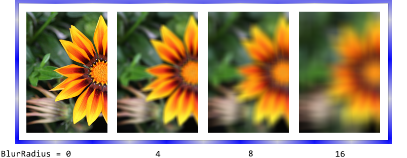
The blur filter is controlled by the property BlurRadius. This value determines the area around a pixel to take in account when calculating the blur effect at the respective position. The larger the specified blur radius, the more intensive the resulting blur effect. Configuring the property with the value 0 (zero) disables the blur effect again:
Please note, Embedded Wizard does not prescribe any concrete method for calculating the blurred values. Depending on the capability of the target system, the Gaussian or Box blur algorithm can be applied. Similarly, the supported blur radius range can differ from target to target. A target system can even be restricted to support only few discrete blur radius values. The value specified in the BlurRadius property is then automatically rounded to the nearest supported value. With the method AdjustBlurRadius() you can query the effective blur radius based on the desired value:
var int32 blurRadius = 50; // Configure the view with the desired blur radius. It is however // not guarantied that the view will really apply 50 pixel radius. FilterGroup.BlurRadius = blurRadius; // ... ask the view, which blur radius will be really used. trace "The real blur radius is: ", FilterGroup.AdjustBlurRadius( blurRadius );
The blur filter considers pixel lying outside the source image as being transparent. Consequently, the closer the resulting pixel to the view's edge, the more transparent pixel lying beyond the borders are involved in the calculation. The resulting pixel will appear faded-out. By setting the property BlurClampToEdges to the value true, the blur effect will end abruptly at the view's edges ignoring the transparent pixel lying outside its area. Thereupon when the source image is aligned at the edges of the view, its borders don't appear transparent anymore as demonstrated in the figure below:
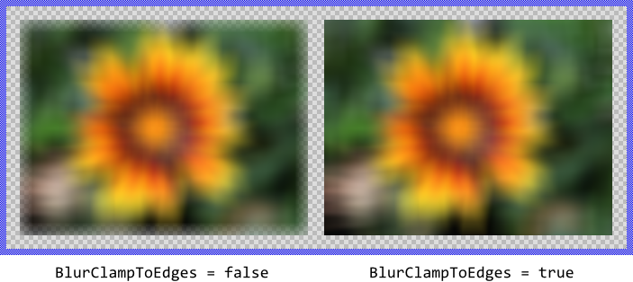
When using the blur filter configured with BlurClampToEdges = false it may be useful to additionally add a margin around the blurred component content where the component edges can fade-out. Without the margin, the blur effect will be clipped at view's edges. For more details see the section Position the component image within the Filter Group view.
CAUTION
Calculating the blur effect can become very CPU intensive if there is no GPU accelerated support for such operation in the target system. From technical point of view, for each resulting pixel the algorithm has to evaluate all surrounding pixel found in the area with size corresponding to the specified blur radius. The larger the blur radius, the more pixel have to be taken in account as consequence.
The blur calculation also requires intermediate image results to be stored temporarily before they can be shown on the screen. These occupy additional RAM according to the size of the blurred area. Thus, if RAM and CPU are scarce resources in your target device, you should use the blur effects with prudence.
Configure the tint filter
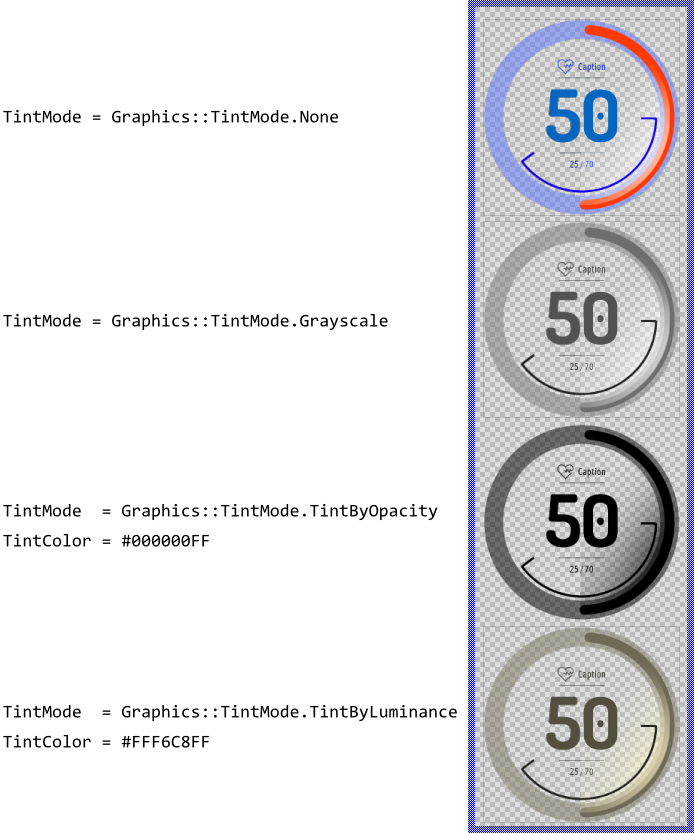
The tint filter modifies the colors found in the image of the associated component. It is controlled by the properties TintMode and TintColor where the desired conversion mode and the color to apply during the conversion are configured. The following table provides a short description of the supported tint modes (for more details see Graphics::TintMode):
Tint mode |
Description and application cases |
|---|---|
None |
The tint filter is disabled. The original colors found in the image are used without any further modification. |
Grayscale |
The original RGB colors found in the image are converted to grayscale values according to their luminance. This mode is thus ideal to simply gray out the image of the component. |
TintByOpacity |
The opacity information found in the image is used to modulate the color value specified in the property TintColor producing so a monochrome image. For example, to display a black shadow based on the content of the associated component, configure the property TintColor with the black color #000000FF. |
TintByLuminance |
The luminance resulting from the RGB components of the image is used to modulate the RGB components of the color value specified in the property TintColor producing so a monochrome image. For example, configuring TintColor with the value #FFF6C8FF (sepia color) lets the original image of the component appear as an old photography. |
The following figure demonstrates the resulting effect depending on selected tint mode and the specified color value:
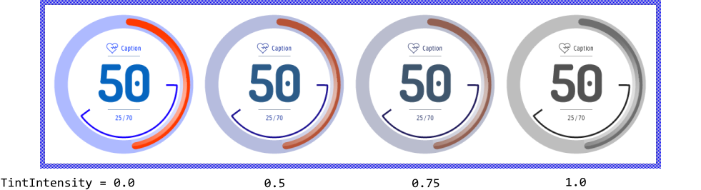
Besides the both above explained properties, the tint effect can additionally be controlled by the property TintIntensity. It determines the intensity of the tint operation and lies in the floating point range 0.0 .. 1.0. If the value is 1.0, the original image colors are completely replaced by values resulting from the tint filter. In turn, the value equal to 0.0 results in the original colors without any tinting effect. For all other values the colors are interpolated between the original and the color value resulting from the filter effect. The following figure illustrates the effect of the TintIntensity property for a Filter Group view being configured to grayscale the colors of the original component's image:
Configure the mask filter
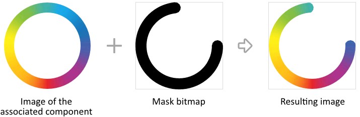
The mask filter combines the image of the associated component with the content of an ALPHA8 mask bitmap, so that pixel information found in the mask bitmap is used to modulate the opacity of the corresponding pixel from the original image. As consequence, the Filter Group view displays only those image pixel which are not transparent in the mask bitmap. The following figure illustrates the working principle of the mask filter:
The mask bitmap to use by a Filter Group view is determined by its property MaskBitmap. Usually, you initialize this property with the name of an existing bitmap resource member, which is typical for all immutable assets well known already at the design time. With the Inspector Assistant you can conveniently select the right resource when you edit the initialization expression for the property MaskBitmap.
From technical point of view, you can initialize the property MaskBitmap with any instance of a class descending from the Mosaic class Resources::Bitmap. This includes in particular the both graphics objects Filled Path Bitmap and Stroked Path Bitmap. Using them the mask bitmap can be rendered from vector path data. The mask and so the filter effect can thereupon change dynamically at the runtime.
IMPORTANT
Unlike all other views, Filter Group view is restricted to single frame bitmaps only. When you assign a multi-frame bitmap as mask to the Filter Group view, the filter operation will be ignored and dedicated error message is reported. Also, please ensure that the assigned mask bitmap is stored in the ALPHA8 format (containing the opacity information only) otherwise the filter operation is ignored and an error message is reported.
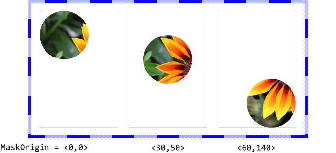
Per default, mask bitmaps are arranged directly at the top-left corner of the respective Filter Group view. To change this distance you use the property MaskOrigin. The following figure illustrates the resulting effect using here a mask bitmap containing a simple circle with 50 pixel radius. The thin gray borders in the figure indicate the areas of the corresponding Filter Group views. When changing the property MaskOrigin, the mask moves within the view exposing so the corresponding image areas of the associated component:
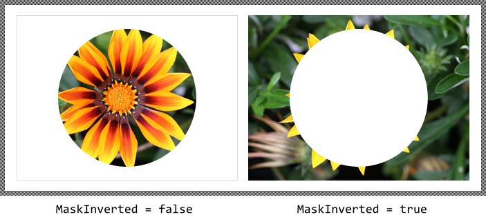
If desired, the effect of the mask bitmap can be inverted. Doing this, the Filter Group view will display only those image pixel which are not fully opaque in the mask bitmap. This function is controlled by the property MaskInverted and the following figure demonstrates it. Please note, that pixel lying outside the mask bitmap are considered as transparent. Consequently, when MaskInverted is true, the Filter Group view will expose all image pixel which are found beyond the borders of the mask:
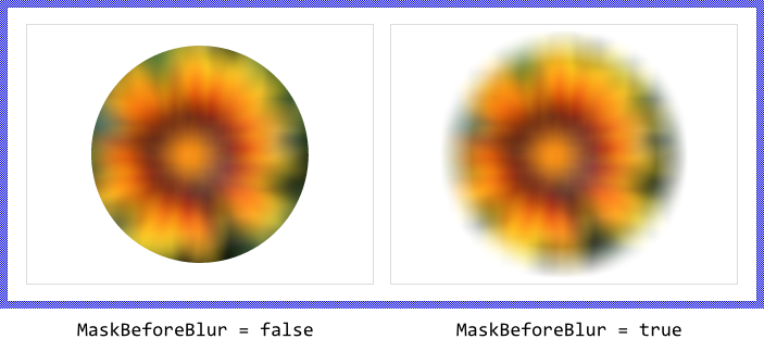
If you intend to combine the mask and the blur filter effects together, note the right order in which the effects are applied. Per default the mask effect is applied after the blur is done. Consequently, the blurred contents appear masked which results in sharp edges according to the shape of the mask. If your application case requires the image content to be masked first and then the resulting masked image being blurred, set the property MaskBeforeBlur to the value true. The following figure illustrates the different results depending on the initialization of the MaskBeforeBlur property:
Combine multiple filter effects together
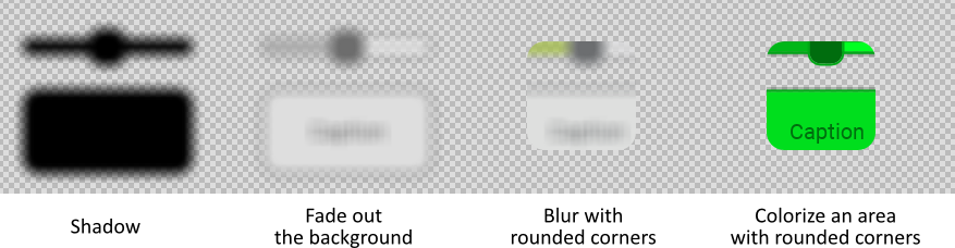
In order to produce more sophisticated visual effects, the above explained blur, tint and mask filters can be combined together. As inspiration the following table provides an overview of the most typical application cases and the necessary filter configuration:
Desired effect |
Blur |
Tint |
Mask |
Description |
|---|---|---|---|---|
Shadow |
YES |
TintByOpacity |
NO |
The opacity information found in the image of the associated component is used to create a monochrome image with desired color. This image is thereupon blurred. |
Fade out the background |
YES |
Grayscale |
NO |
The color information found in the image of the associated component is converted in grayscale resulting in a monochrome image. This image is blurred thereupon. |
Blur with rounded corners |
YES |
None |
YES |
The image of the associated component is blurred and thereupon masked by a bitmap containing a rectangle with rounded corners. |
Colorize an area with rounded corners |
NO |
TintByLuminance |
YES |
The RGB information found in the image of the associated component is replaced by specified color according to the original luminace. This image is thereupon masked by a bitmap containing a rectangle with rounded corners. |
The following figure illustrates the resulting effects of the combined filters:
The following example project demonstrates the practical application of the above mentioned filter effects:
Please note, the example presents eventually features available as of version 12.00
Please note, when using blur and mask effects simultaneously, the order in which these are applied is significant. The mask can be applied either on the already blurred content or the blur filter is applied on the previously masked image. For more details see the property MaskBeforeBlur explained in the section Configure the mask filter.
Position the component image within the Filter Group view
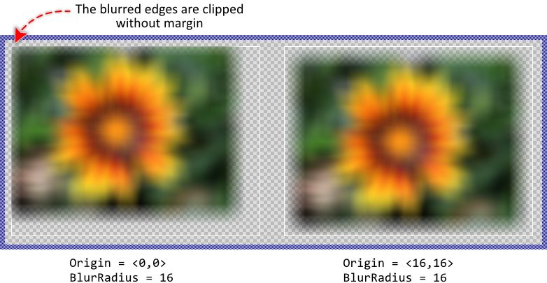
Per default, the image of the associated component is arranged and displayed directly at the top-left corner of the respective Filter Group view. To change this distance you use the property Origin. The following figure illustrates the resulting effect. When changing the property Origin, the image moves within the view. Parts of the image lying eventually outside the view's border are clipped and not visible. The thin borders in the figure indicate the areas of the corresponding Filter Group views:
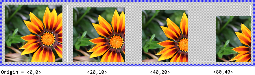
Moving the image is generally a useful feature if the Filter Group view should display a smaller area of a larger component. Other application case is found in connection with the blur filter when it is essential to completely blur (fade-out) the edges of the displayed component. In this case enlarge the Filter Group view by at least twice the size of the specified blur radius and configure the Origin to correspond to the blur radius. This results in a margin around the displayed component where the blurred edges can fade-out. If the margin is too small, the blur effect at this edge will be clipped, what can be undesired depending on your application case as shown in the figure below. Again the thin borders in the figure indicate the Filter Image views:
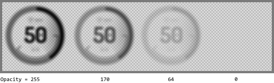
Modulate the resulting opacity of the filter effect
Using the property Opacity you can modulate the opacity of the resulting filter effect, so that it appears semi-transparent even if the original content was opaque. The valid values for the property Opacity are 0 .. 255, whereby the smaller the value the more transparent the resulting image. For example:
Control the visibility of the Filter Group view
The visibility of the Filter Group view is controlled primarily by the property Visible and the content of the associated component. Also the specified opacity and eventually the color tint effect may affect the resulting appearance of the Filter Group view. In particular, when the Filter Group view is configured to tint the original image with a transparent color, the resulting image is consequently transparent too.
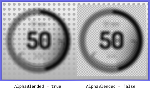
Per default the views appear alpha-blended over the contents lying behind them unless you explicitly disable this mode by setting the property AlphaBlended to the value false. In such case, the image resulting from the filter effect will overwrite the contents in the background. For example:
TIP
In the complete GUI application an individual view is visible on the screen only when all of its superior Owner components are visible too, the view itself does lie within the visible area of the superior components and the view is not covered by other sibling views nor components.