Managing dialogs (multiple screens): Customizing the Slide Transition
The Mosaic framework implements functionality to manage multiple Dialogs. During the runtime of the GUI application, the user can navigate between the diverse Dialogs forth and back. If desired, you can create and configure transition objects determining animations to be performed when the Dialogs are presented or dismissed again. Once the transition object is available, you can pass it in the argument list in the invocation of the method PresentDialog(), DismissDialog() or SwitchToDialog().
This chapter describes how to create and configure an object for the Slide Dialog Transition. This transition represents an animation affecting position and the opacity of the respective Dialog GUI component. When using the transition to show the Dialog, the Dialog ends arranged within predetermined area of its owner component (per default in center of the owner). This transition object is thus ideal wherever the Dialog component should smoothly slide-in/out in context of another component.
The following sections are intended to provide you an introduction and useful tips of how to deal with the Slide Dialog Transition object. For the complete reference please see the documentation of the Effects::SlideTransition class.
Add new Slide Dialog Transition object
Depending on your application case, you have the option to add the Transition object as an embedded object directly to a GUI component or to add it as an autoobject to a unit. The first case is suitable if you want the Transition object to be used only locally within the GUI component. The second case, in turn, is appropriate if you intend to share the Transition object among multiple GUI components like a kind of common resource.
To add a new Transition object do following:
★Depending on your preferred option switch to the Composer page for the respective GUI component class or the unit where you want to add the Transition object.
★Then ensure that the Templates window is visible.
★In Templates window switch to the folder Effects.
★In the folder locate the template Slide Dialog Transition.
★Drag & Drop the template into the Composer window:
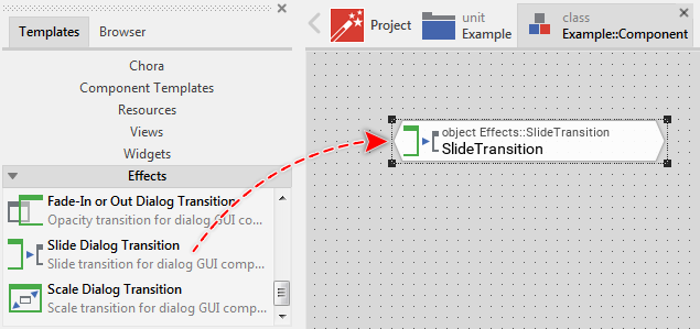
★Eventually name the new added Transition object.
Inspect the Slide Dialog Transition object
As long as the Transition object is selected you can inspect and modify its properties conveniently in the Inspector window as demonstrated with the property Duration in the screenshot below:
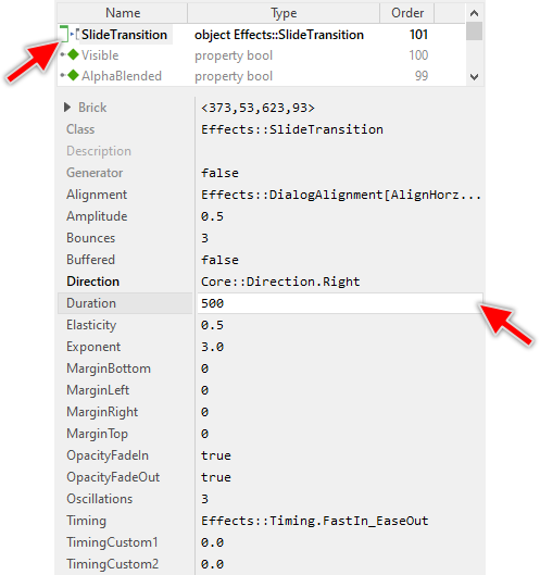
This is in so far worth mentioning as the following sections describe diverse features of the Transition object by explicitly referring to its corresponding properties. If you are not familiar with the concept of a property and the usage of Inspector window, please read first the preceding chapter Compositing component appearance.
Configure how to arrange the Dialog within its owner
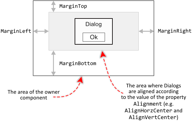
When the transition is used to show a Dialog, the transition uses diverse constraint properties to calculate the adequate position where to arrange the Dialog within the boundary area of its owner. Per default, the Dialogs are centered within the available area.
First at all, with the property Alignment you can determine how the Dialogs should be arranged vertically and horizontally. For example, you can decide to arrange the Dialogs to appear always aligned to the bottom-left corner of their respective owners. Or, you configure the transition to align the Dialogs to their owners top edge and to center them horizontally.
The property Alignment is declared as Effects::DialogAlignment, a set data type, which means that you can activate and deactivate the various alignment options individually. For example, deactivating the option AlignHorzCenter and activating the option AlignHorzLeft will configure the transition to always arrange the Dialogs aligned to the left edge of their respective owners. Similarly, the constraints for the vertical alignment can be configured individually.
With the properties MarginLeft, MarginTop, MarginRight, MarginBottom you can limit the boundary area of the owner components intended to arrange the Dialogs. For example, if you want the Dialogs to always appear centered in the upper area of their respective owners, configure the property MarginBottom accordingly. The following figure demonstrates the effect of the here described configuration properties:
Configure the slide direction
During the animation, the Transition object moves the affected Dialog component along a straight line. By setting the property Direction you determine the course of this movement. The following table describes the effect of initializing this property:
Direction |
Description |
|---|---|
Left |
The Dialog moves horizontally from right to the left. When presenting the Dialog, the movement starts immediately beyond the owner's right edge and continues until the Dialog has reached the predetermined position. |
Right |
The Dialog moves horizontally from left to the right. When presenting the Dialog, the movement starts immediately beyond the owner's left edge and continues until the Dialog has reached the predetermined position. |
Top |
The Dialog moves vertically upwards. When presenting the Dialog, the movement starts immediately beyond the owner's bottom edge and continues until the Dialog has reached the predetermined position. |
Bottom |
The Dialog moves vertically downwards. When presenting the Dialog, the movement starts immediately beyond the owner's top edge and continues until the Dialog has reached the predetermined position. |
TopLeft |
The Dialog moves along the diagonal between the bottom-right and top-left corners of the owner component. When presenting the Dialog, the movement starts immediately beyond the bottom-right owner's corner and continues until the Dialog has reached the predetermined position. |
TopRight |
The Dialog moves along the diagonal between the bottom-left and top-right corners of the owner component. When presenting the Dialog, the movement starts immediately beyond the bottom-left owner's corner and continues until the Dialog has reached the predetermined position. |
BottomLeft |
The Dialog moves along the diagonal between the top-right and bottom-left corners of the owner component. When presenting the Dialog, the movement starts immediately beyond the top-right owner's corner and continues until the Dialog has reached the predetermined position. |
BottomRight |
The Dialog moves along the diagonal between the top-left and bottom-right corners of the owner component. When presenting the Dialog, the movement starts immediately beyond the top-left owner's corner and continues until the Dialog has reached the predetermined position of the owner component. |
The property Direction is declared with the enumeration data type Core::Direction. The above mentioned names are just members within this enumeration. Thus, when initializing the property Direction it is obligatory, that you always specify the complete enumeration name, for example Core::Direction.Bottom.
Configure the duration of the transition
Per default, the Slide Transition takes 500 ms for its animation. With the property Duration you can specify another value in milliseconds.
Configure the timing (easing) of the transition
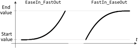
By using the property Timing you can control the course of the animation performed during the transition. The most popular timing functions are named EaseIn_FastOut and FastIn_EaseOut. Analog, the transition configured with the respective function starts slowly (or fast) and then speeds up (or slows down) until the end position has been reached. You can imagine, that using them for a movement animation the speed of the animated object will increase or decrease continuously. The following figures present the course of the both timing functions:
The property Timing is declared with the enumeration data type Effects::Timing. The above mentioned function names are just members within this enumeration. Thus, when initializing the property Timing it is obligatory, that you always specify the complete enumeration name, for example Effects::Timing.EaseIn_FastOut.
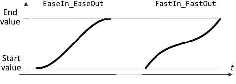
Other two popular functions EaseIn_EaseOut and FastIn_FastOut are ideal when you want the transition both to start and end slowly (or even fast) as presented in the graphs below:
The following three functions Power_In, Power_Out and Power_InOut work similarly, however you can configure them more precisely. These functions are based on the common equation f(t)=t^Exponent with the value of the equation operand Exponent represented by the homonymous property Exponent. The larger the value, the more steep the function course. With the default initialization of this property (value 3.0) the timing functions are as follows:

The functions Exp_In, Exp_Out and Exp_InOut are based on the common equation f(t)=(exp(Exponent*t)-1.0)/(exp(Exponent)-1.0) with the value of the equation operand Exponent represented by the homonymous property Exponent. The larger the value, the more steep the function course. With the default initialization of this property (value 3.0) the timing functions are as follows:

The functions Back_In, Back_Out and Back_InOut are based on the common equation f(t)=t^3-t*Amplitude*sin(t*180) with the value of the equation operand Amplitude represented by the homonymous property Amplitude. The larger the value, the larger the setback. With the default initialization of this property (value 0.5) the timing functions are as follows:

The functions Bounce_In, Bounce_Out and Bounce_InOut implement a sophisticated bounce timing function. The total number of bounces is determined by the property Bounces. How much the amplitude is increased or decreased with every bounce is determined by the property Elasticity. With the default initialization of the property Bounces (value 3) and Elasticity (value 0.5) the timing functions are as follows:

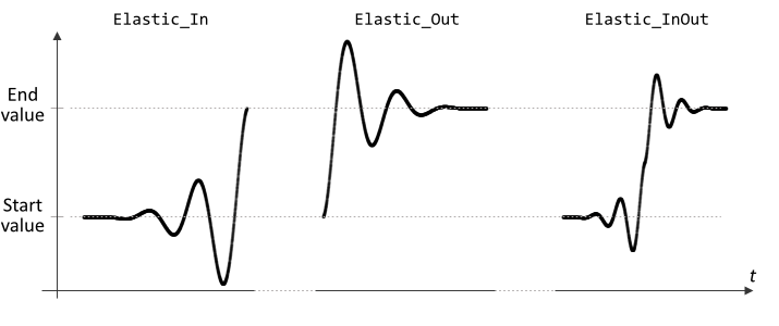
The functions Elastic_In, Elastic_Out and Elastic_InOut are based on the common equation f(t)=t^3*sin(t*90*(1+4*Oscillations)) with the value of the equation operand Oscillations represented by the homonymous property Oscillations. The larger the value, the more oscillations are included. With the default initialization of this property (value 3) the timing functions are as follows:
The following three functions Circle_In, Circle_Out and Circle_InOut are based on the common equation f(t)=1-sqrt(1-t^2). The timing functions are as follows:

Finally, the following three functions Sine_In, Sine_Out and Sine_InOut are based on the common equation f(t)=sin(t*90). The timing functions are as follows:

In practice there is no special recommendation to select the right function for the particular application case. When you understand the above presented graphs you can imagine how the respective timing functions will affect the resulting transition. Accordingly you are able to select the optimal function for your desired animation. Or, you simply try out several functions until you find the right one. Please remember, that many of the functions can be additionally configured.
Please note, besides the above listed functions, the Effect objects support also the timing named Custom. This function, however, exists just for compatibility purpose with older Embedded Wizard versions. It is not necessary to use it in new projects.
Disable the opacity animation
Per default while animating the position of the affected Dialog component, the transition also modifies its opacity. Concrete, when presenting the Dialog, the Dialog is faded-in: its opacity changes from 0 to 255. In turn, when the Dialog is dismissed, its opacity is animated from 255 to 0: it is faded-out.
If this behavior is not desired, you can disable it explicitly by setting the properties OpacityFadeIn and/or OpacityFadeOut to the value false. The affected Dialog component will then retain its full opacity during the corresponding transition phase.
Configure the buffered mode of the transition
During the animation, the Transition object moves the affected Dialog component. Modifying the position of a GUI component causes per default every view nested within this component to be redrawn again.
This behavior can be changed if you set the property Buffered to the value true. Now, the affected Dialog component will manage temporarily an off-screen image of its actual content. Then this image is used to display the component instead of drawing its contents again and again during the transition animation. As consequence, the screen update is optimized.
CAUTION
Please consider, that with enabling the buffered mode, the Transition object will cause the affected Dialog component to reserve memory for an internal bitmap to store its image inside. The size of the bitmap corresponds to the actual size of the component. In other words, a 200x100 pixel large Dialog component will be buffered with a 200x100 pixel large bitmap. Assuming you are working with the RGBA4444 (16-bit per pixel) Platform Package, then the bitmap would occupy ~40 KB of the RAM. Thus, if RAM is a scarce resource in your target device, you should use the buffering mode with prudence.
