Managing dialogs (multiple screens): Customizing the Show/Hide Transition
The Mosaic framework implements functionality to manage multiple Dialogs. During the runtime of the GUI application, the user can navigate between the diverse Dialogs forth and back. If desired, you can create and configure transition objects determining animations to be performed when the Dialogs are presented or dismissed again. Once the transition object is available, you can pass it in the argument list in the invocation of the method PresentDialog(), DismissDialog() or SwitchToDialog().
This chapter describes how to create and configure an object for the Show or Hide Dialog Transition. This transition controls the most primitive fade-in/out operation alternating the visibility of the respective Dialog component only. When using the transition to show the Dialog, the Dialog is automatically arranged within predetermined area of its owner component (per default in center of the owner). This is thus ideal wherever the Dialog component should appear or disappear instantly without any animation effects.
The following sections are intended to provide you an introduction and useful tips of how to deal with the Show or Hide Dialog Transition object. For the complete reference please see the documentation of the Effects::ShowHideTransition class.
Add new 'Show or Hide' Dialog Transition object
Depending on your application case, you have the option to add the Transition object as an embedded object directly to a GUI component or to add it as an autoobject to a unit. The first case is suitable if you want the Transition object to be used only locally within the GUI component. The second case, in turn, is appropriate if you intend to share the Transition object among multiple GUI components like a kind of common resource.
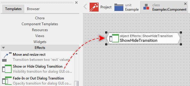
To add a new Transition object do following:
★Depending on your preferred option switch to the Composer page for the respective GUI component class or the unit where you want to add the Transition object.
★Then ensure that the Templates window is visible.
★In Templates window switch to the folder Effects.
★In the folder locate the template Show or Hide Dialog Transition.
★Drag & Drop the template into the Composer window:
★Eventually name the new added Transition object.
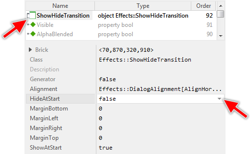
Inspect the 'Show or Hide' Dialog Transition object
As long as the Transition object is selected you can inspect and modify its properties conveniently in the Inspector window as demonstrated with the property HideAtStart in the screenshot below:
This is in so far worth mentioning as the following sections describe diverse features of the Transition object by explicitly referring to its corresponding properties. If you are not familiar with the concept of a property and the usage of Inspector window, please read first the preceding chapter Compositing component appearance.
Configure how to arrange the Dialog within its owner
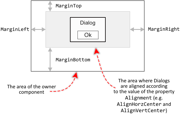
When the transition is used to show a Dialog, the transition uses diverse constraint properties to calculate the adequate position where to arrange the Dialog within the boundary area of its owner. Per default, the Dialogs are centered within the available area.
First at all, with the property Alignment you can determine how the Dialogs should be arranged vertically and horizontally. For example, you can decide to arrange the Dialogs to appear always aligned to the bottom-left corner of their respective owners. Or, you configure the transition to align the Dialogs to their owners top edge and to center them horizontally.
The property Alignment is declared as Effects::DialogAlignment, a set data type, which means that you can activate and deactivate the various alignment options individually. For example, deactivating the option AlignHorzCenter and activating the option AlignHorzLeft will configure the transition to always arrange the Dialogs aligned to the left edge of their respective owners. Similarly, the constraints for the vertical alignment can be configured individually.
With the properties MarginLeft, MarginTop, MarginRight, MarginBottom you can limit the boundary area of the owner components intended to arrange the Dialogs. For example, if you want the Dialogs to always appear centered in the upper area of their respective owners, configure the property MarginBottom accordingly. The following figure demonstrates the effect of the here described configuration properties:
Configure the phase when to show or hide the affected Dialog
The Show or Hide Transition object implements the most primitive transition alternating the visibility state of the affected Dialog component. In fact, there is no real animation to be performed in this case. When the Dialog is presented, it appears instantly. When the Dialog is dismissed, it disappears instantly. This may become problematic, if the Show or Hide Transition is performed simultaneously together with other transition animations (e.g. the Slide Transition). Thus, when should the Dialog appear or disappear: at the begin or at the end of such combined animation?
This particular aspect is controlled by the both boolean properties ShowAtStart and HideAtStart. Is the property initialized with the value true, then the respective operation is executed at the begin of the combined animation (for example, just in the moment when the coupled Slide Transition begins). Accordingly, if the property is false, the operation is performed at the end of the entire animation.