Embedded Wizard Studio: Composer
The Composer is the main editor of the Embedded Wizard Studio. It provides a simple visual programming environment, where you assemble your GUI components and the entire application by conveniently Drag & Drop the respective project members. In other words, you use the Composer to determine the visual aspect and the function of your application. The Composer assumes the center area of Embedded Wizard Studio:
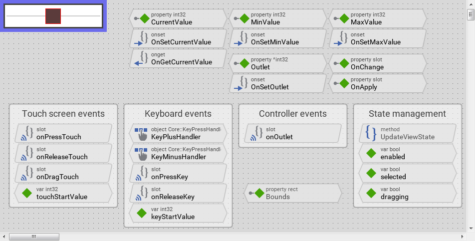
Composer window
Bricks
In Embedded Wizard Studio you develop GUI components and the application by composing them from project members represented visually by small building blocks, so-called bricks. The idea behind a brick is based on the fact, that humans can percept visual symbols in a very effective way, often better than a pure text is percept. Instead of describing the project members in text form you manage them as handy building blocks.
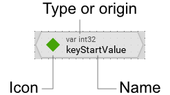
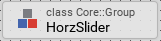
Every brick displays an icon, type or origin information and the name of the represented project member. For example, a variable member named keyStartValue with int32 data type is represented by following brick:
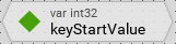
Depending on the role of the represented project member, bricks can be classified and distinguished in three shape categories. The shape together with the displayed icon provide a convenient way to recognize the role of the corresponding project member:
Category |
Example |
Description |
|---|---|---|
Data |
|
Bricks with pointed sides represent entities of data, e.g. variables, properties, arrays, constants, autoobjects, etc. |
Logic |
|
Bricks with beveled sides represent entities of logic, e.g. methods, slot methods, etc. |
Other |
|
Bricks with rectangular shape represent all others entities. In most cases they are complex definitions containing other embedded members inside. For example units, classes, etc. |
Being represented by bricks, the project members can be freely arranged within the entire Composer area. This is in particular very convenient and helps you to keep an overview in complex projects containing hundreds of members. For example, you can place methods and related variables side by side. You are completely free in how the bricks are arranged. The position and the size of a brick have no effect on the function of your application.
Canvas area
If you are editing a GUI component (technically seen a class descended from the Mosaic class Core::Group), the Composer displays a dedicated area where you can see and conveniently edit the appearance of the component. This so-called canvas area is surrounded by a thick blue border and arranged always in the top-left corner of the Composer:
The canvas area affects all project members, which provide own graphical presentation, usually views and other embedded GUI components. Instead of being shown as bricks, those members appear then with their real appearance in the canvas area. In particular they are displayed as images or text in the same manner as they will appear on the screen in the target system. Please note, graphical members lying outside the canvas area are clipped or even invisible.
You can consider the canvas area as a kind of virtual machine which is able to emulate all essential characteristics of the particular target system like its respective color format or screen resolution. Accordingly, what you see in the canvas area is what you finally get in your target device.
The checkerboard pattern represents the actual screen background. With it you can easily distinguish during the design how transparent or semi-transparent areas of the component will in fact be composed with other screen contents lying behind them.
Annotations
With annotation members (annotation legend, annotation group or annotation arrow) you add description to your project or you group project members together. Therefore, instead of being shown as bricks the annotations are displayed as dedicated text blocks or arrows directly within the Composer area. Annotations have no effect on the function of your application:
Inherited members
Since a class inherits all members from its base class, displaying all those members in Composer would quickly become confusing. Therefore, when you edit a class, the Composer conceals implicitly the bricks for members defined in the ancestor classes but not overridden in the actual class. In other words, the Composer shows only those bricks which are added or modified in the actual class by hiding all other inherited and not overridden bricks.
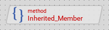
As soon as you override an inherited member, its brick appears in Composer. The overridden brick, however, is shown with gray font. In this manner you can distinguish between members you have added to the actual class and members inherited (and overridden) from ancestor classes:
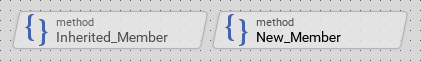
Bricks for overridden members appear with gray font
Please note, that the above described concealing mechanism does not affect the graphical members displayed in the canvas area. See also the section Invisible views.
TIP
The complete list including all inherited members is available in the Inspector window. If you are looking for a particular inherited member, use the Inspector for this purpose.
Erroneous members
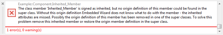
In case of errors in the inheritance of project members, the Composer highlights the affected bricks with red font. In this manner you can recognize, that there is a problem with a particular project member:
Please note, that Embedded Wizard Studio reports the corresponding error messages in the Log window including tips of how to solve the problem:
Invisible views
All project members, which provide own graphical presentation (usually views and other embedded GUI components) are displayed within the dedicated canvas area, similarly as they appear later on the screen in your target device. However, unlike the target device, the canvas area shows also those views, which are actually configured as being invisible. In other words, when you set the property Visible of a view to the value false, the view is still displayed in canvas area.
This forced visibility affects only views, which are new within the actual class. For all other views, be it inherited from an ancestor class or existing within one of the embedded components, the visibility status is fully respected. This special behavior should help you to keep track of the views while you actively design your GUI component. In order to see the component as it will appear on the target device, start it in the Prototyper window.
Please note, whether a graphical member is actually visible or not depends also on other factors, like the position of the view, the arrangement of other views eventually covering each other, colors and contents used to show the view, etc..
TIP
The complete list including all invisible members is available in the Inspector window. If you are looking for a particular hidden member, use the Inspector for this purpose.
Navigate between Composer pages
Embedded Wizard manages the currently opened contents as individual Composer pages. For example, if you have three GUI components opened, then there are three corresponding Composer pages. To switch between and manage the opened pages use the Navigation bar found at the upper edge of the Composer window.
The Composer window is visible all the time and unlike other windows it can't be hidden or shown manually. You can, however, activate (focus) the Composer to then operate it with the keyboard:
★To activate the Composer window press the keys Alt0
★... or select the menu item .
Resize the Canvas area
The canvas area determines the initial size (the design size) of the edited GUI component and implies thus the size of all instances created of the component as well as the size of other components derived from it. The size is considered as initial because for every instance and every derived class the actual size can be modified subsequently. For example, when you embed an instance of one component within another component, the embedded component appears first with its initial size. You can, however, arrange and resize the embedded component as desired.
This explanation is insofar essential, as resizing an instance of the component may cause its views and other components embedded inside it being new arranged in order to match the new dimension. Therefore, you should choose already at the design time the optimal size for your component and using the property Layout specify how the views and other components embedded inside it should react to eventual later size changes.
★To resize the canvas area, simply click on the right or the bottom edge of the thick blue border and drag it:
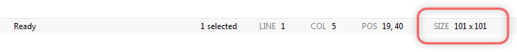
Please note, that the size of the canvas changes in steps specified in the grid setting. You can however suppress this snap function temporarily by simply holding the key Shift pressed. While dragging the edges of the canvas area, its current size is displayed in a dedicated pane of the Status bar:
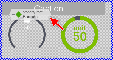
The dimension of the canvas area correlates directly with the value of the component's own property Bounds. Resizing the canvas area changes thus implicitly the value of this property. If this property has not yet been overridden, a brick representing this property will appear now in the Composer window. This is an expected behavior. If the brick overlays the canvas area or other members in Composer, you can move it freely:
TIP
Since the size of the canvas area correlates with the component's own property Bounds, you can alternatively resize the canvas by directly modifying this property. For this purpose locate in the Inspector window the member named this and change its property Bounds as desired.
Add new members
The simplest way to add a new member is to Drag & Drop the corresponding template from the Templates window into the Composer or Inspector window. Embedded Wizard Studio includes per default an extensive set of templates for all project members and further templates for various application cases. For more details, see the description of the Templates window.
You can also Drag & Drop an existing member from the Browser into the Composer or Inspector window and thus duplicate or derive it. With the Browser window, Embedded Wizard Studio provides you a kind of auxiliary view on your project structure so that you can access project members and use them for various copy and derive operations. For more details, see the description of the Browser window.
Select members
Before you can perform operations in Composer you have first to select all project members you want to involve into the operation:
★To select a single member simply click on it with the mouse.
★To select multiple members click on them in succession while holding pressed the key Shift.
★To select all members use the menu item or press the key CtrlA.
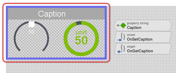
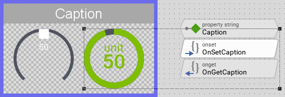
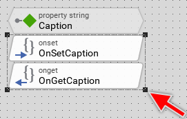
The selected members appear surrounded by a common rectangular selection frame. Additionally all selected bricks are displayed with slightly lightened background. For example, the following screenshot demonstrates the situation with two selected members: a graphical object within the canvas area and the onset method OnSetCaption:
★To deselect a single member from a group of selected members click on it while holding pressed the key Shift.
★To deselect all members simply click on the background of the Composer window somewhere outside the selection frame
★... or press the key Escape.
Alternatively you can select members by dragging a rubber band around them. For this purpose:
★To start the selection click in Composer and hold the mouse button pressed (if there are already members selected, please avoid clicking inside the existing selection frame).
★Now drag the mouse and enclose all members you intend to select inside the displayed rubber band.
★Finally release the mouse button. Subsequently all members enclosed completely within the rubber band will become selected:
★Similarly you can deselect members by dragging the rubber band around them while holding pressed the key Shift.
Since Composer and Inspector windows are coupled together, selecting members within the Composer affects implicitly the selection in Inspector window and vice versa. Also please note, that the Status bar displays in its dedicated panes the number of selected members, the position and size of the selected member, or if several members are selected, the position and the size of the area surrounding them. Similarly, the Status bar displays the current mouse position and the size of the rubber band during an active selection operation:

Inspect members
The current selection in the Composer window correlates with the selection in the members area of the Inspector window. Accordingly, after selecting members in Composer you can inspect and modify their attributes and properties conveniently in the Inspector window.
Rename a member
★First ensure, that the member in question (and only this member) is selected.
★Press the key F2 or select the menu item .
★Enter the new name as described in the Inspector window.
Please note, the name of an inherited project member can't be changed retrospectively. To do this, you should navigate to the first ancestor of the member and change its name.
Open a member
Depending on its type, a project member can provide further contents enclosed inside it. For example, a class can contain methods, properties, variables. etc. In turn, methods are destined to accommodate implementation source code. Before you can see and modify those contents you have to explicitly open such member:
★First ensure, that the member in question (and only this member) is selected.
★Then press the key Enter or select the menu item .
★Alternatively you open a member by simply double-click on it with the mouse.
The content of the affected member appears either in a separate Composer page or in the Code Editor window depending on the type of the content. Now you can inspect and edit this content. To navigate between the opened Composer pages use the Navigation bar found above the upper edge of the Composer.
Select and open a member while Drag & Drop
If during a Drag & Drop operation the mouse pointer rests over a member for a period longer than 1 second, the affected member is automatically selected. Now the properties and attributes of the member are available in the Inspector window so that you can release the dragged content directly over them.
If the mouse pointer rests for a period longer than 2 seconds, the affected member is opened showing its enclosed content. In this manner you can navigate easily within your project during an active Drag & Drop operation until you reach the target location where you want to release the dragged content. Please note, that during an active Drag & Drop operation you can also switch between various Composer pages by using the Navigation bar.
Move members
All members displayed within the Composer window can be moved freely. In particular you can arrange the graphical objects within the canvas area and you can group annotations and related bricks together so that the content of the Composer is tidy and reflecting your development intention:
★First ensure, that all members you want to move are selected.
★Click with the mouse within the selection frame surrounding the selected members and
★... while holding the mouse button pressed drag the selection frame to the desired position.
★Finally release the mouse button:
Please note, that the selected members are moved in steps specified in the grid setting. You can however suppress this snap function temporarily by simply pressing the key Shift. Additionally, while moving the selected members the Status bar displays in its dedicated panes the current position and the size of the selected member, or if several members are selected, the position and the size of the area surrounding them:
Alternatively and more precisely you can move the selected members by using the keyboard:
★To move the selected members vertically 1 pixel up or down press the key Up or Down.
★To move the selected members horizontally 1 pixel left or right press the key Left or Right.
TIP
Since the position of a member correlates with the values stored in its respective properties and attributes (e.g. Bounds, Point1, Point2, Brick, etc.), you can alternatively move the members by directly modifying these properties or attributes. For this purpose select the desired member first and then modify its properties or attributes in the Inspector window.
Resize members
All members displayed within the Composer window can be resized freely. In particular you can arrange the graphical objects within the canvas area and you can align annotations and related bricks together so that the content of the Composer is tidy and reflecting your development intention:
★First ensure, that all members you want to resize are selected.
★Click with the mouse on one of the black corners of the frame surrounding the selected members and
★... while holding the mouse button pressed drag the corner resizing so the selection frame.
★Finally release the mouse button:
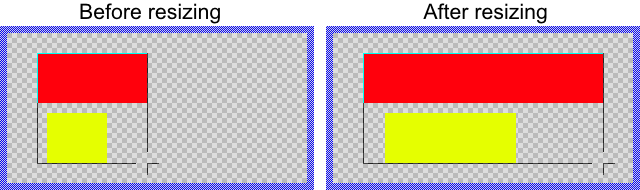
If you have selected multiple graphical objects within the canvas area, these are resized and moved proportionally to the portion the respective member occupies within the selection frame. For example, the yellow rectangle in the following screenshot is half so wide as the selection frame. Accordingly, it will be half stretched unlike the red rectangle which occupies the entire width:
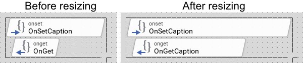
Similar occurs when you select and resize multiple bricks. However, bricks are not resized proportionally. When resizing bricks, the distance between the edges of a brick and the corresponding edges of the selection frame remains unchanged. Moreover, resizing bricks vertically has no effect. The height of a brick is fixed:
Please note, that while dragging the corner of the selection frame, the frame is resized in steps specified in the grid setting. You can however suppress this snap function temporarily by simply pressing the key Shift. Additionally, during the resize operation the Status bar displays in its dedicated panes the current position and the size of the selected member, or if several members are selected, the position and the size of the area surrounding them:
Alternatively and more precisely you can resize the selected members by using the keyboard. With the following shortcuts you can move the right and the bottom edges of the selection frame pixel-wise:
★First press and hold the key Shift.
★Then press additionally the key Right or Left to increase or decrease the width of the selection frame by 1 pixel.
★To increase or decrease the height of the selection frame by 1 pixel press additionally the keys Down or Up.
★You can press the keys Right, Left, Down or Up multiple times as desired.
★Finally release the Shift key.
TIP
Since the size of a member correlates with the values stored in its respective properties and attributes (e.g. Bounds, Point1, Point2, Brick, etc.), you can alternatively resize the members by directly modifying these properties or attributes. For this purpose select the desired member first and then modify its properties or attributes in the Inspector window.
Reorder members
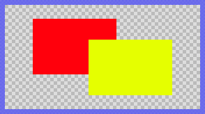
When working with Composer window, the resulting composition of project members (in particular members within the canvas area) is determined by the respective stacking order. Generally, members having higher order do overlay other remaining members with lower order. For example, in the following screenshot the order of the yellow rectangle is higher than the of the red rectangle:
★First ensure, that all members you want to restack are selected.
★To restack up the members (to increase their order) press the key CtrlUp.
★To restack down the members (to decrease their order) press the key CtrlDown.
★To restack top most the members press the key CtrlShiftUp.
★To restack back most the members press the key CtrlShiftDown.
You can perform the above operations also by using the corresponding commands from the menu Arrange.
Please note, that despite the explicitly specified order, bricks are displayed top most while the canvas area appears in the background of the Composer window. Annotations, in turn, are arranged between the canvas area and bricks. In other words, bricks appear above the canvas area even if they have an order lower than the of members existing within the canvas area.
TIP
Beyond the Composer, the order also affects the succession in which the members are initialized and converted in code for the target system. The actual order of a member can be verified in the members area of the Inspector window.
Copy & Paste members
The Composer window supports various Copy & Paste operations permitting you to duplicate and derive members by using the clipboard and keyboard shortcuts. To perform a Copy & Paste operation, do following:
★First ensure, that all members in question are selected.
★Press the keys CtrlC or use the menu item to copy the selected members into the clipboard.
★Eventually switch to another Composer page where you want to paste the just copied members.
★Now, depending on the desired operation use one of the following keyboard shortcuts or select the equivalent menu item:
Shortcut |
Menu item |
Description |
|---|---|---|
CtrlV |
Adds new members as exact duplicates of the members in the clipboard. |
|
CtrlShiftV |
Add new classes by deriving them from the classes in the clipboard. See also: |
|
CtrlShiftAltV |
Add new variant members by deriving them from the members in the clipboard. See also: Create new bitmap resource variant |
|
CtrlAltV |
Add new autoobject or embedded object members (instances) from the classes in the clipboard. See also: |
By duplicating a member you create an exact copy of the original member including all associated attributes and properties like the position and the size of the member. Thus, after the copy operation you would usually move, resize and modify the duplicated members accordingly to your desired application case. You should also rename the members in order to keep your project tidy. Per default, new members retain the name of the original member by appending an additional unique and consecutive number.
Drag & Drop members
The Composer window supports various Drag & Drop operations permitting you to duplicate and derive members by simply using the mouse. As such, Drag & Drop is a convenient complement for the typical clipboard functions. To perform a Drag & Drop operation, do following:
★First ensure, that all members in question are selected.
★Depending on the desired Drag & Drop effect press and hold a combination of the modifier keys Ctrl, Shift and/or Alt.
★With the mouse click within the frame surrounding the selected members and
★... while holding the modifier keys and the mouse button pressed move the mouse.
★If necessary you can switch the Composer page during the Drag & Drop operation.
★If necessary you can select and open a member during the Drag & Drop operation.
★At the target location, where you want to add the dragged content release the mouse button.
★Finally release the modifier keys.
The following table provides an overview of the possible modifier key combinations you can use in conjunction with Drag & Drop and describes the resulting effects. Please note the form of the mouse pointer, which reflects the actual Drag & Drop effect:
Modifier keys |
Mouse pointer |
Description |
|---|---|---|
Ctrl |
|
Copies the dragged members so that you obtain an exact duplicate of them. |
Alt |
|
Copies the names of the dragged members so that you can drop the names into the Code Editor or into an edit field in the Inspector window. |
CtrlShift |
|
Add new classes by deriving them from the dragged classes. See also: |
CtrlShiftAlt |
|
Add new variant members by deriving them from the dragged members. See also: Create new bitmap resource variant |
CtrlAlt |
|
Add new autoobject or embedded object members (instances) from the dragged classes. See also: |


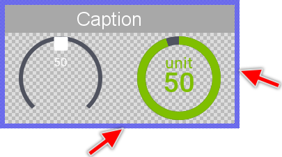
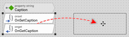
The following screenshot demonstrates the practical usage of Drag & Drop. To duplicate a member (here an analog display widget) you select it first and then you move it with the mouse while holding the key Ctrl pressed:
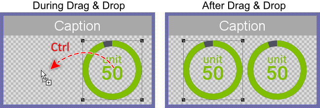
Please note, by duplicating a member you create an exact copy of the original member including its associated attributes and properties. Thus, after the copy operation you would usually move, resize and modify the duplicated members accordingly to your desired application case. You should also rename the members in order to keep your project tidy. Per default, new members retain the name of the original member by appending an additional unique and consecutive number.
Revert to an inherited member
If you want to revert an overridden member to its original inherited state, delete it simply. If the affected member was represented by a brick, the brick disappears now. If the affected member was displayed within the canvas area, the member restores its original inherited state and is still available within the canvas area.
Delete members
★First ensure, that all members you want to delete are selected.
★Then press the key DEL
★... or select the menu item .
Please note, that inherited members as being defined in ancestor classes can't be deleted retrospectively. You can, however, use the delete operation to revert the original inherited state of such member. In other words, deleting an inherited member deletes its overriding - the member still exists.
Navigate in the project
The Composer supports various functions to help you to navigate within your project. For example, if you are editing a GUI component (precisely a class), you can navigate to the Composer page corresponding to the unit where this class is contained. The affected class definition is additionally selected in Composer so you can locate it easily.
The following table provides an overview of all Composer navigation functions as well as the associated keyboard shortcuts and the corresponding menu items:
Shortcut |
Menu item |
Description |
|---|---|---|
CtrlShiftU |
Navigates to the Composer page of the unit containing the currently edited member. |
|
CtrlShiftS |
Navigates to the Composer page corresponding to the immediate ancestor class of the currently edited class. |
|
CtrlShiftA |
Navigates to the Composer page where the immediate ancestor of the currently selected member is defined. This command is useful by inherited members only. |
|
CtrlShiftD |
Navigates to the Composer page where the original definition (the first ancestor) of the currently selected member. This command is useful by inherited members only. |
Grid setting
The grid appears as a dot pattern filling the entire Composer area. With the grid enabled, the members do automatically snap at grid points when moving or resizing them:
★To enabled/disable the grid function toggle the menu item
★... or press the key CtrlG.
Per default, the spacing between two grid points is 10 pixel. The currently selected grid spacing can be reviewed and also changed in the grid selection combo box in the upper area of the Embedded wizard Studio.
TIP
You can suppress the snap function temporarily by simply pressing and holding the key Shift while you move or resize members.
Zoom setting
You can adjust the factor of how the Composer should scale its content. Typically, you zoom in to see the details in the canvas area and you zoom out to get the complete overview of the entire content available within the Composer:
★To zoom in press the key Ctrl+ or select the menu item .
★To zoom out press the key Ctrl- or select the menu item .
★To restore the 1:1 zoom factor (100 %) press the key Ctrl0 or select the menu item .
★Alternatively you can modify the zoom factor with the mouse wheel while holding down the key Ctrl.
Per default, the Composer shows its content with 1:1 factor (100 %), which means that one pixel in your designed GUI component corresponds to one pixel of the Composer window. The currently selected zoom factor can be reviewed and also changed in the zoom selection combo box in the upper area of the Embedded wizard Studio.
Scroll the Composer content
If the content of the Composer is larger than the Composer window itself, you have to scroll it. Usually you do it by using the scrollbars at the bottom and the right of the Composer window. Alternatively, you can scroll the content by simply grabbing and moving it with the mouse:
★First press and hold the key Space.
★Then click with the mouse within the Composer window.
★While still holding the key Space pressed move the mouse. The Composer content follows accordingly.
★Finally release the mouse button and the key Space.