Using Views: Text
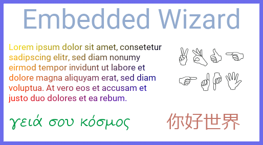
The Mosaic class Views::Text implements a graphical object specialized to display text. This so-called Text view can be used to compose the appearance of a GUI component, in particular to add any kinds of captions, labels, message text blocks, etc. to it. The following screenshot demonstrates few examples of how Text views appear in the canvas area of Composer (and accordingly on the screen in your target device):
The following sections are intended to provide you an introduction and useful tips of how to work with the Text view. For the complete reference please see the documentation of the Views::Text class.
Add new Text view
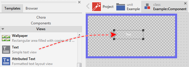
To add a new Text view just at the design time of a GUI component do following:
★First ensure that the Templates window is visible.
★In Templates window switch to the folder Views.
★In the folder locate the template Text.
★Drag & Drop the template into the canvas area of the Composer window:
★Eventually name the new added Text view.
Inspect the Text view
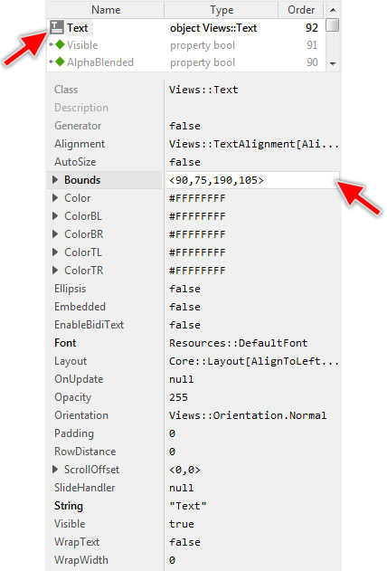
As long as the Text view is selected you can inspect and modify its properties conveniently in the Inspector window as demonstrated with the property Bounds in the screenshot below:
This is in so far worth mentioning as all following sections describe diverse features of the Text view by explicitly referring to its corresponding properties. If you are not familiar with the concept of a property and the usage of Inspector window, please read first the preceding chapter Compositing component appearance.
Arrange the Text view
Once added, you can freely move the Text view, or you simply grab one of its corners and resize it in this way. You can control the position and the size of the view also by directly modifying its property Bounds. If you want the Text view to appear behind other views you can reorder it explicitly.
Specify the font
The Text view renders the text by using the font information specified in its property Font. Usually, you initialize this property with the name of an existing font resource member. With the Inspector Assistant you can conveniently select the right resource when you edit the initialization expression for the property Font.
From technical point of view, you can initialize the property Font with any instance of a class descended from the Mosaic class Resources::Font. In particular, if your Platform Package contains a TrueType font engine, you can use an instance of the Resources::ExternFont class and render the text with fonts, you determine at the runtime.
Please note, every new added Text view uses the Resources::DefaultFont font resource in order to display something on the screen. Thus you will usually initialize the Text view with your own font resource. If desired, you can also use one of the other default font resources intended to help you when you start to create a prototype of your new product.
Specify the text
The text to display by the Text view is determined by its property String. This property expects an initialization expression resulting in a valid string operand. This is usually a string literal (e.g. "Caption") or the name of an existing string constant member. In particular, the usage of a constant is preferable wherever you plan to localize the text for different languages.
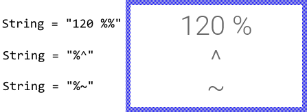
Please note, that there are few special characters, the Text view interprets as format instructions instead of displaying them. This affects the signs: ^ (circumflex), ~ (tilde) and % (percent). In order to display such sign, you have to prefix it within the string explicitly by an additional % (percent) character. For example:
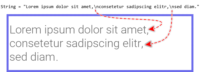
If the specified text contains \n (new-line) characters, the text portions lying in-between are treated and displayed as individual text rows. In other words, if you intend to display a multiline text block, you separate the rows simply by \n (new-line) characters. The \n (new-line) character itself is not visible in the resulting text:
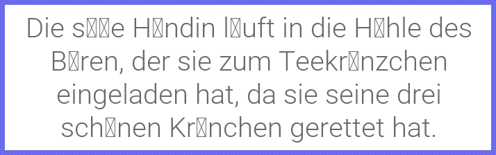
Please note, that to appear correctly, all signs used within the text should also be available in the specified font. In order to reduce the size of the resulting application, you have to determine for every font resource, which glyphs you intend to use at the runtime of your application. Not specified glyphs are then excluded. Trying to show them anyway will result in dummy signs, usually small boxes, displayed on the screen. For example, if the font resource doesn't include the typical German Umlaut ÄÖÜ nor the Eszett ß signs, the German text appears incomplete:
Enable RTL (right-to-left) and bidirectional text processing
Per default the characters within the specified text are displayed from left-to-right (LTR) according to their original storage order. To display text with right-to-left (RTL) direction as it is usual for the Arabic and Hebrew languages you have to explicitly enable the bidirectional text processing. For this purpose set the property EnableBidiText of the affected Text view to the value true.
With the enabled bidirectional text processing the Text view performs the Unicode Bidirectional Algorithm according to the rules specified in Unicode Standard Annex #9. This includes reordering of text fragments containing RTL characters, shaping of Arabic glyphs and building of Arabic mandatory ligatures. If you leave the property EnableBidiText initialized with its default value false none of these steps are applied.
In Arabic and Hebrew scripts the text rows appear per default right aligned. To achieve this effect you should thus explicitly configure the Text view with the AlignHorzRight alignment mode. Alternatively you can select the mode AlignHorzAuto which then causes the Text view to determine the actual alignment dynamically depending on base direction of the entire paragraph (depending on the first strong LTR or RTL character found in the original text). Please see also Align the text within the Text view area.
With the enabled bidirectional text processing it is sometimes useful to know more details resulting from the algorithm. For example, you can query the actual base direction of the paragraph. The Views::Text class provides for such application cases various useful methods. You can call those methods whenever your GUI component implementation requires the corresponding information. The following table gives you a short overview of them:
Method |
Description |
|---|---|
Returns true if the specified text contains any right-to-left contents or any other Bidi algorithm relevant control codes requiring the Bidi processing of this text. |
|
Returns true if the specified text starts with an RTL (right-to-left) character. This implies the base direction of the entire text paragraph. |
|
Queries the writing direction of the given character within the specified text. |
Wrap the text in multiple rows automatically
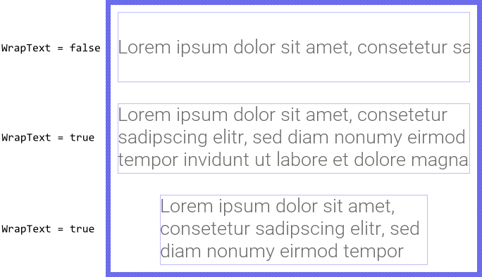
As described in the section Specify the text you can separate the text rows by \n (new-line) characters and so layout multiline text blocks easily. More sophisticated is to instruct the Text view to wrap the rows automatically according to the available space (usually the width of the Text view). To enable this feature, you simply initialize the property WrapText with the value true. The following figure demonstrates how the same text is displayed depending on the value of the WrapText property and the size of the Text view area (indicated by the thin blue borders):
The automatic text wrap applies primarily to space characters (blanks). The words, in turn, are not split unless the word contains special format characters. The following table provides an overview of the available format characters and the resulting effects. Using them, you can control the text layout more accurately:
Character |
Effect |
|---|---|
~ |
The signs ~ (tilde) are treated as soft-hyphens. They determine potential candidates to wrap a word. These signs are not displayed until the text wrap took place at their position. In such case the affected text row is terminated with an additional hyphen - sign indicating that the word has been broken there. |
^ |
The signs ^ (circumflex) are treated as silent soft-hyphens. They determine potential candidates to wrap a word. These signs are never displayed nor replaced by any hyphen even if the text wrap took place at their position. They are simply silent. |
\x00AD |
The standardized character code for a soft-hyphen. It has the same effect as described above with the sign ~ (tilde) and exists for compatibility purpose with UNICODE character set. |
\x00A0 |
The standardized character code for a non-breaking space (NBSP). The character is displayed as a blank without being taken in account as potential wrap position. |
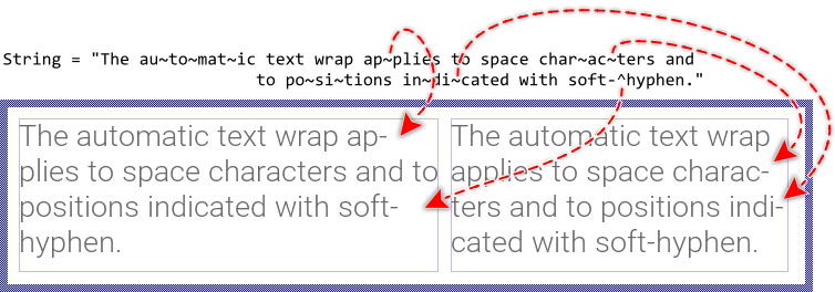
The following figure demonstrates the effect of the above described special characters to automatically wrap the words. As you see, enriching the text with ~ and ^ characters allows the Text view to automatically determine the ideal positions for the syllabication depending on the available space (indicated by the thin blue borders):
TIP
The special characters ~ and ^ exist for your convenience permitting you to enter them directly by using the keyboard. However, since being special characters they are not visible. In order to display the ~ or ^ sign, you have to prefix it explicitly by the % (percent) sign, as described in the section Specify the text.
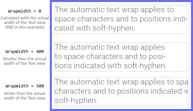
Per default, the text wrap is calculated depending on the actual width of the Text view. Changing the size of the Text view will thus cause the text layout to update accordingly. With the property WrapWidth you can override this behavior and specify explicitly other width to wrap the text irrespective of the actual size of the Text view. This is in particular useful, if you intend to align or scroll horizontally the resulting text block. By assigning the value 0 (zero) to the property WrapWidth the Text view restores again its default wrap behavior. For example:
Change the distance between text rows
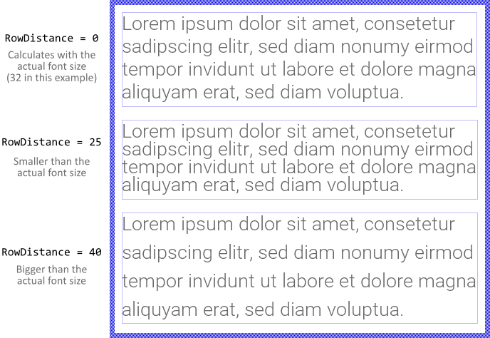
Within a multiline text block all rows are arranged per default at a distance determined by the size of the font used to display the text. With the property RowDistance you can override this behavior and specify explicitly other line spacing. Changing this property causes thus the text rows to appear more closely or loosely. By assigning the value 0 (zero) to this property the Text view restores again its default behavior. For example:
TIP
If you want to adjust the row distance based on the currently used font, you can calculate with the font object properties Ascent and Descent, which added result in the actual font size. Assuming, your project contains a font resource named App::Font and you want the distance to be 80 % of this font size, then you initialize RowDistance with an expression like this: (( App::Font.Ascent + App::Font.Descent ) * 8 ) / 10.
Align the text within the Text view area
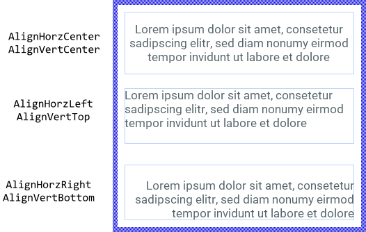
Per default, the Text view displays the text centered within the area determined by the property Bounds. If the text is larger than the available area, the parts lying outside it are simply clipped and are not visible. If desired, with the property Alignment you can determine other behavior.
The property Alignment is declared as a set data type, which means that it is possible to activate and deactivate the various alignment options individually. Primarily, with these options you specify how to align every displayed text row horizontally and how to align the entire text block vertically. The following figure demonstrates few examples of how the initialization of the property Alignment affects the text layout (the thin blue borders indicate the view areas):
If the Text view is intended to show bidirectional text with horizontal alignment depending on the actually displayed content, you should activate the option AlignHorzAuto instead of AlignHorzLeft or AlignHorzRight. In such case the correct alignment is derived from the base direction of the affected text (which depends on the first strong LTR or RTL character found in the original text). Consequently right-to-left (RTL) scripts like Arabic and Hebrew will appear right aligned while left-to-right (LTR) text is automatically left aligned.
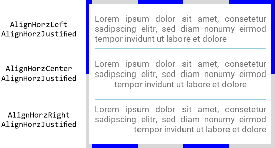
Regardless of the specified horizontal alignment you can additionally activate the option AlignHorzJustified. With this option you instruct the view to justify the space signs (blanks) lying between words of an automatically wrapped text rows, so the rows appear filling the entire available width of the Text view. The following figure demonstrates the effect of the additionally enabled AlignHorzJustified option (the thin blue borders indicate the view areas):
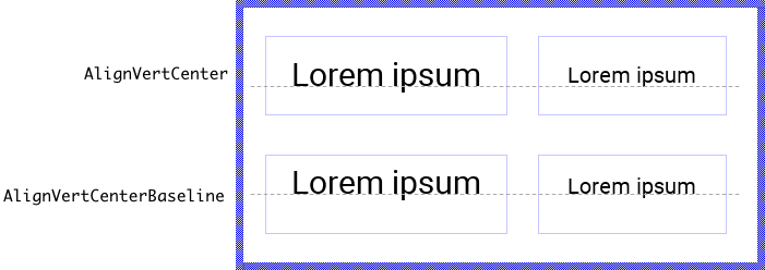
Please note the new option AlignVertCenterBaseline introduced with Embedded Wizard 12. It behaves similarly to the option AlignVertCenter causing the Text view to center vertically the displayed text. With AlignVertCenterBaseline being enabled, however, the text position is additionally adjusted so the text base line appears vertically centered within the area of the Text view. This is useful if the font associated to the Text view does change at the runtime and your application requires the text to still correctly appear centered at the same vertical position.
The new option is also useful to align the text displayed by several Text views. The following figure ilustrates the application case. There are two Text views using two different fonts. In the first row, when AlignVertCenter is enabled, the Text displayed in the left and right view is centered individually within the area of the Text view. The baselines of the both text fragments are not aligned. This problem disappears when AlignVertCenterBaseline option is used:
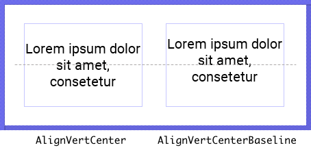
The option AlignVertCenterBaseline is used mainly to center a single text row. However, should the Text view display several text rows, the above explained vertical position adjustment is applied to the entire text block. Depending on the metrics of the used font, the text block and thus all the rows appear sligtly shifted up or down. If the number of text rows is odd, the base line of the row found in the middle of the text block is centered:
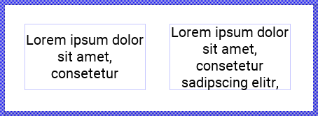
Starting with Embedded Wizard 12 the alignment options AlignVertCenter and AlignVertCenterBaseline can be combined with AlignVertTop or AlignVertBottom. The resulting effect: as long as the text is small enough to fit vertically within the Text view, the text will be centered. If the text is too high, however, the specified top or bottom alignment will override the center alignment. The following figure demonstrates the behavior. The both Text views in this figure are configured with the same alignment options AlignVertCenter and AlignVertTop. In the left view the text is small enough and can be centered. The text in the right view is already too large, so the Text view enforces the text to be aligned at the top edge:
Similar happens with options affecting the horizontal text alignment. The AlignHorzCenter option can be combined now with AlignHorzLeft, AlignHorzRight or AlignHorzAuto. Again, as long as the entire text is small enough, the text will be centered horizontally. As soon as the text is too wide to be fully visible within the Text view, it will be aligned at the corresponding left or right edge.
You should remind, that the text alignment does depend on the metric information provided by the original designer of the selected TrueType font. Especially italic fonts designed to appear slanted may cause problems with the last glyph in a right aligned row. Such glyph may appear clipped. The following figure demonstrates the problem (the thin blue borders indicate the areas of the Text views):
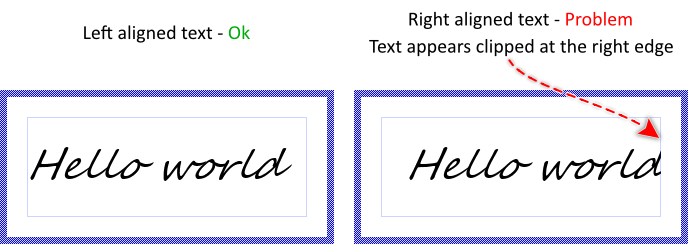
To help you to deal with such problems, the Text view implements the property Padding where you can specify a margin the Text view should additionally add at its left and right edges. With this margin you win additional space where the unexpectedly clipped glyphs can appear as expected. In the following figure you see the Text view with the right aligned text and additionally specified padding:
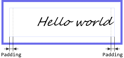
The property Padding expects its value being expressed in pixel. However, which value you specify, is particular to the used font. Usually you will need to try several values until you get the expected results. Also please note, specifying the padding does shrink the available area where text can be displayed within the Text view. Therefore it is reasonable to enlarge the Text view to compensate the additional padding. For example, if you set the property Padding to the value 12 then enlarge the Text view by 24 pixel horizontally. With this the Text view will appear as if it were configured without padding.
Rotate the text within the Text view area
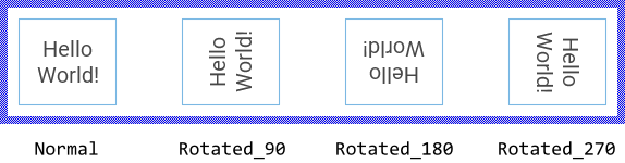
With the property Orientation you can determine the rotation of the displayed text in steps of 90 degrees (0, 90, 180 and 270 degrees). The following figure demonstrates how the initialization of the property Orientation affects the text layout (the thin blue borders indicate the view areas):
Modifying the Orientation property has also an effect on how the text is aligned within the view's area. For example, if you have configured the Text view to align the text at its top-left corner and then you rotate the text 90 degrees counterclockwise, the text will in fact appear aligned to the bottom-left corner of the view. The following figure demonstrates it (the thin blue borders indicate the view areas):
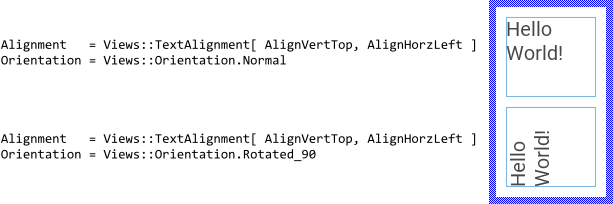
In such case the simplest is you consider the specified alignment constraints as being valid in context of original text instead of the edges of the Text view. Accordingly, regardless of how you initialize the property Orientation, a left aligned text will stick at its original left edge.
Please note, if your target device doesn't provide any dedicated graphics hardware for bitmap rotate operation, the operations are performed by the CPU, which may impact the performance of your application significantly if you use this feature extensively.
Scroll the text within the Text view area
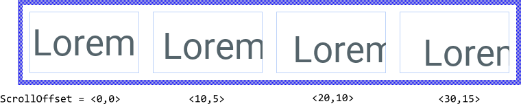
Besides the possibility to align the text within a Text view you can also scroll it pixel-wise. For this purpose use the property ScrollOffset. You can determine the vertical and the horizontal displacement individually. With positive values the text is scrolled right/down. With negative values left/up. For example (the thin blue borders indicate the view areas):
TIP
If you want the text to be scrolled automatically (so-called marquee text) add a Move point effect to your GUI component, configure the effect according to your desired animation and connect it to the ScrollOffset property of the text view you want to animate.
Truncate text with ellipsis
If you try to display text, which is larger than the available Text view area, then text parts lying outside this area are simply clipped at its edges resulting in text signs or even entire rows being half visible. With the property Ellipsis you can instruct the Text view to replace, if necessary, the leading and/or final parts of the text by an ellipsis sign ..., so that the displayed text fits automatically in the Text view area Bounds without being clipped ugly. To enable this mode, initialize the property Ellipsis with the value true.
The effect of this mode depends directly on the specified text alignment. For example, if the text is aligned at the top-left corner of the text view, the algorithm will remove all invisible or partially clipped rows at the bottom of the text and all signs at the right end of the last visible row until there is enough space to display one ellipsis sign. In turn, if the text is centered vertically, the algorithm affects the text rows at the top and at the bottom edges. The following figure demonstrates the effect (the thin blue borders indicate the view areas):
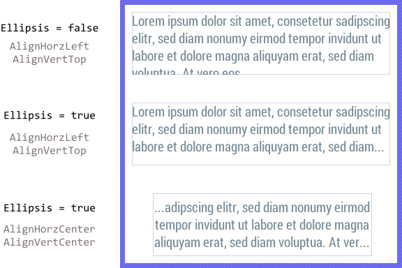
In the past, the usage of ellipsis with Text view configured to center the text produced some confusions. As explained above, the ellipsis will replace in such case both, the preceding and the following text fragments leaving only the center part of the text enclosed between a pair of ellipsis signs. If this behavior is not desired, you can configure the Text view to override the center alignment as soon as the text is too large. For example, when you configure the Alignment property with the values AlignVertCenter and AlignVertTop, the text is centered as long as it does fit vertically within the Text view. If the text is too large, the configured top alignment will override the center alignment and the text is automatically alligned at the top edge of the Text view. Consequently the ellipsis signs will replace only the bottom part of the text.
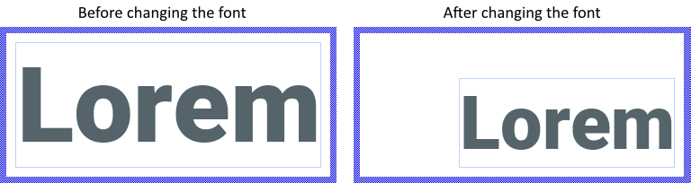
Configure the Text view to adjust its size automatically
With the property AutoSize you can instruct the Text view to automatically adjust its size and eventually its position when new text or font is assigned to it. In other words, the Text view will assume the size of the displayed content. Similarly, changing the wrap width while AutoSize is true will adjust the size and eventually the position of the view.
You can combine AutoSize with the alignment options. For example, if you have configured the Text view to align the text at its bottom-right corner, changing the font will move the left and top edges of the view by maintaining the bottom-right corner fixed. This is demonstrated in the following screenshot (the thin blue borders indicate the actual view area):
Since with AutoSize mode enabled the Text view assumes automatically the size of the entire text, truncate the text with ellipsis is not useful in such case.
Specify colors of the Text view
To specify the color of the Text view you change its property Color. Alternatively you can configure the text to be drawn with a color gradient. For this purpose you specify the colors for the four corners of the view (top-left, top-right, bottom-right and bottom-left) individually by using the corresponding properties ColorTL, ColorTR, ColorBR and ColorBL. The gradient colors are interpolated linearly between the specified values. Using color values with alpha < 255 causes the text to appear semi- or even transparent. For example:
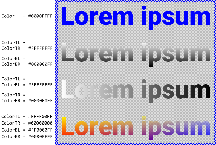
Please note, before the version 11.00 the common property Color and the individual properties ColorTL.. ColorBR were intended to be used exclusively. You could specify either the common color for the entire text or individual colors for its four corners. Using both approaches simultaneously produced unexpected results depending on the order in which the properties were initialized. This confused the users.
Starting with the version 11.00 the Text view calculates the resulting colors by modulating the values from the individual properties ColorTL..ColorBR by the value from the common property Color. In this manner, you are able to specify colors in all properties simultaneously avoiding the unpredictable behavior found in the preceding version. From technical point of view, the modulation is performed by multiplying the color components (red, green, blue, alpha) from the individual property (e.g. ColorTL) with the corresponding components from the common property Color.
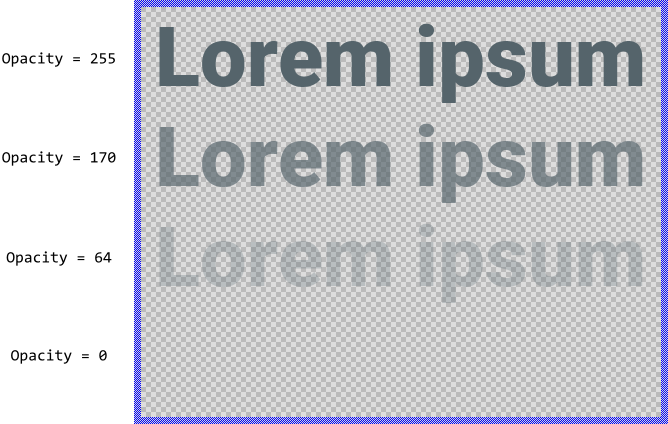
Modulate the opacity of the displayed text
Using the property Opacity you can modulate the opacity of the displayed text, so that it appears semi-transparent even if the originally specified colors were opaque. The valid values for the property Opacity are 0 .. 255, whereby the smaller the value the more transparent the resulting text. For example:
Arrange other views on the content of the Text view
Sometimes it is necessary to know the position of the text fragments displayed within the Text view in order to e.g. automatically align other views with them. For example, you can arrange an image view to appear always side by side with a text row, so that when the text changes, the image view is moved accordingly. The Views::Text class provides for such application cases various useful methods. The following table gives you a short overview of them:
Method |
Description |
|---|---|
Returns the position and the size of the area occupied by the entire text block. |
|
Returns the total number of text rows within a multiline text block. |
|
Returns the position and the size of the area occupied by a text row. |
|
Calculates from a given row/column number the origin pixel position of the corresponding sign. |
|
Calculates from a given pixel position the row/column number of the corresponding sign. |
|
Calculates from a given row/column number the corresponding character index within the originally specified text. |
|
Calculates from a given character index the corresponding row/column number. |
|
Returns a text portion corresponding to a text row. |
|
Returns the number of the row with largest width. |
|
Returns the number of the row with smallest width. |
|
Queries the writing direction of the given character within the specified text. If the character has RTL (right-to-left) direction (e.g. Arabic glyph), the method returns true. See also Enable RTL (right-to-left) and bidirectional text processing. |
You can call those methods whenever your GUI component implementation requires the corresponding information. More sophisticated, however, is to join the update mechanism provided natively by the Text view. Precisely, when you assign a slot method to the Text view property OnUpdate, the slot method will receive postsignals every time the text content, its layout or position changes. Accordingly, within the slot method you can react on this notification and e.g. arrange other views at the new text position. The following steps describe how to do this:
★First add a new slot method to your GUI component.
★Assign the slot method to the property OnUpdate of the Text view.
★Open the slot method for editing.
★In the Code Editor implement your desired arrangement algorithm by using the values returned from the above described Text view methods.
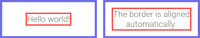
Assuming, your GUI component contains a Text view named Message and a border view named Border. Furthermore let's assume you want the border to appear arranged automatically around the text with an additional small margin. In such application case implement the slot method with following Chora code:
// Get the current text area, inflate it by 5 pixel and finally // assign it to the Border view. Border.Bounds = Message.GetContentArea() * <5,5>;
With such implementation, every time the text in the Text view changes, the border is updated automatically:
TIP
Please note, that the font associated to a Text view provides additional useful methods to calculate with the text layout and to query the metric information for the font and its individual glyphs. See the reference for the class Resources::Font.
Adjust text size to fill a given area (scale text)
If your application case requires the text to be scaled in order to fill a predetermined area, you have to manage in your project multiple copies of the font resource, each copy with a different size. At the runtime you repeatedly calculate for each font the size of the area occupied by the text and select the font with it the text does optimally fill the area. You can perform the necessary calculation steps by using diverse methods available in the Resources::Font class. For example, the method GetTextAdvance() calculates the width of the area needed to display a text portion. For example:
// Get the number and the content of the widest row var int32 rowNo = TextView.GetWidestRow(); var string textRow = TextView.GetRowString( rowNo ); // Calculate the area occupied by this text row if it will be displayed // with the actually used font var int32 width = TextView.Font.GetTextAdvance( textRow, 0, -1 ); // Now compare the calculated width. If the text is too large (e.g. larger // than 250 px.), select a smaller version of the font resource if ( width > 250 ) TextView.Font = ... // font smaller than the actually used // ... or select a larger version. if ( width < 250 ) TextView.Font = ... // font larger than the actually used
If you are using a Platform Package containing a TrueType font engine, you can simplify this operation and connect the text view with an Extern Font object instead of with the regular (static) font resource. The advantage of the Extern Font object is, you can flexibly adjust its properties, e.g. the height. Moreover, the object provides a convenience method to automatically calculate the optimal size for the font. For more details see: Use Extern Font object to adjust text within a given area.
Connect the Text view with a Slide Touch Handler
For your convenience the Views::Text class implements an interface for easy coupling Text views with Slide Touch Handlers. In this manner, the user can scroll the content displayed within the Text view by simply touching the associated Slide Touch Handler. Assuming that you have already a Text view in your GUI component, then:
★Follow the instructions to add a new Slide Touch Handler.
★Arrange the Slide Touch Handler so it covers the destined Text view.
★Assign the Slide Touch Handler to the property SlideHandler of the Text view.
TIP
You can configured the Slide Touch Handler to automatically snap between two text rows. For this purpose initialize the component y of the Touch Handler's property SnapNext with the value corresponding to the text row height. See also Configure the snap positions.
Control the visibility of the Text view
The visibility of the Text view is determined primarily by the property Visible, the specified text and the associated font. Also the opacity and the color values, if they are not opaque, may affect the resulting appearance of the Text view.
TIP
In the complete GUI application an individual view is visible on the screen only when all of its superior Owner components are visible too, the view itself does lie within the visible area of the superior components and the view is not covered by other sibling views nor components.